Hallway interior design in various styles
The first impression about the house, its owners and their aesthetic taste is formed by the facade, entrance and adjacent territory. But it is very important that the positive opinion created by them is not immediately destroyed by the bad design of the hallway. That is why it is necessary to approach it very responsibly and carefully to its execution in various styles.
Given the function of the hallway, you will have to make its design as laconic as possible, emphasizing your idea with a minimum of decorative details. The simpler the design solutions in the corridor and the less space they take up, the better.
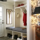
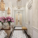
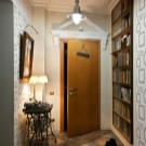
Room stylistics
Hi-tech is characterized by simplicity and the use of the most modern technologies at the same time; in this style, it is possible to achieve maximum release of space. Decor items are either absent altogether, or are used very limitedly, in no way can they be catchy, attracting attention.
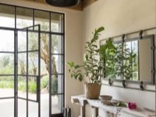
For painting the walls, not too bright monochromatic colors are used; cabinet furniture with separate metal parts is best. A wardrobe equipped with a glass door will fit well into the concept. There cannot be a lot of plastic, metal and glass.
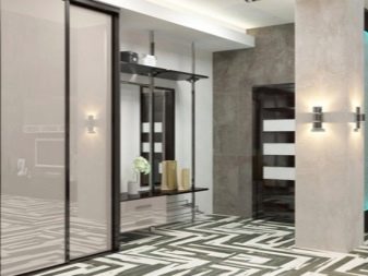
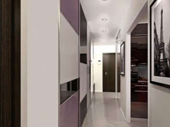
Of the accessories, the high-tech logic allows you to use only a mirror and a single plant on the floor.
Modern, that appeared at the end of the century before last was completely unique and unrepeatable, its creators tried not to duplicate any of the earlier styles. All lines should be smooth, both in furniture and in doorways and windows. Only calm colors that are found in nature are used in the design - mustard, white, beige, olive and brown.
Wood in a modernist interior is actively used, while its cheap varieties are unacceptable. Colored glass items are widely used for decoration. If paintings and ornaments are used, flowers and insects will be the preferred theme.
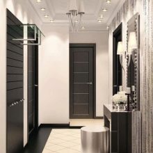
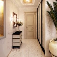
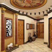
Minimalism attracts the attention of many people with its simplicity, the ability to use only the necessary things, without bothering to arrange numerous accessories and care for them. At the same time, in contrast to high-tech, minimalism is more convenient and comfortable in everyday life, but does not lose the least bit of versatility.
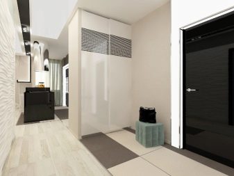
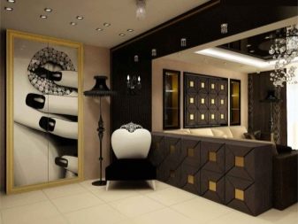
The layout should be geometric, and the finish is outwardly simple, but sound enough.
Country combines the attractiveness of rural simplicity and the comfort of a country house. You can use almost any natural material for decoration, as long as they are not perceived as industrial products. With all the differences in the branches of country in different countries, there are common signs. So, discreet shades found in nature are preferable, finishing materials should be selected a tone or two lighter than furniture. The walls are covered with plaster, painted, and the fireplace portal is finished with natural stone.
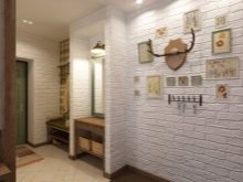
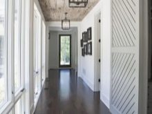

If there is no way to hide household appliances, you should at least use its built-in options. Of the accessories, enameled dishes, knitted and embroidered products are preferred, and the amount of textiles can be anything.
Art Deco formed in the interval between the First and Second World Wars, and its main adherents in the past, and now are creative people.
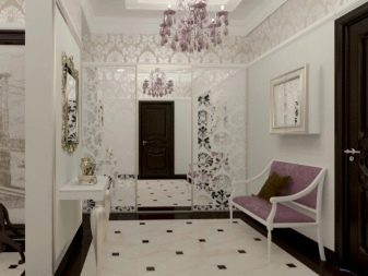
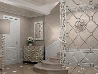
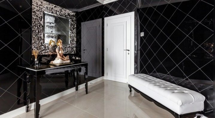
A combination of zigzags and curved lines is widely used in this style, trapezoidal shapes are used. The tonality can be contradictory - they often combine black and white, or they make the main color metallic.
Expensive materials are used for decoration, the floor is almost always made of wood; you can only partially cover it with carpets, focusing on them. Lighting devices must be equipped with frosted glasses. Mirrors, figurines, paintings with African themes fit well into the Art Deco style.
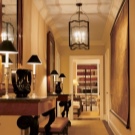
Classics in their external manifestations are similar to the Empire style, with a baroque interior, but a close look will immediately notice that it is not so pretentious. It is unacceptable to use more than one layer of stucco molding. For zoning, only columns and gables are used, in no case pieces of furniture.
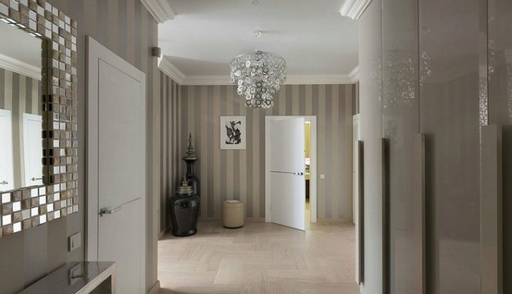
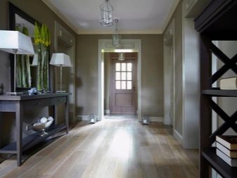
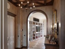
The classic design looks good only in a high corridor, provided that the furniture is symmetrically arranged. Key colors are beige, cream and a variety of pastel shades, diluted as desired with splashes of brown and green. The ceiling should be as simple as possible, the only acceptable decorations are a medallion or stucco molding along the contour.
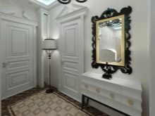
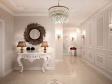
Textiles should be selected with floral motifs, but the installation of a massive chandelier or built-in lamps depends only on your taste. There must certainly be a mirror in an elegant frame. Neoclassicism allows you to add a little bit of modern motives.
The American style of the corridor can be quite different, but one way or another it will include:
-
Comfortable massive furniture;
-
Home textiles;
-
Bright hues.
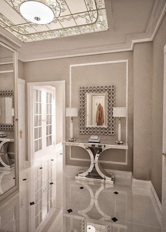
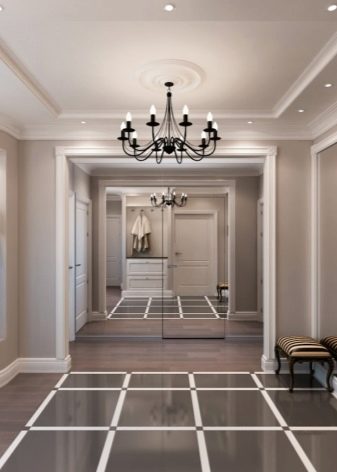
Please note that all this can be realized only in a large space, flooded with light as much as possible. Important features of the American style can also be considered the use of arches for zoning rooms, wall niches.
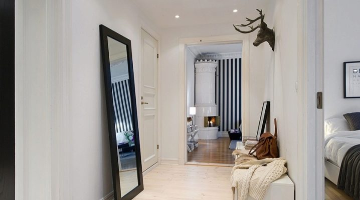
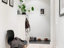
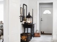
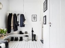
Scandinavian style expresses, first of all, the mood of good quality and reliability, it is laconic and relatively strict. White predominates, and pastel colors and even more bright colored inclusions are used very sparingly and carefully. The wall can be painted or plastered. For the floor, light-colored boards are used, white floors are best suited to the style. Unlike minimalism, you don't have to limit yourself to using only the furniture you need. Decorative items should be used in small numbers, but each of them is as bright as possible.
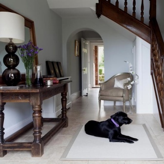
English style means dark wooden furniture, austerity of design, the use of laminate or parquet. Such a hallway should be delimited from the rest of the apartment or house with a thick curtain. This is the very case when the pictures on the wall will not look alien. The walls themselves are covered with wallpaper or plastered, mirrors, umbrella stands and banquets are used from decorative objects.
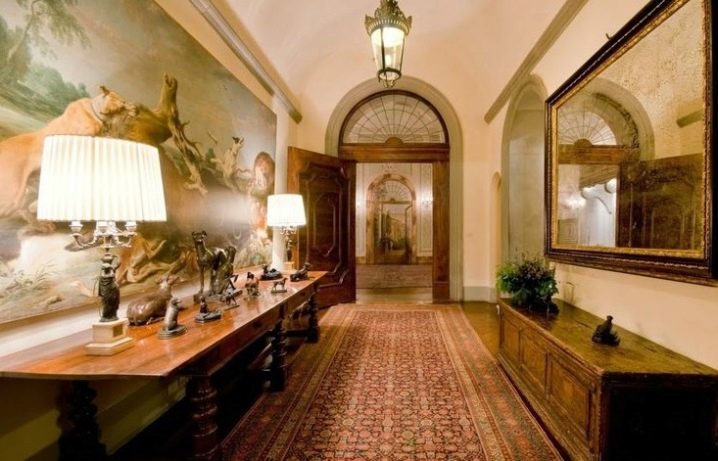
Italian format represents classic design motives. To create an Italian hallway, like an American one, will only work in a large room. Textiles, decor are used slightly. Instead of woven compositions, it is worth using large-sized paintings (hung out in front of the doors), candlesticks or bright napkins.
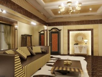
Egyptian style enigmatic and mysterious, as if returning to the distant past. It is not necessary to use gilding, you can beat such style features as calmness and harmony. An indispensable requirement is the naturalness of the materials and the harmony of all the colors used. Most often, light yellow, golden, beige and blue tones are used, marble tiles are laid on the floor or a pattern is made.
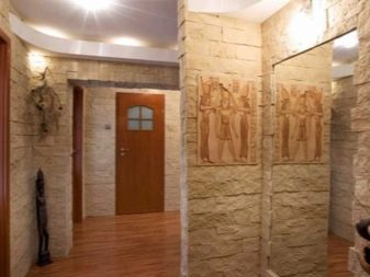
Furniture, ideally, should not be at all, and if it is, then only from dark wood. Textile themed, unobtrusive lighting and accessories will create a complete look.
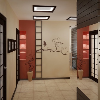
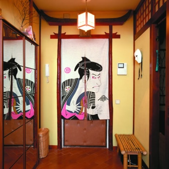
Exotic Japanese style finds wide application in different countries.Its characteristic features are the rejection of bright colors, the use of only the most necessary furniture made from natural materials, the addition of vases, pots of flowers. The ethnic accent is highlighted by bamboo and rice paper in various combinations. Bright lighting is strictly unacceptable, but floor mats will create the right mood.
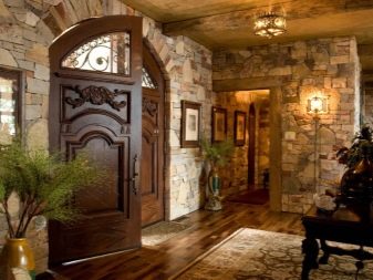
Chalet - the Swiss counterpart of country and Provence. With the external simplicity of such an interior, it should be borne in mind that it does not tolerate savings on the quality of materials. Wood or stone cladding is used. Placing animal skins on the floor is a very good idea. But hanging hunting trophies on the walls is undesirable. Luminaires should reproduce the effect of candle lighting.
Empire style - embodied chic, extraordinary luxury and only natural materials, very strict geometry. The imperial style is well revealed only in a large room. Typical tones are blue, bronze, golden, white, red. The floor should be made of elite wood, in the bathroom it is made of marble. Textured wallpaper with imitation of expensive materials is only the most extreme case, natural brocade or silk is much preferable.
Furniture should be selected massive and lush, with carved patterns and gilding. Antique products are beyond competition.
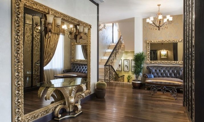
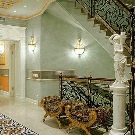
Curtains should be heavy, brightly colored and expressive. Pretentiousness of lighting fixtures and decoration with metal decorations are only welcome.
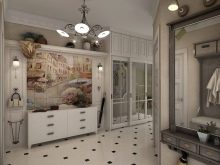
Mediterranean hallway light and airy, romantic. It can be made in warm shades with an abundance of details (the Italian variety), and in white with the addition of columns, rough plaster (and this is already the Greek direction). The "Spanish" room is distinguished by an abundance of stone and richness of colors (with a predominance of ocher, blue, gray, terracotta), it will have a lot of forging and textile decorations.
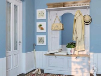
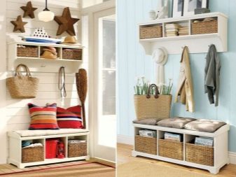
Nautical interior - emphatically summer. You can safely use a combination of white and blue stripes of various widths, but no frills.
Lighting as an accent
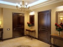
Stylish classic and modern hallways, it would seem, is easy to light up. It is unacceptable to leave dark corners, compact wall and ceiling lights are preferred. The corridor should be lit in the same way as the rest of the premises. If the ceiling is high, you can hang a row of chandeliers, each of which will illuminate "its own" part of the room.
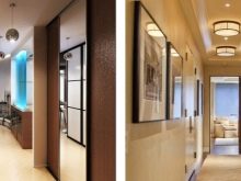
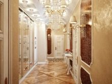
Furniture design
Given the purpose of the hallways, it is still undesirable to purchase furniture of white color and overly light shades in general - it will quickly become dirty. Natural materials or those that imitate a natural surface will come in handy. Classic in an apartment, house, country cottage is almost always appropriate, and it is she who should be preferred over ultramodern design.
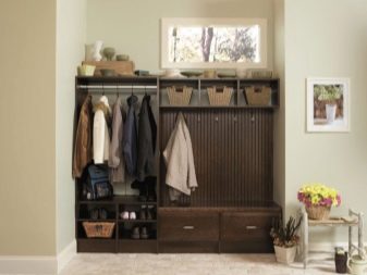
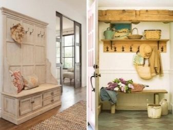
Examples of options in the interior
Pure white paint is not very practical for renovation, but combining it with other basic colors can create a lovely corridor. It is quite possible to cover the top with wallpaper, and put ceramic tiles on the bottom. It is best suited for decorating the floor (if the chosen style allows), and porcelain stoneware is much more correct to use than tiles. A visual expansion of space will be provided by stretch ceilings with a glossy finish.
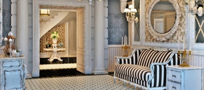
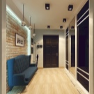
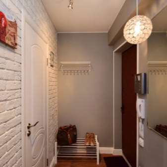
It is advisable to put corner furniture in square hallways. Take cabinets that are shallow, with drawers and shelves placed inside. With a lack of space, a large chandelier looks worse than equidistant compact lamps.
Watch a video on the topic.


The comment was sent successfully.