All about the pop art style in the interior
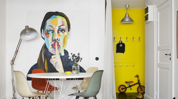
In the 1950s, the pop art style migrated from the halls of art galleries to residential interiors. The creative style is used in interior design even now, adapting to each individual room. Pop art is understandable and attractive to young people who prefer active growth, creative options without fear of being misunderstood by others.
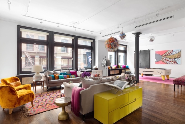
What it is?
To describe the style of pop art, the word shocking is most suitable. Most often, this design can be seen in a modern apartment where students or a young couple live. In such a space, it is difficult to imagine a family couple with experience and the presence of young heirs.
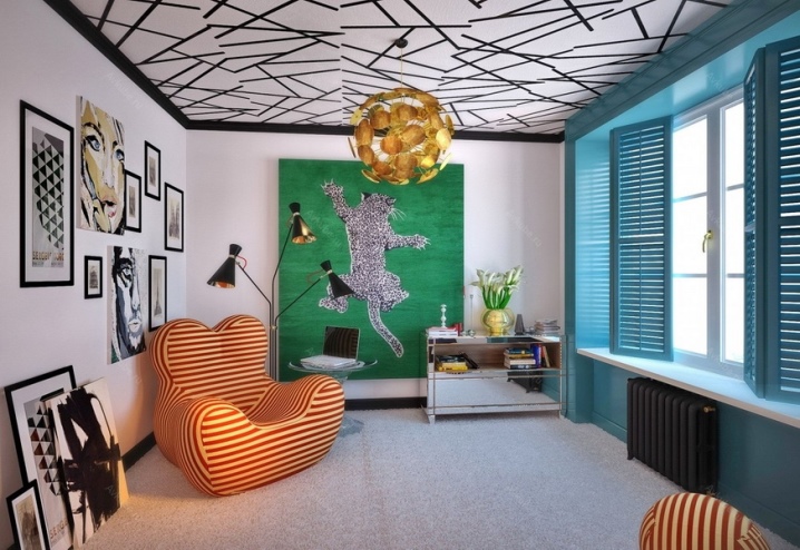
When it comes to pop art in a living space, it is assumed that certain stylistic techniques are present there.
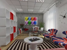
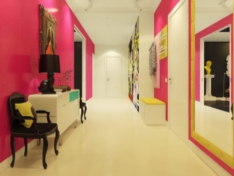
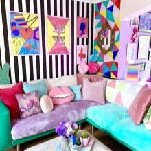
- The use of rich, deep, neon, acidic colors, contrasting combinations and simply incredible shade variations. Often black and white are the duo.
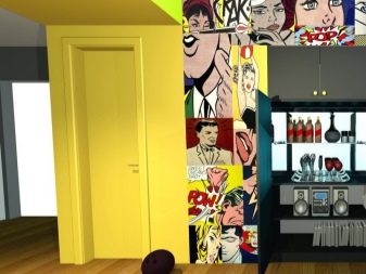
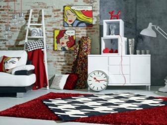
- Posters, portraits of stars, scenes from comics. Images are placed on walls, decorate bed linen, household items, etc.
- Creation of a spatial illusion using neon light, LED lamps.
- The minimum number of pieces of furniture (especially in sight). In the rooms, preference is given to built-in shelves, pull-out berths, armchairs.
- Fabrics can be silk or synthetic, rhinestones are not alien to the decor, disco balls are popular.
- In pop art design, household items are often misused. For example, a tin can or a glass bottle can serve as a vase for a fragrant bouquet.
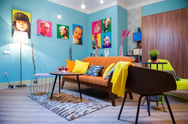
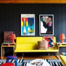
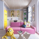
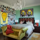
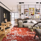
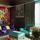
The features of this catchy style also lie in the layout of the free space. Designers do not use large cabinets, preferring to build them into niches in the wall. More often, for storing things, they equip an area for a wardrobe, separating it with a decorative partition, or use a separate room for this.
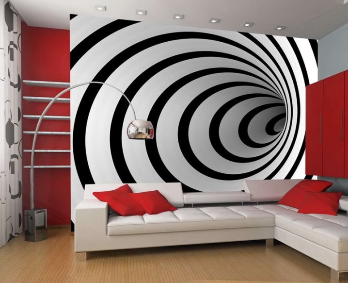
Lovers of the psychedelic effect will definitely appreciate paintings with optical illusion and volumetric images with overflows.
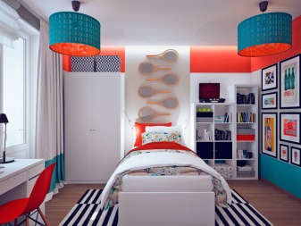
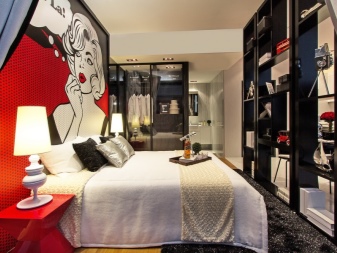
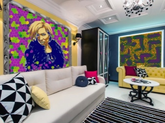
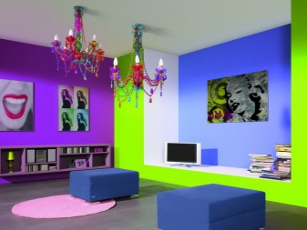
With this, it is important not to be too clever, so as not to overload the living atmosphere of the room. A creative approach to the decor and the presence of hand-made things are encouraged.
With the help of the play of colors, dimensions, shapes and a small amount of homemade decorations, it is easy to turn a standard room into a studio charged with positive energy and inspiration. The duplicated elements will slightly open the curtain to the visitors into the depth of the inner world and the perception of the owners of the living space. The use of portraits of celebrities and various landmarks in modified colors and sizes is a frequent technique of designers in this direction. The desired effect can be achieved with the help of collages and stencils.
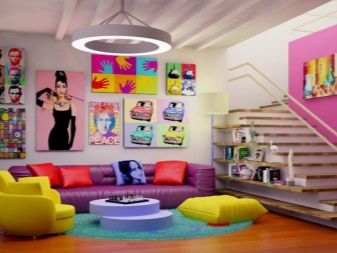
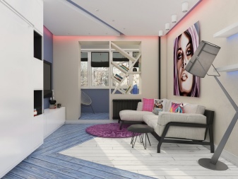
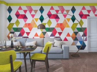
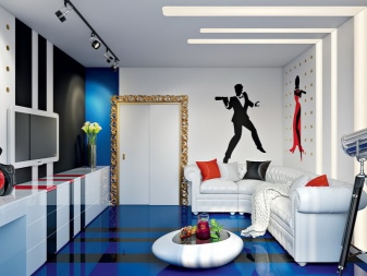
To decorate an apartment in the spirit of pop art, you will not need huge amounts of investment in decor. A little imagination - and from any item purchased in a regular store, you can create a unique interior item. It is enough to let your imagination run wild and admire your hand-made work of art. Any cheap materials and fun products can be used. Plastic bottles, lids, bags, colored pencils, foil, etc. are used.From this arsenal it may well turn out a starry sky, curtains, pigtails, original panels - there are no frames in pop art. Therefore, such an interior is often chosen for design by the founders of the art cafe.
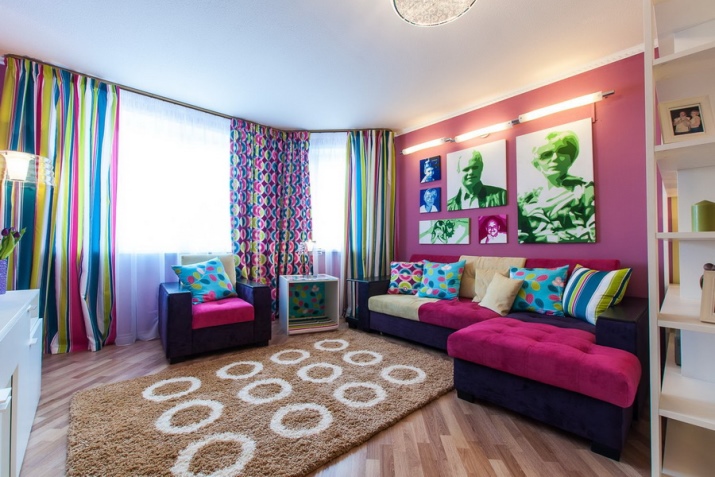
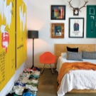
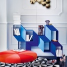
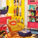
For creative individuals, life in such a space will only be a joy, unlike admirers of restrained classics.
For courage and expressiveness, pop art is chosen by creative, whole people. But, before embarking on its implementation, it is important to figure out whether such a style corresponds to its own internal state. It depends on whether it will always be comfortable to be in such an environment. Experts do not recommend plunging into the atmosphere of pop art at once. It is better to equip the space over and over again, filling the residential meters one by one.
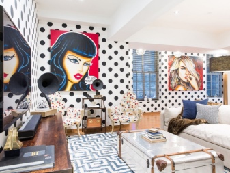
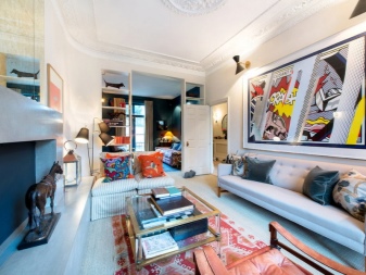
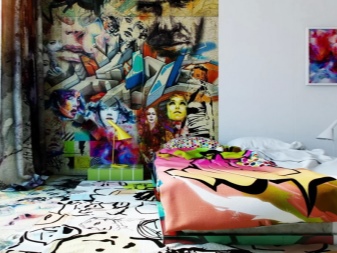
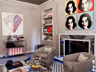
If it turned out to figure out what it is, what is needed, then the environment will only contribute to a positive attitude, inspiration, the development of creativity and self-realization.
History of origin
The unusual style first originated in the visual arts. A new trend was formed in the 50-60s of the XX century and was to the liking of young people and those who are young at heart and love everything unusual. Pop art is characterized by audacity, determination, bright colors. Without exaggeration, this trend can be called an uprising against standards.
At the dawn of the 60s, the style was borrowed by American artists, connoisseurs of the combination of the simple and the unique. It was in America that pop art gained popularity for its creativity, cheerful atmosphere, cheap decor and furniture elements. Designers began to create, creating the necessary things that would attract the consumer. Often, this style was used in the process of creating advertising clips in the media.
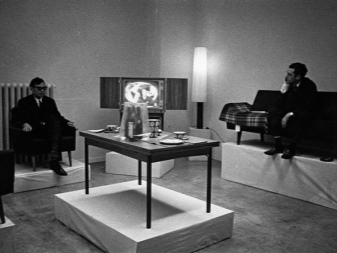
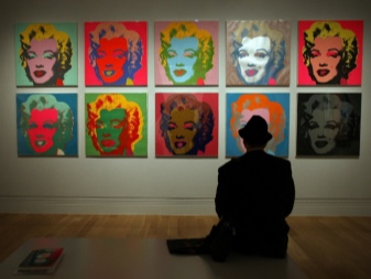

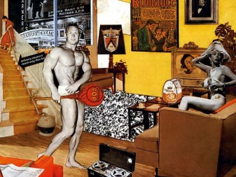
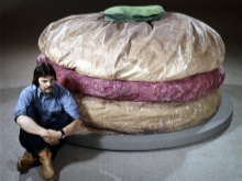
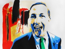
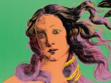
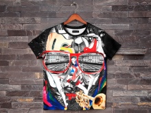
Among the founders of Pop Art are young English artists such as Richard Smith, Joe Tilson and Peter Black. Famous creators in this style include Roy Lichtenstein (heroes from comics on an enlarged scale), Claes Oldenburg (bright objects made of canvas, plaster and plush), Robert Rauschenberg, Andy Warhol, Jasper Johns and James Rosenquist. Echoes of this 1960s style remained in the form of prints on youth T-shirts depicting famous objects, cartoon characters, celebrities from among actors, singers, etc. Pop art is mainly used in the modern world as an interior design trend. The flamboyant experimental style has survived the test for years and is steadily growing an army of admirers, especially among the newfangled creatives - hipsters.
Finishing options
Pop art is heterogeneous both in structure and in colors. The style combines a large number of materials for decoration and decoration: chalk, synthetics, leather, paper, vinyl, etc. More often, preference is given to artificial materials.
Sten
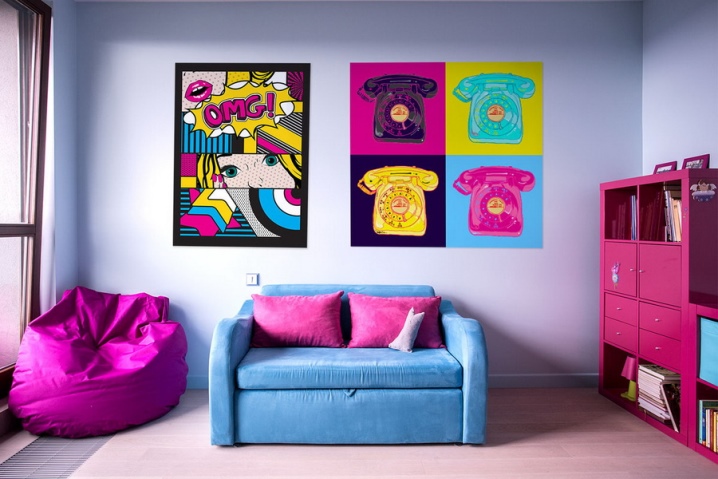
For a spectacular design, wallpapers with a mesmerizing optical illusion or pictures changing from different viewing angles are glued to the walls. Bright textured plaster is often applied to vertical surfaces, painted or pasted over with plain wallpaper. A single-color background is fundamental if it is supposed to place numerous decorative compositions in the design. They can also be cyclical, that is, when some ornament or pattern is duplicated several times. The walls are usually assigned the key semantic load.
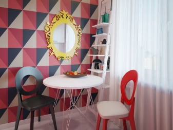
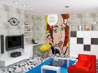
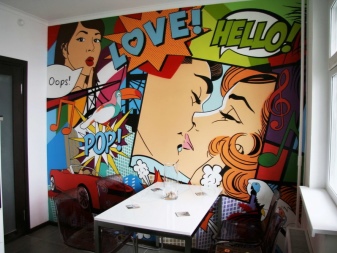
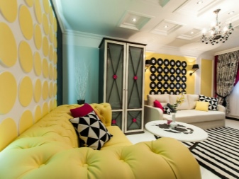
To make the walls interesting, a combination of different colors and textures of the rainbow spectrum is also used. For example, one of the walls is made light, the second is covered with small patterns, and bright paint is applied to the rest. Creative chaos will create a special non-standard atmosphere that does not fit into the usual norms of harmony.
If you wish, you can hang one light wall with posters, apply decorative plaster on the second, and create brickwork or its imitation on the third. Pop art fans will appreciate this approach.
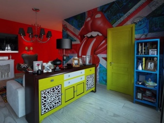
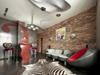
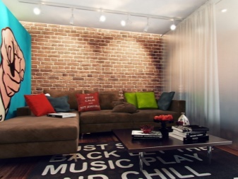
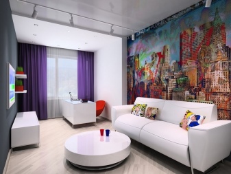
Paul
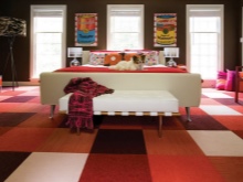
A spectacular shimmering gloss is ideal. Especially if a self-leveling floor is used, which allows you to apply a picture in the spirit of pop art. The device of a multi-tiered floor with a podium looks like a good design solution. Tiles in bold color combinations work well for the bathroom.
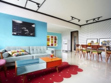
In living spaces, different types of flooring are appropriate. But if the task of the floor is to act as the main art object, it is worth choosing a heterogeneous coating and chaotic patterns. It can be both ceramic materials and carpet. And if the emphasis is on the interior, discreet parquet is traditionally laid.
Ceiling
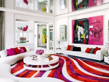
The ceiling is always made interesting from the point of view of the art object. It can be glossy with an enigmatic shine, illuminated by spot LEDs, single or multi-level configuration. Stretched, suspended, painted - the choice is up to the designer and the owner of the square meters. At the same time, the ceiling in the spirit of Pop Art is allowed to be of any color, although it is more often white that predominates.
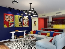
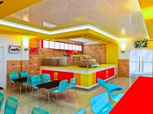
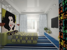
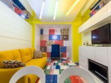
As for the interior doors, they also come in any color to suit the overall style of the home. They may not even exist at all, and instead of a door leaf, the openings will be delicately obscured by transparent vinyl curtains or bright fabrics with comics. But in the vast majority of options, these are still standard doors, painted in the color of the wall on which they are located.
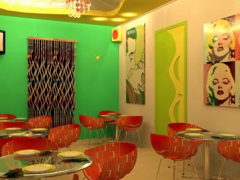
Choosing furniture
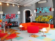
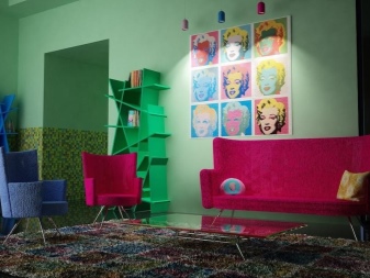
The main qualities of furniture in the spirit of Pop Art are intricate shapes, catchy colors and gloss surfaces. The interior contains transforming furnishings, often with drawings. As upholstered furniture, small bright sofas of an interesting shape fit perfectly into the creative atmosphere. Like many years ago, red sofas-lips and cozy armchairs-bowls do not lose their relevance. Fashionable and modern frameless armchairs have found application in outrageous design.
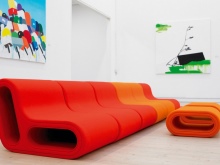
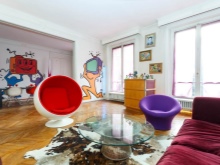
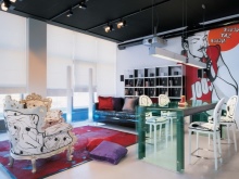
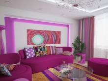
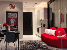
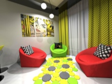
Bar counters are used for zoning space. Sometimes they are substituted for traditional dining tables in the kitchen. A colorful base of countertops is welcome. In the recreation area, they must allocate a place for a low table. Furniture is mainly made of high quality plastic, wood, glass, items with pictures are welcome. A set of items is selected to the minimum of what is necessary. Popular forms copying cartoon characters, participants in popular comics, outlines of faces and female figures.
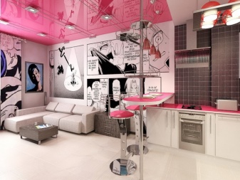
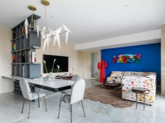
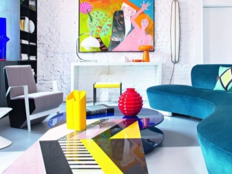
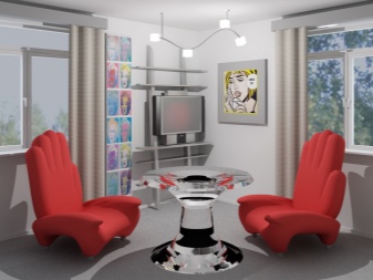
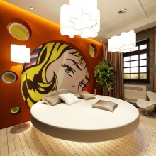
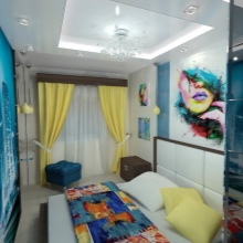
For a bedroom, a large round or traditional bed, a built-in wardrobe or chest of drawers and a soft pouf are considered a standard set of furniture. Dressing tables are rare guests in the bedroom interior in the pop art genre.
Color palette
The main colors of this style are:
- White;
- deep red;
- all shades of pink;
- juicy coral;
- rich black;
- sunny yellow;
- radically blue.
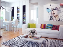
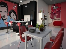
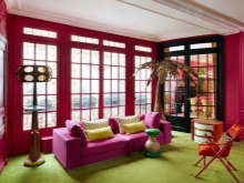
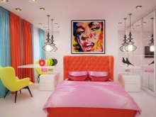
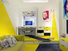
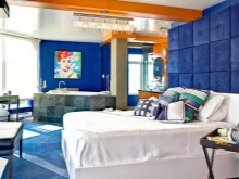
Designers love to add vibrant details to solid colors, for example, by applying patterns in the form of circles.
Due to the fear that multiple colors can quickly become boring, it is recommended to use up to 3 colors. It is better to make bright accents replaceable and complemented in the form of bedspreads, pieces of furniture and decorations (flower pots, pillowcases, paintings). It is easier to replace them if you get bored than to redo the decorative finishing of the walls and ceiling.
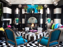
The key tones in the room are black, blue, white and red, and neon variations are also allowed. The most popular option is bright accents on plain surfaces, often combining incongruous colors. But black and white is not boring in and of itself. It is recommended not to overload the interior with bright colors. For floors, walls and ceilings, you shouldn't choose many color combinations.
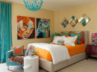
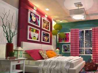
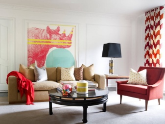
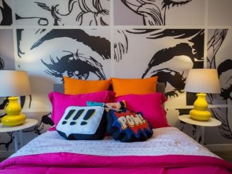
Let the mood and color be set by a certain plane, and not all at once.
Usually, in a creative interior, the primary meaning is assigned to the walls. Traditionally, two solutions are used: in white or cold gray they create a background for placing accents of color - posters, photographs, collages, etc. In this case, combinations in contrast are only welcome, colors with a gradient can "flow" into one another. All sorts of patterns in the form of stripes, peas, geometric shapes fit organically into the concept. One of the walls can be made using the cyclical technique, with multiple repetitions of one element.
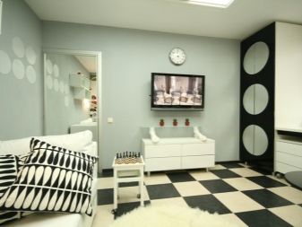
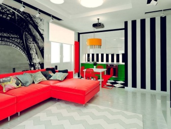
You should not try to logically build color combinations in pop art. In the same room, beige and acid colors can coexist. The only harmony present in pop art lies in the original white background to contrast the main bright decorative elements. Graffiti on the whole wall or the installation of large-format banners add juiciness to the atmosphere.
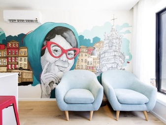
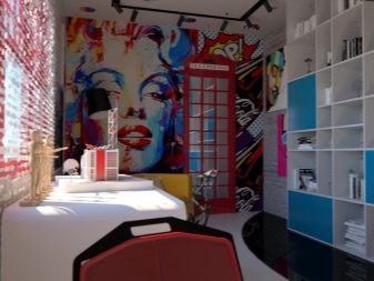
Decor and textiles
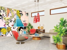
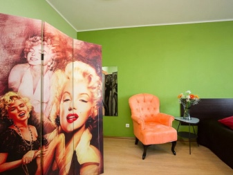
Pop art is all about details. The smaller the room, the more "chips" should be in it. Ideally, a spacious room with lots of accents. Everything here should fit the format of a glossy magazine: unusual sculptural works, portraits of stars of a past era, framed by a non-standard baguette. One of the symbols of the style is posters with colored images of legends from different eras, for example, Marilyn Monroe, Madonna, Charlie Chaplin. From modern stars in high esteem among fans of pop art Johnny Depp. Pictures are painted with paints of acid colors, sometimes with deliberate color distortion. Stylized photographs are also popular in the interior.
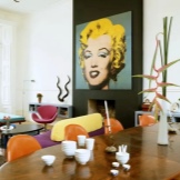
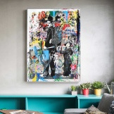
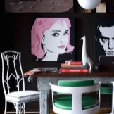
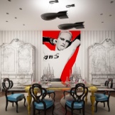
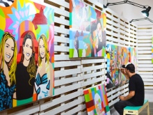
Some owners prefer to surround themselves with portraits of pets. The nuance is that they are custom-made in acid colors or printed as a poster with a subject of your choice.
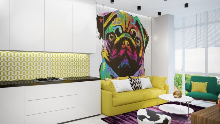
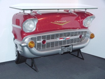
Unusual bottles, vases, hand-made products on open shelves are in demand. They complement the decor with bedspreads, pillows, curtains and carpets in bright colors. Describing creative pop art, we can define it as a kind of souvenir shop of original things. Having given a bold look to any household item, you can turn it into an interior exhibit. To do this, you don't even have to redo it. For example, to introduce a car bumper into the interior.
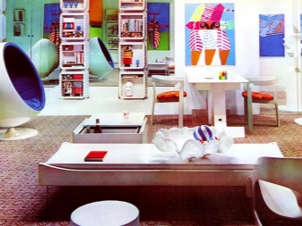
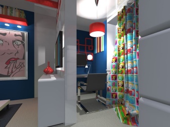
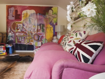
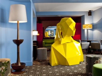
A beautiful design technique will be the placement of graceful sculptures on the steps of the stairs, if any. Large items will look good right on the floor. Only for this, the general background of the floor should not be flashy, drawing attention to itself.
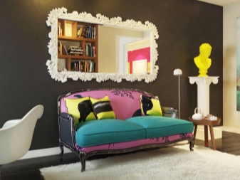
Pop art textiles are present throughout the home and create a cozy atmosphere. If the curtains, then bright, carpets - patterned, pillows, bedspreads - acid, bedding sets - decorated with prints. Materials with a glossy texture are suitable for curtains: artificial silk, taffeta, polyester, organza and viscose. It is advisable to design windows as laconic as possible, giving preference to roller blinds, "Japanese" screens and aluminum blinds.
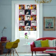
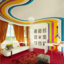
Given the concentration of color accents in the setting, curtains are chosen in monochromatic versions or with a pattern in contrast.
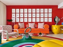
In the style of pop art, textiles are also popular as screens, synthetic rugs with a cozy fluffy pile. The shape of the carpet also does not fit into the usual standards. Asymmetry and fancy shapes are encouraged, such as paint spills or ink stains.
Lighting
In an environment where the spirit of pop art soars, spot lighting is often thought out. LED or colored neon illumination is held in high esteem. The furnishings are spectacularly complemented by colored shades. Bright light allows you to focus on one of the objects in the room. The spotlight is also bright, diffusing light evenly.
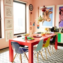
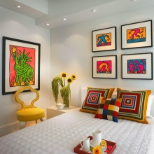
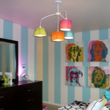
A room in this style involves the use of optical effects from chandeliers, mirrors, gloss surfaces, neon light. Pop art is a shocking direction suitable for experimenters and creators, so anything handmade is welcome.Many household items can be turned into extraordinary lamps, lampshades a la pop art. You can use unnecessary jewelry, plastic containers and cardboard, original vinyl records, CDs, glass drink bottles.
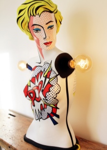
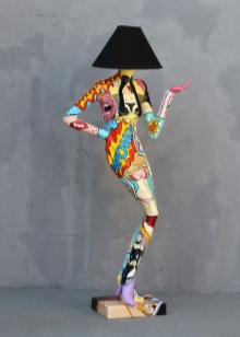
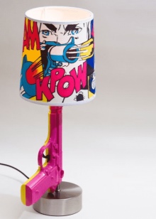
The main thing is to get an unusual designer item and give it life in a new role.
Stylish examples in the interior
The finished photos will help you navigate how best to decorate the room so that it turns out to be bright and stylish.
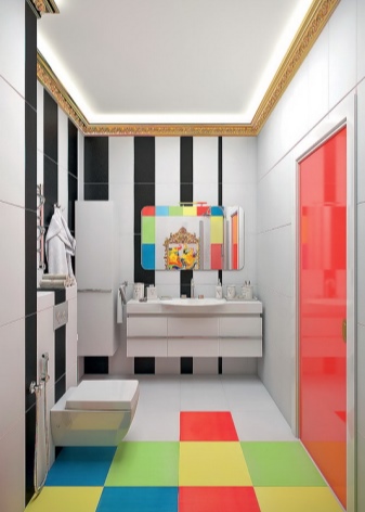
- Pop art in the design of the bathroom initially raises strong doubts. In fact, the process of transforming a standard bathroom into a stylish and bright object is just a matter of imagination. Multicolored squares of tiles, staggered or randomly laid, plus an unusual shape rug, psychedelic towels and several mirrors of different sizes - a pop art room is ready.

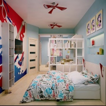
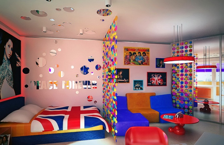
- Pop art is most suitable as a space arrangement for children, especially adolescents. Large-scale posters depicting media persons will fit in here in the most successful way. Bright colors, a rebellious type of finishing of the work and sleeping place - far from all the possibilities of pop art. The style allows you to play with the shape of the walls, depriving them of their usual symmetry. Plasterboard structures successfully complement the neon lighting strips, placing accents in the right places.
- Pop art designs are capable of producing psychedelic effects. It is achieved as a result of decorating the walls with fantastic wallpaper, pictures on which either disappear or appear, playing depending on the lighting. It is important to catch Zen in the setting, the very middle ground between the desire to shock and the feeling of inner harmony, comfort and an atmosphere of coziness.


The comment was sent successfully.