All about the neoclassical style in the interior
Neoclassicism is a style that is uncompromising in its excesses. If a sense of proportion and accuracy are respected in design with due respect, it is highly likely that it will work to create an exemplary neoclassicism in the house. Although there are certainly much more requirements. But there is something to try for - this is a style of luxury and respectability, loved by more than one generation and suitable for almost any spacious room.
Peculiarities
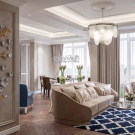
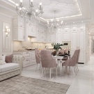
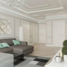
Neoclassicism is the daughter of the classic style in the interior. This is what designers often say, and it's a fair definition. It was from the classics that the style took the tendency to use materials, decor items, and finishes exclusively natural. The compositional solutions are also taken from the classics, as well as the overall impression of a chic home, elegant and luxurious.
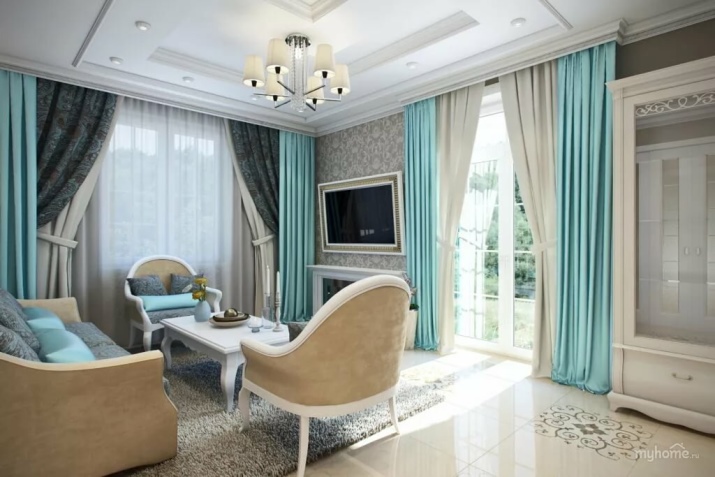
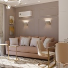
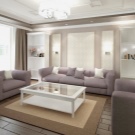
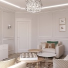
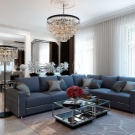
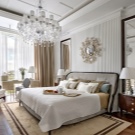
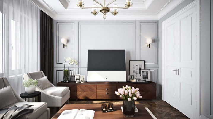
But many things in the neoclassical style are acceptable - for example, high-quality imitation of natural materials. Fragmented, it can be present in the interior. Also, in neoclassicism, a plasma TV or a modern audio system will not be a foreign object.
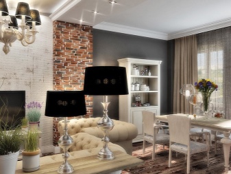
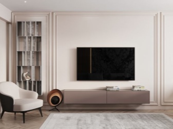
Main features
Let's consider the main characteristics.
- Restrained color solution - the use of neutral shades, dark saturated colors, pastel and expressive, complex ones is encouraged. The main thing is that the range is restrained and unobtrusive. Bright and flashy colors have no place here.
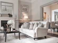
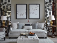
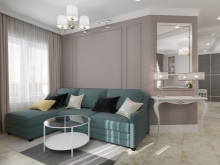
- Materials should be natural, but good imitation is allowed. Wood, stone, natural textiles fit this description. But, for example, instead of natural marble, it is quite possible to take high-quality porcelain stoneware.
Instead of natural parquet, you can use expensive laminate flooring.
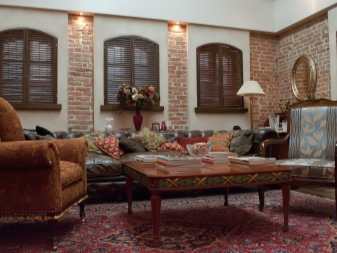
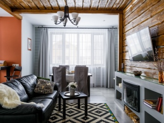
- Nobility of forms - objects and interior solutions used in this style may be close to the classics, but minimalism and laconicism in this case make their own adjustments. A little more restrained, a little more modest than in the classic style - this is how you can describe the neoclassical interior.
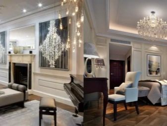
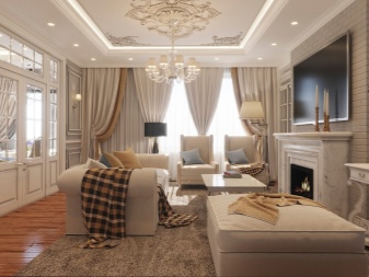
- Compositional techniques remain classic - furniture, as a rule, is arranged symmetrically, so is the decor. Proportionality and sparseness should be taken into account when building an interior composition. But static is no longer in favor of the classics: an updated style for the dynamics in the interior.
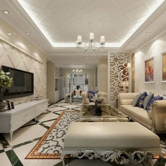
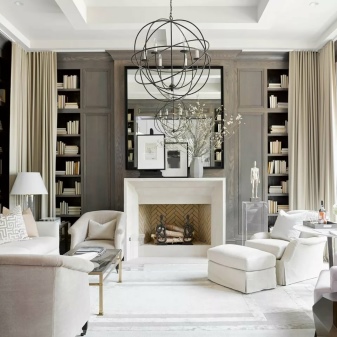
- Traditional classic designs can remain visible in the appearance of the home, but still the patterns are becoming more restrained and unobtrusive. Neoclassicism (and American too) tends towards moderation, it prefers monochromatic textured fabrics, highlighting laconicism and minimalism in this too.
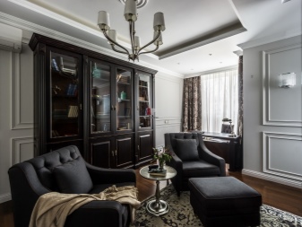
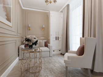
- The style assumes a lot of air, that is, no space clutter. It is great if the room has high ceilings, if there are no bulky items, the decor is moderate. If the area is limited, but the owners want to maintain the style, you need to focus on compact furniture.
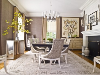
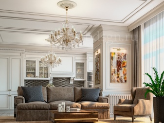
Finally, there should be a lot of light in this style - both general and local.
And the priority is natural light, which enters the room without unnecessary obstacles.
In general, we can say: neoclassicism, unlike its predecessor, is a more flexible style, less canonical, which makes it organic to modern apartments and the lifestyle of residents.
Finishing options
Innovative technologies for renovating an apartment in the neoclassical style are only welcome. But all materials (wallpaper, tiles) should, if not be natural, then imitate a natural structure.
Sten
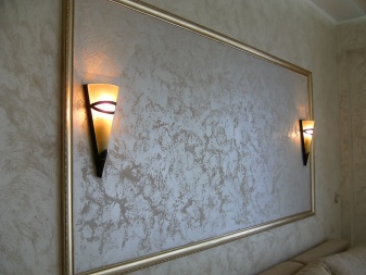
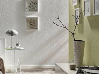
The most common finishes are decorative plaster or wall painting... Wallpaper is used a little less often. The latter are welcome if the owners want to create geometric patterns on the wall, which is difficult to do in the case of painting or applying plaster.
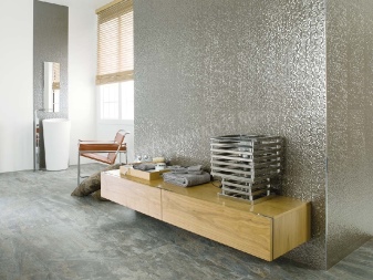
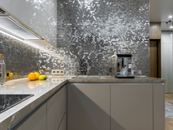
Metallized tiles are considered very popular today. You can also paste over the walls with mirrored or glass panels, which is beneficial in the case of not the largest footage of the dwelling. Such visual techniques meet the needs of style.
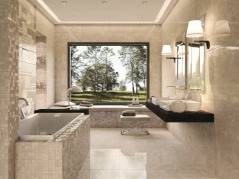
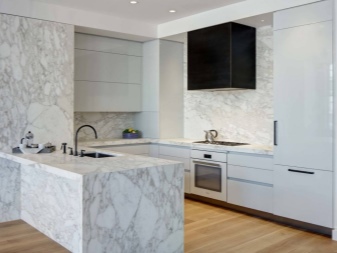
For the walls of the bathroom and kitchen, marble would be an ideal solution, but a more budgetary idea is high-quality marble-like porcelain stoneware. In many cases, this solution is more sensible, because modern porcelain stoneware looks no less convincing, and costs several times cheaper.
Floor and ceiling
The ceiling can be either simple or multi-level. Most often, the finish comes down to a good paint job. The surface of the ceiling must be perfectly flat. More often the ceiling is made white or light beige. Tension structures are also used, but less often. They can be either matte or glossy.
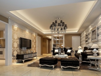
If the ceiling is multi-level, it is usually a structure with a metal profile and plasterboard sheathing. Do not mount decorative elements there. True, you can consider the option with non-standard lighting.
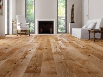
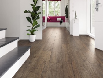
The floor is a parquet board or a good laminate. But in the dining room and kitchen, the floor can still be the same porcelain stoneware or polished stone.
Decoration of doors and windows
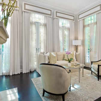
Neoclassicism is a style for spacious apartments and houses. And if we are talking about a country house, then panoramic windows will be an excellent solution to recreate the style. A if this is a city apartment, wide window sills will help out.
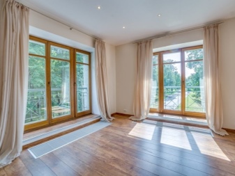
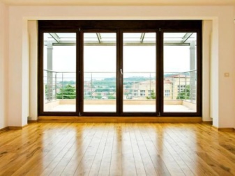
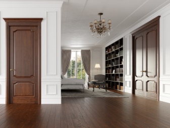
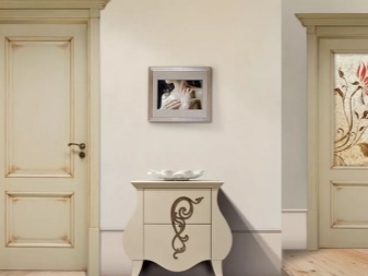
Interior doors made of natural wood - an excellent option, but veneer doors fit well into the style criteria. Unobtrusive carved elements are appropriate on the door leaf.
Furniture design
Furniture items in the house depend primarily on the taste and financial capabilities of the owners. Someone will not be stingy with carved solid wood furniture: it is very expensive, but such headsets, dressers, dining tables will serve for decades. It is possible that over the years they will also grow in price.
But the main requirement for furniture is high functionality.
Nothing costs just like that, everything performs a very specific function. Several tasks performed by one subject are the best option.
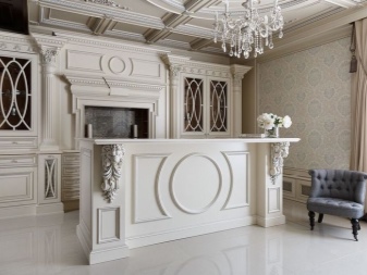
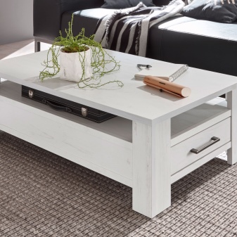
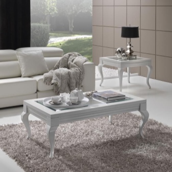
For example, a coffee table in the living room is not just a place where newspapers, magazines are kept, where you can view documents. This is the same place for family evening teas. In such a table, narrow but capacious drawers can be provided, where it is very convenient to store documents and receipts.
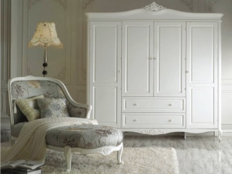
The furniture is functional, it maintains and creates comfort in the house, but furniture clutter is excluded. For example, if a wardrobe takes up the entire hallway, leaving no space in it, this is a bad option. A compromise must be sought.
If you want to make a library area in the living room, it is better to put cabinets that are not closed., and structures with open shelves (possibly in the form of plasterboard niches). And the tones of this design should match the wall decoration so that the overall merging of colors visually expands the space.
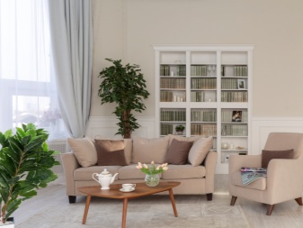
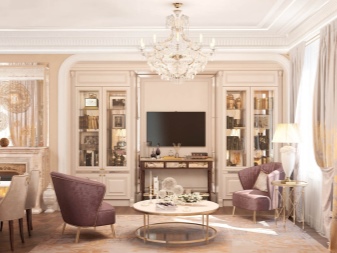
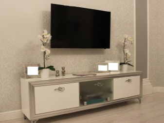
A TV stand can be an elegant and weighty part of the media zone, but if it is empty inside, you need to think about whether this element is so necessary. Therefore, sometimes a more functional chest of drawers is used instead of a curbstone.
An interesting corner construction is also possible, where the library and media zone or the library and the desktop will be combined.
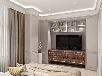
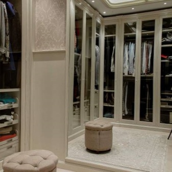
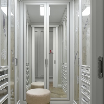
The essentials should remain in the bedroom. If it is possible to make a dressing area instead of a massive wardrobe, this should be done.It can be a false wall, on one side of which there are bars with hangers, boxes or other places for storing clothes, on the other - a mirror and a dressing table, for example.
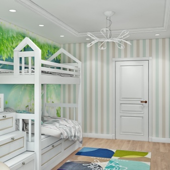
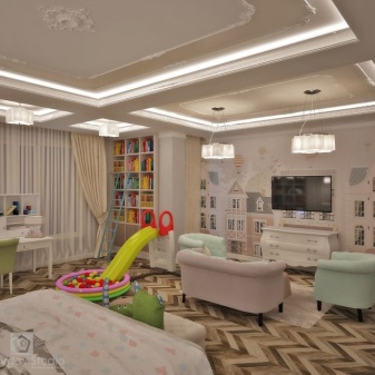
In the nursery, bunk beds are appropriate, but consistent with the style. Children's rooms are usually kept in light colors. In a large house, children may have a small bedroom with only a bed, a table, and a wardrobe. And in a separate room there is a playroom, where the child spends most of the day
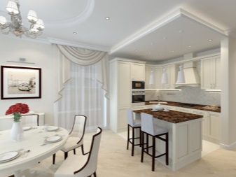
The kitchen can be either separate or combined with the living room. In the latter case, the space is united by demolishing part of the wall between the living room and the kitchen, closing the former passage to the kitchen. The dining area in such a combined room can be located at the intersection of two former rooms.
The bar counter can act as a zoning element.
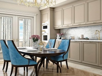
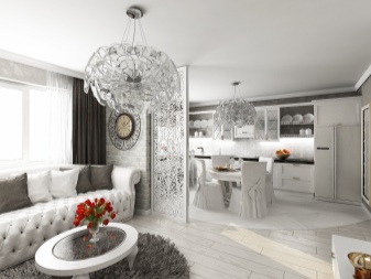
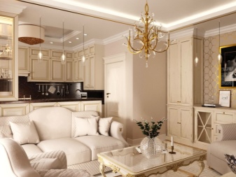
In the event of a confluence of premises, the kitchen set should match in color and stylistically with the furniture in the living room. Chairs for the dining area, as a rule, are selected from one headset, although this is no longer necessary for the Scandinavian style, eco-style.
Color palette
The general characteristic of the choice of colors is a discreet decision. The most common colors are neutral. It is beige, milky, white, gray-brown. They create the basis of the style, making it easier to select furniture, resolve issues with decoration.
If the space is not very large and you want to visually expand it a little, white and milky tones are a salutary solution.
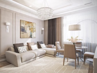
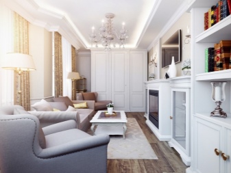
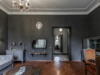
But neoclassicism cannot do without dark tones. Wine, dark gray and dark brown colors can be afforded by those who have a lot of space at home, and dark colors (even black) will only become strong, style-forming accents. Lovers of pastel shades in neoclassicism also have a lot of interesting prospects: delicate lilac, apricot and dusty pink colors show themselves especially well.
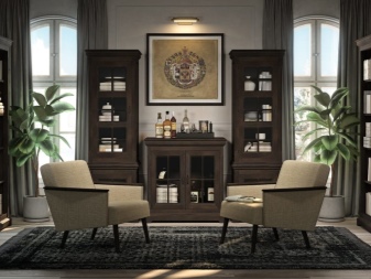
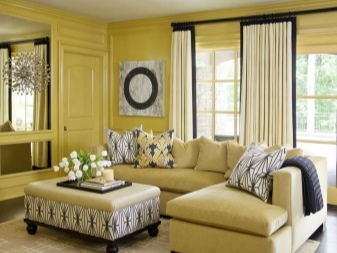
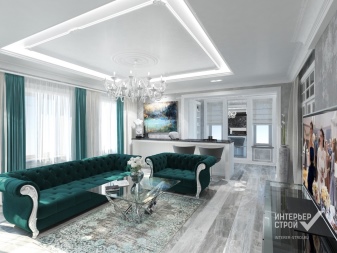
Well, complex and expressive colors give originality, depth, individuality. These include terracotta, mustard, mint, purple colors. Together with a well-chosen texture of the material, they create the desired visual effect, becoming both a central and a cozy part of the space.
An example of this is the emerald plush sofa in the living room, the center of the room and its soul.
Lighting
There should be a lot of light, as well as its sources. You can't think of a better pendant chandelier in a large room - this is a central light, which should be classically decorated. But neoclassicism allows you to find a chandelier in a minimalist style, which may even be original.
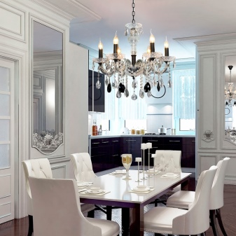
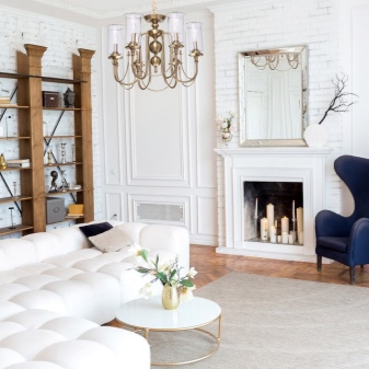
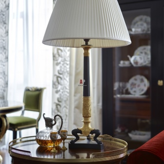
At the same time, the room may additionally have a sconce, a floor lamp, a classic table lamp, a multi-track lamp - this is a tribute to the predecessor of the classics. The origins of the style should be addressed specifically with regard to lighting, since these rules are unchanged and always work. Whether to make spotlights on the ceiling is a matter of taste. Some people like LEDs, and their appearance will not be a sharp stylistic violation. Still, classical solutions dominate.
Textiles and decor
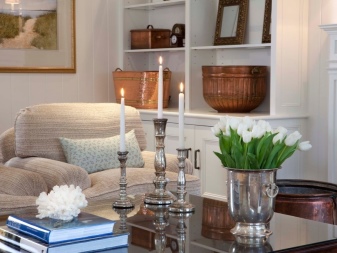
Decor and accessories should be mandatory, but they are used concisely, without distortion. It is better to find one elegant, very interesting statuette than to use several typical, standard ones. Neoclassicism does not tolerate pretentiousness. If there is one interesting picture hanging in the room, a mirror in a chic frame, is there any more decor needed here - perhaps, perhaps, perhaps a dotted one. For example, in the form of a beautiful candlestick on a coffee table or just two laconic light candles of different sizes.
The decor should focus attention on some important place to which it really makes sense to look.
But if the space is oversaturated with accents, the entire stylistic image created falls apart.
It is possible to use stucco on the walls of the rooms, but not very intrusive.
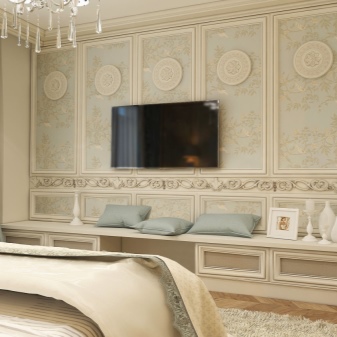
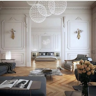
What's relevant: photos in retro style (you can use real photos of ancestors), paintings on the walls, stylized posters, mirrors and mirror elements... There may be figurines, boxes, vases and candlesticks on the nightstands and coffee tables. But only dosed, without oversaturation.
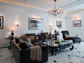
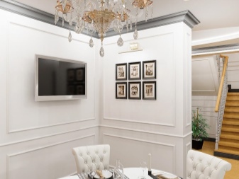
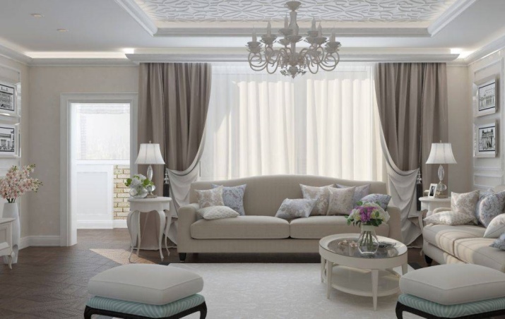
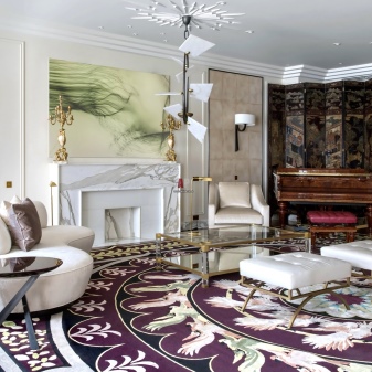
Textile decides a lot in the decoration of rooms. Carpets, pillows, curtains, rugs, dining paths and coffee tables - everything is appropriate. But these elements must contain something, due to which they will be in tune with each other. It can be one consistent pattern, color (or partner colors), texture. For example, sofa cushions should overlap coloristically with curtains.
And this, by the way, can be accent expressive colors against the background of a general neutral color calm.
Decoration of different rooms
It is great if the style in an apartment or house is sustained in every corner of the living space.
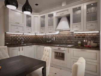
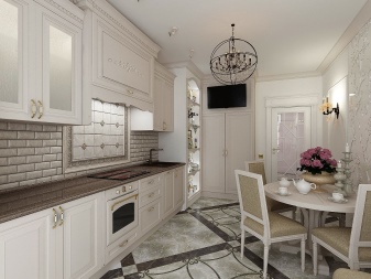
- Kitchen. The interior is as practical and functional as possible. Household appliances can be left in conspicuous places (while in the classic style it is suggested to hide them). Nothing should go against the space, if the kitchen is small, the furniture is chosen compact. The room should remain airy, full of light.
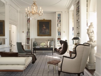
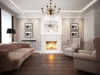
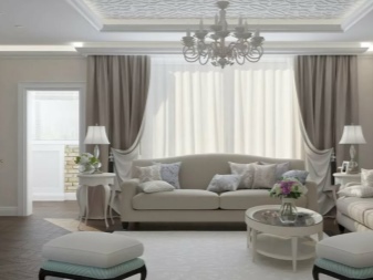
- Living room. Functional and luxurious at the same time. If there is space, a fireplace will be a harmonious base in its center. The rest of the composition of the room will be built around it. Furniture can be purchased with graceful carved legs. But simple geometric shapes are also welcome. The very space of the living room should be conducive to relaxation, conversations, lightness. It should be comfortable to be here, comfortable to read, drink tea, receive guests.
The spaces of the kitchen and living room, as already noted, are often combined, and in neoclassicism this is quite permissible. Moreover, if you want to maintain the style in a typical apartment. The emphasis is on compact furnishings and sophisticated, stylish décor.
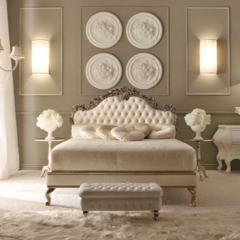
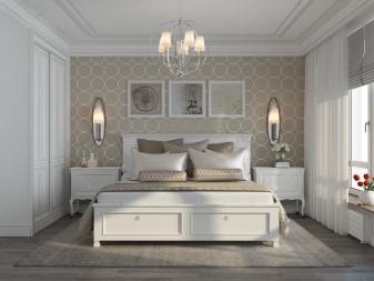
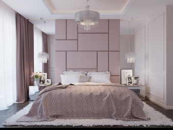
- Bedroom. It is great if it is a spacious room, where there will not be the slightest hint of cluttering with furniture. The bed is usually in the center of the room. Textiles together with decor and well-chosen lighting create coziness and the most suitable environment for relaxation.
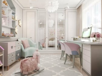
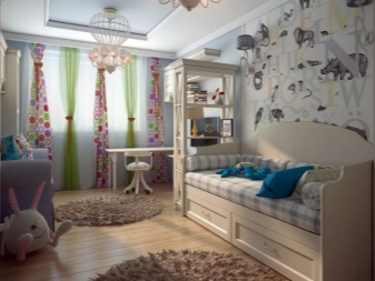
- Children's. The age of children must be taken into account first of all, for teenage girls, neoclassicism is the ideal choice. A bed with carved legs can be placed in the center of the room. Decor and accessories will create a romantic setting. But for both boys and younger girls, interesting neoclassical options can be found.
It is advisable to choose furniture and textiles with your child.
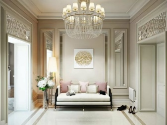
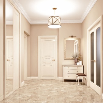
- Corridor or hallway. It is important to preserve the principle of symmetry here. It is difficult to maintain the style in a cramped and small corridor; you will have to use a lot of mirror and glass inserts. The main color palette is beige. The pieces of furniture are symmetrical in relation to each other. Adequate lighting (both central and local).

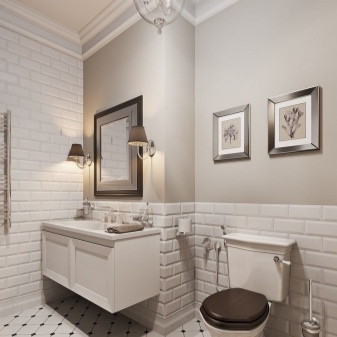
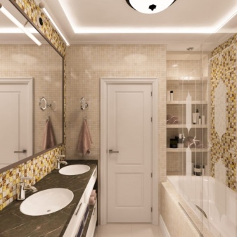
- Bathroom. The bathroom, as a rule, is done in pastel colors, without bright accents. Therefore, it is better to hide even cosmetics for water procedures, various creams and scrubs inside cabinets or pour into suitable decorative containers. The small bathroom also uses mirrors and glass structures, visually working to expand the premises.
It will help to competently and complementarily arrange the space of "eye training", when, by studying and analyzing many photos and pictures, an understanding of the style is formed.
Stylish examples of interiors
The next 10 examples are examples of style, good solutions, not too difficult to repeat.
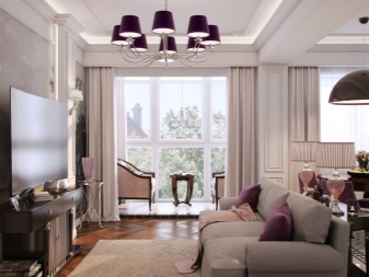
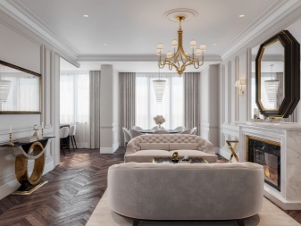
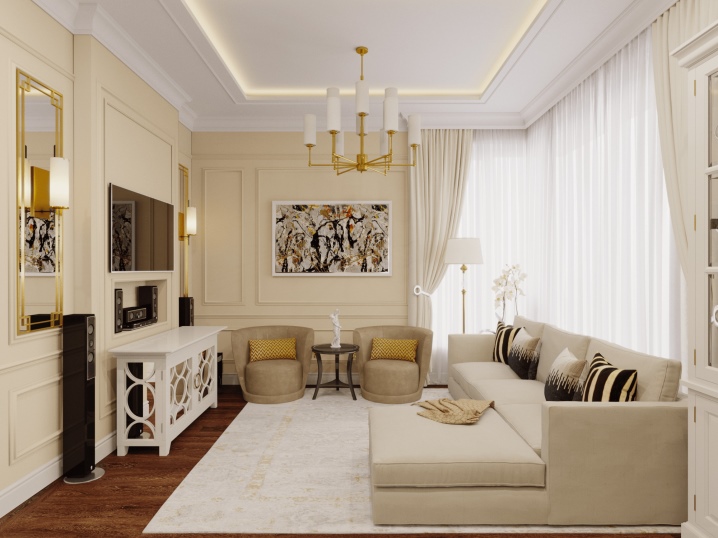
An example of a beautiful neoclassical living room where size doesn't really matter. The proportions are clearly maintained, the decor is well chosen, the choice in favor of compact furniture helped to avoid the feeling of a cramped space. And the TV looks like a mirror, which is very appealing to the overall solution.
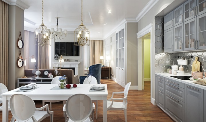
An interesting example: the kitchen and living room are adjoining rooms, there is not even a door between them. The apartment is most likely in a new building, where the geometry of the layout is often non-standard. Colors, choice of furniture, symmetry, point decor did their job - the space is very harmonious.
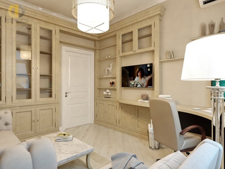
Another not very large living room, which was inhabited by neoclassicism. The area of the library, smoothly turning into the media area, has been perfectly resolved. And its color is in tune with the color of the walls, which visually expands the space. The work area is also not immediately evident - the room is made softly, without clear zoning, which is what is needed in a modest footage.
This living room shows that rich and deep colors are also appropriate in neoclassicism. Large windows help out, which give the right amount of light. The ceiling is strictly decorated, which is good - with a multi-level ceiling, the space would be overwhelmed.
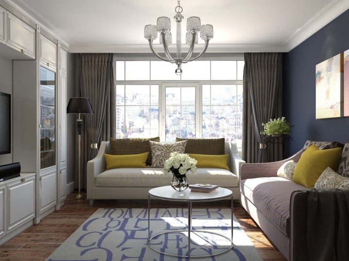
An example of the intersection of rooms - living room, kitchen, dining room. The furniture is universal: this is also suitable for the Scandinavian style, for example. But the wall decoration and decor clearly indicate that this is neoclassic.
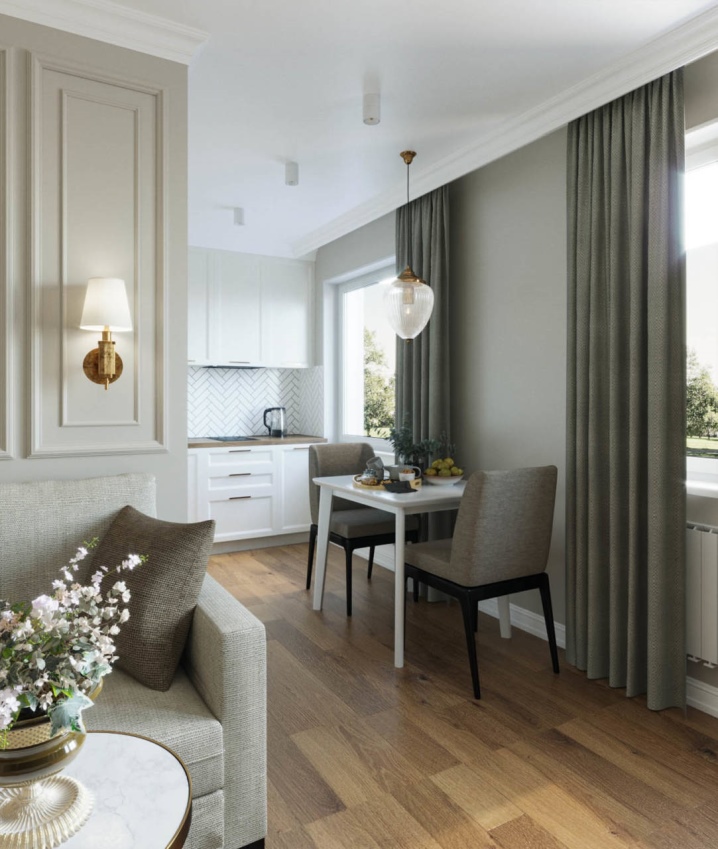
The wardrobes in this living room are veiled, they seem to be part of the walls, which is a smart decision. The colors are calm, relaxed. There is a lot of light in the space, there are also enough places for rest.
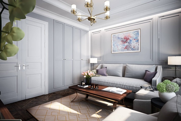
A room with a bay window is a great opportunity to beautifully combine the living room with the dining room, bringing the latter to the window. In an elongated room, furniture should be narrow enough. But it is equally important that the colors blend smoothly, there are no sharp accents that "cut" the room.
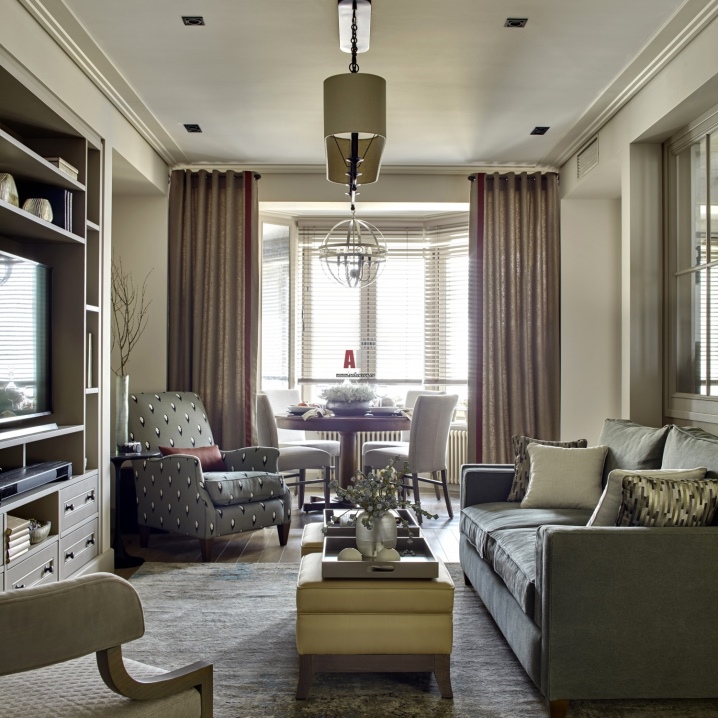
And this is also neoclassic: pastel colors, furniture created according to classical patterns, glass elements and well-chosen lighting. The zones are separated by a glass partition, the footage is mastered rationally.
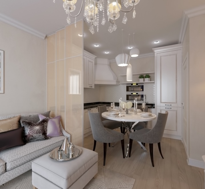
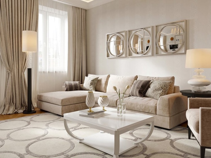
If you want the white color to be felt in the house too, this living room design option is suitable for those who cannot choose between beige and white. These colors can be combined to create a delicate space, cozy and stylish. Mirrored decorative elements on the wall look original and respectable, and the decor emphasizes the excellent taste of the owners. Ideal for a spacious living room.
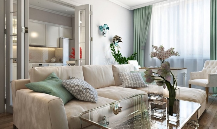
In such neoclassicism, it will be convenient for representatives of different generations to coexist. The opening from the living room to the kitchen is luxurious, the floral decoration adjusts to the desired, slightly nostalgic mood. A glass side table is the perfect solution for a narrow room, as a massive wooden table would create a cluttered feel.
The following video will tell you about the neoclassical interior.


The comment was sent successfully.