American classics in the interior
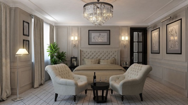
Hundreds of thousands of children and adolescents growing up on the classics of American cinema (which is only "Home Alone") dreamed that their apartments and houses would one day be exactly the same: spacious, cozy, with many small details that you want to look at for hours. So back in the 90s, the American classics penetrated into the subconscious of many - a style direction that is in great demand today in the vastness of the CIS. And it's really good for repeating, quoting, and setting up a cozy family nest.
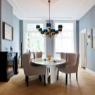
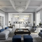
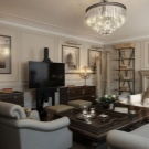
Main features
This style was created for spacious rooms, classic houses with a rather large hall and individual bedrooms, where there is a dining room and where the kitchen can accommodate more than one hostess. Partitions are often missing in the house to emphasize the dominance of the space.
Features of American classics:
- the interior is functional + elegant;
- comfort;
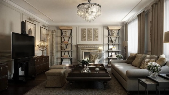
- symmetry in the layout;
- instead of wardrobes, the project provides for dressing rooms;
- rooms are combined (living room and dining room, kitchen and dining room);
- arches and portals are common;
- Art Deco elements are not uncommon (contrast in edging, glossy surfaces);
- colonial style techniques are also often borrowed;
- there should be a lot of natural lighting;
- paired elements are welcome.
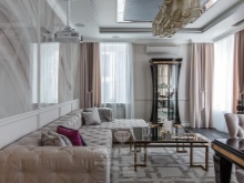
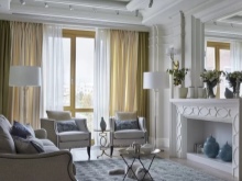
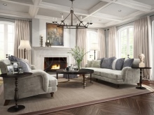
Spacious rooms and a fundamentally open layout are inherent in the style, and this applies not only to houses, but also to apartments. The living space is positioned as a single one, except for rooms for delicate privacy. Often an apartment in this style looks more like a studio. Initially, the American style was very similar to the English classics, but it was simpler and, one might say, nicer. There is a lot of space, few walls, but the issue of zoning has been resolved anyway - due to furniture and design tricks.
In American classics, especially in its modern solutions, styles are successfully mixed. In one townhouse, for example, you can see an organic combination of Art Deco and colonial motives. And if Scandi-aesthetics are mixed with this, there will be an individual interior, beautiful in its finely built eclecticism. In each such interior design approach is felt, therefore there can be no chaos - everything is collected in a single interior "salad", where each ingredient is in its place. Comfort and practicality were chosen as benchmarks.
Everything should be rational: from the shelves above the chest of drawers to the competent arrangement of the mezzanines.
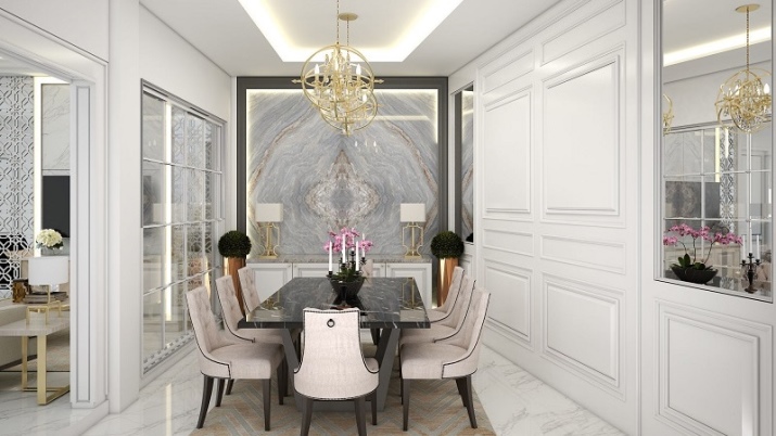
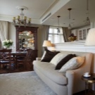
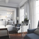
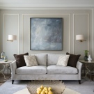
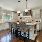
Color palette
The principle of neutrality is the soloist in the choice of color. The dominant color can be conciliatory white or warm brown. Contrast is created using, for example, a combination of white, blue and red, sand is ideally combined with rich brown, gray and black. This design is characterized by geometric patterns, which are characterized by symmetry, monochrome. So, on the walls of any room you can see stripes and rhombuses, rectangles and squares, leaves are possible. The texture is usually chosen with a depth effect and a dynamic pattern.
A so that the color palette in the living room, bedroom, nursery, hallway, bathroom and toilet was original, “washed out” smoky shades can be used. These are purple-gold, and purple, dissolving in blue, and even khaki. Quoting the Art Deco style emphasizes the contrast of colors. So, dark floors "play" with walls painted in a light color, and dark walls are in harmony with light doors and window frames.Both furniture and appliances are usually tried to be taken in the same color scheme.
Finishing options
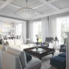
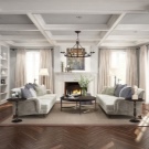
Wallpaper is much less common than painting. The wall is brought to perfect smoothness, one color is chosen, more often matte paint. If, nevertheless, it is decided to take wallpaper for repair, the pattern on them will be small and neutral. Often, wall panels are found in the arrangement of the hallway, living room and even the kitchen. They are usually light, wooden, but imitation is also possible.
Materials "like brick" or "like stone", rough plaster also do not contradict the style. The ceiling is traditionally simply painted or whitewashed, but the stucco molding is not excluded, but only geometrically verified. The ceiling is either white or beige, neutral. In the kitchen, it can be decorated with beams or their imitation. If a ceiling plinth is used, then it is wide, plaster or wooden, made in light colors.
The floor is traditionally wooden and most often dark. Usually it is either parquet or parquet board, but laminate is also found as a more budgetary alternative. If the interior allows, there may be ceramic tiles on the floor, as well as artificial stone. But more often they are placed in the most vulnerable areas (kitchen, bathroom).
American-style living spaces often feature stained glass, especially in areas of zoning. This makes the interior particularly sophisticated, stylish and, again, serves as a contrast, and an umbrella, and an element in which the main colors of the interior can be combined.
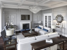
Choosing furniture
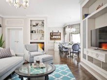
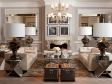
American-style furniture is both convenience, elegance, quality and high functionality. Usually, preference is given to large-sized models of sofas, beds, dressers, tables. But the style itself is large areas, so this choice is understandable. If the style of American classics is being recreated in a smaller space, when choosing furniture, you need to make allowances for these proportions.
On upholstered furniture, as a rule, upholstery with plain textiles, on benches and ottomans - pillows that are combined with the overall picture.
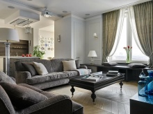
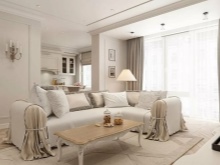
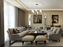
Let's list the layout rules.
- The center of the room should be given to the semantic center. If this is a sofa, then it will shamelessly stand in the center. And next to it are chairs, a low coffee or coffee table. All together they form a recreation area, which is probably the most popular in the house. It should not be crowded here - comfort and convenience are above all.
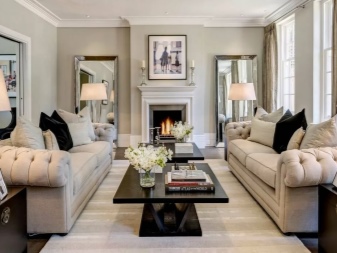
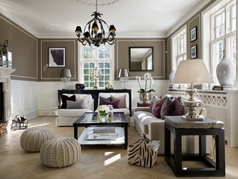
- Wardrobes and dressers, niches and shelves become slender rows along the walls. The style and color of the furniture must be consistent, it is very difficult to independently decorate the interior with eclectic furniture so that it is stylish. This can be entrusted to a designer, although more often than not, coloristic splashes in American classics are simply avoided.
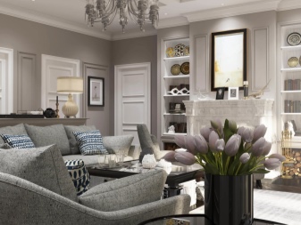
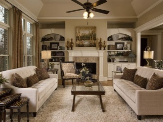
- The arrangement of furniture should be symmetrical and proportional. - this is one of the pillars of style, therefore, it is rarely abandoned. In addition, it is easier to harmonize the space in this way, especially if it is large.
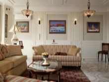
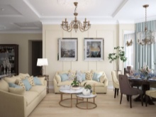
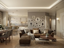
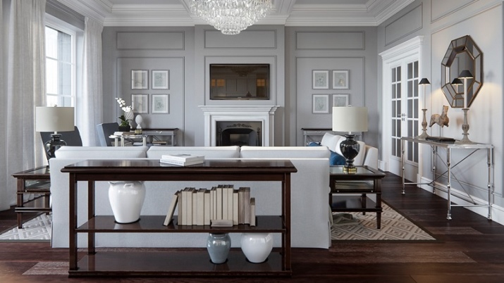
- In the living room, the fireplace is often the semantic center. And furniture can be located near it. Although now there is often such a situation when a fireplace is an imitation and its second role is a console for a plasma TV. Thus, the recreation area turns into a media area.
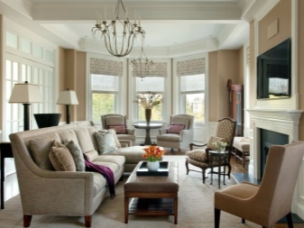
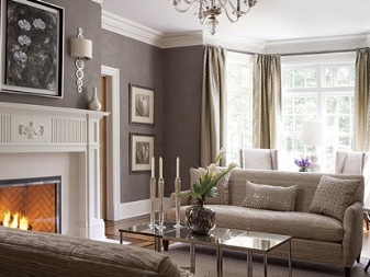
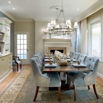
- The dining room is usually done in an island layout. In the central part of the room there is a table (usually a large rectangular one), a countertop with a stove and a sink. There may also be a bar counter. They try to place the set along the main wall.
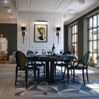
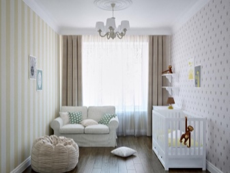
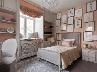
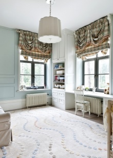
- Children's room usually elongated, but large enough to accommodate a play area, a work area, and a sleeping area. Very often, the walls here are not just painted, but pasted over with some classic wallpaper, for example, striped. Horizontal combination of wallpaper with a dark solid color bottom is allowed.
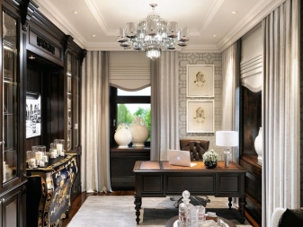
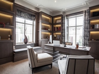
- Cabinet cannot be called an obligatory room, but if the footage of the house allows, then for the American classics this is a traditional and correct decision.There may be bookcases along one of the walls (right from floor to ceiling), necessarily - a massive writing desk with a comfortable chair. In the office there can be a place for both a sofa and a small table for visitors.
And, of course, in the style of American classics, there should be a cozy guest room in the house.
Lighting and decor
Lighting is variable - you can adjust spotlights around the perimeter, you can hang more familiar arm chandeliers in the center of the ceiling. There should be enough light: sconces, classic table lamps, floor lamps in all appropriate places. The device should shine softly and as naturally as possible. But the priority is natural light, it should be enough.
Even in the bathroom, according to the project, a window is often meant. And in modern living rooms, panoramic windows can be seen more and more often. There is such a nuance in the decoration - there is no dominance of various decorations in the American classics. But this is not minimalism either, because the house is decorated, but each such element is carefully thought out.
If the picture is in a frame, then such that individualizes the interior, poured into it. Mirrors and vases are also matched to the setting. But more important in American classics is not even vases with candlesticks, but textiles. It has a great semantic load.
Curtains, as a rule, monochromatic, made of natural materials. They should be simple in cut, without distracting frills. Drawing is acceptable, but small, geometric. An alternative to classic curtains can be blinds, both Roman and Japanese.
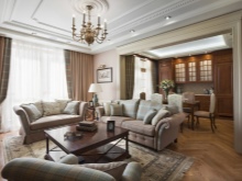
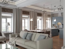
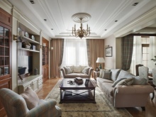
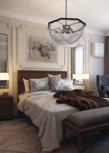
Carpets can only be seen in the chill zone in the living room or in the bedroom. In other spaces, they are considered impractical. Upholstery of upholstered furniture, seat cushions, cushions cannot be independent decorative accents - they are selected in combination with the entire environment, play along with it, combine interior elements with color, texture, pattern.
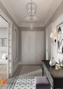
In the American style, the hallway can be very small, connected to the living room, it is only needed to take off clothes. The living room is the most spacious and comfortable room. There should be enough bedrooms for everyone in the house, but at least two of them. Any creative mess is encouraged in the children's room, but even it does not go beyond the boundaries of stylistic rules.
In general, American classics are a solid home, very comfortable and capable of catering to the tastes of all generations.
In the next video you will find an overview of an apartment of 160 square meters in the style of American classics.


The comment was sent successfully.