Two-room "Khrushchev": ideas for renovation, layout and design of rooms
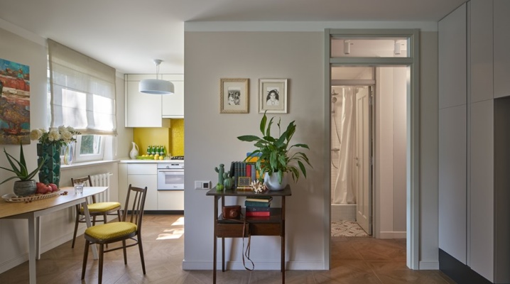
The first houses of mass development in the USSR were precisely "Khrushchevs" - standard apartments, the popular name of which has become entrenched in the mass consciousness. This is a small housing with low ceilings and not the best sound insulation. Modern housing is much more comfortable, but millions of people live in the heritage of the Khrushchev era, which means they are looking for options for its optimal improvement.
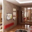
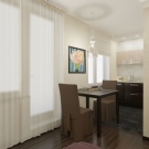
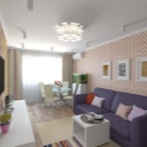
Features of the 2-room "Khrushchev"
You can recognize "Khrushchev" by its wide square windows, walk-through rooms, and small kitchenettes. A combined bathroom is another typical detail in the plan-project of such apartments. A standard bathtub in such a small bathroom could not even fit. Many apartments have a balcony and a storage room.
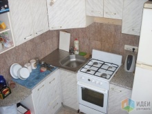
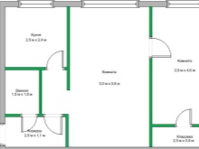
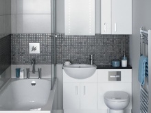
The two-room "Khrushchev" apartment is a very compact apartment. In new buildings, even "odnushki" modern planning have a similar area (40-45 sq. M.) And even more. "Khrushchev" has a maximum footage of 46 squares, if it is "kopeck piece", but thanks to the compactness of the zones, you can nevertheless conveniently place everything on them. It's just that it is sometimes more profitable to deviate from standard schemes by looking for new solutions.
Sometimes this is a global redevelopment, which involves changing the geometry of the apartment. Naturally, so that the load-bearing walls do not suffer, redevelopment must be legalized in the appropriate authorities.
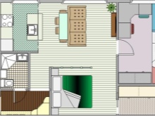
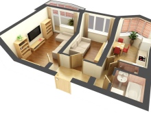
There are several options for the standard layout.
- "Book". So it is customary to call an apartment in which the rooms go one after another sequentially. The total area of such a dwelling is 42-43 squares.
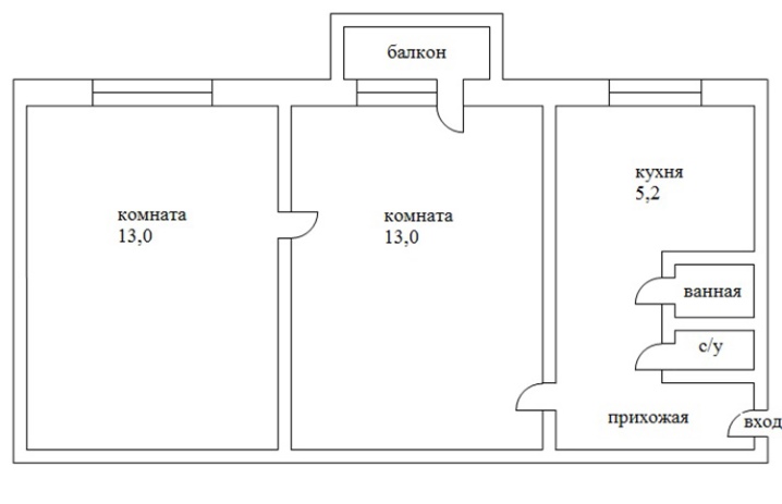
- "Tram". And this is a "kopeck piece", the area of which is 47 squares, the rooms in it are adjacent, one of them is corner.
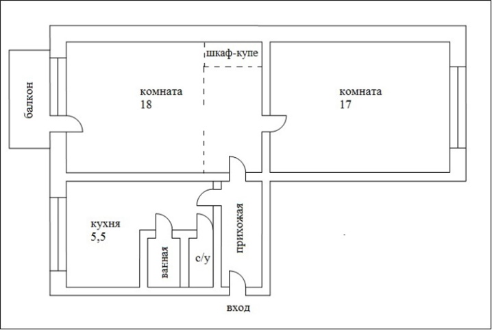
- Improved. This layout does not imply a walk-through room, moreover, it even has a separate bathroom, atypical for a "Khrushchev" building. True, the kitchen in such a dwelling is tiny.
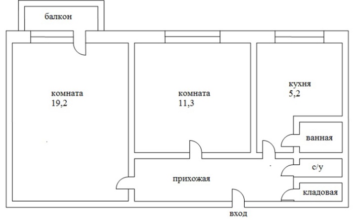
- "Butterfly"... In such an apartment, the kitchen is in the middle, and living rooms are at the edges. A separate bathroom is also an advantageous aspect of this layout.
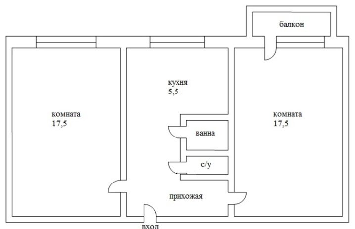
It is definitely impossible to say which of these layouts is more convenient for restructuring. For example, in a “book”, adjacent rooms can be easily combined into one (if this is intended), and then the dwelling will turn into a full-fledged studio. In any case, there is something to think about.
Redevelopment options
Internal walls and partitions in the "Khrushchev" are not load-bearing, therefore you can make a new geometry of space without much difficulty. But still, it is better to check with the experts: the fact is that some people are sure that they live in the "Khrushchevs" and begin to break down the load-bearing walls. Paradoxical as it may seem, this is exactly what happens.
In any case, a redevelopment permit must be taken in order to legally transform the apartment. If the living rooms and the kitchen remain in the same places, only the position of the walls will be different.
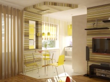
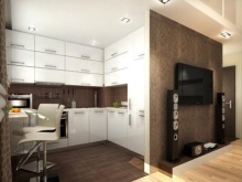
Consider the common redevelopment options.
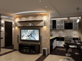
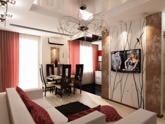
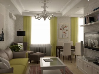
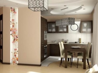
- "Euroodnushka". The small size of the kitchen and bathrooms are the main disadvantages of the "Khrushchev". With the help of redevelopment, you can change the footage of the kitchen. So, the tenants decide to remove the wall between the kitchen and the next room (most often - a walk-through), and so a spacious kitchen-living room is obtained in the housing. The bedroom in the apartment remains isolated, and the combination of kitchen and living room looks like a worthy compromise. The extra wall goes away, which means there is more space for furniture.
- Studio. If you completely remove the interior partitions, the apartment will turn into a modern studio. Only the bathroom and toilet will be isolated in such a space.
The good thing about the studio is that even a budget renovation will allow it to be zoned. Actually, you can build new partitions, less massive and more functional than the walls.
- Relocation of walls while maintaining two isolated rooms. So you can expand the space of the kitchen, making a territory from a 5-meter kitchen up to a 15-meter one. One wall will need to be demolished, and a new one will have to be erected.
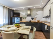
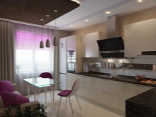
- Optimal layout. The kitchen can be combined with a walk-through room, dividing the larger room in half. If the family is small, you can consider this option. Especially if this family is hospitable.
Of course, when making repairs with the transformation of space, you need to take into account many factors: and in which house the apartment is located - in a panel or brick, if the apartment is angular, this also narrows down the options for rebuilding. Of course, separate rooms or they are adjacent, taking into account the fact that one of them is a walk-through, is also important.
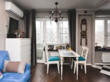
Zoning
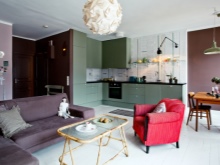
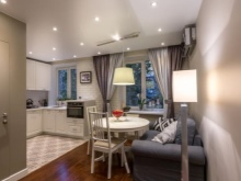
Zoning techniques are a "golden" tool in the hands of a skilled craftsman. If you managed to make a redevelopment, it will only be beneficial if zoning is successful. For example, in the combined space of the kitchen and living room, there should be visual separation. That is, the cooking area will most likely have a classic kitchen, of which the bar can be a part. And this rack, with a good location, will become the main element of space zoning.
In a small combined space, a fairly wide bar counter can become a dining table. If the family is small, this is a good way out of the situation and saves space. And in the living room, near the sofa, there can be a low transforming coffee table, which can be expanded if guests are waiting at home.
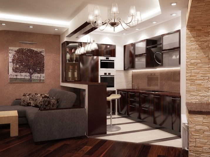
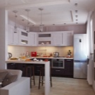
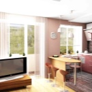
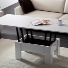
You can do something more radical, for example, install a thin wooden or metal partition - possibly openwork, through. A glass partition may even be an ideal option, because it does not steal space at all.
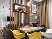
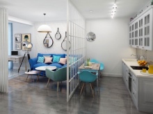
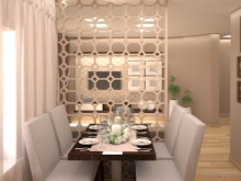
If you don't want any new elements, then zoning can only be done in color. That is, the decoration of the kitchen area and the living room area will differ in materials and color scheme.
For visual separation of spaces, this is one of the best options. Tiles are laid in the kitchen area, laminate in the living room area, and this is already zoning.
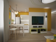
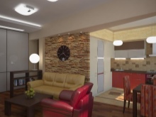
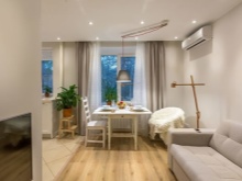
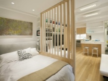
If the number of rooms has not changed after redevelopment, zoning still takes place. For example, in the living room it is necessary to arrange both a media zone (at the same time - a reception area) and a bedroom (if the second room is given to children). And again the partition will help out: glass or through. There will be a bed behind it. And if adults sleep on a folding sofa or couch, then behind the partition you can make a working corner where you can retire at the computer.
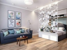
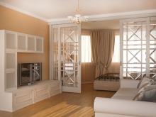
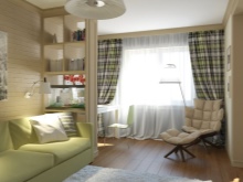
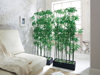
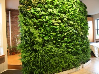
Today, a very fashionable trend in zoning can be considered "Green partitions"... This is the name for the use of plants in the design of space: with the help of indoor flowers and beautiful pots, racks and other devices, you can significantly transform spaces.
It looks especially advantageous in a light interior, in a Scandinavian style.
Room decoration ideas
The arrangement of furniture in the interior is in many ways a defining part of redevelopment or renovation. Furniture can be arranged successfully and ergonomically, and even the smallest living room can be arranged this way. But from the hallway it is better to remove all unnecessary things, abandoning bulky furniture.
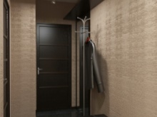
The corridor
Narrow and small - this is usually the hallway in the "Khrushchev", sometimes flowing into the corridor.
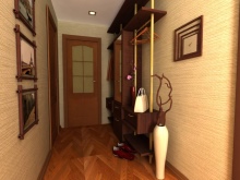
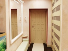
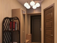
The main design technique that allows you to divert attention from this is light and mirrors. You can combine general lighting with local lighting. A large mirror successfully transforms a narrow room.
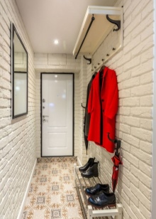
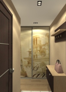
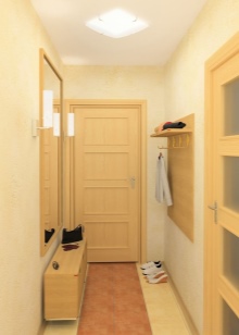
The most winning design tones are pastel: they saturate the room with warmth, but at the same time take care of its visual expansion. A good option would be classic beige, complemented, for example, with bamboo motifs. And the insufficient height of the corridor can be brightened up with glossy ceilings. Wall murals depicting perspective will also help - it creates the desired visual effect, deepening the space.
The floor covering can be represented by a diagonal laying, this also visually helps to slightly expand the space. You can also take it outside the hallway / corridor. So visually the coating will look more interesting, and the perception of space changes favorably.
Kitchen
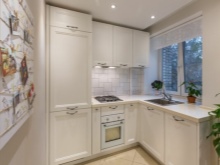
Redecoration in the kitchen can be done with your own hands, but first you need to think over its clear plan. If the apartment does not provide an opportunity to "roam" in the area, then there are definitely no restrictions in ideas.
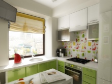
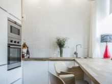
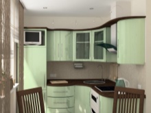
What can be considered a good solution for kitchen design in Khrushchev:
- 2 colors for furniture and walls - this streamlines the space;
- glossy furniture facades of pale shades;
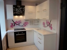
- bright or dark colors, if present in the interior, then only in the apron area;
- with patterns and small details, you need to be careful, you should adhere to minimalism;
- top cabinets can reach up to the ceiling;
- everything that is possible, it is better to remove from the table top - raise or hide, hang;
- leave the kitchen without a door;
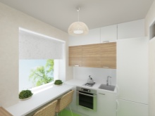
- instead of a window sill, equip an ergonomic tabletop;
- integrate the hood into the cabinet.
In a word, all the principles of arranging a small space work in the case of the kitchen in the "Khrushchev". The most preferred colors for such a room are white and woody. And live greens are suitable as a decor.
This is the most pleasing to the eye combination: natural, harmonious, calm.
Bathroom
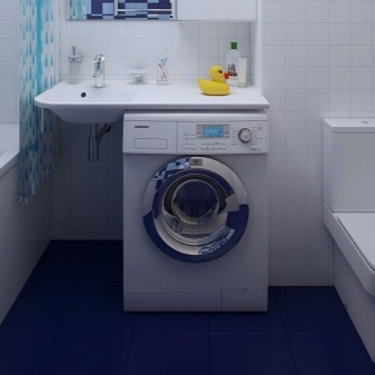
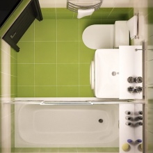
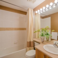
If this is a combined space (bathroom with toilet), you can also replay the situation there a little. And above all, give up unnecessary things. If, for example, there is nowhere to put the washing machine, then the cabinet under the sink must be removed to make room for the equipment.
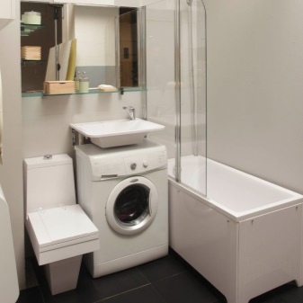
Soft colors, simple shapes without overloading with small or bright details will increase the space in the bathroom. And please note that after the repair in the bathroom is done, the space will be filled with bright bottles, rugs, towels... They will create brightness and variegation in the room, therefore it is best to refuse it in the decoration, otherwise there will be an overkill.
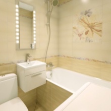
In a small bathroom, 2 colors are the maximum acceptable option. In one color, the room may be too simple, but where the third color appears, this is already a clear overkill. But if you decide to make the bathroom just white, complementing it with blue, for example, a rug and the same towels, it will be very laconic and beautiful. Timeless option.
Hall
The plan for the transformation of the hall is as follows. First, you need to accurately determine the functionality of the room, then decide what kind of furniture you can't do without. Then choose furniture that can be easily transformed. You will have to fight for free space, but it's worth it. In addition, there is always something that you can refuse: people are often simply sorry to part with a bulky wall that only hinders them.
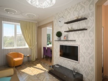
A good finish color creates harmony, comfort and mood. Walls in pastel colors are a reconciling solution if there are disputes in the family about the color of the decoration. A large drawing should be abandoned - only a small and discreet one will not make the hall even smaller visually.
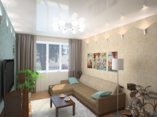
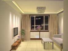
Choose curtains in the living room not the most dense. It is necessary that the lighting in a not very large room is of high quality. Multilevel lighting also helps - you quickly get tired of one central chandelier, and there is little functionality in it. Good lighting is really not worth saving on.
And do not forget about the great role of space zoning.
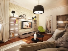
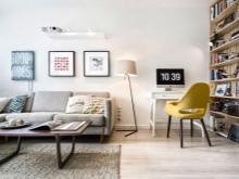
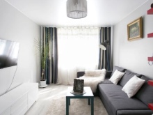
Move the working area as far as possible from the rest area. A large mirror above the sofa or in another part of the room will also "work" to expand the usable area. If you make the living room white, then in the media zone you can make a white structure with many open shelves - in case you don’t want to give up the demonstration of your home library and dear little things. Yes, it is bright, but due to the rest of the Nordic whiteness, which will dominate the hall, the image of the room will turn out to be whole and harmonious.
Bedroom
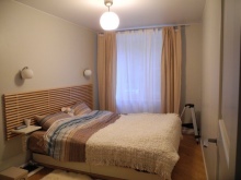
Optimal colors for finishing are beige, sand, milky gray, faded grass. Dark shades are taken only for very modest accents.
Other important design points:
- remove bulky things, replace them with compact and functional;
- instead of bedside tables, choose compact shelves;
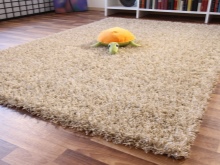
- instead of comfortable chairs, buy a high-pile carpet - surprisingly, this unexpected change works.
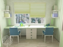
If the working area is in the bedroom, you can use the wall near the window for it, sometimes even the entire length of the wall. Two workplaces can fit there at once.
Pantry
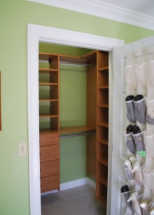
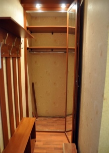
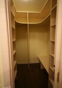
You can organize it if you are trying to take out the storage places from the rooms. A free corner is suitable for organizing a pantry if the corridor in your apartment is square and relatively large. You can also use the end blind part of the narrow corridor. Finally, if nothing else remains, a spacious wardrobe, equipped in a suitable part of the apartment, can act as a storage room.
A distinctive feature of this space is the shelves to the very ceiling.... All kinds of hooks and hanging storage systems are also welcome.
To organize the pantry, choose colors that better "mask" the surrounding space.
Styles
An interesting and sometimes defining choice for a beautiful design of a modern "Khrushchev" is the style of decoration. And here, too, apartment owners have several interesting options. Design decision - which style to choose.
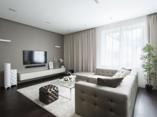
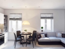
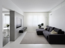
- Minimalism. A logical solution for a small apartment, as well as for a small family. The priority is open space, minimal decor and restraint in the choice of colors. But if this is a family with children, it is not easy to maintain such a style.
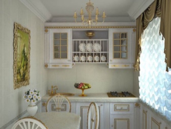
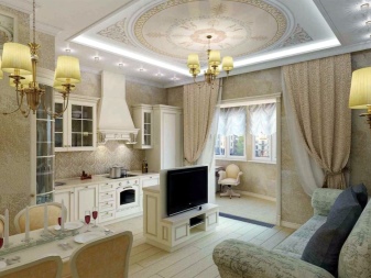
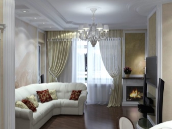
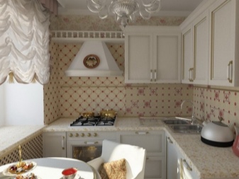
- Classical. And it is difficult to subordinate it to a small space. The classic style is not always combined with the modesty of forms and finishes, moreover, it very rarely fits into the framework of budget repairs.
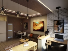
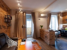
- Loft. Today it is still fashionable, and there are not so few variations of the loft.
A frequent solution for a young family who wants something interesting in their first family nest.
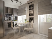
- Scandinavian. The king of style when it comes to small spaces and limited renovation budgets. Although experts say that Scandinavian is too broad a concept, and that which is increasingly seen in modern apartments, it is better to call the Nordic style. It is very democratic, incredibly cozy and rich in interior solutions.
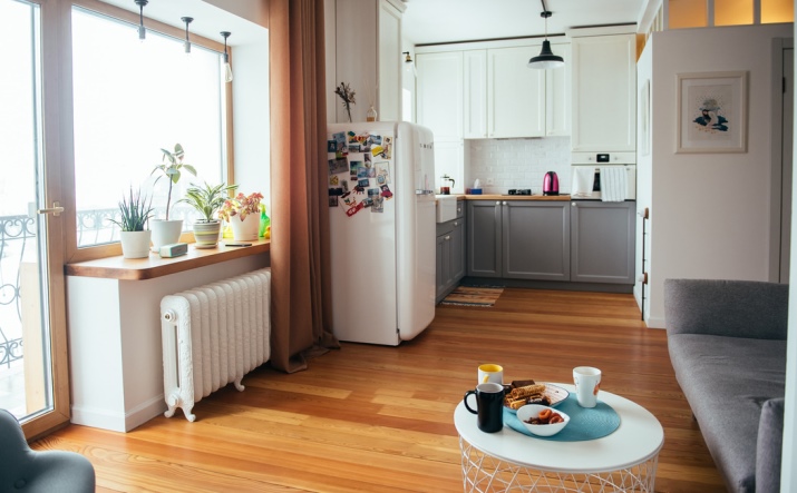
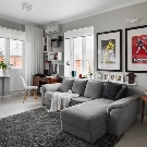
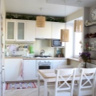
Probably, if you draw the popular look of a modern two-room "Khrushchev" apartment, it will be a light, naturally decorated apartment (greenery, wood, ceramics), with transformable furniture, laconic decor and smart solutions like glossy ceilings, diagonally laid flooring and much more.
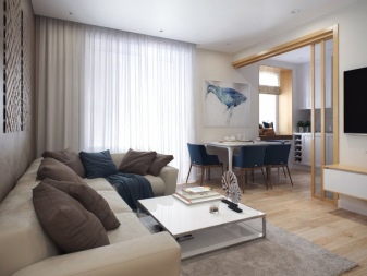
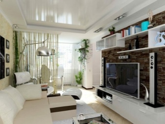
Design examples
How it might look, evaluate in the examples of well-equipped two-room "Khrushchev" houses.
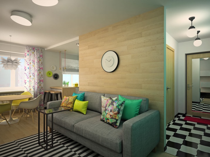
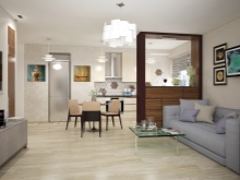
- A united space in which both Nordic white (an ideal canvas for any design solutions), graphicity and the warmth of wooden surfaces are perfectly combined.
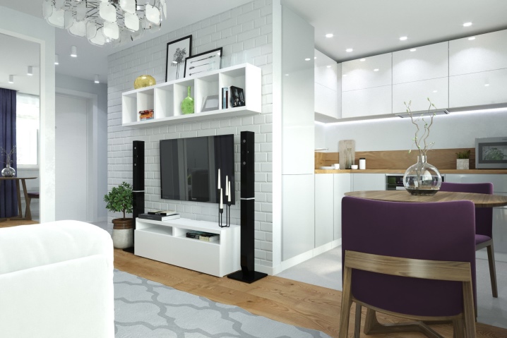
- An example of how cozy gray can be. And again the combination of the kitchen and the hall. The dining area stands at the intersection of spaces.
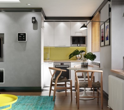
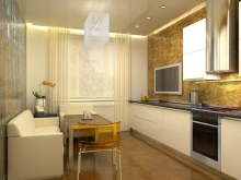
- An interesting solution in which the owners (or the designer) took into account all the nuances of a small space. For example, transparent chairs. The finish and color of the furniture were very harmoniously selected, everything turned out to be soft and enveloping.
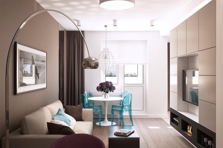
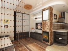
- And softness, and brightness, and a little audacity (in the form of a loft wall) - everything was combined in this interior. Interestingly, the bar is at the window, and this is, indeed, a convenient place to drink your morning coffee.
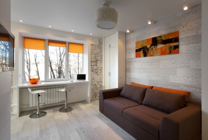
- Gray + white = great combination. Look at how interestingly the small space of the room in the "Khrushchev" is played. A good solution with a working area and a very unexpected way of lighting.
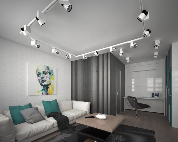
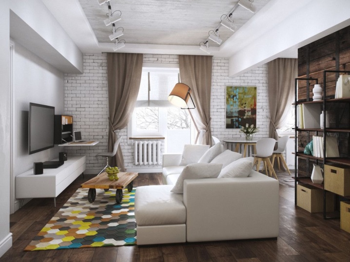
- Another nice graphic interior, behind which a modest footage is not immediately guessed. Successful combination of zones. The living room is small, narrow, yet cozy and functional. Again, the area near the window is played well. A pleasant combination of colors makes the space both modern and comfortable.
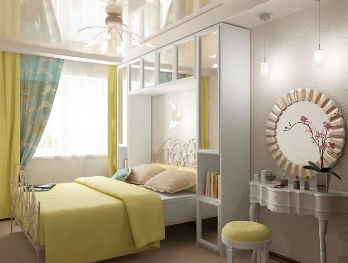
- A small bedroom does not look like that, but all due to the successful selection of colors and surfaces. The mirror by the bed was very helpful.
Successful transformation of your home!


The comment was sent successfully.