Design of a one-room apartment with an area of 40 sq.m: examples of interior design
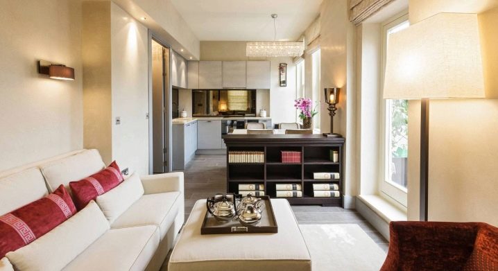
An apartment of 40 sq. meters cannot be considered too small. "Odnushki", designed in the time of NS Khrushchev, were much smaller. Modern people value space and comfort. The possibilities of construction and furniture production allow us to turn 40 sq. meters of area into a spacious, elegant home.
How to equip?
It is better to start arranging a one-room apartment with renovation. No matter how beautiful the furniture is, surrounded by old walls it will lose its attractive appearance and will not be able to create the expected comfort. Having made a decision in favor of repairing, keep in mind two options for the development of events: you can make a redevelopment by destroying the walls, or leave everything in its original form and repair it with high quality. Each approach has both pros and cons.
Redevelopment
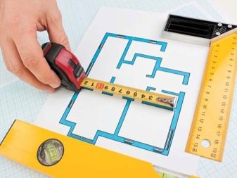
It is necessary to draw up a design project. Sizes, style, furniture - everything needs to be thought out at the initial stage. Then you should register the changes in the BTI (this will make it possible to do without problems during the sale or donation). The bearing walls and communications specified in the project must not be touched.
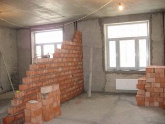
The room can be combined with a corridor, kitchen, balcony. You can also remove all partitions by equipping a studio apartment on an area of 40 sq. m. Connecting the hall with the balcony, you should take care of the insulation of the second. Radiators can be slightly displaced or covered with a curbstone. Even with a small balcony, an increase in space is observed. So, it turns out a cozy area for rest or work.
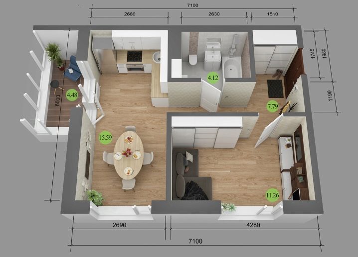
If you remove the wall between the living room and the corridor, the area will expand significantly. Having abandoned the hallway, you will have to change your shoes right in the hall, but this inconvenience will be kept within a few minutes, but then you can enjoy the spaciousness for hours. The kitchen and the living room are organically combined into a single whole. There is so much space that zoning suggests itself. However, you will have to solve the problem with the gas stove. It can be replaced with an electric one, or the working area can be separated from the dining room with a solid partition in the form of a wardrobe.
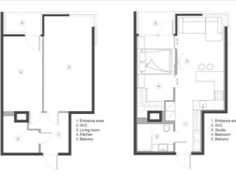
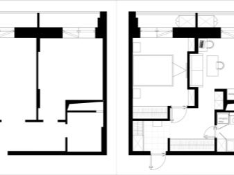
Repair without redevelopment
Starting repairs in an apartment, you need to clearly imagine the end result. The entire workflow should be directed towards a premeditated outcome. For example, leaving untreated brickwork on the wall (for a loft-style interior), residents change their mind and purchase Provence-style furniture. It is not easy to fix a wall when the renovation has already been completed. Hall in an apartment with an area of 40 sq. m cannot be called either tiny or large, therefore any actions during repair and improvement should be aimed at achieving the main goal - visual expansion of the volume.
If the ceiling is not high enough, then you should not overload it with multi-tiered structures. It is better to choose the color classic white, but you can also use a shade that is two tones lighter than the walls. Glossy canvas increases the space well, and dark gray has great reflective properties. A large, low-weight chandelier reduces space. The lighting solution should be active, separating each zone.
If central lighting is necessary, then a small chandelier should be chosen that fits tightly to the ceiling.
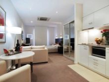
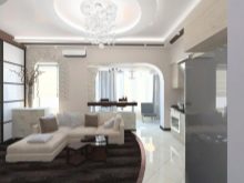
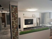
The walls will have to be worked well at the rough stage. Do not hope that liquid or corrugated wallpaper will "hide" all the distortions.In the process of work, you need to remember about zoning: you may have to make a niche, highlight part of the wall with a different color. It is better to paste over a small room with light wallpaper, although different tonality of the walls is allowed. For a cheerful look, you can make a bright accent. When working on the floor, you should choose light glossy materials. In combination with delicate walls, they will create additional volume. A good screed will even out the floor and the furniture will not look skewed.
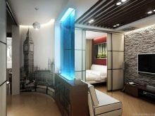
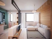
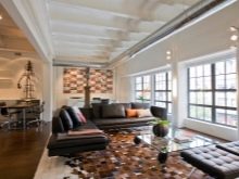
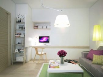
Furniture must match the chosen style and have a common color scheme... Sometimes, guided by the taste of the owner, you can mix several styles, but you should not be too zealous in this. Originality and tastelessness have no clear boundaries. Furniture should be chosen functional, perhaps a transformer, and it is better to refuse everything superfluous. In small rooms, mirrors and glossy surfaces are used, which deepen the space. Do not surround yourself with many small objects - a cluttered room seems smaller. In addition, trinkets do not carry a practical load, and a few expensive things are enough for aesthetic perception.
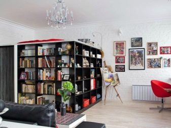
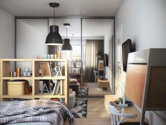
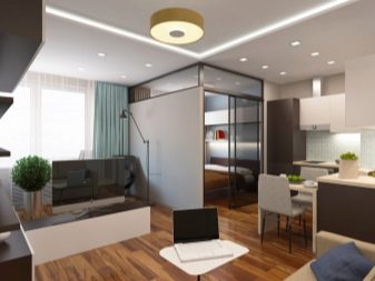
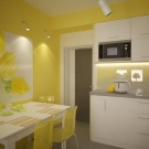
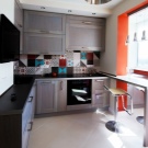
A kitchen that is not connected to the hall should have two zones: a working and a dining room. This room is often visited and needs to be made as comfortable as possible. The working area, located in a circle, will allow the person standing in the center to reach everything with his hand. As for furniture, blind structures are well diluted with modules. Something has to slide out, and the table for the dining area can be transformed from the side of the cabinet. Chairs are hiding in the same curbstone.
Small kitchens are more difficult to maintain, so all surfaces are best smoothed.
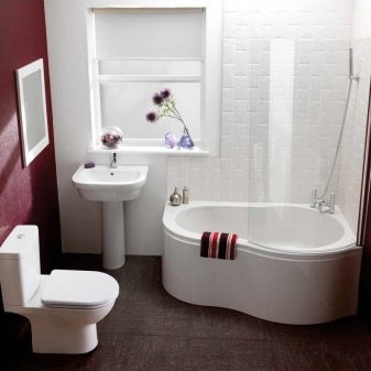
The bathroom and toilet can be separate and so small that there is nowhere to even wash the clothes. If the bathroom is combined, then there is a place for a washing machine, shower, small bath, sink and toilet. It is better for families with children not to destroy the wall. You just need to replace a large bathtub with a small one or a shower stall. They may have to be turned to another wall, making room for a typewriter.
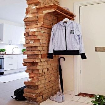
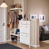
A small hallway should not be overloaded with monolithic furniture. Everything should look open and accessible, that is, be at arm's length. For example, a shoe rack with a seat, above which a hanger or mirror is located, or a 30 cm deep slim fit, will do. In it, shoes are stored almost upright. If there is a need for a cabinet, it is better to disguise it as a wall.
Space zoning
The smaller the apartment, the more difficult it is to organize the detached areas that the family needs. The task is not to have an area of 40 sq. m divided into equal territories, but in order to use the space with maximum benefit. The interests of all family members must be taken into account. The apartment must have a place for sleeping, receiving guests, cooking, work. A family with a child should take care of its private territory, since children live by their own interests, and they have nothing to do with the wonderful interior of adults. In some cases, an area is allocated for a library, a winter garden or a workshop (for example, with a table equipped with small boxes for needlework).
In an apartment, zoning can be done both in the living room and in non-residential premises.
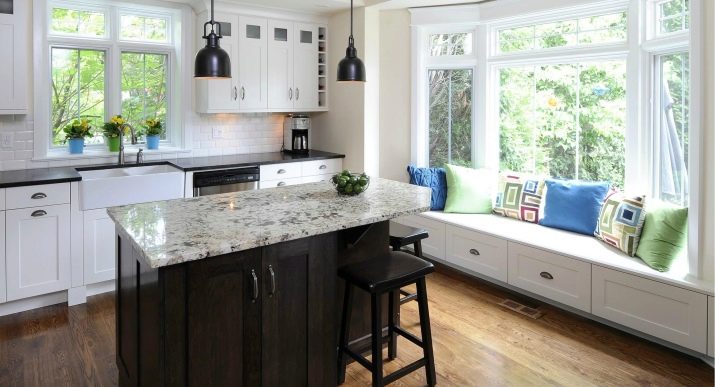
- Kitchen traditionally divided into dining and work areas.
- Combined bathroom in order to maintain hygiene, it can be divided by a light partition, but otherwise it is clear where the laundry area is, and where is the shower area.
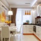
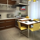
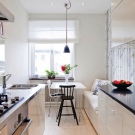
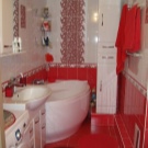
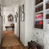
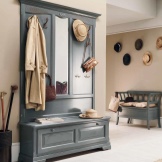
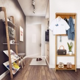
- Hallway, if space permits, should be divided into two zones: frequent use and storage of seasonal items. The first should have at least a small shoe rack, hanger, mirror and rug.If space permits, you can add an ottoman, a bedside table for small things, accessories for umbrellas, hats, bags, scarves and gloves, as well as a housekeeper. The storage location for seasonal items also depends on the free space. It can be equipped with a small but tall wardrobe and a closed shoe rack or an impressive structure with various sections, including space for shoes and small items.
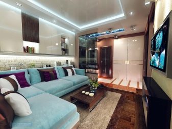
- Living room - the only living room in the apartment. She will take over the functions of a bedroom, dressing room, possibly a dining room. In the same room you will have to rest, work and meet guests, and if there are children, then the best part of the room should go to them.
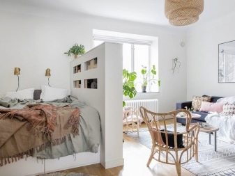
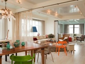
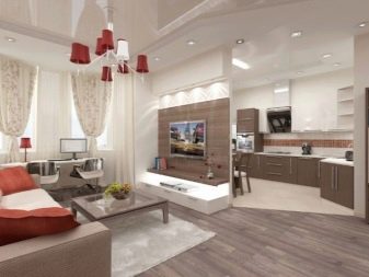
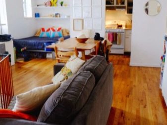
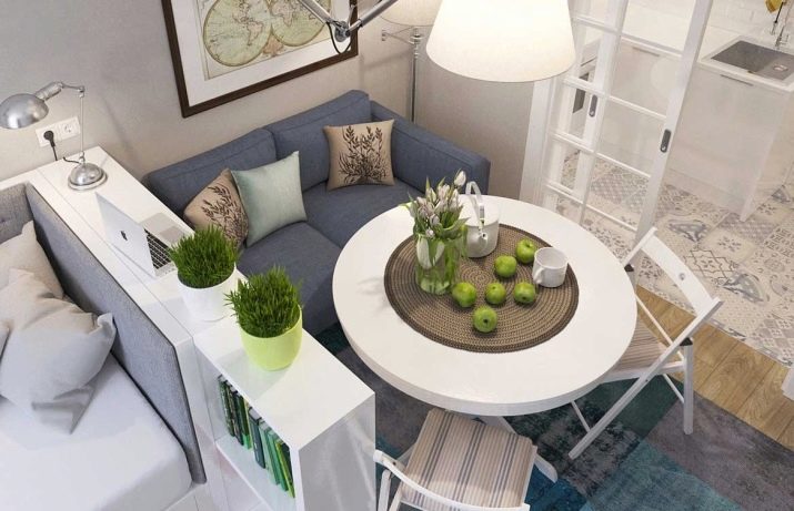
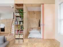
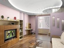
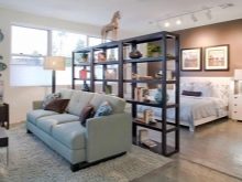
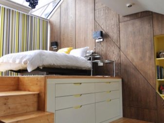
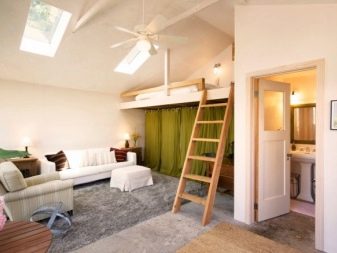
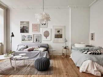
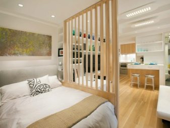
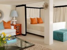
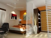
Sleeping place can be highlighted with a podium, protected with curtains or a light partition. In especially cramped rooms, it is better to install a fold-out sofa, which has to be assembled every day. The lack of a sleeping area will allow you to arrange a working corner. The computer desk and chair are separated from the rest of the space by a rack with double-sided shelves. If the workplace is not so important for the owners, then you can limit yourself to a folding laptop surface. It is not necessary to burden the space with a wardrobe; it is quite enough to place a couple of light wardrobes in different parts of the room.
Studio apartment
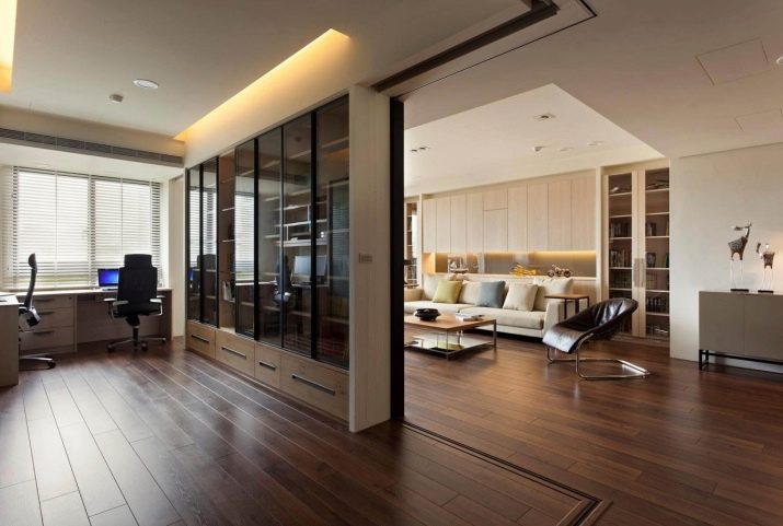
The zoning theme is also relevant for a studio apartment. A space without partitions requires a more active territorial division. The fashion for the studio came from the west, where premises without kitchens for students were being built. Small families feel quite comfortable in such apartments, especially if the design is made taking into account the wishes of all residents. When creating an interior, you will have to follow some rules:
- it is necessary to create harmony of the common space, not to clutter it with solid partitions, limiting ourselves only to light, mobile ones.
- It is necessary to maintain the airiness of the room, not to overload it with monolithic furniture.
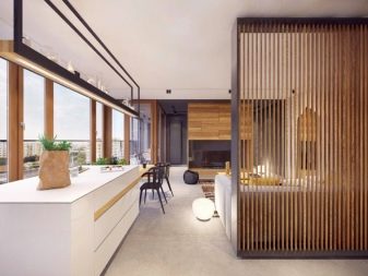
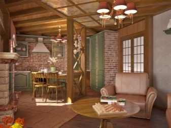
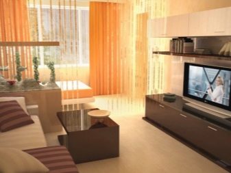
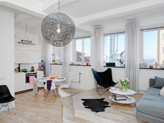
- Try to use transformers and modular designs.
- The kitchen should organically fit into the overall design, and not look isolated.
When carrying out repair work, you should give preference to natural, environmentally friendly materials, because you will have to spend all the time in the same room. In studio apartments, divisions into zones are especially important. Areas are separated depending on the function (work, dining room) and the need for a private space (nursery). Choosing wallpaper with your child, do not be afraid that their bright pattern will not match the tone of the walls. Let the children's corner become a fun accent of the whole room.
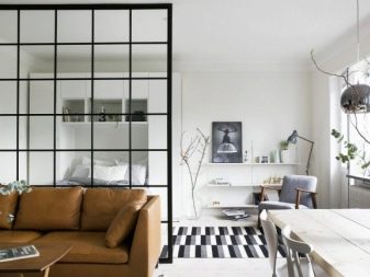
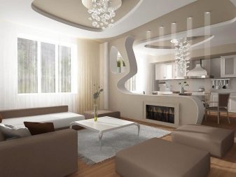

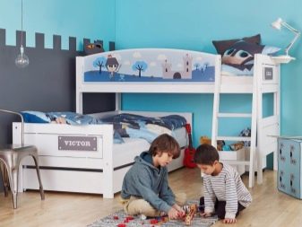
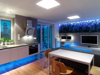
It should be remembered that zoning takes place even at the stage of repair: wallpaper with a children's pattern is glued, a podium is allocated for a berth, and the ceiling design, equipped with soffits, defines the boundaries of the working area. It is possible to divide a room into functional components with the help of color, curtains, partitions, furniture and lighting solutions, and the light is taken into account both artificial and natural. If the room has only one window, then all zones are lined up along an imaginary line to the right and left of it. Sunlight should hit each of them, and not run into a built-in partition. A dark corner is also suitable for a berth.
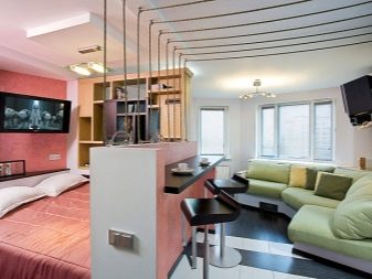
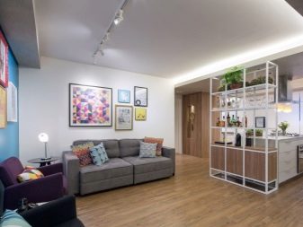
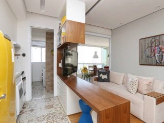

As for artificial lighting, it is arranged in such a way that lamps are present in each zone. This will help people go about their business without interfering with each other. In addition to ceiling spotlights, the work area is equipped with a table lamp, a seating area with a floor lamp, in the dining room the chandelier can be directly above the dining table, the bedroom area can be decorated with a sconce. Where the child lives, a bright light is needed for games and activities, a night light for relaxation. The solemnity of the central chandelier is suitable for celebrations and meeting guests.
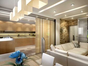
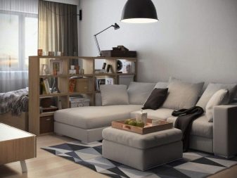

Style solutions
It is difficult to achieve coziness, even dividing the room into zones, arranging beautiful furniture and hanging lamps.The feeling is created that each object "lives its own life", an atmosphere of discomfort is felt. Style is needed to create a coherent whole. This is the core that holds the entire disconnected interior. Styles have been formed over the centuries, and the modern world has accepted the most worthy of them and adapted it for itself:
- Historical include modern, empire, baroque, classicism, gothic. They are echoes of the eras from which they came.
- In the modern direction, they use high-tech, pop art, minimalism, loft styles. They reflect the spirit of our time.
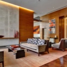
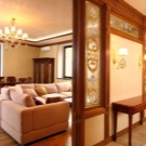
- Ethnicity is a direction that conveys the traditions and habits of various peoples. This includes Scandinavian, Japanese, English, Provence (French), African.
- Mixed styles include eclecticism, fusion, kitsch. These are unstable directions based on different design experiences.
- The colonial style stands out because it unites several historical and ethnic trends.
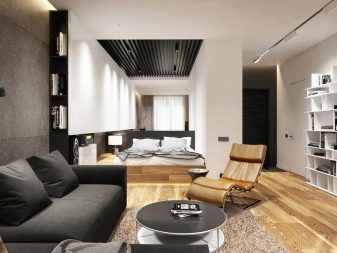
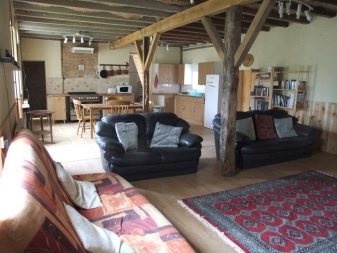
If we talk about the most popular stylistic directions for one-room apartments with an area of 40 sq. m, the following can be distinguished:
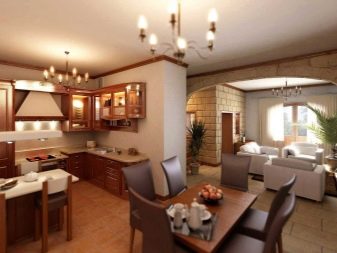
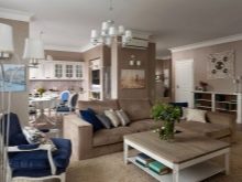
- Classicism - expensive refined style, not ostentatious, like the baroque. The main characteristic is real, time-tested comfort. You should use only natural materials, strict but expressive furniture, rich curtains falling to the floor, calm colors and active decor.
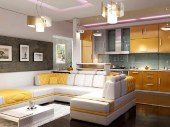
- Modern. The style is based on smooth lines, combining practicality and comfort. Furniture, appliances, decoration, decor - everything should be the best and most unique, emphasize the special taste of the owner.
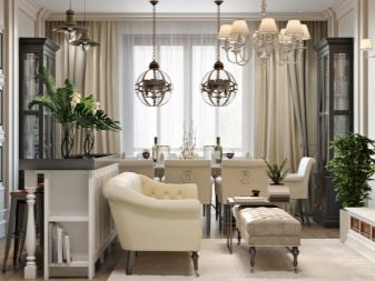
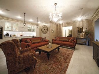
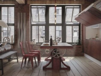
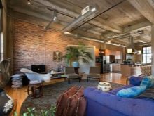
- Loft. The style of industrial premises originated in America during the Great Depression, when factory premises were given away for housing. A wall with brickwork is a visiting card of the style. Also characteristic are large windows, simple furniture, and posters and graffiti instead of decor.
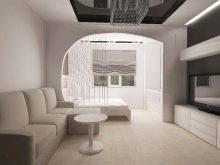
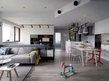
- Minimalism. Simple but rather large forms of clear geometry are used. Colors - white, black, all shades of gray. The decor is laconic.
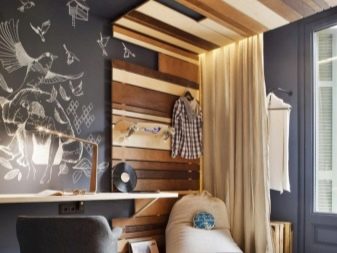
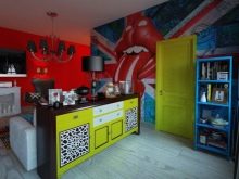
- Pop Art is a style of cheerful energetic youth. It will take a little money to create an interior, but bright colors and decor made with your own hands actually from plastic bottles will please.
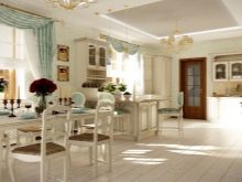
- Provence. The style of the South of France is oversaturated with furniture and decor. We prefer only natural materials. The decor is very diverse: knitted blankets, ornamented tablecloths, ruffles, candlesticks, flowerpots, pillows with patterns, fresh flowers on the windowsill.
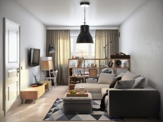
- Scandinavian the style is characterized by light, almost white tones. Natural wood is used in the manufacture of furniture. A rather unusual storage system is used: boxes, boxes, baskets, lined up in rows on shelves. The design includes animal skins, candles, bright dishes.
Example of registration
Before you start decorating an apartment of 40 sq. m, you need to find out who it will serve and for what purpose. If a family with a child is planned to live, in addition to functional areas, private territories will be required for everyone. A lonely person can do without zones at all. Entrusting the design of your apartment to a specialist, you should study the styles, listen to the designer's ideas, consider examples and decide on changes in your life.
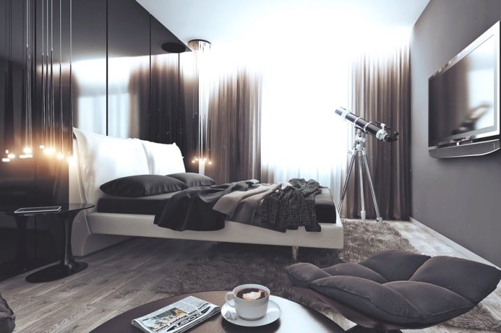
The interior of the room for a man is made in the style of minimalism: it is strict and laconic. The main color of the design is gray. It has many shades, blends well with other colors and emphasizes the masculine character.
A full-wall window draped with plain curtains looks like a large sunspot. The floor is covered with light oak laminate and a fluffy carpet reminiscent of dry grass. In the center of the room is a large white bed with light legs, as if floating above the floor. The headboard has black gloss panels. They fill the entire wall and contrast with the white bed.The glossy black theme is supported by a bedside table and a large "plasma" on the opposite wall of the room. In the foreground is a tea table and a soft gray velor pouf.
Particularly noteworthy are the lamps located on both sides of the headboard. They fall from the ceiling in thin straight lines and end with luminous "stars". The theme of strict romance is supported by a telescope displayed on a tripod. In general, the space looks laconic and strict, but dark glossy surfaces bring elements of elegance and charm to the interior.
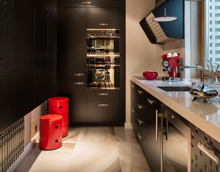
The kitchen, continuing the theme of the living room, is made in black tones. The dark color is diluted with light shades: white table top by the window, large floor tiles and beige mosaic walls. A sufficient amount of light enters through the window, giving softness to the black tones of the interior. The uniform surface structure of the furniture is combined with the bubbly texture of the individual inserts. The two-tone fume hood supports the same theme.
Despite the small size of the room and the seeming simplicity of the interior, all designs are practical, there is a spacious storage system. The working area is moved towards the window. The square sink is equipped with two mixers: for washing dishes and for supplying drinking water. The lower level cabinets contain a large number of drawers and an oven. On the opposite wall there is a spacious structure with a complete absence of handles. The concealed push-tu-open system allows the doors to be opened with a light touch of the hand. There is a refrigerator built into the closet against the wall adjacent to the window. The same structure contains a showcase and additional drawers.
Ceiling lighting is represented by three spotlights. Several rounded lamps hang over the work surface on long mountings. The accents of the entire interior are two scarlet cylindrical stools with built-in drawers. The coffee machine and sugar bowl on the worktable are in the same red color.
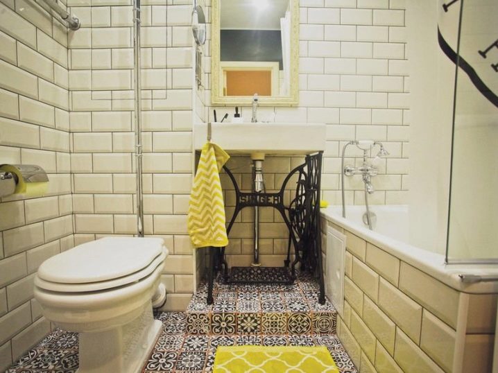
The combined bathroom turned out to be light and calm. The walls are decorated with classic beige tiles. The floor was pleasantly pleased with bright ornaments. The bath, toilet and washbasin are traditionally white. The highlight of the interior is the openwork forged stand for the washbasin.
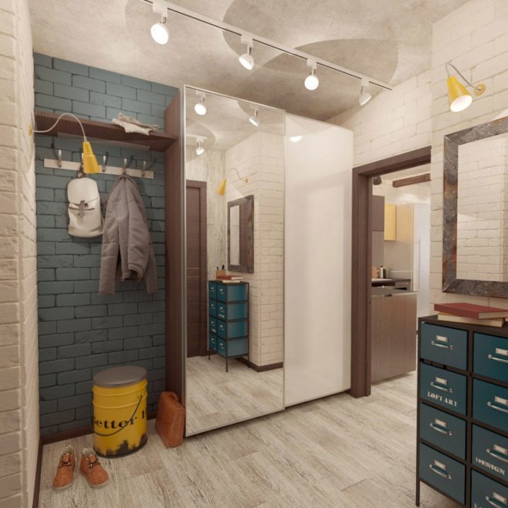
The entrance hall is designed in the loft style. The wall, peeled to brick, is painted gray and beige. The situation itself looks uncomplicated, with a touch of brutality. There is a simple wardrobe with a large mirror, next to it, on a gray surface, there is an open shelf and a hanger. Against a wall with an empty frame is an incomprehensible structure on a metal base with eight drawers in which shoes can easily fit. Two yellow lamps and a bucket with a soft lid instead of a seat act as accents.
Using the modern possibilities of decorating an apartment, you can get an excellent result, no matter how many meters the living area is located.
An example of the design of an apartment with an area of 40 square meters, see the following video.


The comment was sent successfully.