Design of rooms 12 sq. m in a modern style
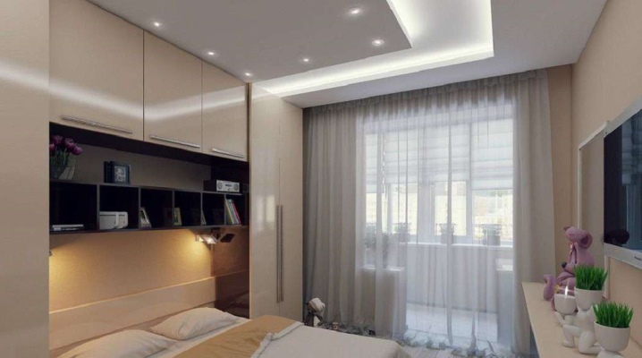
Design of rooms with an area of 12 sq. m. in a modern style is a very attractive option for decorating the space. It is imperative to figure out the choice of a sofa and other furniture. It is equally important to study specific examples of family room design.

Peculiarities
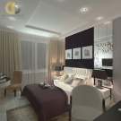
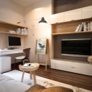
Room design 12 sq. m. in a modern style is optimal for both individuals and families. The most important principle of this design is the abundance of free space. Such a concept fits perfectly into the latest ideas, according to which one must get away from cluttering the space at any cost. It is necessary to reduce the amount of furniture.
The decor can be used, but preference should be given to small-sized solutions. Restrained, unsaturated, even slightly dusty colors are welcome.
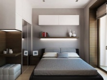
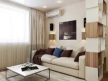
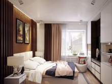
Best suited to modern style:
- white;
- graphite;
- graceful beige;
- brown;
- earthy paint.
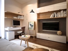
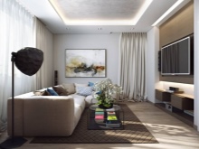
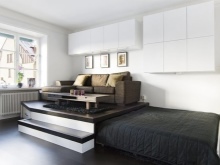
Simplicity is achieved in another way - it is necessary to prefer straight lines in the design.
Interior doors can contain glass inserts. However, they must have an emphasized geometric shape, patterns of a complex type are unacceptable. Cabinet furniture is ordered with emphatically simple facades and without any panels. If curtains are hung in a modern room, then you will have to completely forget about lambrequins or heavy canvases.
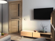
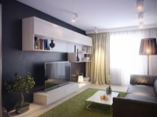
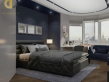
Before you implement any idea, you need to consider how functional it will be. The classical installation of furniture "along the wall" is not encouraged. On the contrary, the furnishings are deliberately designed for zones with different functions. At the same time, a modern room is still decorated with compositions made of durable, well-proven materials.
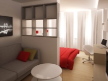
What should not be “fashionable things in the current season”:
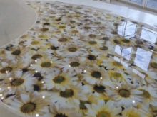
- self-leveling floors;
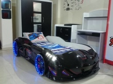
- car-like cribs;
- plastic panels in decoration;
- frames of "brick" color.

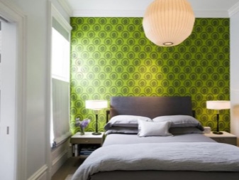
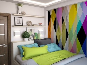
The gradual development of modern style makes it less and less relevant to use the same wallpaper throughout the room. It would be much more correct to use accent walls. Vivid colors help to form the necessary accent.
If a bright monochromatic solution is not too convincing, you should use rich natural subjects or geometric prints.
Other important features are:
- active use of storage systems instead of traditional cabinets;
- even geometry of ceilings (any decorations are unacceptable);
- frequent use of whitewash for the ceiling;
- sophisticated scenarios for organizing lighting.
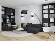
Layout options
On an area of 12 m2, functional design is critical. The traditional way of dividing functional areas among themselves is the use of partitions made of gypsum board. The division into:
- clothing;
- guest;
- personal (aka recreation area);
- working segments.
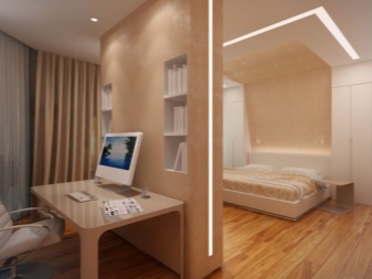
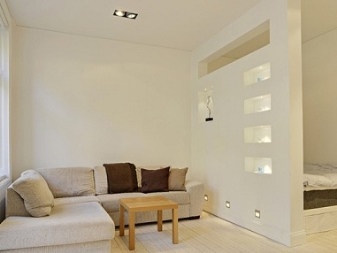
In a small rectangular room, a decorative partition is usually placed, dividing the entire space into two main parts. If we are talking about a bedroom, then a bed and a wardrobe are placed in one zone, and a working corner and a small table in the other. If the window is in an oblong wall, and the entrance is in the corner, then one corner is set aside for the cabinet. The butt is occupied by another large piece of furniture. When the entrance is located in the middle of a short wall, symmetrical cabinets are placed around it.
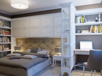
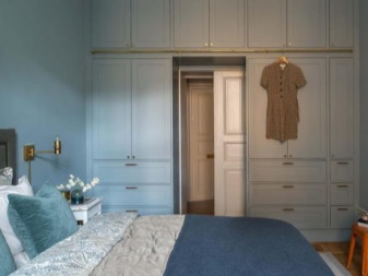
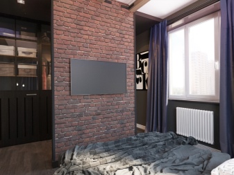
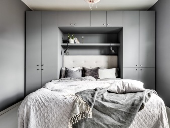
An alternative solution is to install a berth on one side, and a cabinet or wardrobe corner on the other side. In some cases, the bedroom and the entrance are separated by a partition on which the TV is hung. In square bedrooms, small wardrobes can be installed on either side of the headboard. Sometimes they put a closet against a wall parallel to the sleeping area.
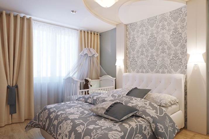
Important: if a crib is placed in the room, complete symmetry cannot be achieved, and there is no point in wasting time looking for it.
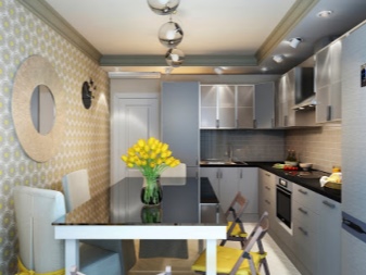
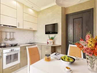
When drawing up a plan for a small kitchen, you must completely abandon open shelves, even those located inside the cabinet. The use of large household appliances is also contraindicated. In a square kitchen, all products are placed along adjoining walls. The headset itself, ideally, should be oblong, with a shallow depth.
Typical use of L-shaped and U-shaped combinations; in any case, the entire layout is ordered individually.
Tips for increasing space
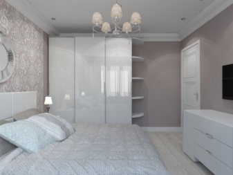
The classic, but not losing its relevance, advice is to use as many light shades as possible and increase color saturation. These solutions apply to both wall and floor decoration.
Important: you should avoid using "contrasting spots" - because of them, the space is visually reduced. The smaller the difference between colors in individual rooms and their parts, the better.
To further free up space, use:
- sofa transformer;
- special transforming shelves;
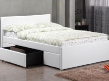
- beds containing boxes;
- wardrobes with a mezzanine;
- podium with pull-out bed.
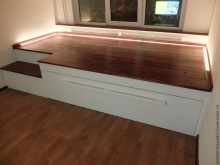
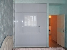
Additionally, it is worth considering ideas such as:
- use of roof rails;
- installation of shelving;
- installation of various hooks for clothes;
- organizer boxes.
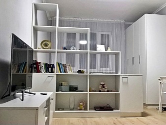
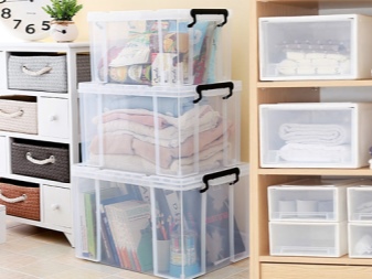
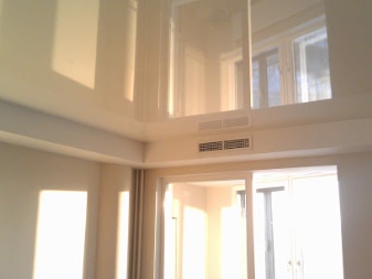
Along with purely practical ways of increasing the space, it is necessary to return again to the design methods of solving the problem. It is necessary to abandon bright and dark components. In a long, narrow room, wallpaper with a horizontal stripe is recommended. To visually increase the space, it is also recommended to use trim with a medium-sized plant print. Low ceilings can be corrected by using a white glossy or even "mirror" canvas.
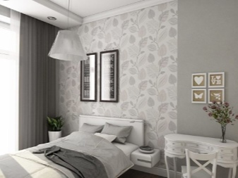
Conventional wall mirrors also help expand rooms. But you should not get carried away with such components. The farthest corner is usually decorated with a bright object that creates a perspective effect.
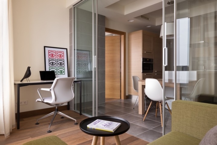
The choice of furniture with transparent facades is encouraged. Replacing simple doors with glass partitions will also be good.
Beautiful examples of interiors
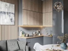
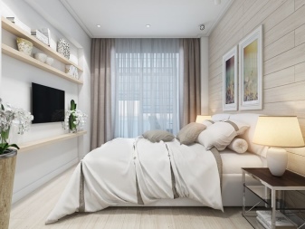
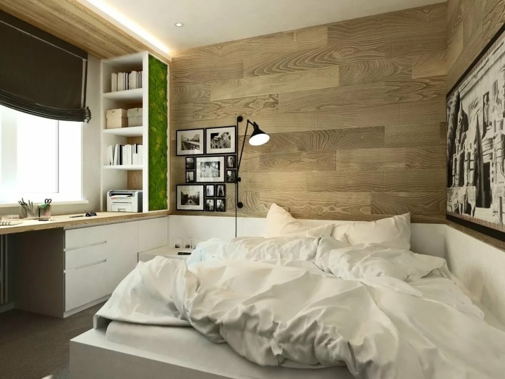
A good example of a 12 m2 room with a modern twist might include light wood-textured walls with photographs on the walls. The light wood facade of the furniture set turns out to be an appropriate solution.
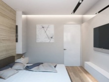
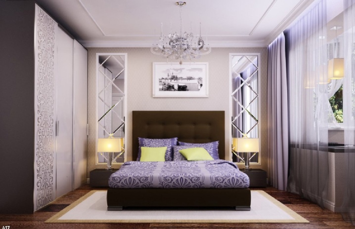
An equally attractive solution can be a bedroom in a modern style. Light lilac notes are woven into this interior. A dark floor with a light carpet goes well.


The comment was sent successfully.