Features and design options for a white kitchen with a black countertop
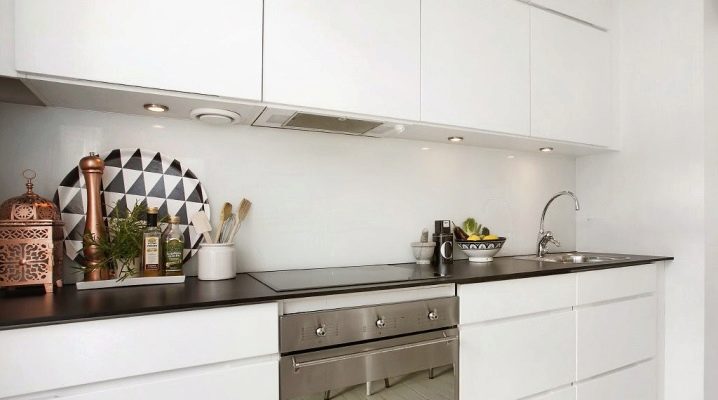
The kitchen is the place where you always want to create coziness and comfort. At the same time, everything should be at hand so that it is convenient and pleasant to cook dinner for the whole family and arrange for an evening tea party. Therefore, many approach the design of the kitchen very seriously and think over its design in advance, the combination of materials and colors, furniture and decor elements. For those who love strict style and laconicism, contrasting colors are suitable. For example, you can consider the features and design options for a white kitchen with a black countertop.
Advantages and disadvantages
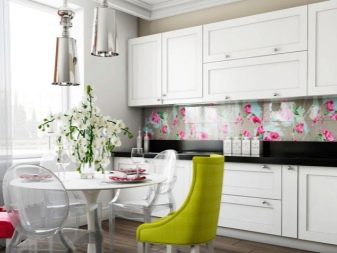
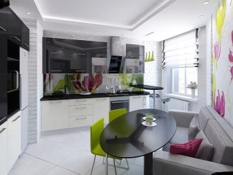
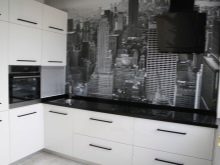
A white kitchen with a black countertop is ideal for lovers of a strict style, where there is nothing superfluous, and all items are ideally combined with each other. Bright elements can be added to dilute the cool color combination, and the possibilities are endless. There are a lot of design options. If the kitchen set is white, then, perhaps, the dining area will be of a different color, and curtains will suit it in color.
The advantages of such a black and white kitchen are that it can be decorated in various styles: you just need to add various elements, choose the right furniture and finishing materials. Loft and high-tech, modern and Scandinavian style will be appropriate.
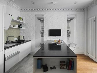
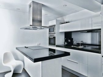
Cold tones can always be successfully played with the help of bright strokes: there is an opportunity to periodically change accents, which means to update the interior.
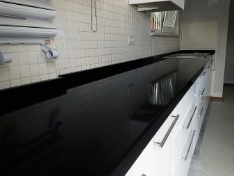
On the other hand, white always gives a sense of spaciousness and space. A black countertop only emphasizes this effect, especially if the surface is glossy, which perfectly reflects the color.
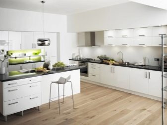
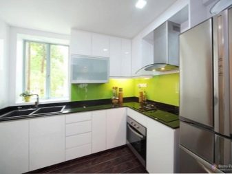
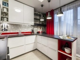
It seems that black and white is a classic combination, and it is difficult to come up with something new here. But it is with such colors that it is more convenient to experiment and embody the most daring ideas. For example, you can add a bright red splash, a discreet gray chord, or a pale blue touch. And what interior items to give this or that color depends on the general composition and the location of other items in space.
Some may consider the disadvantages too cold and austere look. After all, such a combination is designed for a specific taste. Someone likes it, and he knows how to play with these colors and arrange the space. And for others, this color of the kitchen is unacceptable. It's a matter of taste.
The main disadvantage of a white kitchen is that, naturally, all the spots are immediately visible on it. Cleaning in such a room will be very frequent. If you do not pay enough attention to this, such a kitchen will look sloppy, and all the pollution will be conspicuous. If you don't have the time and desire to clean up often, it's better not to think about such a kitchen.
Suitable materials
The most suitable material for the countertop, which also looks great in the overall interior, is stone, natural or artificial. Such materials are characterized by a variety of patterns with all kinds of inclusions. Such countertops not only look stylish and harmonious - they are easy to clean, easy to clean by any means, without losing their attractive appearance.
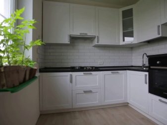
They also use natural wood, chipboard, plastic, but it is more problematic to care for them, and they will last much less.
Most often, kitchen sets are made of chipboard and plastic, the surfaces are made moisture resistant, which makes it easier to care for them and increases their service life.
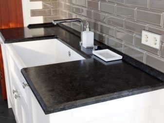
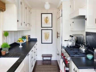
A kitchen made of natural wood looks and costs more, but this option is not suitable for every style. In addition, excessive moisture and temperature changes will not have a very beneficial effect on the tree.
Plastic is less susceptible to all these factors: most often surfaces are made from it, and such kitchens are much cheaper. But you need to be careful with detergents: those that contain chlorine and acid can have a bad effect on the paint - it will become dull, it can change color, or stains are formed from treatment with such substances. So it is better not to experiment with such cleaning agents, but to wash the kitchen with ordinary ones.
Design tips
If the kitchen is large, then there are practically no restrictions on its design, the main thing is that everything is combined in style and color. If a classic kitchen is chosen as a guideline, it can be decorated with only two colors, for example, with a black countertop and a white “apron” or with a pattern in light colors. A black and gray kitchen with the addition of white is also a classic, where the countertop is also black, and the kitchen set itself is gray or gray with white. These three colors go well with each other. You can leave only such a color scheme or make a bright splash in the form of a decorative element - it can be curtains or a floor vase with artificial flowers, a lampshade or a sofa.
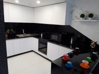
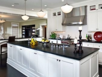
If the kitchen is spacious, it can be divided into zones, which can also be highlighted with color. Absolutely all shades are combined with white and black. Therefore, you can choose a brightly colored dining area for a white kitchen with a black countertop. It can be orange or red, green or blue. If you want a calmer combination of colors, then you can complement the black and white kitchen with blue, gray, lilac, pink.
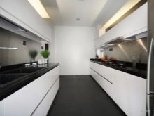
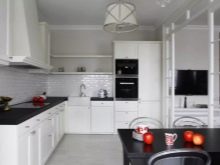
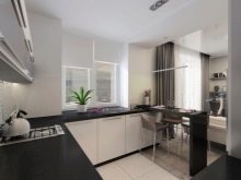
If the kitchen space is small, you need to try to visually expand the space. A glossy surface is suitable for this. It successfully reflects light and visually expands the space. This is facilitated by the white kitchen furniture, which can be combined with the dark surface of the countertop.
Alternative options
If you want to see your kitchen in light colors, then, for example, a cream or beige kitchen would be a good option. These shades are suitable for both small and large areas, but will bring a warm touch to the interior. You can add more saturated shades of the same color scheme to them, complement them with brown or orange.
Against the background of a bright kitchen, an "apron" can stand out. Both abstract and real landscape, and images of kitchen themes will look good. It all depends on what other colors are planned. For example, the color of the "apron" can be made to match the walls. Or a picture will be depicted there, and the walls will create harmony with a corner sofa and a table. It is important to make a choice, focusing on your taste, and correctly place accents. Maybe an unusual chandelier or a picture on the wall will be a good addition.
If you add blue or turquoise color, it will be bright, eye-catching strokes. Turquoise curtains and upholstery of chairs or a turquoise sofa and a tablecloth to match it.
If the kitchen is beige and you don't want to make bright accents, but there is a desire to observe a calm palette, the interior can be supplemented with an interesting clock on the wall, a TV, and flowers in a pots. All this will create coziness and the time spent in the kitchen will be comfortable.

Interesting examples
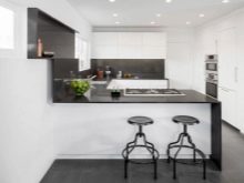
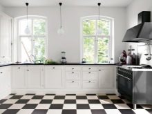
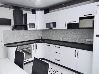
- Ideal for a classic black and white kitchen just like that. The black high-gloss surface of the countertop contrasts with the white furniture, which is complemented by black fittings. The black upholstery of the chairs makes a duet with the white table. And even the tiles on the floor are lined with white with the addition of a black pattern in the center. However, the third color is still there. And it is gray: it is present in the design of the "apron" and the ceiling.In general, the kitchen looks harmonious - for one it is ideal, while for another it may seem too cold and uncomfortable in such a room.
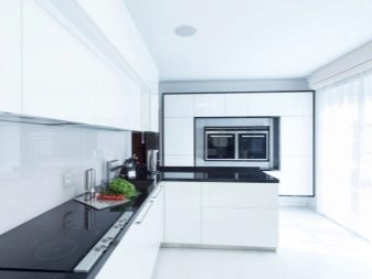
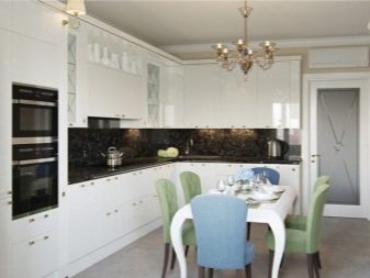
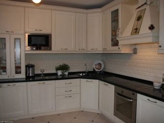
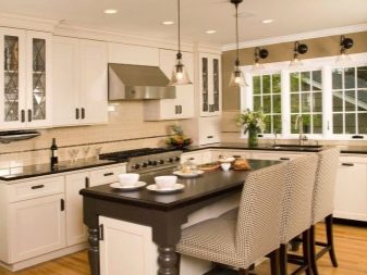
- The beige kitchen also looks good with a glossy black worktop. And the "apron" in the form of bricks and floor tiles to match the kitchen set are also well suited to it. The kitchen looks elegant, everything goes well with each other. But she already looks warmer and more comfortable. It is easier to choose decor elements for such an interior in order to add your own zest.
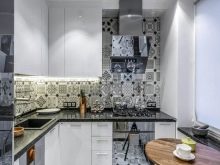
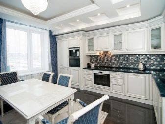
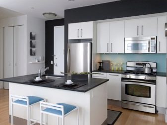
- When additional shades are added to black and white, it also looks like a win-win. White furniture goes well with black surfaces. The gray refrigerator and stove also fit well here. And besides, the floor in brown tones creates a special warmth. Finally, the complementary color is blue, which is used to decorate the apron and upholstery of the chairs. Instead of blue, it could have been any other color. The main thing is that there are not too many of these shades. One or two, at least three additional colors are quite enough, but they should also be combined with each other so as not to violate the overall harmony.
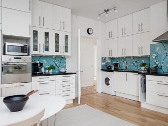
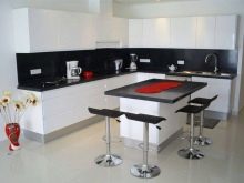
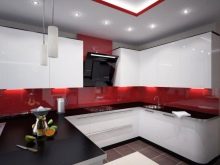
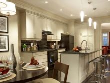
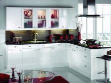
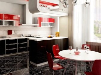
- You can always let in a bright element, and the kitchen will sparkle with new colors. Red goes well with white and black. White countertop with black furniture looks no less beautiful. Red chairs with cabinetry additions set their own accents. You can add a few more color strokes to your liking. A flower, a vase, a lamp, a panel, beautiful dishes - it can be anything. Instead of red, you can use green, blue, yellow, purple. It all depends on preferences.
For tips on choosing kitchen colors, see the following video.


The comment was sent successfully.