Modern kitchen design options
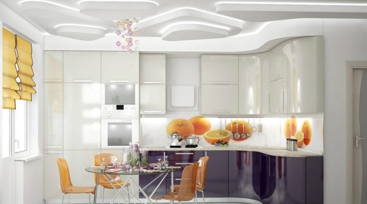
Having conceived to make repairs and update the interior in the kitchen, many do not know which style to give preference to. One of the most popular today is Art Nouveau. What this style is and how to decorate the kitchen in this modern direction, we will tell you in this article.
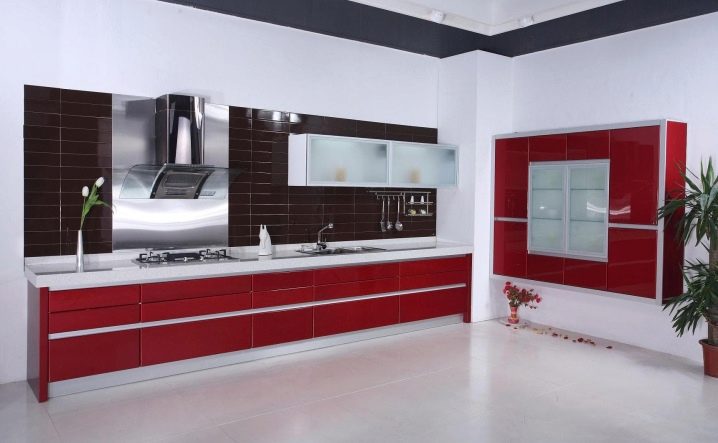
Style Description
Modern (literally "modern") is a modern concept, but this style originated in the 1880s. It is not surprising that floral ornaments were common at that time; the creativity of the artists who foreshadowed Raphael was appreciated; rejection of symmetry was encouraged; simple "natural" lines were used. It was at the end of the 19th century that the first furniture sets were created, distinguished by simple ornamentation, purity of material and uncomplicated lines. But by 1910, these ideas were so exaggerated that, instead of simplicity, Art Nouveau began to manifest itself as an original and expensive style.
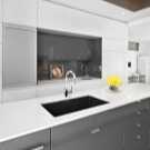
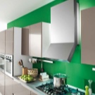
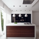
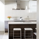
Only after the First World War a new generation of designers began to revive modernity, combining new materials and technologies. This is how panoramic windows and partitions on metal beams appeared, light contoured furniture made of synthetic materials and the desire to unite the space, sweeping away solid walls.
The philosophy of modernity is the imitation of naturalness, nature itself. That is why sharp corners are rarely found here, and if this happens, then the object surrounds the space, symbolizing airiness, freedom, lightness. The main element is a curved line that resembles a flexible liana, a woman's waist, a curl fluttering in the wind. That is why the furniture has a radial shape, and its facade is decorated with floral ornaments.
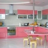
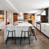
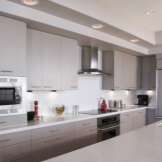
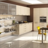
At the beginning of the 20th century, curved furniture was most easily made from solid wood - rosewood, pear, mahogany, stained maple. With the invention of new materials, wood was replaced with lighter and more durable ones, but the desire to have a “wood-like” kitchen remained, which is why these ideas in design are so popular today.
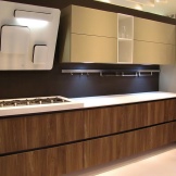
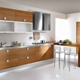
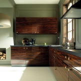
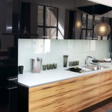
Yet XXI century modern is very different from French art nouveau and Italian liberty. Today it looks more like minimalism, hi-tech or a mixture of these styles - contemporary. There is something from the avant-garde and loft, Scandinavian and even eco-style.
Of course, modern is not an eclectic mixture, but the modern style could not but absorb what was created by time. Therefore, ideas of other styles slip into interiors.
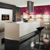
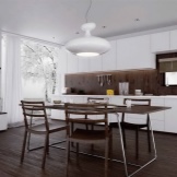
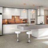
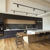
So, it's time to talk in more detail about the features of modernity. The main features of the style include such factors.
- Smoothness of lines. It is used not only in the form of furniture, but also in window and doorways.
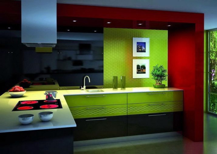
- The color gamut as close as possible to the shades of nature. Shades of beige, white, blue, mustard, golden, brown, olive, silver are used. But modern designers have learned to beautifully apply black and blue, red and bright green.
- Modern looks expensive, and therefore natural wood or its imitation is held in high esteem, gloss on the furniture facade, stone countertops, huge windows.
- The design of the last century did not like bright lighting: it was recommended to make lamps with frosted lampshades. Modern designers argue that modernity should have a lot of light, and from different sources.
- There are very few decor items, but they are very bright, contrasting: vases, fresh flowers, pillows on a sofa or chairs.But no ruffles, toys, clay figurines.
- All things that are in sight must have a practical function, otherwise it is better to hide them.
- It is recommended to use in the design two colors and two materials.
- Finishing of the floor, walls and ceiling can be done with absolutely any materials. To look expensive and to be expensive are different concepts after all.
- Style loves large areas, but also a small kitchen can be decorated according to the rules of modernity. In a large kitchen, you can use an island layout, in a small one - a peninsular one.
- Not only a kitchen set, but also a table with chairs should be comfortable and practical. No pretentiousness and pomp.
- Asymmetry: if not in furniture, then in curtains, but at the same time there should be few textiles.
- Minimum open shelves, even built-in appliances should be practically invisible.
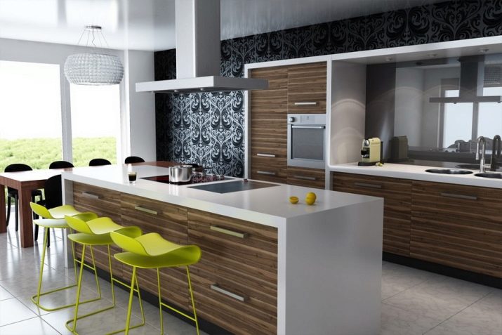
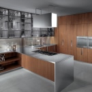
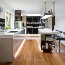
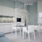
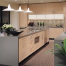
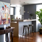
Summarizing all of the above, it can be noted that the design in the Art Nouveau style is a modern view of the world, high functionality and practicality, a complete image. And if you are a fan of constantly adding, buying, changing something, then this option may not work - unnecessary details are not needed here.
Color spectrum
When decorating any room, it is important to remember that the color palette consists not only of pieces of furniture and equipment. This is the whole interior as a whole: the floor, the walls, the ceiling, and the curtains. When developing the design of a future kitchen, you need to find a color balance between all surfaces. The easiest way to do this is when one main color is used, and the second is a contrasting one - as an element of decor. Variations in halftones are possible. If bright colors are used, then there cannot be many of them - this is not an avant-garde.
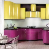
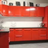
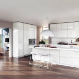
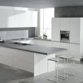
The white color of the glossy surface will visually increase the size of a small kitchen. A large snow-white kitchen is the standard of the concept of "expensive". But do not forget that a bright element, for example, a kitchen apron above the countertop, will make the room more expressive. There are several options:
- all surfaces are white and a few bright spots of a different color as a decoration;
- white furniture against a background of walls and floors of a different color.

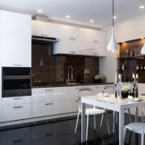
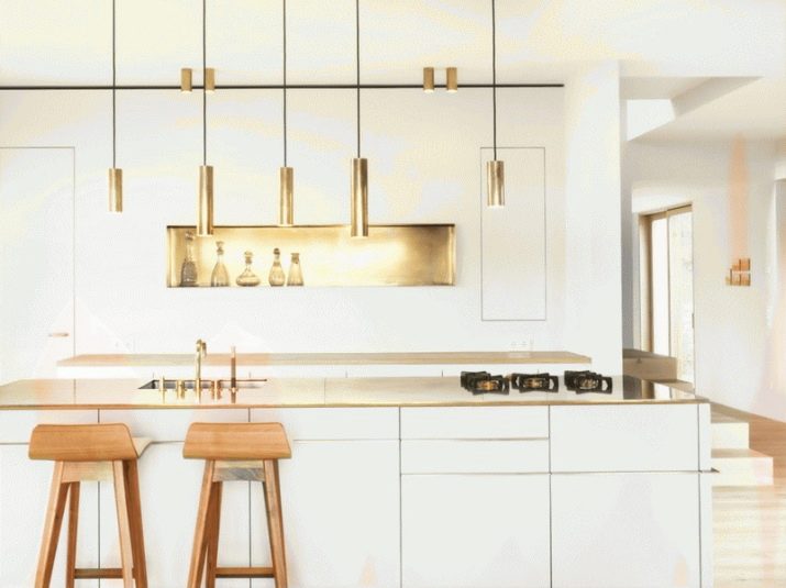
A bright kitchen will turn out if warm pastel shades are used: beige, baked milk, light wood, light green, silver, olive, golden. They will make the room larger and at the same time softer, warmer. They can be used everywhere: walls, ceiling, floor, textiles, headset facade. In this case, different shades of the same color are used for vertical and horizontal surfaces. The difference in textures will give the greatest expressiveness to pastel shades: a glossy facade, foamed wallpaper, artificial stone.
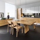
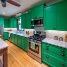
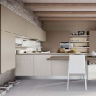
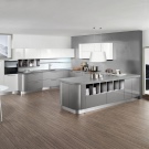
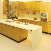
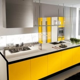
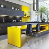
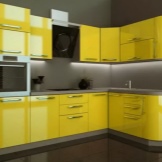
Yellow has become extremely popular in kitchen design. Pleasant, non-toxic shades of yellow help to relax, replace the sun on gloomy days or in dark rooms. Combines well with brown furniture and floors or subtle shades of green.
If the kitchen is completely made in yellow, then small red details can be used as a second color for decoration: dummies, sconces, a flower pot.
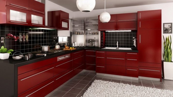
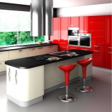
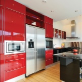
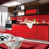
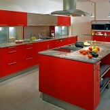
Red is not quite a typical modern color, but it can be muted: use matte surfaces, combine with darker browns or blacks. Red and black is a favorite combination of many designers, but you shouldn't use it in a small kitchen. But metal elements will decorate a red kitchen of any size.
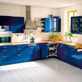
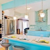
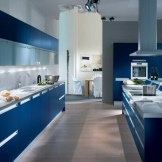
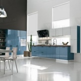
If the kitchen has large windows facing the sunny side, then all shades of blue are a psychological salvation from the heat. From sky blue to navy blue, all shades are suitable for the modern style. In addition, blue reduces appetite, but causes apathy. This must be taken into account when arranging a general gathering place.

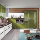
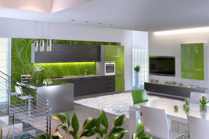
The color of living nature is native to Art Nouveau. Light shades or a combination of juicy green and pale yellow look better. Light green, the color of young greenery is suitable for curtains and shades.All shades of green are perfectly combined with chrome details. And this is the most suitable color for floral designs.
Brown color, on the one hand, is the most standard color for floors and furniture, on the other hand, wood grain patterns make any room truly warm and cozy. It is important to choose the shades and patterns on the surfaces correctly: noble chocolate looks much better with plain beige than with checkered linoleum. Combination with milky white or creamy walls will bring real pleasure to connoisseurs of beauty.
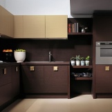
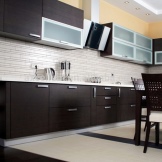
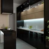
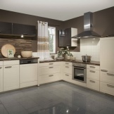
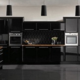
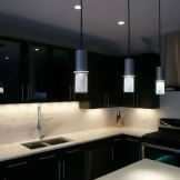
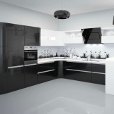
The use of black depends on the size of the kitchen: in a small room, the abundance of this color will psychologically crush. Do not use it in large quantities in dark rooms. But black goes well with all colors and shades.
It is worth remembering that every drop or speck of dust will be visible on the glossy black surface. The larger the room, the less noticeable the errors.
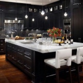
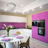
Recently, shades of purple are gaining more and more popularity in design. It's beautiful, stylish, but you must take into account the size of the kitchen.
Materials and design
Contemporary style requires modern materials. Now it is difficult to find furniture made of solid wood, they do not put parquet from natural solid wood, but they almost always use materials that imitate wood: for the ceiling, walls, floor and the furniture itself. But plastic, glass, metal elements are also popular. The main thing is that all materials must be suitable for the kitchen conditions: high humidity and fire hazard.
Walls
Vertical surfaces should be flat, with minimal texture. This can be achieved by painting decorative plaster, decorating walls with MDF or PVC panels, gluing various types of wallpaper. The main principle is plain walls or a dull pattern in the form of floral ornaments or stripes. But there are pleasant exceptions - when a large floral pattern harmoniously blended into the style.
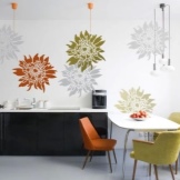
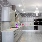
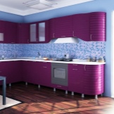
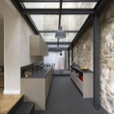
Pastel colored artificial brick has found its wide application in design. The texture is small, but the volume looks interesting as a kitchen decor. A special place is occupied by a kitchen apron, which is usually made of glass, MDF, tiles, mosaics. It is the apron that can be the only bright spot in the entire monochromatic kitchen.
Floor
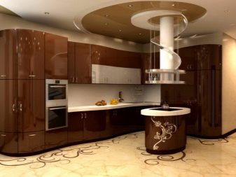
For the flooring of a modern kitchen, it is not recommended to use parquet: either straight natural boards, or laminate, linoleum or ceramics. It is very important to choose the right pattern for the floor: it should not be colorful, contain many elements, if the kitchen furniture has bright enough colors. But the color can be very different: from gray-haired white to burning black. Large color combinations look very nice. It is also interesting that Art Nouveau loves not only glossy furniture facades, but also glossy floors. Self-leveling floor technology allows you to match the color and pattern to any interior.
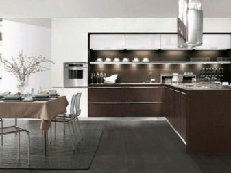
Ceiling
Almost all materials can be used to decorate the ceiling. A few years ago, multi-level plasterboard ceilings were very popular. Now the designers themselves consider this idea outdated, but if it suits your kitchen, why not. Drywall is covered with matte paint. Perfectly combined with the style features of wooden ceilings or imitating wood.
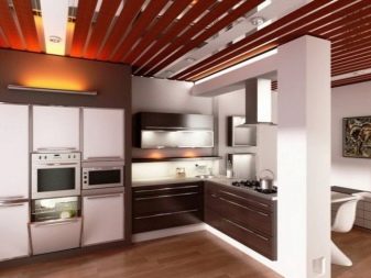
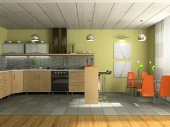
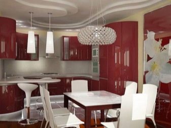
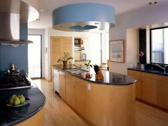
Stretch glossy ceilings are more and more common: a wide variety of colors, ease of installation, durability have made the material easy to use. But an ordinary concrete bleached ceiling suits modernity no less: monotony, dullness, simplicity - everything that a style needs.
Window decoration
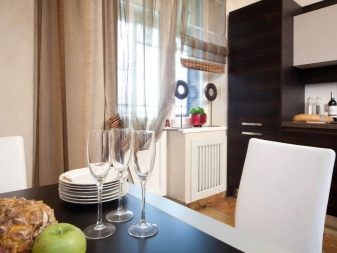
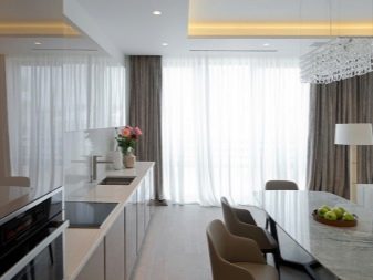
Designers recommend using textiles to a minimum. Therefore, windows are often decorated with blinds: Roman, rolled or pleated. If fabric curtains are used, then they should be light, airy. Material - taffeta, silk in one or two layers. There are several rules for modern style blinds and curtains:
- folds and asymmetry are welcomed: with this option, a feeling of slight chaos is created where there is none;
- pastel shades are used: in a white and beige kitchen, you can pick up curtains literally a few shades darker, and the kitchen will become more noble;
- flowered linen curtains are not suitable here - only an airy canvas.
Lighting
For such a kitchen, the light should be different, but have the following features:
- illuminate the working and dining area;
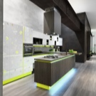
- the style involves various types of lamps: LED spot technology, a pendant chandelier (and more than one), fluorescent lamps over the kitchen apron and sink, decorative night lighting over the floor, LEDs in the kitchen set, wall sconces;
- for ordinary lighting, natural yellow or white light from lamps is used; for decorative lighting, the color is matched to the interior;
- lamps are not very diverse in shape: mostly balls, ovals or dots, but they can be stylized to resemble plant elements.
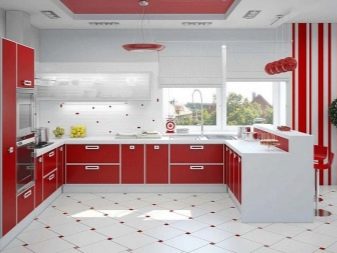
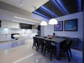
The main thing is that there should be no dark corners in the kitchen. But too bright light should be avoided.
Headset selection
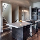
The size of the kitchen will affect the shape of the headset. It can be straight, L-shaped or U-shaped. The materials used for the headset are solid wood, plastic, MDF panels for wood or monochromatic, glass, PVC film. Narrow handles as fittings characterize modern furniture or the complete absence of handles (cabinets are opened using a special mechanism by pressing the door). A minimum of open space and decor, only a little floral design on the facades. And this despite the fact that sharp corners must be avoided in every possible way.
The most popular among buyers is Italian kitchen furniture. Of course, there is a colossal price difference: buy a kitchen set made in Italy from solid wood, or made in our country with Italian facades made of fine wood. But the choice is always up to the buyer.
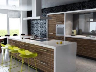
For arranging a standard kitchen in a high-rise building, modular furniture will be a real salvation, and manufacturers offer a wide selection of such headsets. But many people choose custom-made furniture: this is a special project, room for imagination. Furniture for a large kitchen can be designed with an island on which to place the work area; for a small kitchen - with a peninsula where the dining table will be located. When installing a headset with an island, you need to consider the following features:
- the island can be mobile or stationary;
- if it is planned to place household appliances or a sink in it, then it will only be stationary;
- to the island with kitchen appliances, it is necessary to bring communications at the design and repair stage (electrician, water pipes and drainpipes):
- the floor as a result of these manipulations will have to be lifted;
- a hood is usually installed above the hob;
- whatever is located on the island - a work or dining area - there should be ceiling lighting.
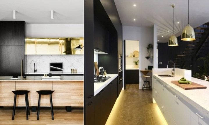
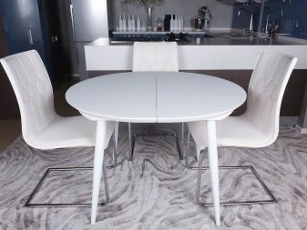
If the dining area is a free-standing table and chairs, then the furniture is chosen compact:
- narrow table and bar-type chairs;
- round table and chairs with rounded corners:
- in wood-like design - wooden table and chairs with high backs.
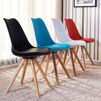
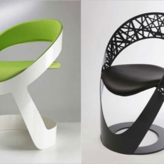
It is for this style that plastic furniture is often bought, and it does not look cheap. You just need to pick up wooden or metal legs, curved or emanating from the center of the table (chair). The use of stools or chairs with a very low back is allowed.
A kitchen set should have a good storage system: the larger the family, the more drawers you will need. And household appliances have no place in an open space. If the kitchen is small, then the cabinets rush upward, being placed not in two, but in three tiers.Drawers, pivoting radius shelves will also help save space. Moreover, these modern storage systems are fully consistent with the design of the style.
Beautiful examples of interiors
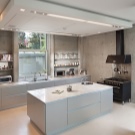
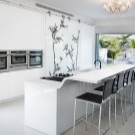
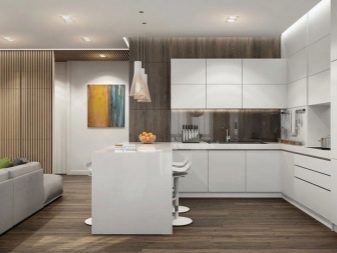
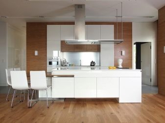
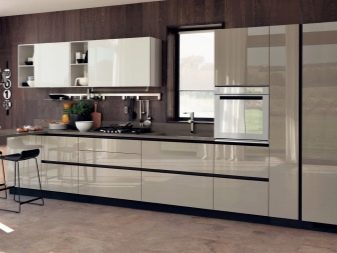
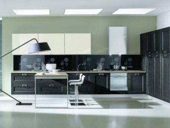
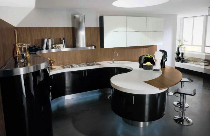
Contemporary Art Nouveau kitchens are a combination of sophisticated restraint and innovative technology. The style loves a large space, but will also fit into a small kitchen. It is characterized by warm wood and cold gloss, light plastic and heavy metal: balance, balance, dao. And there are a great many examples of this path to perfection. The ergonomics of this peninsula kitchen in a small space is striking: every detail is in its place. Concise functionality for a small family of adults.
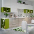
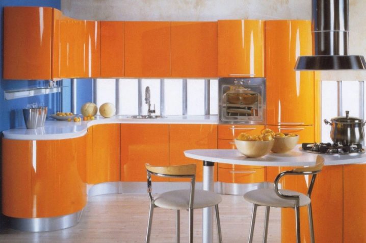
This sunny kitchen creates a completely different mood. The corner kitchen unit with radius corners seems to take up little space, but the arrangement of the drawers in two tiers makes the storage system very functional. This is facilitated by an island with a hob and dining area.
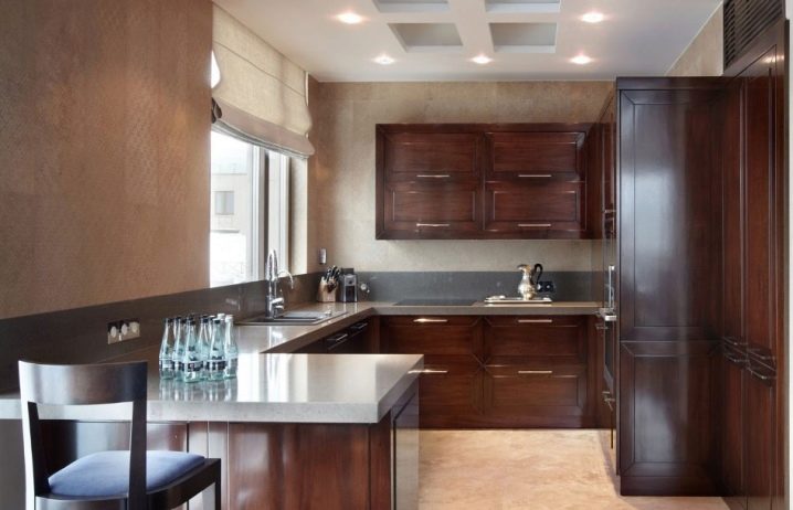
Classic kitchen wood-like U-shaped. Due to the chosen shape, it was possible to connect the work surface with the dining area, increasing the number of floor cabinets. A very competent color selection of floor and wall finishes, a good choice of blinds and an original kitchen apron around the perimeter of the headset.
For information on how to plan an Art Nouveau kitchen, see the next video.


The comment was sent successfully.