How to design a minimalist kitchen?
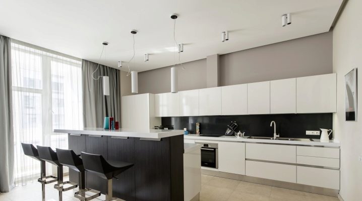
Minimalism in the design of premises is a design characterized by simplicity of forms, precision of lines, clarity of composition. It eliminates unnecessary space-consuming parts that reduce operational efficiency. This style is the best solution for finishing small areas - up to 10 sq. m. These metric parameters include kitchens in small apartments "Khrushchev". As part of the style, the kitchen room undergoes redevelopment for this design, the furniture set and design are selected in the correct color combination.
Style features
Renovation in the style of minimalism and renovation to a minimum are unrelated concepts. The simplicity of minimalism does not mean cheap or low quality. On the contrary, laconicism and functionality put it one step above other types of finishes. The characteristic gloss and gloss create a sense of order and stability of the interior atmosphere. Subdued neutral colors facilitate visual perception. Their number does not exceed 2-3 shades. Decorative, vintage elements are completely absent. Household appliances in a minimalistic kitchen are built-in. Its location is ordered and subordinated to a specific purpose.
Design and zoning
A characteristic feature of the minimalist style is the delineation of the premises into functional zones. Among them are those that are intended for:
- cooking;
- her reception;
- storage of utensils;
- recreation.
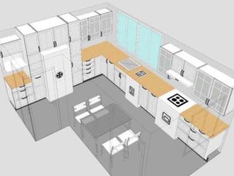
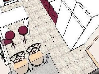
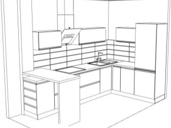
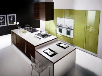
Each zone is divided into sub-zones. In the cooking area there is a place with a stove, oven, sink and cutting table. It uses blocks to store utensils that are used in cooking. The eating area includes a main table and seating for several people or a counter. You can drink a cup of coffee with it without resorting to serving. Storage space.
In this area there is a refrigerating chamber, various cabinets and shelves containing containers with food and other kitchen items.
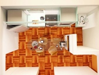
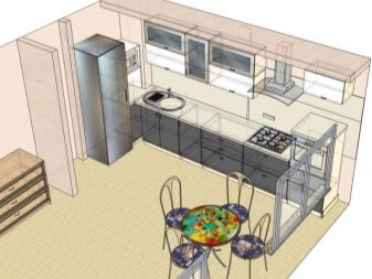
Relaxation space. This area accommodates a small sofa or couch. The listed zones can be located separately or paired with each other. The minimalistic 9-meter kitchen is three meters long and three meters wide. In such a small area, it is not easy to fit all the necessary zones. Therefore, careful planning and advance design are needed. If the kitchen is located in a building with an open plan, it is possible to expand its functionality by turning the kitchen into a studio. To do this, a passage door is cut into the adjacent room. It is often used to integrate a bar counter that works on two sides.
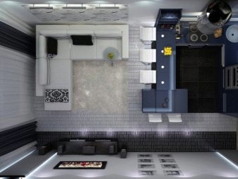
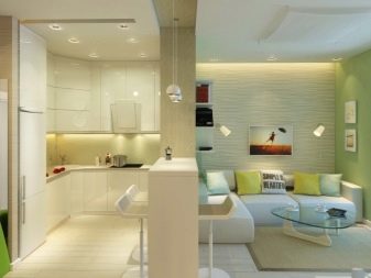
At the design stage, the functional areas are allocated a measure of the area corresponding to the intended purpose. It is measured as a percentage relative to other areas. The gradation of their sizes depends on the wishes of the kitchen user. In some cases, more than 40 percent is allocated for the cooking area, in others, the bulk is given for a place for eating (for example, if you have a large family). Passage areas are determined in advance. They should allow one or more people to move freely around the kitchen.
In accordance with the characteristics of this style, a communication scheme is designed. Their list includes:
- water pipes;
- gas supply;
- sewer drain;
- wiring.
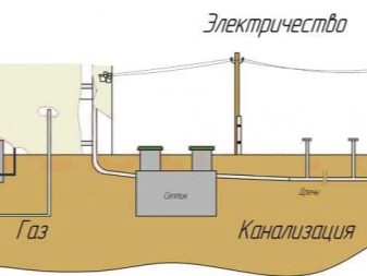
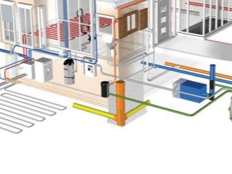
The output points of the communication nodes must be determined in advance.
Their revision and technical parts are hidden from the eyes of the observer. Access to them remains free.
Registration
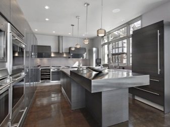
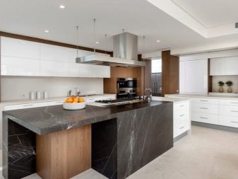
The interior in the style of minimalism involves the use of modern finishing materials. These are plastic, glass, metal, ceramics. At the same time, the organic introduction of materials of natural origin - wood, stone, fabric - is not excluded. The selection of such a combination should be done by professionals, since there is a possibility of moving away from the main style to another.
Walls
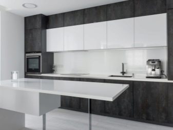
A pronounced feature of the walls in the style of minimalism is their monotony. When designing, avoid combining different colors on the same plane. This combination is allowed in the case of abutment of two different planes to each other, for example, adjacent walls. This attitude towards color is reflected in the choice of design solutions related to textured coating. Adjacent surfaces can contrast with the profile of their texture: gloss - roughness, metal - wood, artificial - natural materials. Decorative florid patterns, ornaments are not used. Preference is given to straight lines, regular shapes.
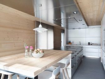
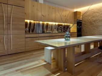
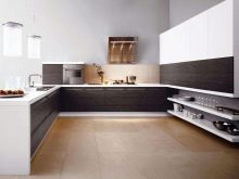
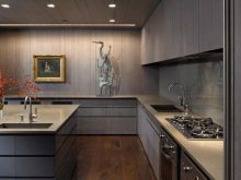
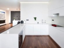
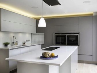
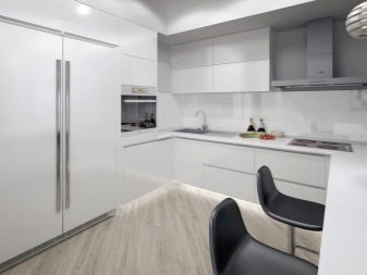
Minimalism is characterized by cool tones and shiny surfaces, although not always. Common shades include:
- black;
- Gray;
- black and gray;
- gray-white;
- White;
- similar variations of combinations of a beige shade.
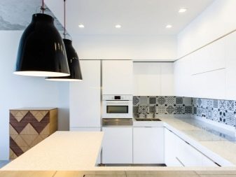
Ceramics, laminated panels, impact-resistant glass are used for finishing the apron.
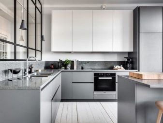
Floor
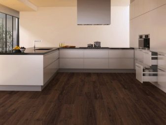
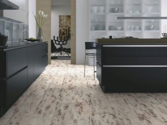
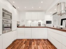
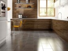
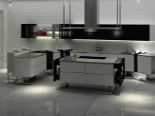
A floor in the style of minimalism is that part of the kitchen that can be made of natural materials: stone, wood. Such a design solution will give the room an atmosphere of minimalistic character and simplicity, combined with the effect of high cost and gloss. Minimalist flooring colors tend to be extreme. For example, the tiles chosen for the kitchen floor can be either black or white. Intermediate tones are generally discouraged. The same applies to other types of coating: wood, stone, laminate.
Ceiling
The ceiling should be as light as possible, preferably white. Dark tones absorb light, which will impair the visual experience of the room at night. The ceiling, which absorbs some of the lighting, will exert a pressing effect on the subconscious of people in the kitchen. This can negatively affect your emotional and even physical well-being. Light colors reflect light waves, increasing the percentage of room illumination.
The presence of a sufficient amount of light has a beneficial effect on human perception, activates positive emotions and improves well-being.
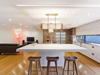
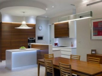
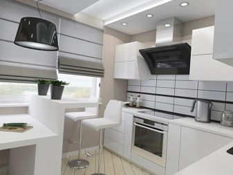
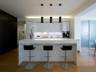
Popular materials for finishing the ceiling in the style of minimalism are:
- drywall, 1-2 levels;
- tension material;
- panels (wood, plastic, metal).
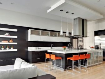
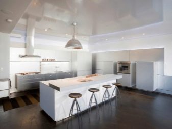
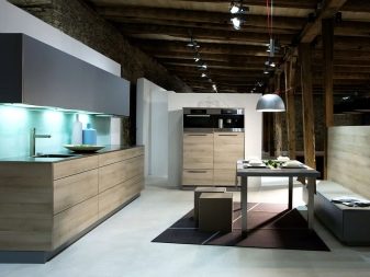
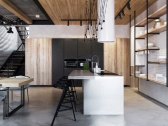
A single-level plasterboard ceiling is putty and painted white. If additional levels are equipped, they are covered with white or tinted paint. In both cases, the ceiling texture is matte. Gloss can be achieved using a special water-based varnish.
There are two types of stretch ceiling - matte and glossy.

The second type is rarely used. It must fully fit into the design of the room. Among the elements of the interior there should be many that have glossy surfaces. The matte stretch ceiling gives the surface a natural and clean effect. It is made of a solid sheet, and the surface of the rough ceiling must maintain its integrity to exclude damage to the tension sheet.
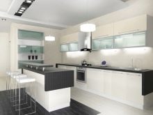
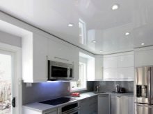
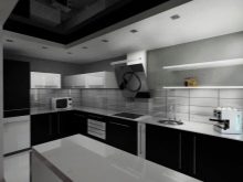
Furniture selection
Minimalism in the field of visual perception is complemented by the convenience, functionality and ergonomics of the furniture.Its obligatory characteristic is the factor of embeddability and the possibility of transformation. Furniture should organically fit into the design and give maximum efficiency in a minimal space. The front part of the kitchen set is decorated with blank surfaces without additional decor, in a monochromatic spectrum. The minimalistic style lacks furniture with glass windows. What is inside is hidden from the eyes of the observer.
To cover the countertop, a natural material - stone can be used.
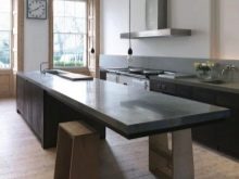
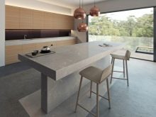
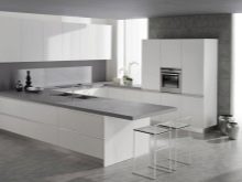
Mostly polished granite is used for the tabletop. It is a strong material that is not susceptible to mechanical damage and the influence of aggressive chemicals. Chrome plated metal surfaces are welcome. Among them may be cabinet handles, the surface of the exhaust system, panels of household appliances - stove, oven, refrigerator and others. If natural wood or a material that imitates it is used in the design of furniture, tones are selected that sharply contrast with the rest of the interior elements. The contrast of time is allowed: antiquity against the background of modernity or vice versa. The use of patterns and ornaments on wooden surfaces is excluded.
Beautiful examples
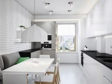
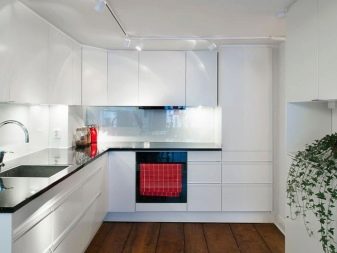
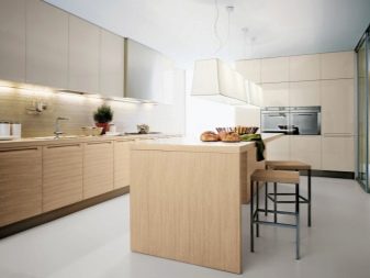
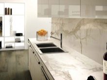
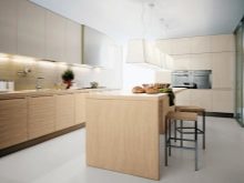
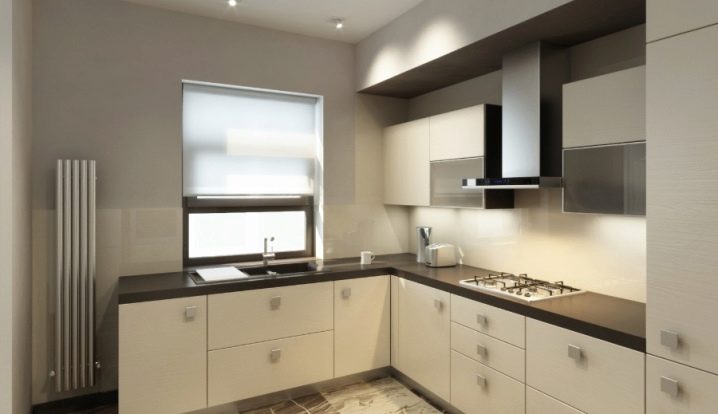
The room is decorated in soft beige tones, using contrasting combinations with darker elements. This design assumes light facade surfaces and shaded horizontal planes, which creates a color balance and facilitates the visual perception of the room. The interior is filled with straight clear lines, regular shapes, sharp angles.
All functional areas are located along the wall, communications are taken into boxes and are inaccessible to review during surface observation. The water supply point and sink are located at the window - a source of natural light. Frosted glass unit protects the room from external view, which eliminates the need for curtains or blinds. The matt ceiling in a light, subdued shade is marked by spot lighting, equipped with a beam directivity adjustment function. This solution is a characteristic feature of the minimalist style.
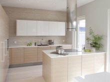
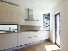
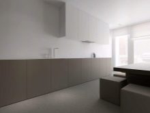
The walls are in one soft beige color. In this case, the use of a contrasting color combination of adjacent wall surfaces was not applied.
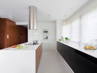
The floor is finished with large tiles. Its stylization is made in the form of imitation of natural materials with the selection of appropriate contrasting tones. The apron covers almost half of the two walls of the kitchen. It is made of light-colored tiles with a geometric pattern. The furniture fits seamlessly into the available space. Built-in appliances were used in the form of a gas stove integrated into the surface of the countertop. Chrome metal surfaces complement the interior design and give the space a modern character.
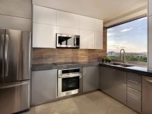
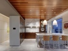
A distinctive feature of this design is the use of contrasting solutions in decoration. In this case, natural materials of natural origin are used, such as wood, metal, and artificial materials - plastic, laminate, glass.
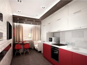
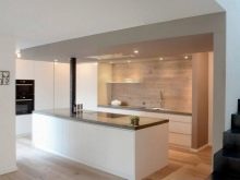
The ceiling is marked in an unusual way. Wooden slats, placed on the edge, are attached to the light surface of the ceiling. This combination of shape and color creates a sense of the remoteness of the expansion of the room upward. The lighting is placed at a distance from the ceiling, which prevents the formation of additional shadow from the slatted design. Transparent shades provide maximum light output in all directions. The floor is covered with light, almost white tiles.
The effect of the opposite contrast of the main horizontal planes is created - this is a non-standard solution in the design of the kitchen, since the ceiling is usually made lighter than the floor.
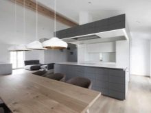
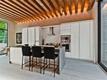
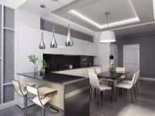
The available space allows the front wall to be used to a minimum. There is no kitchen set on it.It is replaced by simple straight shelves, into which the hood box fits organically. Household items installed on the shelves correspond to the style of contrasting modernity and classics. The apron, like most of the front wall, is covered with wood paneling. This is the main design highlight that catches the eye of the observer in the first place. It creates an atmosphere of coziness and a feeling of closeness to nature against the background of the technological functionality of other parts of the interior.
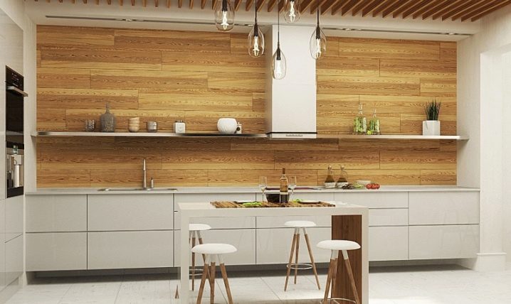
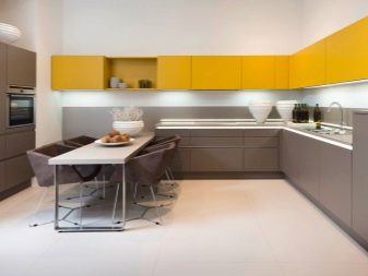
The dining table, located in the center of the kitchen, has 4 seats. It is made with a combination of natural wood and white laminated flooring. High-legged stools are his addition, designed accordingly. All stationary household appliances are built-in. It has a striking design and functional characteristics. Straight and clearly defined horizontal lines create the effect of expanding the room and complement the overall style.
How to decorate your kitchen in a minimalist style, see the video below.


The comment was sent successfully.