Features of finishing the kitchen with tiles and wallpaper
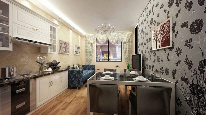
The kitchen is the most beloved and cozy place in the house, so it is important to think over the style of the interior as much as possible, to choose the right combination of colors and textures. Kitchen decoration with tiles and wallpaper is the central link in the design. It is not enough just to carefully stick the materials, it is important to select and combine them. Kitchen interiors can be bright or decorated in restrained colors.
In addition to visual impact, materials must be practical, moisture and high temperature resistant.
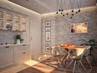
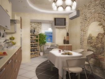
Choosing a finish
Despite the wide range of materials for finishing kitchens, traditional tiles and wallpapers still dominate.
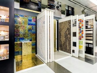
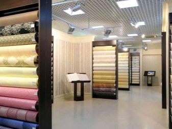
Wallpaper
The main qualities that people pay attention to when choosing a wall covering are non-staining, resistance to steam and heat, harmonious design. A rich selection of wallpapers is offered.
- Paper-based. This is a very inexpensive segment, represented by a variety of colors and ornaments. This type is not recommended for the kitchen, it cannot be cleaned. However, it is possible to use them in combination with more resistant materials, decorating the dining area.
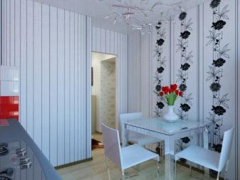
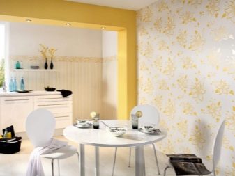
- Non-woven base. This is a more serious version of paper wallpaper, which, in addition to cellulose, also contains polymer. They are good for painting, their structure is unusual. It is very simple to glue them, they are breathable, dense and easy to clean. An undeniable advantage is the ability to repaint if you are tired of the design.
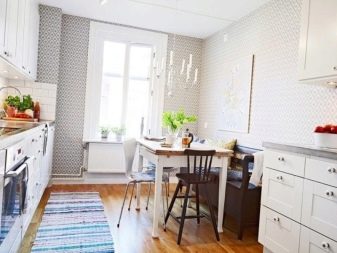
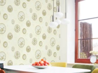
- Vinyl. The most common type, their base can be either paper or non-woven with a vinyl coating. They perfectly hide the defects of the walls, are durable, easy to maintain, and withstand mechanical damage. They give great opportunities for design, as they imitate wood, stone, brick. Minus - they do not allow air to pass through, therefore, antifungal treatment is recommended in too damp rooms.
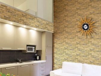
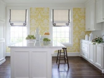
- Glass fiber. A novelty with high strength, fungus will not develop under them, they are heat-resistant and not subject to static. They may not lose their original appearance for up to 30 years. If the design is boring, you can easily repaint it. Of the minuses - the high cost and the need for perfectly flat surfaces. There are wallpapers made of bamboo, textiles, photowall-paper, liquid, but they are suitable only as an element of the design of the dining area due to their fragility. The popularity of wallpaper in the design of kitchen walls is explained by the simplicity of dismantling and stickers, an affordable price, as well as a huge selection of options.
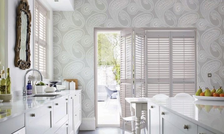
- Tile. Ceramic tiles are an all-time hit. It is incredibly practical, durable, and easy to clean. Moreover, every year manufacturers offer new tiles of different sizes, shades, textures, ornaments. The most popular solution is to decorate the work area with tiles, the so-called apron. So you will protect the walls from stains, streaks, grease, all this can be removed from the tiles very easily.
The tile is not afraid of moisture and temperature changes - these properties allow you to safely use it in the hob area.
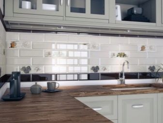
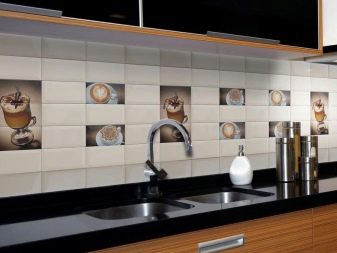
The shape of a tile can be:
- square, 10 by 10 or even 50 by 50 cm;
- rectangular in different sizes;
- bricks of the classic size;
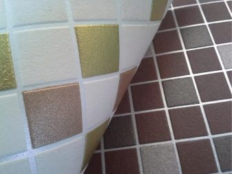
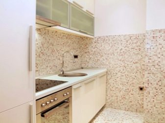
- mosaic or imitation mosaic;
- oblique octagon;
- decorative elements, such as panels, friezes, which bring expressiveness, originality into the design and harmoniously fit into the overall composition.
The most impractical type of all of the above is mosaic, there are a lot of seams in this design, and dirt and microbes accumulate in them. Visually, tiles are classified into glossy and matte. The easiest way to clean is gloss without thread, in addition, it is more practical in terms of the visibility of streaks, drops and stains.
Another plus is the obvious visual expansion of the space, which is especially significant for small spaces.
Combination of materials
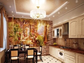
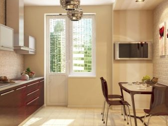
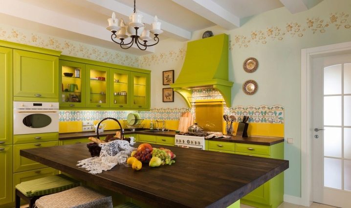
Most often, in modern housing, the kitchen combines both the working and dining areas, so its functionality is expanded. The correct combination of materials will take into account the characteristics of each of the zones and distribute them adequately to the load. Workspaces that are prone to dirt, high humidity and heat are ideally tiled. This is a sink, a hob. The rest of the room can be safely decorated with wallpaper, it is cheaper, more interesting in terms of design, more comfortable, leaves room for interior experiments. The use of additional elements in the decor looks great: glass panels, decorative plaster, photographs on various surfaces, wood trim.
How to arrange the joints correctly?
Tile laying methods depend on the size and shape of the selected material, the presence of decor. Experts distinguish between three main methods:
- diagonal, that is, the direction of the masonry goes from one corner to another, is suitable only for square tiles;
- the staggered or offset method, in fact, is similar to brick laying, in which the material of the subsequent rows is laid in such a way that its center falls on the seam of the lower row;
- traditional, in this case, tiles of any shape and size are laid out in an even row, the seams form the correct mesh.
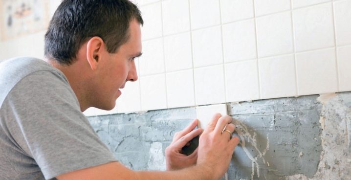
These methods are used both for laying out walls and floors. Ideally, the tiles for both surfaces should match in style and color, and be from the same collection. If you have made a decision to combine materials from different manufacturers, be sure to lay down a certain amount of stock when buying, which will be spent on errors when cutting and fitting.
As a rule, this is at least 15%
There are three ways to create an aesthetic, invisible transition between materials:
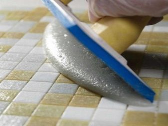
- using grout, rounding inward, after drying, the joint is sanded, the wallpaper is glued with an overlap;
- decorate the joint with a convex grout, paint it to match the color of the wallpaper;
- use overlays made of metal or wood, if the chosen design allows it.
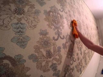
Beautiful examples
The brighter the tiles, the sharper the contrast, the calmer, more concise the walls should be. By observing this simple rule, you can avoid too flashy and intrusive interior, even using very bright tiles to decorate the work area.
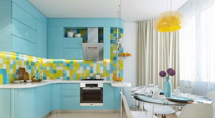
To fit such a combination, it is enough to dilute it with a third neutral shade, for example, white, and use it as the main color of the wallpaper.
An incredibly positive combination of shades of yellow and blue looks great against a snow-white background.
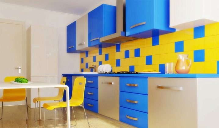
The yellow-blue composition will serve as an excellent backdrop for blue accents and neutral wallpapers.
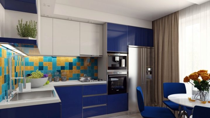
Such a color scheme will look especially advantageous in a patterned version against a muted blue-gray background.
For the features of finishing and repairing the kitchen with tiles and wallpaper, see the video below.


The comment was sent successfully.