The subtleties of kitchen zoning
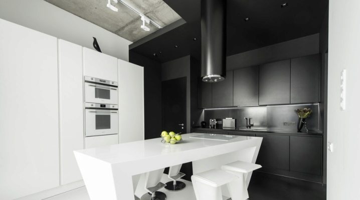
In many apartments, the kitchen is not only a place for cooking, but also for eating. In some families, there is also a TV and a kind of seating area. In any case, the kitchen plays an important role in the house, so the zoning of this room should be done according to the rules.
rules
Kitchen zoning should be carried out, taking into account both the style of the interior and the performance of each zone of a particular function. In addition, it should be remembered that each part of the room has its own individual requirements. For example, the work surface should be close to the sink and stove, and the dining area should be well lit. In addition, it is important to respect the proportions so that one kitchen area does not "suffer" from the other.
Main zones
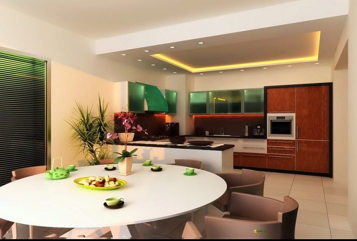
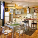
The division of the kitchen should be carried out in such a way that two main zones are created: a work and a dining area. In the first one is cooking and storing food, and in the second, as you might guess, eating food. If the size of the room allows, then you can also highlight a recreation area. - for example, put a small sofa against the wall, and place a TV in front of it. Young people will also like the bar area, which, by the way, takes up minimal space.
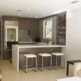
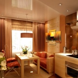
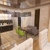
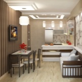
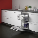
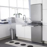
The washing subarea should include a sink, dryer and, if necessary, a dishwasher. It is also customary to place a trash can under the sink. The working area usually consists of a stove, a variety of necessary equipment and a surface of sufficient size., on which all operations are carried out. The dining area is impossible without a table and several chairs, and the table itself can be either folding or stationary. It is recommended to move this section away from the cooking section.
Types of zoning
There are three main ways to zoning a kitchen space.
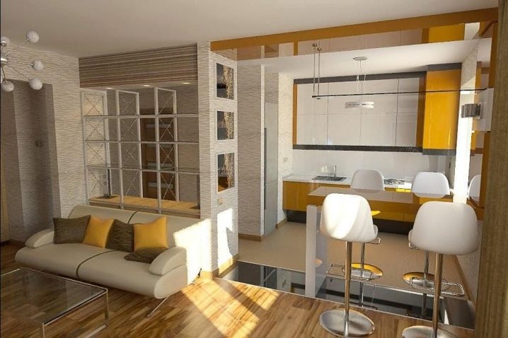
Furniture
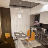
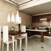
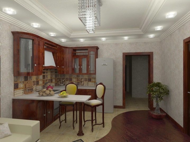
This method is considered the simplest and most common. The easiest option is to use the dining table. If you install it on the border of individual zones, then you can easily separate the cooking area from the food intake area. To enhance the effect, you can surround the large table with chairs of different colors, but in the same style. Some of them will correspond in color to the dining area, and some will correspond to the working area.
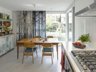
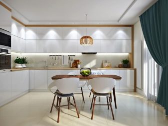
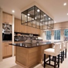
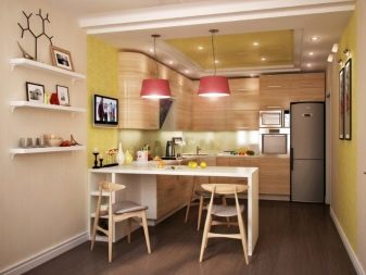
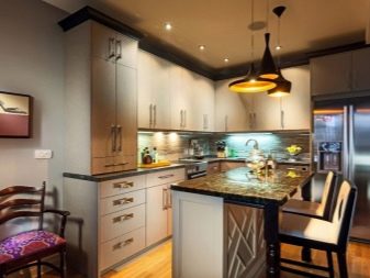
Another common option is a large square or rectangular kitchen island that integrates a work area, sink, storage space, drawers, and probably a stovetop. When using this divider, it is important to leave enough free space between the table and other objects. In principle, to divide the kitchen space into two zones, you can also use an ordinary sofa. If you put it to the dining table, and turn it back to the kitchen set, then the necessary section will occur, but the square meters will not be lost. It is only important in this case not to choose quickly dirty sofa upholstery.
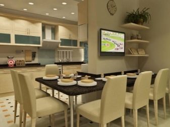
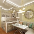
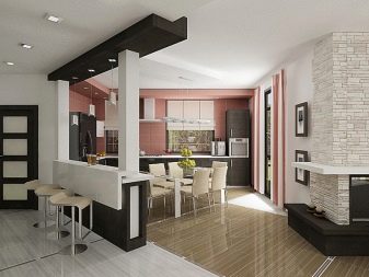
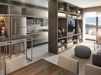
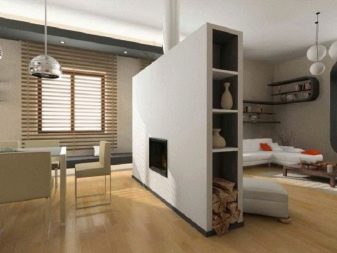
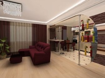
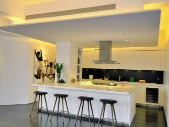
In a studio that connects both the kitchen and the living room in one space, it will be possible to divide the space with the help of a neat cabinet. Thus, not only will there be additional storage space, but it will also be possible to divide, in fact, one room into 2 components. At the same time, it is recommended to arrange the back wall in some way, for example, hang a poster or fill it with photographs. Of course, it will be possible to zone the space with such a common object as a bar counter. Its use is typical both for individual kitchens and for spaces combined with a living room. The bar counter is a salvation for a small space, because it not only copes with the division of the room, but also replaces the dining table if necessary. In addition, the presence of this interior element immediately modernizes the interior.
Lighting
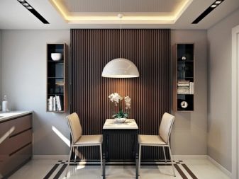
Correct zoning can be done with light. By modifying the location of the bulbs, it will be possible to highlight the dining table, work surface, bar counter or stove. To highlight the cooking area, it is recommended to use light bulbs that can be built into the surface of cabinets, elongated lamps mounted on an apron, or the purchase of illuminated equipment, for example, hoods. The dining area should be made near the window, and if this is not possible, then mount a lamp above it with the ability to adjust the height. In the same way, soft illumination from spotlights placed on the ceiling or on the floor, or from ordinary wall lamps, will work.
Finishing
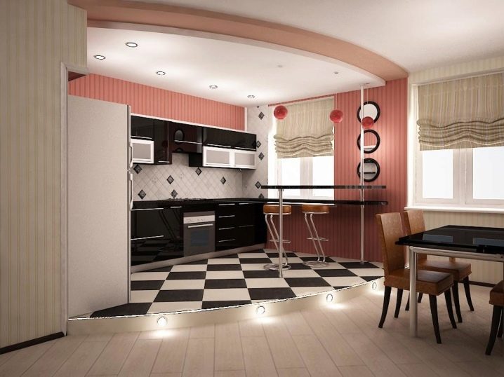
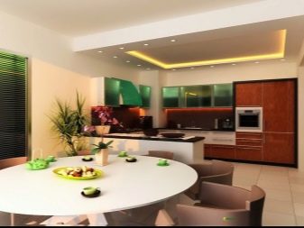
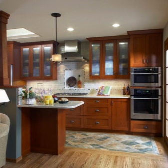
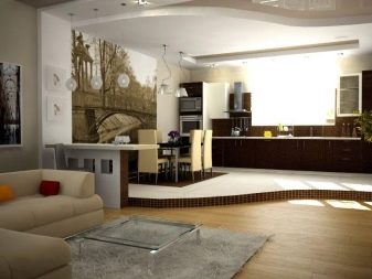
Finally, zoning is carried out using a variety of finishes: it is highlighted with plasterboard, wallpaper or wall covering, floor or ceiling level are changed. A podium is created on the floor or several floor coverings are used that seem to be of different heightsdespite the fact that they are on the same level. The walls are decorated with different materials, for example, the work area is complemented by ceramic tiles, and wallpaper with the possibility of washing is glued next to the dining table. The boundaries between different types of materials should be visible, but not excessively.
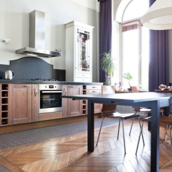
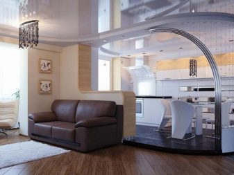
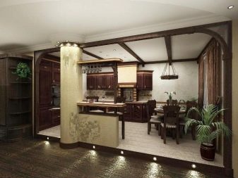
Different materials can be replaced with the same materials that differ in shade, but are in the same color palette. In the case of a kitchen combined with a living room, the use of contrasting colors is allowed, but very thoughtful and neat. The podium is most often used to highlight the dining area, although it will also come in handy in a situation where you have to hide the existing communications of the working area. Typically, this element is accompanied by light emission.
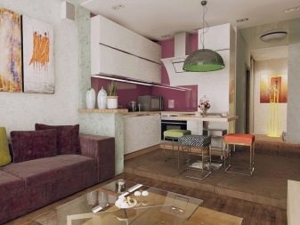
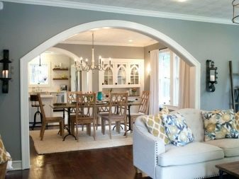
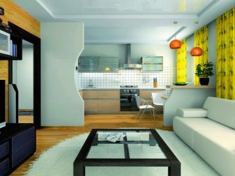
By the way, the construction of plasterboard structures, which are a full-fledged partition, arch or semi-arch, is considered very popular. Sometimes this element is recreated from wood or glass - so it becomes not only a functional object, but also a full-fledged highlight of the interior. In addition, screens made of other materials or even fabric curtains are used for zoning. The latter are highly mobile and, if necessary, are quickly dismantled or replaced by curtains with a different style. There are also sliding partitions, which are recommended to be closed during cooking, and at the end of the process, combine the zones back.
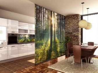
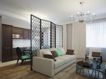
Of the unusual zoning methods, one can single out the use of an aquarium or a combination of cells with unusual objects inside. The dining area can also be highlighted by placing wall murals, a large painting or posters on the walls. And, of course, the most effective will be the use of several of the above possible methods.
Design
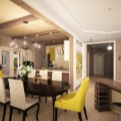
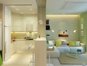
Very often in an apartment, especially in a high-rise building, there is a combination of a kitchen and a living room, in which zoning of space is simply necessary. In this case, any options for allocating individual sections of the room are possible. It is most convenient to place a bar counter between the two zones, erect a plasterboard partition or put a mobile screen. A good delimiter is the sofa facing the cooking area. In the living room, as you might guess, it will be used as intended. Organically, a cabinet with shelves without back walls will fit in such a situation, the bottom of which, by the way, can be left deaf and equipped with doors.The design in which the kitchen set is placed on the podium and stands out with light will look most interesting.
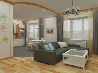
If the kitchen is small, then zoning will have to be carefully thought out, because the number of square meters is limited, which means that each of them should have utility and versatility. It will be convenient to divide the headset into two parts, the first of which is left in the usual format, and the second is combined with a bar counter or arrange in the window sill area. Another solution is to purchase a corner set and a corner sofa that save space. The use of color and light zoning should be done with the utmost care, as small spaces require specific solutions. Dark color is allowed only to separate the niche with the sink or the wall farthest from the window.
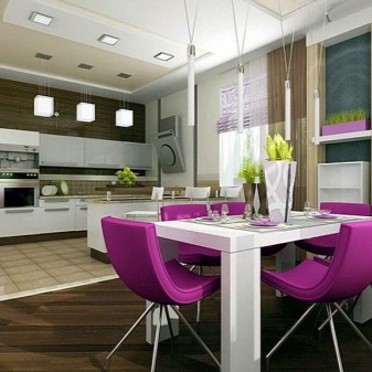
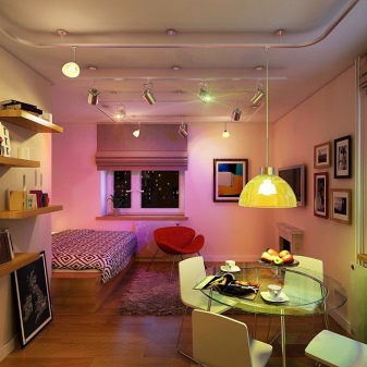
It is better not to touch the floor and ceiling in chamber spaces - additional levels will only visually reduce the room and will interfere with the owners. Zoning of elongated rooms is carried out mainly with the help of the correct arrangement of furniture. Eating is usually carried out near the window. This place is highlighted by additional lighting and other flooring. Alternatively, there is a working area equipped with a sink by the window. It is recommended to highlight a free wall with a different color and lamps that produce vertical streaks of light. You can also use a photo wallpaper with perspective or murals to create a similar effect.
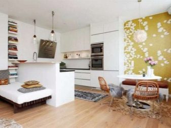
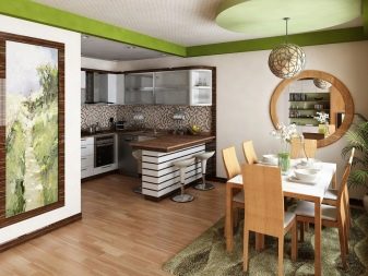
Beautiful examples
The interior looks most successful, the zoning of which is carried out using several basic tools. The working area from the living room can be separated by a bar counter, highlighted by futuristic lamps, and various wall coverings: waterproof wallpaper and a tiled backsplash in the kitchen and brickwork in the resting place.
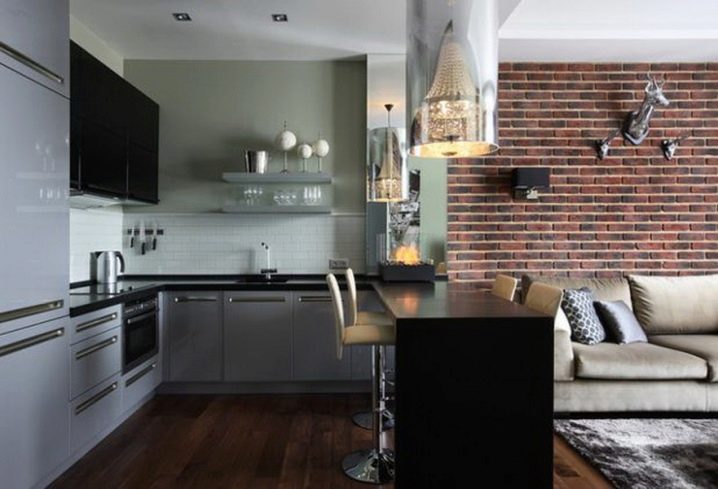
It will be possible to delimit these zones in a large studio using a plasterboard partition that imitates a brick wall of a house with an unusual bright picture.
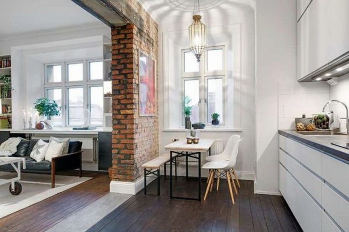
The podium always looks spectacular, on which, by the way, you can use different flooring to separate the dining area. The round table on the rounded part of the dais is additionally highlighted by a bright lamp.
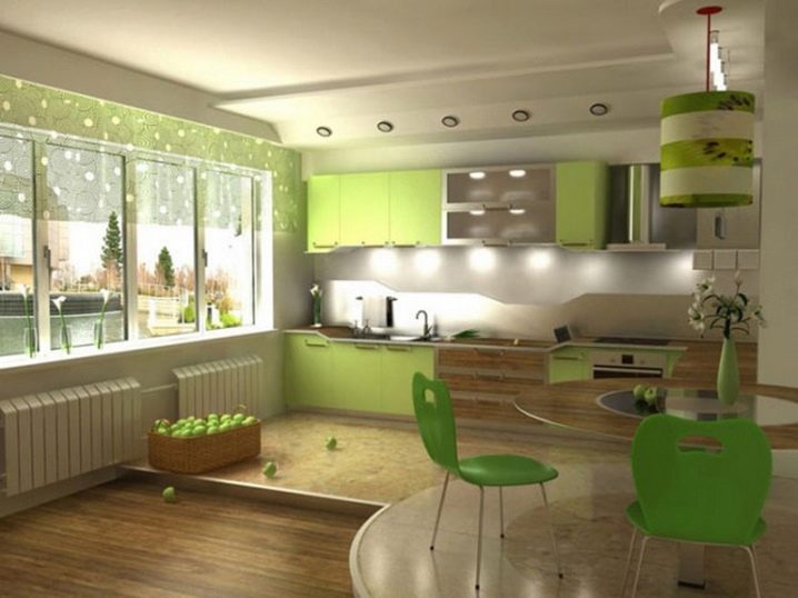
The easiest way to divide the space is to use a coating of contrasting shades, the border between which goes along a curve, and also using contrastingly colored furniture in different sections.
For information on how to zone the kitchen, see the next video.


The comment was sent successfully.