Kitchens with mezzanines
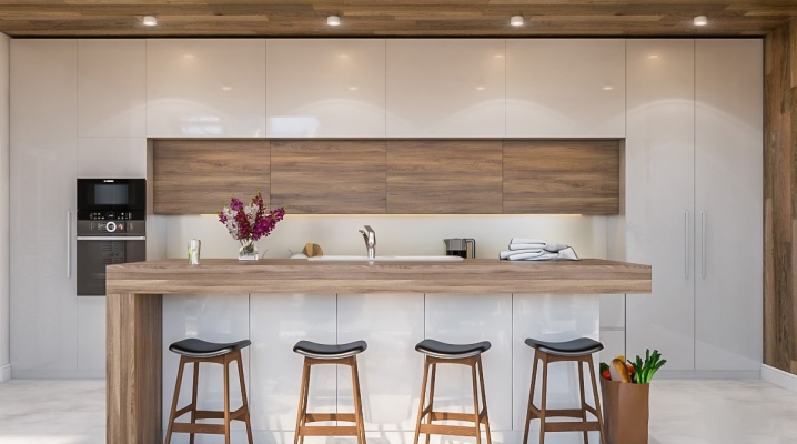
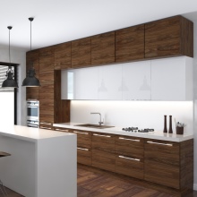
Kitchens with mezzanines are a very important and interesting option for filling the space in an apartment. They can be represented by corner and other mezzanine kitchen sets up to the ceiling. It is also worth paying attention to the placement of additional cabinets above the door.
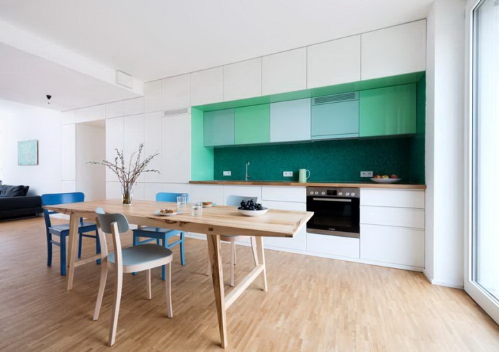
Advantages and disadvantages
The construction of a kitchen with a mezzanine - which is quite obvious - allows you to use the total area as efficiently as possible. But much less obvious, albeit very pleasant news, will be the simplification of cleaning the room. It is also worth noting the expansion of the visually perceived space (even if in fact the same amount of free space is taken away from the room as when using smaller furniture).
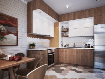
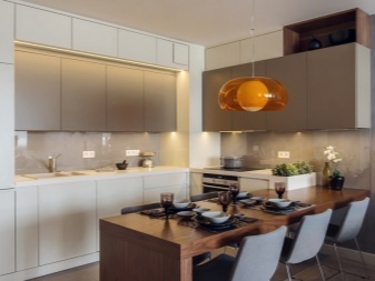
From the point of view of economy, it is important that a minimum of free space will have to be finished with various decorative materials.
A tall cabinet makes it easier to plan the layout of your basic kitchen utensils. Items that are rarely needed are usually placed at the top. At the bottom there are more popular things. It is worth noting that for stunted people, this is rather a disadvantage. Sometimes furniture is equipped with special stairs. But this approach is just a compensation for the negative, it complicates and increases the cost of the design.
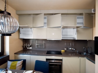
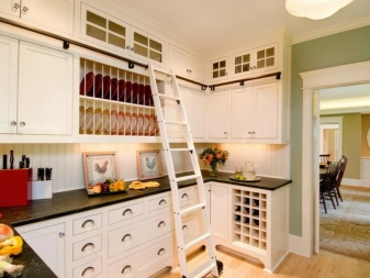
A cabinet with a mezzanine up to the ceiling is not appropriate in every kitchen. Sometimes the lack of space does not allow you to put it at all. Problems can be caused not only by low ceilings, but also by hoods, ventilation outlets and other necessary communications. But with a successful arrangement of structures, the same ventilation ducts will be able to be disguised. The room is visually raised, and its proportions become more pleasing to the eye.
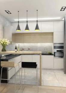
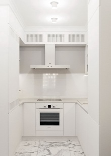
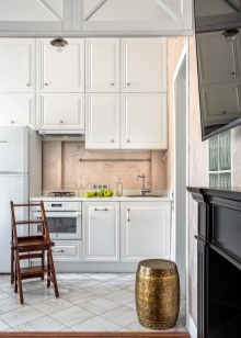
Views
Floor standing
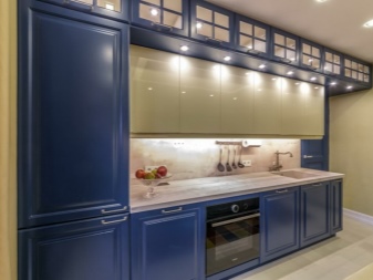
This type of mezzanine compositions visually resembles a column up to the ceiling. They will occupy the entire space without a trace. Sometimes special pencil cases are used, where it is convenient to build in equipment. Even the installation of refrigerators is allowed in them. The most common solution is the three-section base cabinet.
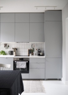
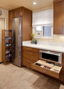
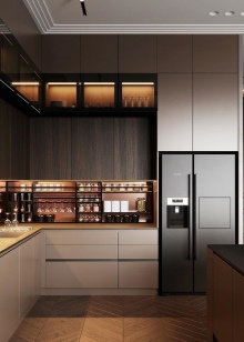
The upper and lower compartments in this version are most efficiently allocated for storing food and other frequently used things. Household appliances occupy the middle:
- Microwave oven;
- oven (most often electric);
- large coffee maker.
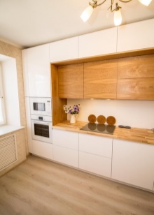
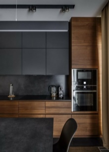
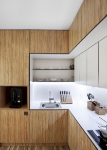
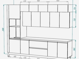
Most common sizes:
- from 2100 to 2400 mm in height;
- from 450 to 600 mm in depth;
- 400, 500 or 800 mm in width.
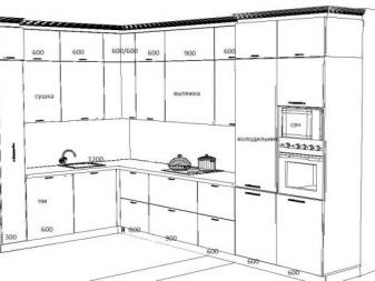
Hinged
Such models are installed under the ceiling. They are designed primarily to place bulk products, tableware, spices, and various small items. A set of this type often includes several rows of lockers or single modules. The arrangement in two rows allows more space for common kitchen utensils. Typical top wall cabinets range in size from 900 to 1200 mm in height, 300 mm in depth, 300-1000 mm in width.
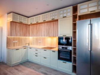
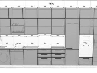
Small suspended products, in contrast to large straight columns, can also be installed above the door or in another space limited in size.
Forms
A classic kitchen set - that is, a single-row - is great for both large and small or medium-sized rooms. Straight structures can be quite long and even cover the entire wall. Unambiguous preference - which is quite logical - is given to solid-type countertops. It is worth noting that they are especially practical, and therefore they try to use such a solution with other geometry.But it is necessary to consider other popular formats as well.
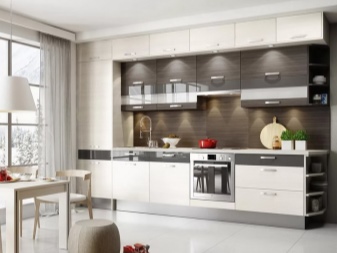
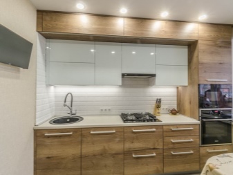
Corner kitchens with mezzanines are valued for their compactness. That is why they are much more often used in small rooms. The entire space will be used as ergonomically as possible. The extremely close location of household appliances and work areas also testifies in favor of this design.
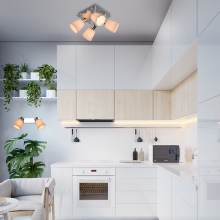
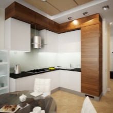
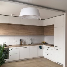
The less you have to walk around the kitchen, the better - all housewives will agree with this (and the cooks will join them).
If you can use three adjacent walls at once, then it is worth considering the U-shaped option. Such a device will save space if its opposite sections are at a distance of about 2.5 m. At a greater distance, the headset will be impractical, because it will cause too much time to be wasted.
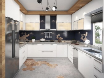
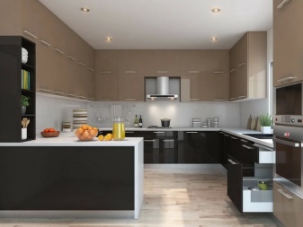
If the total length turns out to be less, then even the height will not allow you to get rid of the tightness.
The traditional design of the kitchen unit is equipped with protruding handles. More modern designs use buttons instead of these knobs. This solution is suitable for a modern or ultra-modern style. But in an atmosphere of modernity and even more so in the classics, it is inappropriate. Features of the compositions can be associated with different depths of their components; the size of the lower tier cabinets usually adapts to the size of the countertop.

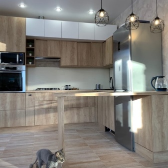
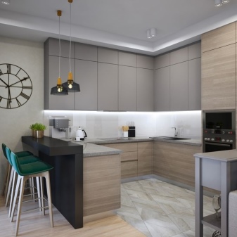
Also, sets are distinguished, which also include a bar counter. They are much more functional than ordinary everyday solutions. Such a product will look especially good in a studio apartment. A two-row arrangement of elements is recommended for walk-through kitchens, where they are installed along mutually opposite walls. Work areas, stove and washing area are advised to be placed exactly opposite the storage areas.
Materials (edit)
The main rule in the selection of materials for the kitchen is the ratio of cost and quality. It works in a room of any size, regardless of budgetary constraints and stylistic preferences. In large classic kitchens, solid wood furniture works best. It creates a sense of sophistication that cannot be confused with anything. Painted (enameled) facades are visually perceived more expensive than foil, and they will last longer.
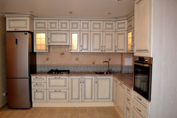
Even chips will be easy to mask, regardless of the degree of damage to the films. An ideal combination with such furniture will be countertops made of natural stone or an array of elite rocks.
If considerations of economy come to the fore, then you can safely choose chipboard. There are a lot of options for kitchens made of such material, and it is not difficult to choose the right one. It is only necessary to take into account the difference in particle board parameters from individual manufacturers and the emission classes of harmful substances.
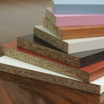
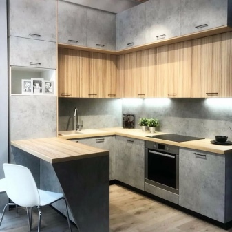
If it is possible to add another 20-30% to the cost for the same order, preference should be given to MDF. Facades made of this material serve well for 20-25 years. Combinations with metal and glass can also be used in facades. The finished look is created with:
- acrylic plastics;
- film melamine;
- veneer;
- special enamels;
- foil PVC.
Opening systems
Swivel design implies the use of furniture hinges. They are partly inside the body, partly outside it. Therefore, it will not be difficult to remove and hang back the facade. The hinges can contain 4 or 7 hinges. Latest models reduce hanging time; solid structures are designed for at least 100 thousand opening and closing cycles.
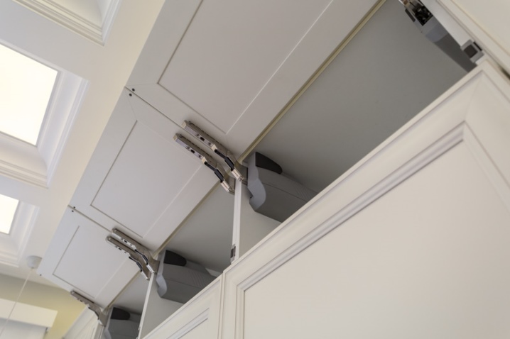
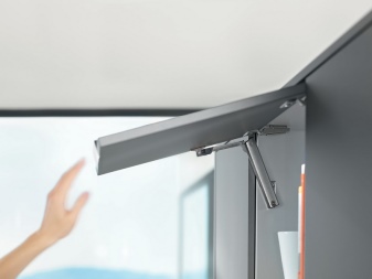
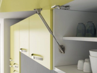
A typical hinge opening angle is 95 degrees. In corner cabinets with roll-out and rotating storage systems, hinges with an opening angle of 30 to 270 degrees are used. A number of modern kitchens use vertical opening systems. Some models of such devices work without any loops at all. The most advanced vertical versions are pressure sensitive and have ride control systems.
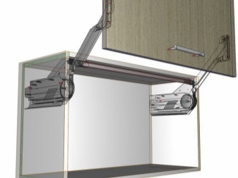
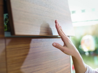
Folding mechanisms, in turn, are divided into two types: mechanical spring and gas lift. Such solutions are most convenient for a large solid facade. They are also welcome in large kitchens with overhanging visors. The spring systems work reliably, but the spring force is not adjustable, except for the most expensive models. A more practical scheme with a gas lift.
Design
The vast majority of designers believe that the best option for any style, both modern and classic, would be a white kitchen with a mezzanine. You just need to understand that white in such compositions fits into completely different contexts. And also experts advise to dilute it with other shades, preferably in the warm part of the spectrum. Then the room will look more comfortable. If you don't like a pure classical composition, you can take a closer look at such an option as neoclassicism.
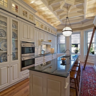
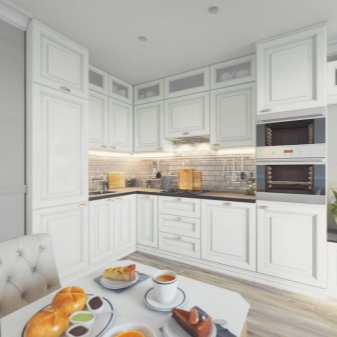
It is about the careful adaptation of classics to modern household appliances and advanced materials. In this case, glossy facades should be avoided, because they are difficult to fit even for a professional. The more natural everything looks, the better: gray-white and beige colors will work well, but ebony will hardly be appropriate.
For lovers of modern technology, it is most reasonable to choose a high-tech approach with its shiny metal surfaces, refusal of jewelry. But you can focus on completely non-standard styles:
-
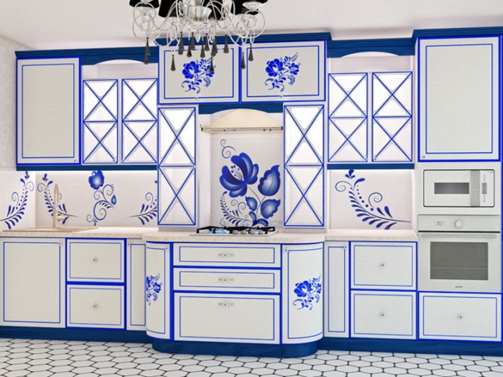
the "Gzhel" variant with an abundance of lavender color, with accentuated bright blue inclusions;
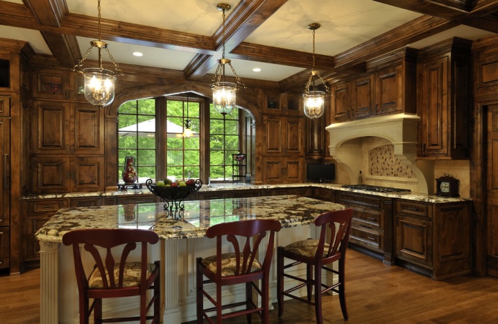
- Gothic, with its abundance of natural stone and unfinished wood;
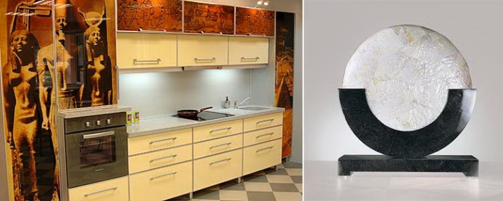
- Egyptian style, implying massive headset items and characteristic images;
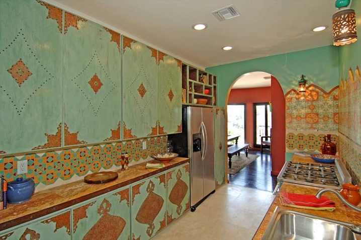
- Indian design, allowing any colors, as long as they are as bright as possible, carving is also welcome;
- lounge, with rounded corners and soft, pleasant colors;
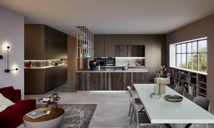
- inlays and painting in the spirit of mannerism;
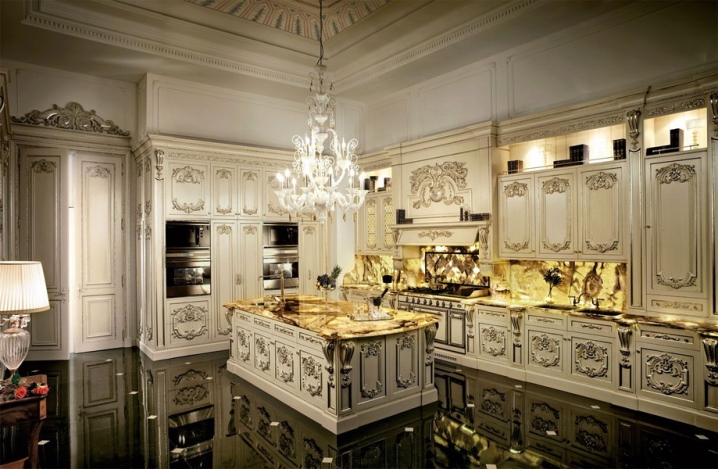
- bright ceramic tiles for the apron combined with natural furniture and ornaments (Moroccan version);
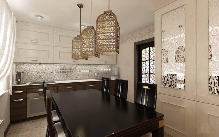
- white and blue romance of a nautical style;
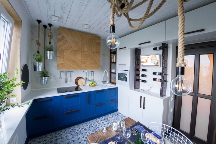
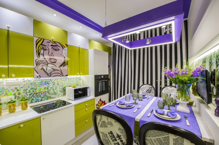
- glossy textures and inserts of acid colors in the spirit of pop art;
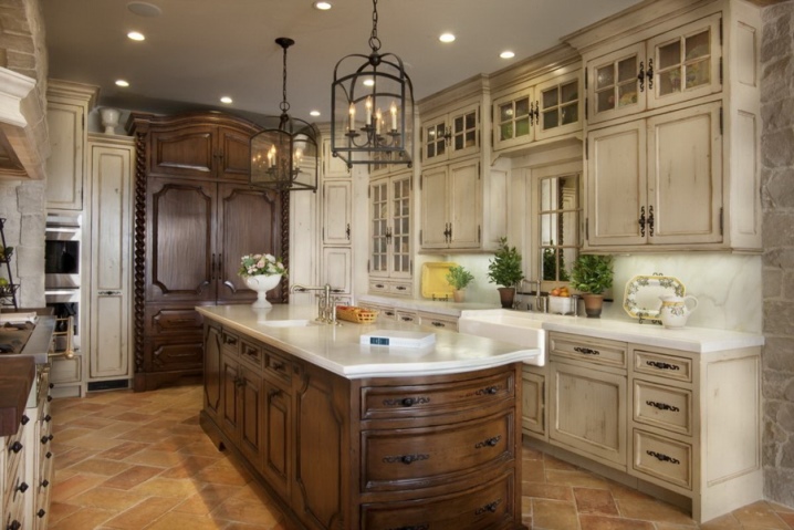
- harmonious aged Provence;
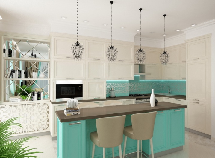
- flowing lines and forging, combined in the Tiffany approach, which has been popular for over 100 years;
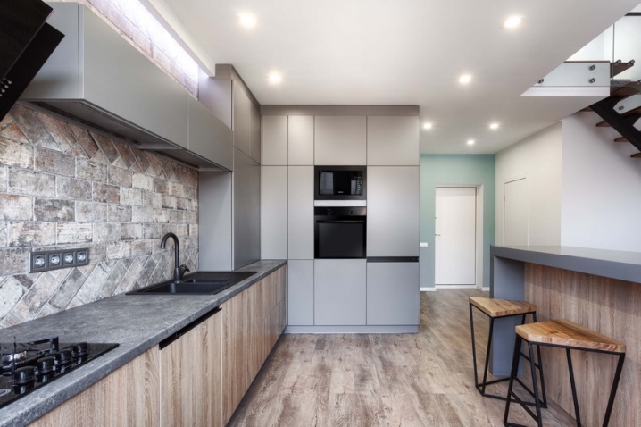
- emphatically modern compositions (functionalism);
- festive and textile-rich fusion;
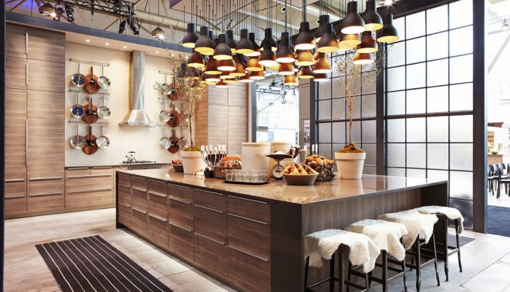
- cozy and natural, decorated with many trinkets, hygge style kitchen;
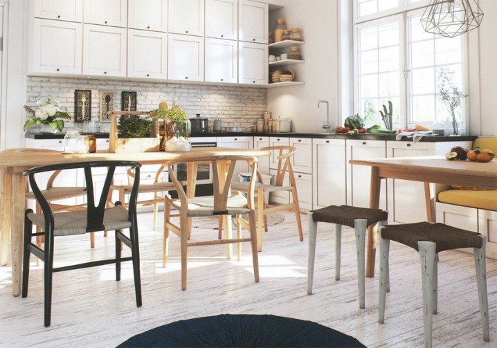
- palace luxury, close to everyday life (Belgian approach);
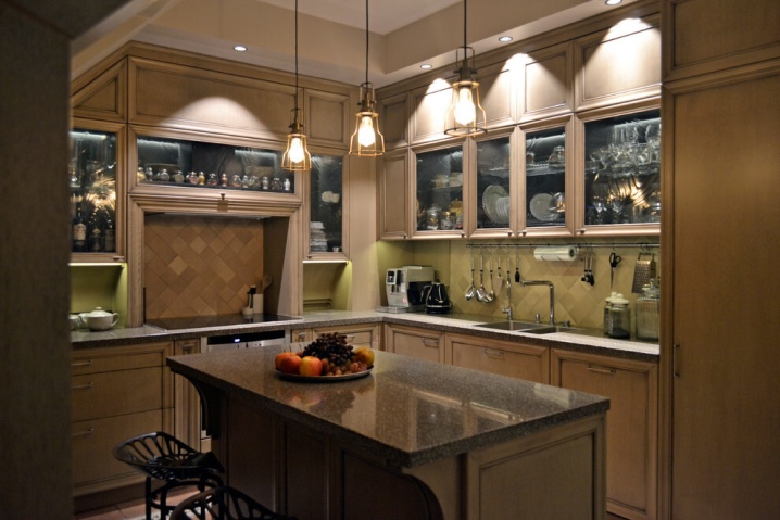
- incredibly flighty and romantic boho.
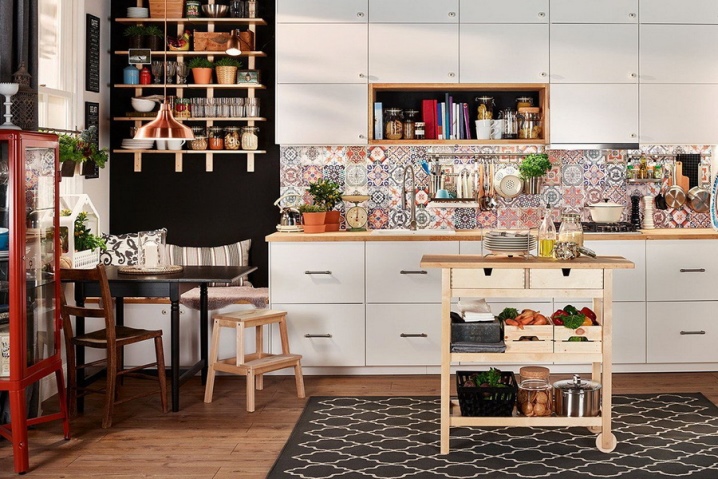
Selection Tips
It is most correct to order a kitchen with a mezzanine from local firms, in extreme cases - from Russian, albeit from another region. Delivery from abroad is expensive, and the equipment and technologies are the same everywhere. The ideal apron is either glass or solid tiles. The optimal facade color is white gloss. Top drawers with a lifting mechanism do not outperform the swing models with a door closer so much, and the difference in price between them is palpable.
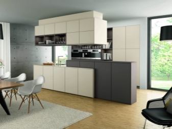
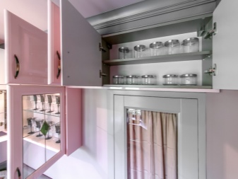
We must not forget about the presence of a refrigerator and a stove - or rather, about how they will open. To choose the right offer, you need to familiarize yourself with the assortment of at least three companies (ready-made or custom-made - it does not matter). For decoration in a classic style, it is sometimes more correct to take not an array of soft wood, but a more affordable and reliable MDF. All housings and frames are actually made of chipboard - which is why lamination of even inconspicuous edges is so important. Rounded fronts can be used, but they have long been out of fashion.
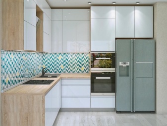
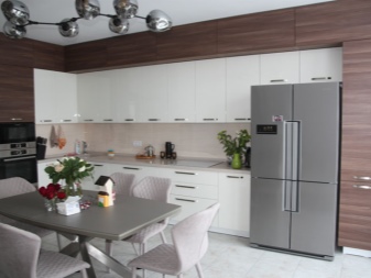
Beautiful examples
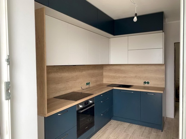
A very pleasant addition to the interior is such a kitchen with mezzanines in the form of a white strip of cabinets. The wood-like work area looks great. The non-standard blue color of the lower tier adds originality.
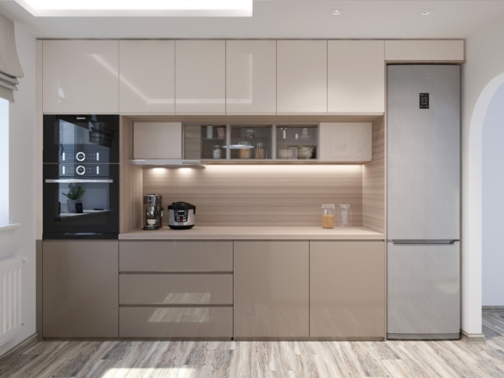
A straight kitchen set by experienced designers can be just as good - light, gray, dark surfaces and interior lighting are perfectly perceived.
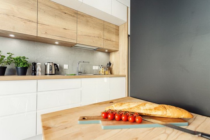
And this is what the kitchen combination looks like along a large straight wall. - with a pronounced woody texture of the upper tier, with a pure white lower tier and with an indefinite gray apron equipped with spotlights.
For information on how to avoid mistakes when designing a kitchen with mezzanines, see the next video.


The comment was sent successfully.