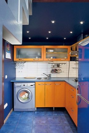
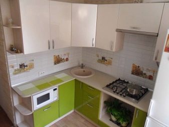
Design and design options for a kitchen with a size of 6 sq. m in "Khrushchev"

Kitchens in "Khrushchevs" are small in size, so their owners have to think carefully about everything in order to accommodate everything they need. Correct organization of space and storage systems helps to solve this problem.

Features of the layout
The layout of a small kitchen measuring 6 sq. m in "Khrushchev" begins with determining the location of the sink and slab, since transferring them to another point is not always possible. At a minimum, you will have to obtain permission from utilities and pay for their movement. Depending on these two constants, the plan of the entire space is formed. For example, a corner sink means placing the refrigerator near a window. Next to it, a module will fit perfectly, the width of which does not exceed 30 centimeters, and then you can put a stove.


The sink by the window looks very nice, but to implement the idea, you will have to lengthen the pipes. A refrigerator will perfectly fit in its former place. Thus, you get a spacious and very unusual space. The traditional option is to place the sink approximately in the middle of the working area, when the refrigerator rises into the vacant corner.


Often kitchen spaces in "Khrushchevs" are equipped with a window cabinet for storing food. In the presence of a full-fledged refrigerator, the meaning in it disappears, so the fate of these meters should be decided more reasonably. For example, it will turn out to place radiator batteries in a niche or, having insulated, adapt it for storing a multicooker or ordinary dishes.


It is also worth mentioning that small kitchens can, in principle, be enlarged with redevelopment. In this case, either the area is expanded by combining the room with a balcony or other adjacent space, or the walls and doorways are transferred. Of course, it is much more difficult to carry out redevelopment than to initially purchase multifunctional compact furniture. In the case of a balcony, it will have to be insulated, and if you combine the kitchen and living room, you will have to resolve the issue of arising food odors, high humidity and other consequences of cooking. Do not forget about the need to obtain special permissions for the appearance of extra squares.


The layout of the kitchen is directly related to the kitchen set, since it is he who takes up most of the free space. Therefore, the choice of one without the other is simply impossible - these two aspects should always be considered together.
How to choose a kitchen set?
Before purchasing furniture for the kitchen, you should think about what structures will be extremely necessary here, and which you can do without. As a rule, you cannot do without a washbasin, stove, refrigerator, work surface and some kind of dining area: a full table or bar counter. Basically, a six-meter kitchen has a place for a dishwasher or washing machine, oven and microwave. Experts recommend that you first purchase all the equipment, and then order a headset that ideally combines with it. The distance between the upper and lower modules must be between 50 and 70 centimeters, and the width of the aisles must be at least 120 centimeters.


The most convenient kitchen for "Khrushchev" is considered to be a corner one, that is, in which pieces of furniture are placed in an L-shape. In this case, a very spacious corner zone does not disappear, and the corner itself either remains right or becomes smooth. It is recommended to make the extreme components of the headset rounded in order to widen the passage. The linear "wall" is suitable when there is no need for a large number of modules. A set in the shape of the letter "P" is more appropriate if the kitchen is combined with the living room, which means that there is no dining area in it. Then the free space can be filled with lockers.


There is another option for placing the headset along opposite walls of the room, but this is only possible if approximately 1.5 meters remain on the passage. This layout is suitable for elongated rooms, but creates some difficulties with the location of the dining area.
Where to put the refrigerator?
The problem with a refrigerator is that it always takes up a lot of space. It is not very convenient to place it away from the work area, and it will also look extremely inappropriate between two work surfaces. In addition, you need the proximity of the outlet, a free gap between the back surface of the equipment and the wall, as well as the ability to calmly open the doors. Therefore, in "Khrushchevs" the refrigerator is often moved from the kitchen space to the corridor or niche that was freed up after dismantling the pantry.


If the device is still needed in the kitchen, then it is worth replacing the standard model with one that has a smaller size. For example, it can be a built-in technique or its narrow variation with a depth and width equal to 54 centimeters. If necessary, it can be supplemented with a separate freezer located in another room.


Design options
For a small kitchen, interiors are suitable that are not only modern, but also characterized by a small amount of detail. The most correct solution would be to stick to minimalism. This style implies the presence of straight facades and calm basic colors: white, gray and black. If possible, the shelves should be closed, and if they are open, they should not be cluttered with knick-knacks or household utensils. All things are put away in multifunctional wardrobes. By cleaning horizontal surfaces, you can create a sense of free space.


A high-tech interior will also fit well into a six-meter kitchen. To implement it, you will need to choose a bright kitchen set without fittings and with metal or glass facades. In addition, neon or LED lights are to be installed. Glossy surfaces will reflect light and thus increase the area of the kitchen. If classic ideas are closer to the apartment owner, then the kitchen can be decorated in the same style, but subject to several conditions. It is recommended to choose light colors, paneled facades and a small amount of decor.


Other good solutions for a small kitchen are the Scandinavian style with the maximum possible lighting, or a loft. In addition, you can combine some of the above and get an original space that meets the individual needs of apartment owners.
It is important to mention a number of limitations inherent in the design of a six-meter kitchen. There should be no dark shades on the floor and walls, and bright colors are acceptable only as accents in limited quantities. Long curtains and massive curtains, as well as a multi-colored ceiling, should be avoided. In addition, vertical stripes on the walls and large overhanging cabinets will look bad.

It will be possible to introduce not only a visually interesting, but also a functional note if you replace the classic table with either a bar counter or an elongated window sill. And also relevant are semicircular, folding and folding models that save space. If we talk about materials, glass and plastic tables, as well as samples from light wood, look best in a small kitchen.Chairs, by the way, are also better to choose folding chairs that can be removed after use. It is worth thinking about replacing the top of the headset with open shelves with a shallow depth.


"Expand" the walls will turn out by choosing a kitchen apron in pastel colors. Similarly, stereoscopic wallpapers or images whose perspective is located on one of the walls will work. The effect of space will appear if you arrange a small fragment using mirror inserts. It is recommended to place a laminate or a herringbone tile running across the floor. Oblique masonry will also look good.


In a small space, the use of bright colors is allowed, but only as accents. The same applies to the pattern on the walls - it should be discreet and calm. Beams, stucco, tiered structures and other ceiling details are prohibited, as they will only steal an already small space. It is better to confine yourself to a white smooth ceiling, possibly with a gloss. In addition, skirting boards and cornices should be as close as possible in color to the surfaces.


A set should be chosen with open shelves and glass doors. It is advisable to do without any large flashy patterns on the facades and give preference to either natural motives or abstract waves. Curtains should not fall below the level of the window sill, and also be made of dense fabrics.
Beautiful examples in the interior
Moving the sink to the window allows you to functionally use the window sill space and free up space for the refrigerator. A corner base cabinet complete with corner drawers creates additional storage space. The abundance of white and pastel-colored headsets visually expand the small space. The window sill, by the way, can be turned into a full-fledged work surface with several drawers. In this case, the storage systems do not take up a large area, but they can accommodate everything you need. A white apron, a wood-like facade and a lack of abundant decor complete this pleasant interior.

It will be possible to save even more square meters by equipping a pull-out table. Such a surface can be used both for cooking and eating a meal. In this case, it is logical to make chairs folding. In the case when a sofa is used instead of chairs, it is better to choose a model with a box, where you can remove some of the things. However, the white sample with legs will fit well into a compact interior.

You should pay attention to the fact that the radiator can be transformed into a shelf for storing vital little things, and the window sill is again brought to the state of the working area. The elongated long table increases the amount of free space, and the interior with an abundance of white and additional lighting makes it visually freer.

3D kitchen interior design with a size of 6 sq. m is waiting for you in the next video.


The comment was sent successfully.