Kitchen design with an area of 18 sq. m
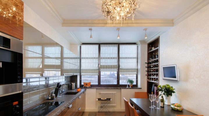
Most often, kitchens are 18 sq. m are found in individually built houses or in the independent design of your own apartment, purchased in the open-plan version. In typical apartments, such a number of square meters of kitchen is almost impossible to find. The most common option is a studio with a variety of zoning options. If you have purchased housing that allows you to allocate so many squares for the kitchen, then it will be easy to equip it. It doesn't matter what shape the future kitchen has, it can be rectangular or square, but most often it is 6 by 3 meters.
Starting a renovation in such a spacious kitchen, you get the opportunity to realize all your ideas, fantasies in interior design. It is important that the project is thought out competently, functionally arranged, and the style is modern, effective and aesthetic.
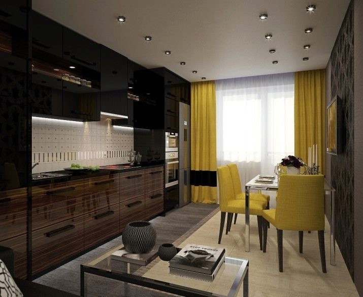
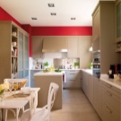
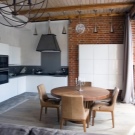
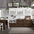
Peculiarities
Unfortunately, a clumsy approach can ruin even such a large area. If the owners of small kitchens are faced with a difficult task - to expand the space, then the main goal of any large kitchen project is not to clutter it up, to place everything that is needed, but not to overload it with details. Because even such a kitchen can turn into a warehouse. First, ask yourself a series of questions and find the answers to them:
- how many zones will be allocated;
- how to arrange compactly household appliances and a work surface;
- what style to prefer.
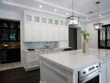
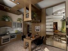
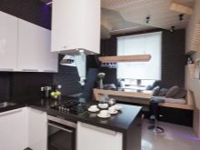
Be sure to consider the following points:
- 18 squares is a considerable area, but still it is far from huge, so it should not be visually reduced;
- household appliances, equipment should be located as comfortably as possible, otherwise you will have to walk a lot;
- the design should be not only spectacular, but also practical, comfortable; you should not turn the kitchen into a museum;
- correct lighting is a very important nuance, even if there are large windows in the room, they will not be enough, so you will have to think about additional light sources in the working area, a large chandelier.
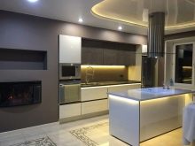
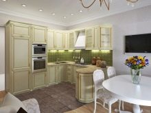
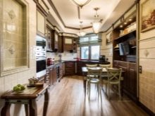
Studio
This type of layout stands alone, but in recent years it has become more and more popular. 18 squares are enough to accommodate the work area, dining area and relaxation area in one room. An obvious plus - there is no need to combine nearby premises, but if you are considering such an opportunity, then pay attention to the connection options:
- with a balcony;
- from the hallway.
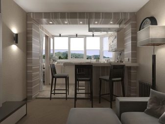
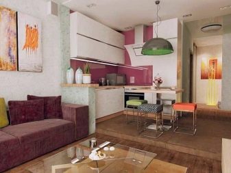
This option has both pros and cons, so be sure to think through all the details.
Minuses:
- it is difficult in terms of repair costs and obtaining permits from authorities;
- a very powerful hood is required, otherwise all the smells will "walk" around the house;
- there will be no opportunity to retire in the kitchen;
- the mess will immediately catch your eye.
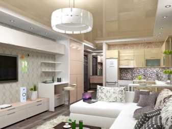
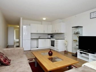
Pros:
- the opportunity to be with the whole family in the cooking process;
- children in front of your eyes when you are busy with business;
- large space;
- interesting design solutions.
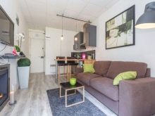
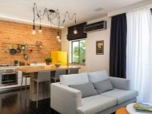
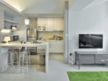
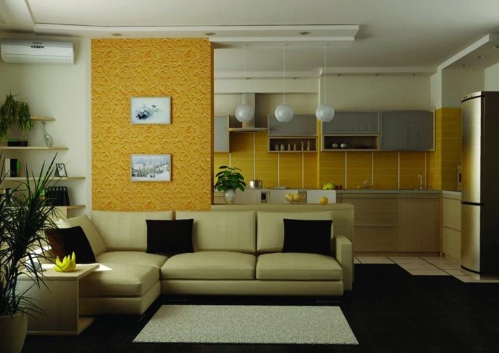
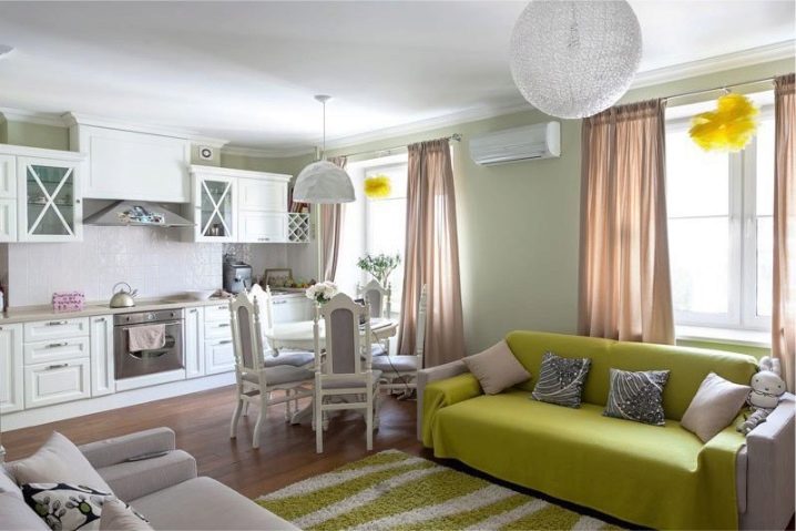
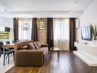
You can correctly zone the studio as follows:
combine two different color palettes, visually dividing the zones;
use different textures, materials, eclecticism of styles;
partitions in the form of sofas, tables, cabinets, other furniture;
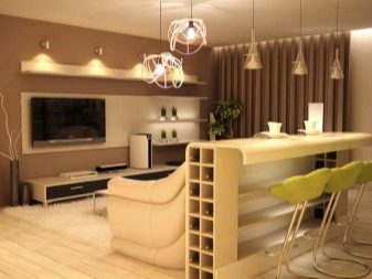
- different floor heights, podiums, steps.
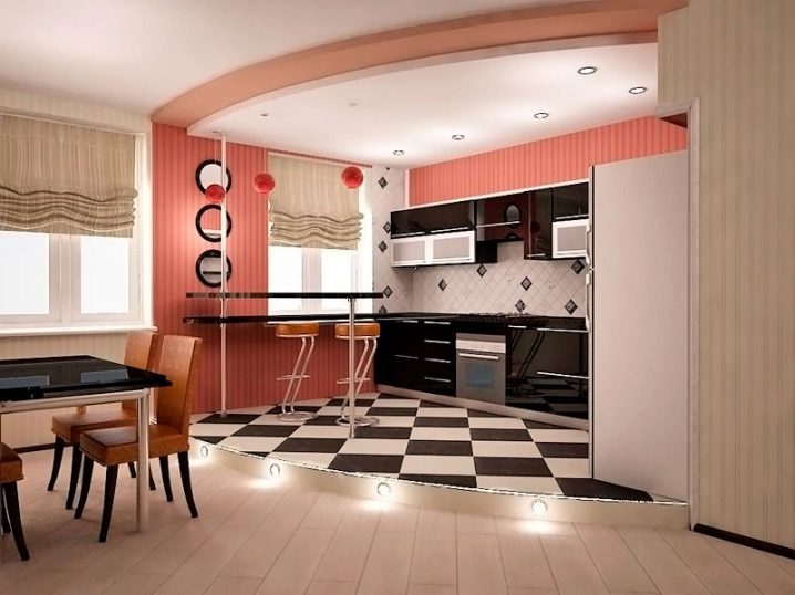
L-shaped
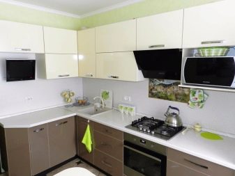
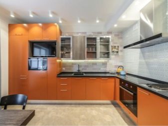
This is one of the most versatile layouts and works great for an 18 square rectangle.Especially if you are planning to make a large dining area and do not want to save on work space. The G-layout allows you to functionally equip the headset with all the necessary equipment, zone the room with a bar counter, put a sofa or a sideboard if necessary. The following solutions will be ergonomic:
- the location of the sink, refrigerator and stove in a triangle, and not in a line with close proximity to each other;
- corner sink will allow you to properly organize the space in the corner.
Linear
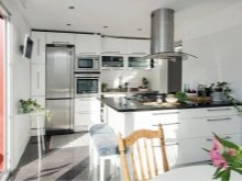
If you prefer placing furniture in one line, then you will have to face a number of inconveniences, since you will have to walk quite a lot. A peninsula or an island, in which a part of household appliances or a sink is mounted, will help to make the linear arrangement more comfortable. The peninsula will take up less space, in addition, it can be adapted exclusively for storage and as a bar counter, which will simplify repairs.
It is very important in this interior version to correctly calculate the distance between the modules, ideally it should be 1.2 meters.
Parallel
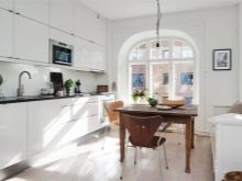
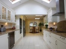
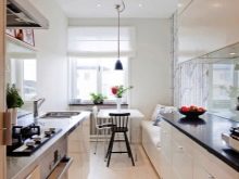
This is a great option for a rectangular shape. At the same time, furniture is placed along two parallel walls. The dining area can be placed either in the middle if the kitchen is wide, or in the back, for example, by the window.
When placing the headset in the immediate vicinity of the doors, consider that they do not interfere with the use of storage modules. It is better to prefer the sliding model or remove the door completely. You can arrange important household appliances on one side of the headset for convenience, then the second will be used as a sideboard.
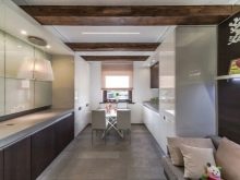
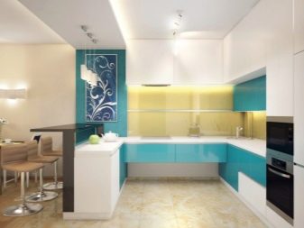
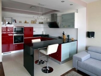
U-shaped
This is a very convenient layout. If you cook a lot, then this option will definitely suit you. The main disadvantage of this arrangement is the small amount of space for the dining area. Consider the option with a peninsula that serves as a bar counter, or deprive one of the sides of the top row of cabinets. This will make the room more spacious and airy.
The distance from one sidewall to the other should not be less than a meter. The U-shaped arrangement looks great in combined studio kitchens.
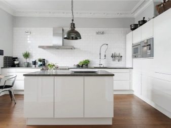
Ostrovnaya
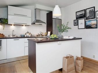
A very original layout option that is impossible in a small space. It allows you to functionally place kitchen gadgets and move quickly at the same time. The island arrangement, unfortunately, will leave almost no space for the dining area, so it can only be very compact.
If your home has a separate dining room, then this option is ideal. Remember that the passage between the headset and the island cannot be less than a meter.
Choosing a color
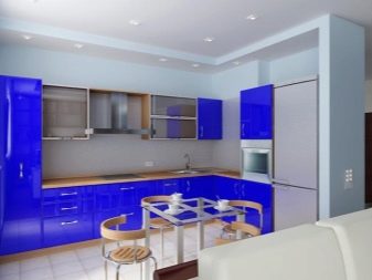
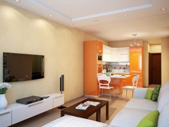
This is a very important point when creating a kitchen design. First of all, you need to build on the chosen style, natural lighting. Think over zoning options using color; it is not necessary to make the work and dining areas in the same range.
You can create the illusion of two rooms in one by making the headset in a neutral, discreet palette, and the dining area in brighter, more saturated colors. Luxurious option - different shades of the same palette in two different areas of the kitchen.
Defining the style
Classic
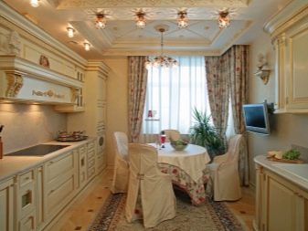
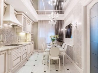
Typical features of the classic style: calmness of colors and textures, softness, comfort, clear lines, symmetry. Also, the classics are distinguished by natural materials and discreet luxury. Most often, wood, leather, stone or their imitations are used in decoration. Plastic is excluded, choose household appliances either in retro style, or cover with facades. The color scheme is also natural, the windows can be decorated with curtains. When zoning, consider the presence of columns, a fireplace, an arch.
Provence
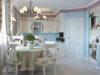
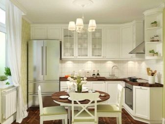
The rustic style of the French province is extremely popular. A large kitchen provides many possibilities for such a design. The color range is natural, soft and light, unobtrusive: white, pastel, heavenly, green, lavender, mint.One of the distinctive features of the style is the aged light furniture.
The general impression of Provence is spaciousness, air, sun. Therefore, avoid heavy curtains, bulky elements. Provence allows for an abundance of decor: flowers, paintings, figurines.
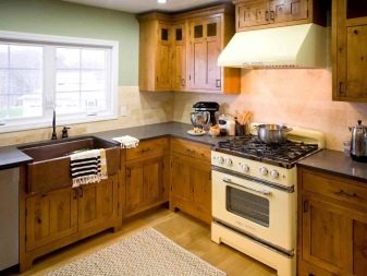
Country
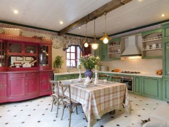
In this style direction, unnatural materials and colors cannot be used. Distinctive features: natural light and structures, plastered walls, rough furniture, wooden floors, various beams, raw boards look good. Most often, country music is performed in dark wood, so a large space is required. A green accent in the form of textiles, milky as an additional shade will look great in combination with wood. A large lampshade and a floor lamp will organically fit into an 18-meter kitchen.
High tech
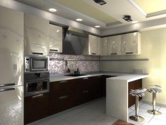
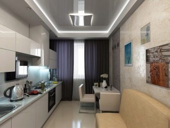
This modern trend is distinguished by clear lines, strict forms, functional minimalistic design, and very little decor. Contrasting colors look great, the color scheme is calm: black, white, gray, silver, all shades of metal.
Eliminate natural wood, fun curtains, intricate furniture finishes. Everything should be laconic, unobtrusive. The bet is placed on the technique, decorated in glossy metal with a bright sensor. Appliances in this style are not hidden, as this is one of the most important elements of the kitchen.
Loft
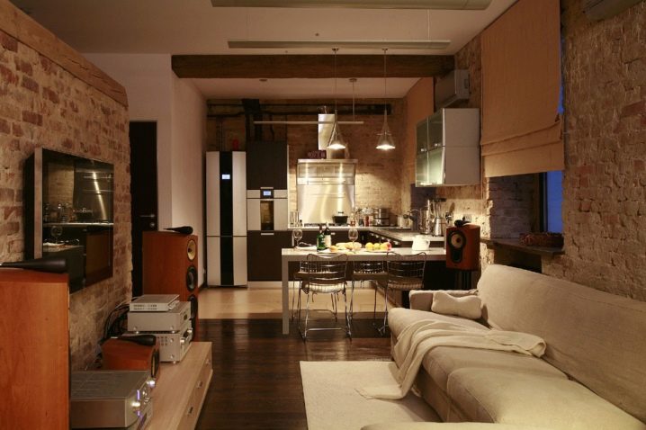
Another popular style solution that looks great in a large kitchen. Distinctive features: lack of decor, rough finish in the style of an abandoned industrial premises. Good brickwork, wooden beams, plaster. The color scheme is calm, but bright elements are allowed. The windows may not be decorated at all, but it is desirable that they be large enough. Open communications, pipes, valves, sockets are suitable as a decor.
Zoning the loft is not recommended; large rooms in the same style are preferred.
Kitchen overview 18 sq. m, see the next video.


The comment was sent successfully.