Kitchen design with an area of 15 sq. m
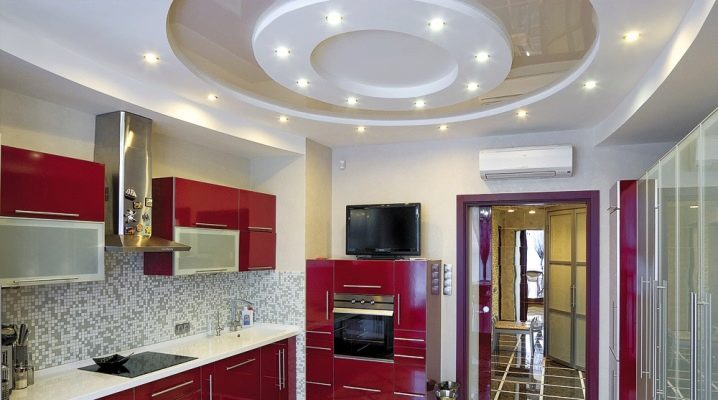
On 15 square meters of area, you can create a kitchen to the envy of everyone. Here it will be possible not only to equip the workspace, but also to allocate enough space for the recreation area. It is necessary to make the room functional and comfortable.
Features of the layout
Fifteen square meters open up a lot of space for creativity, allowing you to implement a variety of projects, not even for arranging the kitchen as such, but a full-fledged kitchen studio. Such a room wins if it has an exit to the balcony, which in the warm season serves as a continuation of the recreation area.
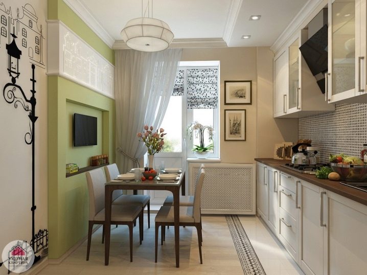
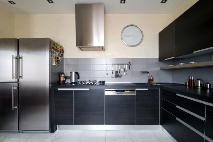
At the same time, thanks to the large square, it is easy to realize the dream of many owners of a roomy refrigerator or even two.
The future interior is largely determined by the choice of the configuration of the kitchen set. Kitchen 15 sq. m allows you to make a choice among a wide variety of options for furniture designs.
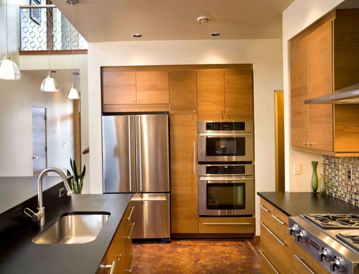
You can choose a corner kitchen. It fits best in a rectangular or square room. Furniture set elements are installed on two adjacent walls. In this case, one side of the headset may be shorter than the other.
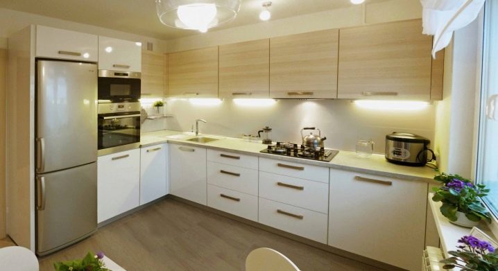
This configuration allows observing the so-called triangle principle, which functionally unites the sink, stove and refrigerator, between which the hostess has to "turn" during cooking.
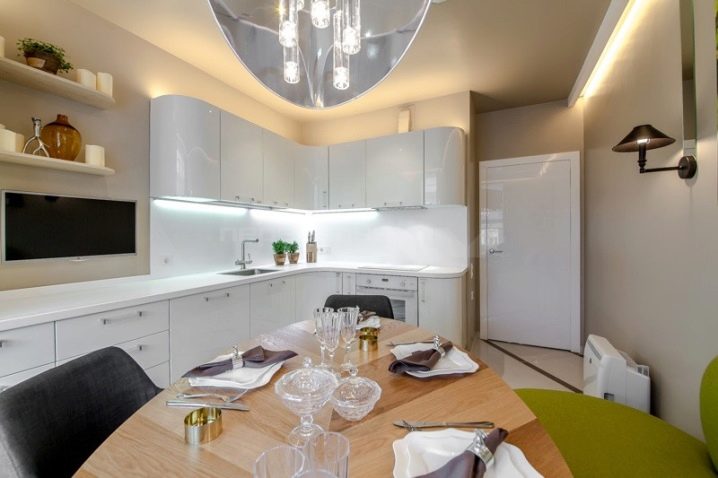
It is convenient to put a dining table in front of such a headset. Squaring allows you not to limit it in size. There is enough space not only to arrange the required number of chairs around it. You can install a comfortable sofa or corner next to it, which is often equipped with additional storage places.
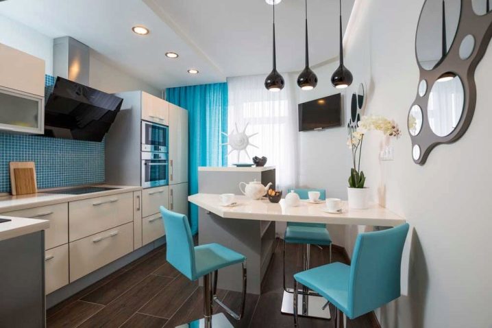
Owners of a kitchen in 15 squares can also install a U-shaped headset. It fits well into a rectangular room. It is undesirable to make the sides of the headset too long. With them, the set of furniture will look too massive. For the same reason, it is better to place the hinged part of the kit only on two adjacent walls, as in a corner set.
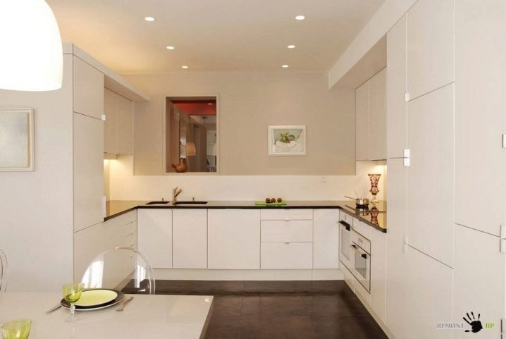
The linear layout is also convenient for a rectangular room with two entrances. The kitchen unit is installed along a long wall. So that during work the hostess does not have to ply from edge to edge, the refrigerator can be installed at the neighboring one, observing the same triangle principle, which ensures the convenience of cooking.
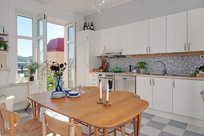
In a rectangular elongated room, a parallel layout of the headset is often used, when pieces of furniture are located against opposite walls. If the width of the passage is from 1 meter 20 centimeters to one and a half, this will ensure the convenience of using the furniture.
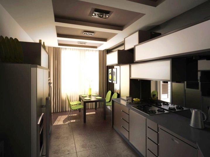
By turning between the parts of the headset, you can safely do all the work. Moreover, if the plan provides for the arrangement of one line of furniture as shorter in relation to the other, a spacious area for the dining room remains in the room. It is better to furnish the kitchen so that this part is near the window.
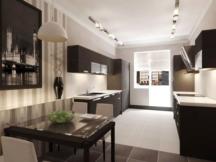
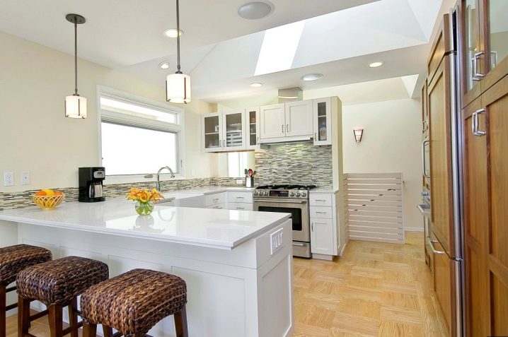
For a square kitchen, you can choose a suite with a peninsula. This block marks the boundaries of the working area and at the same time acts as a dining table, cutting table, bar counter, stove. This layout is good for a large family, when the hostess, working in the kitchen, has the opportunity to monitor the children in the part of the room intended for recreation.
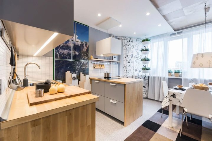
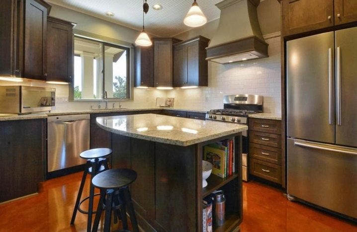
The spacious kitchen is the place for a headset with an island. It makes it easier to use and transforms the interior. The islands come in a wide variety of configurations - round, square, and asymmetrical in shape. This block is often centered. It can serve as a full-fledged dining table, appliances are installed in it, and loaded with other kitchen functions.
Zoning options
The 15-meter kitchen can accommodate:
- a kitchen area with all the elements of furniture and appliances necessary for work;
- dining area;
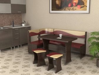
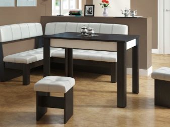
- a place of quiet relaxation, which includes a sofa and a TV, and in a country house, for example, a fireplace.
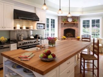
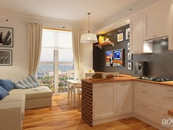
Each zone can be distinguished physically or visually:
- different color schemes of individual areas;
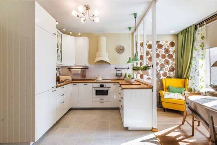
- light when special lighting is provided for each site;
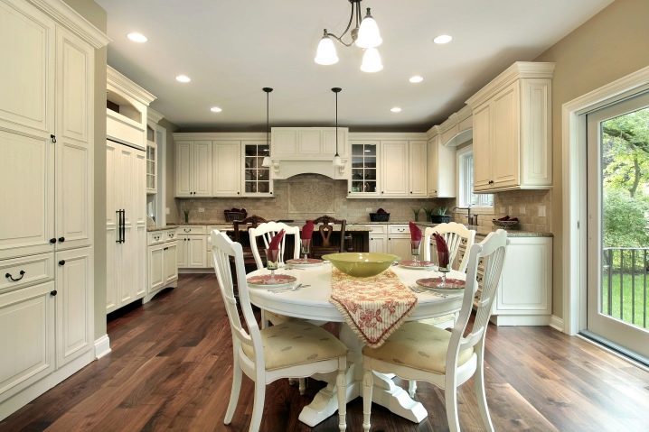
- decoration of walls, ceiling and floor;
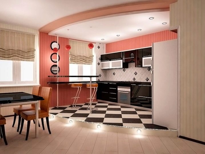
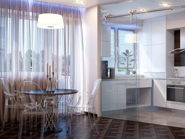
- partitions, curtains or screens;
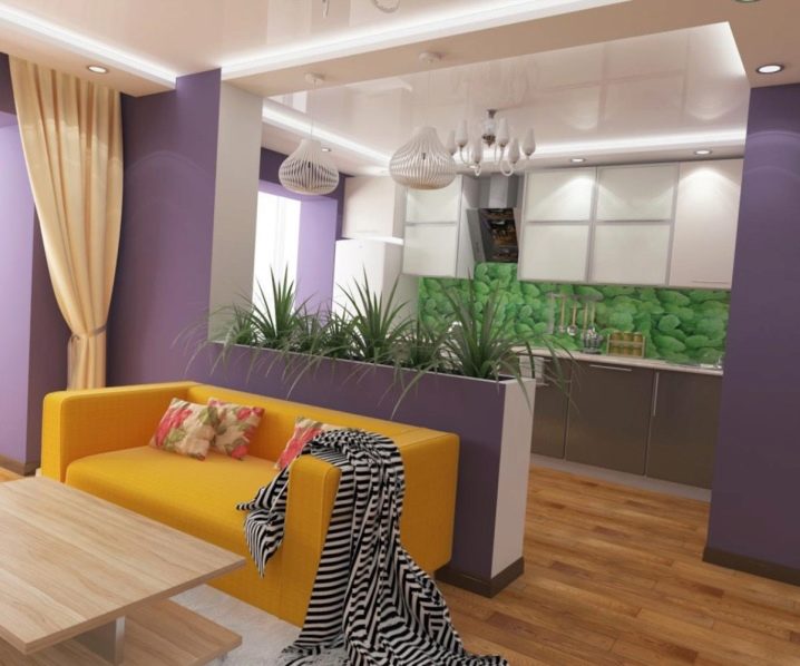
- furniture.
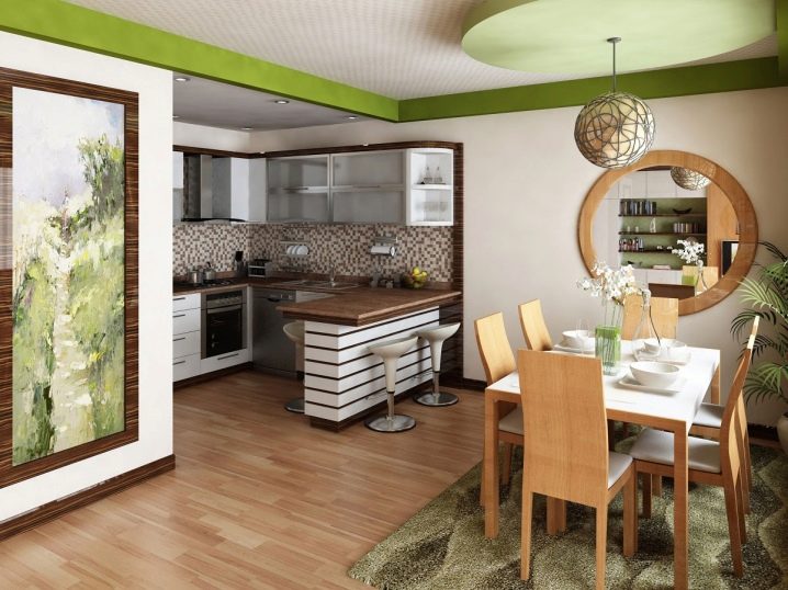
For a harmonious color combination of individual zones, warm adjacent shades are used, for example, yellow with beige or sandy with light brown. But you can also use contrasting colors.
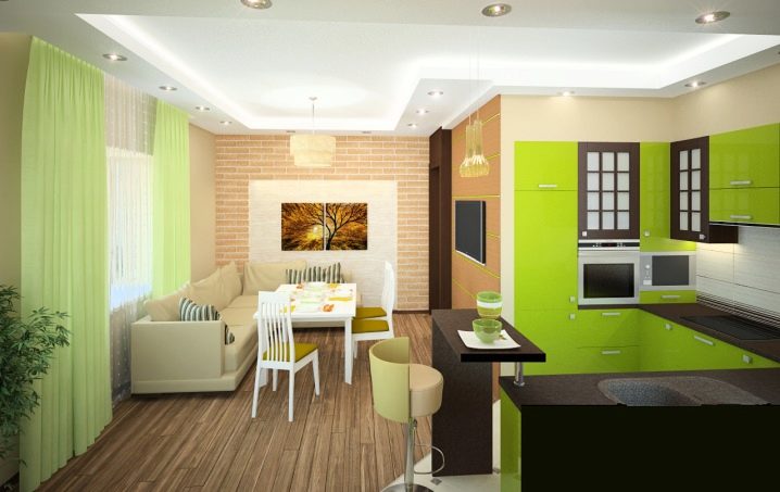
When dividing with light, you can use lamps placed, for example, above the working area in the kitchen and directly above the dining table. Both wall and floor lighting fittings will do.
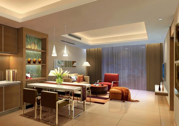
An effective method of zoning is the use of different finishing materials in certain areas., as well as the principles of the design itself. In one place, you can use tiles, and in another plaster, decorate the ceiling in a special way or raise the kitchen or dining area on the podium.
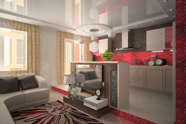
The natural limiters of this or that site are the elements of furniture. The same bar or table is the best proof of this. Large sofas are often used to separate areas. It is recommended for this to use only those that do not have easily dirty upholstery.
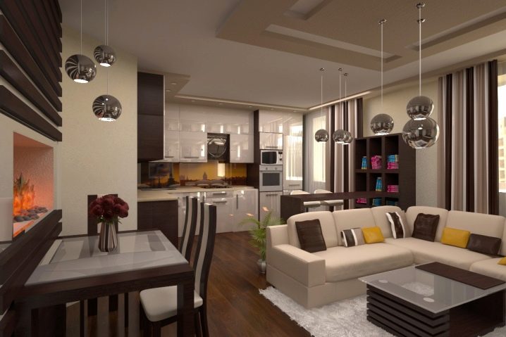
A simple and effective way to designate zones is to use curtains of different colors on the windows in the kitchen and living room (if there is more than one in the room).
Finishing
The fifteen-meter kitchen allows you to combine a variety of finishing materials for renovation in different parts of the room.
Floor
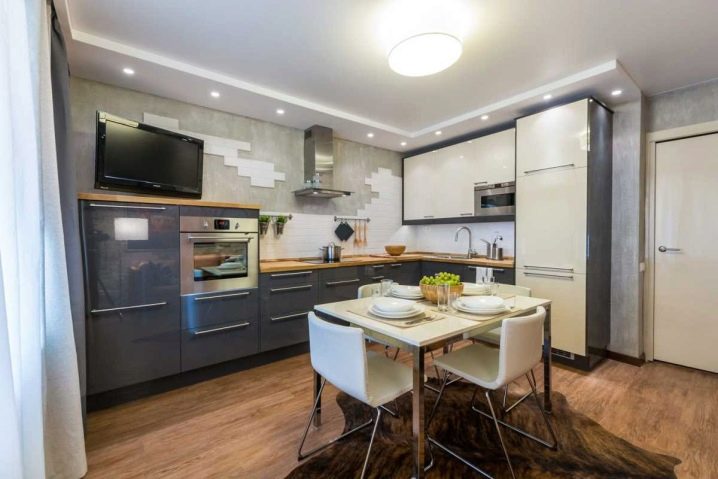
The most suitable materials for the floor are tiles, linoleum, laminate. All of them are resistant to dirt and moisture characteristic of such a room. In some cases, you can use wood, but in order for it to last a long time, it will have to be specially processed.
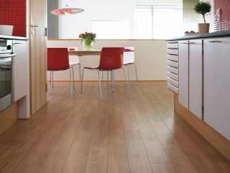
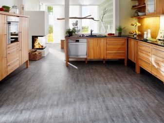
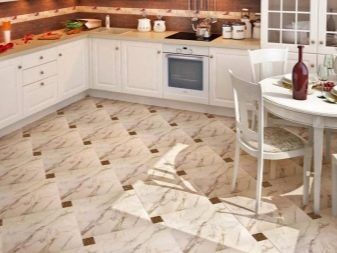
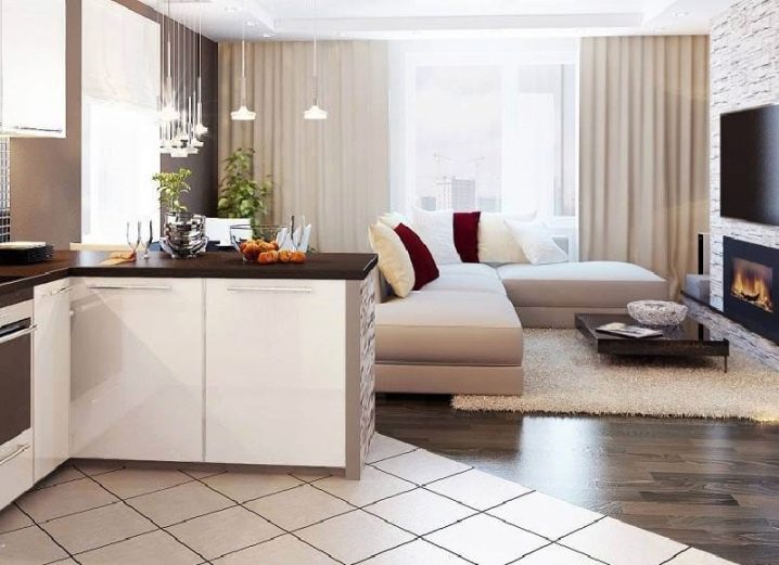
In the kitchen area and the dining area, it is advisable to use different materials to delimit the space. It should be borne in mind that the room will look more spacious if the drawing on the tile or linoleum is placed diagonally.
Walls
When choosing materials for decorating walls, one must take into account their resistance to the effects of not only kitchen contaminants, but also household chemicals, with the help of which these contaminants are removed. Temperature changes should also not affect the finish. These requests correspond to:
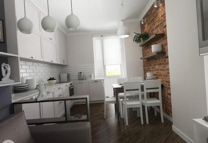
- brick;
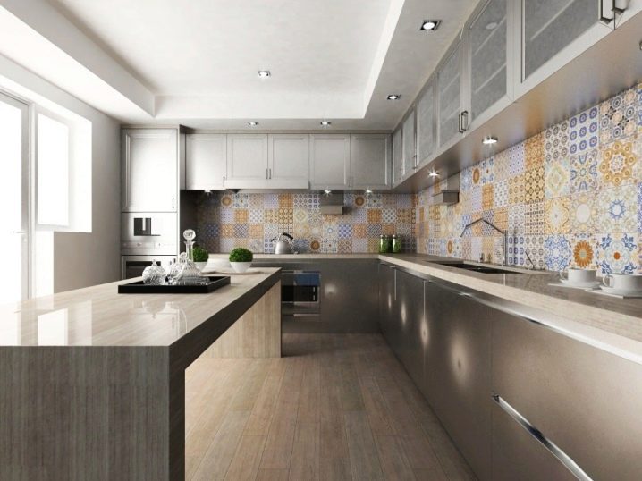
- tile;
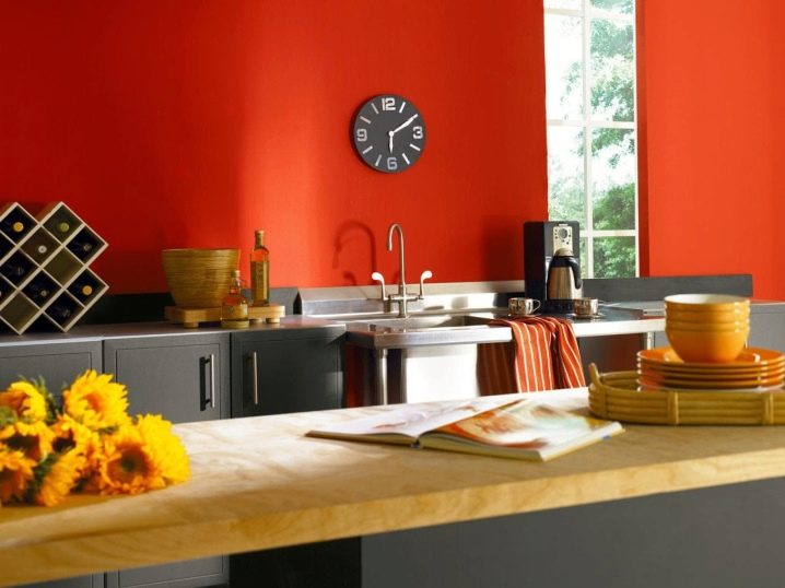
- high quality paint;
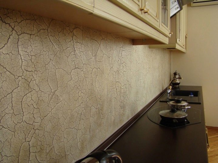
- plaster.
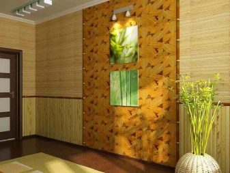
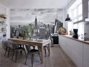
Considering that the kitchen is large, combining several functions, it also has a place for applying wallpaper, including both photo and washable wallpapers, bamboo panels and some other materials.
Ceiling
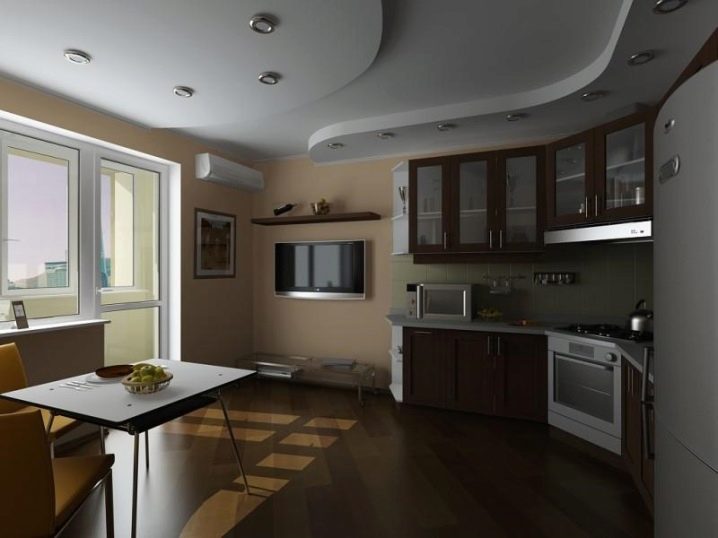
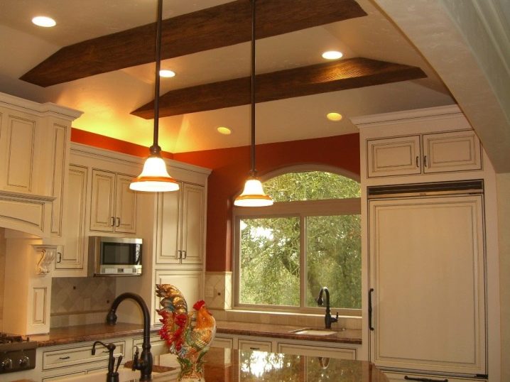
The 15-square kitchen allows the use of multilevel suspended plasterboard ceilings. You can make such a ceiling in one tone, as well as combine similar tones in different parts of the kitchen.
Stretch ceiling also solves the problem of finishing. Matte or glossy - depends on the design idea.
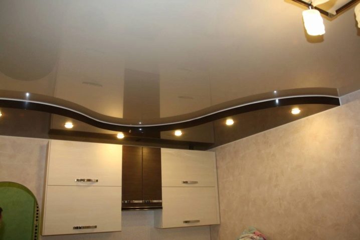
In one area, you can use, for example, structures from slats and drywall, allowing you to maintain a certain style in decoration.
Color solutions
The color scheme depends solely on the preferences of the owners of the kitchen. In a large space, everything is acceptable - from black to white.
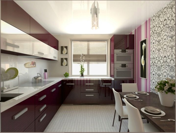
Most people do not like dark shades, moreover, these "eat up" light and space. Therefore, the use of dark tones is permissible only if an experienced specialist deals with them.
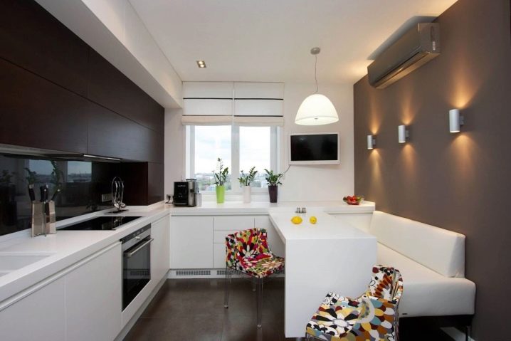
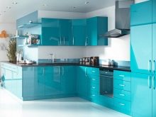
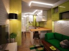
It's easier to create an interior with shades of blue, green, yellow, white.
Decor and lighting
Lighting in a large kitchen should be balanced. More powerful lamps are installed at the workplace than in the recreation area. For the dining area, it is better to choose dim lighting that adjusts to a calm mood.
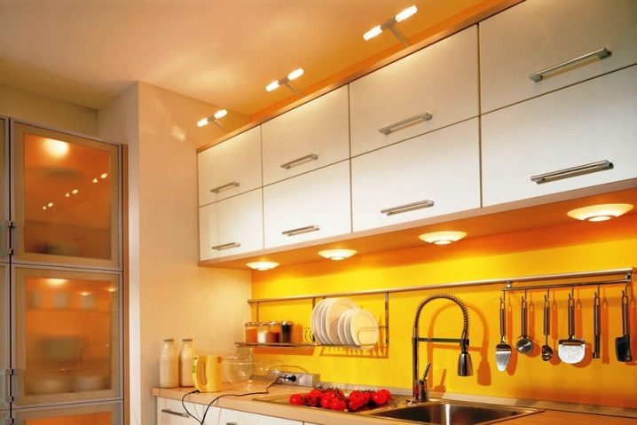
It is advisable to install a large chandelier in the center of the kitchen on the ceiling., provide individual lighting on the kitchen set around the entire perimeter. Separately, you can highlight the apron and glass doors near the cabinets. It is both functional and aesthetically pleasing.
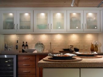
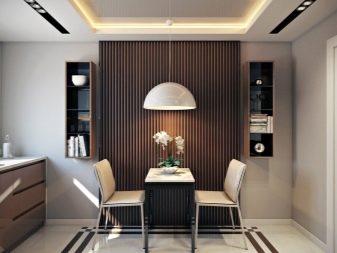
Additional sources of lighting allow people to feel more comfortable in different areas of the kitchen, as well as highlight the facades of furniture and decorative elements.
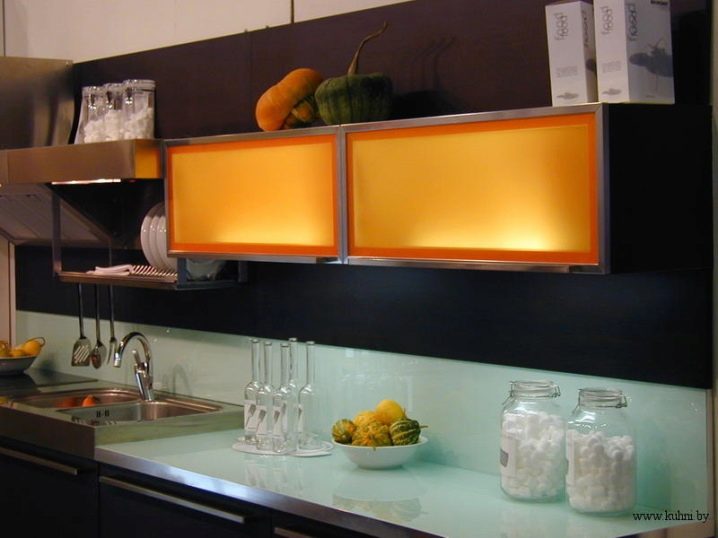
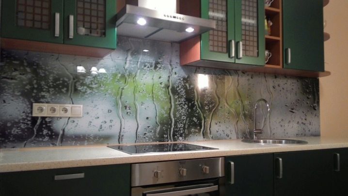
Thanks to a thoughtful approach to the decor, they make the kitchen apron effective. Instead of tiles, here you can use glass with photo printing, focusing on this part of the room.
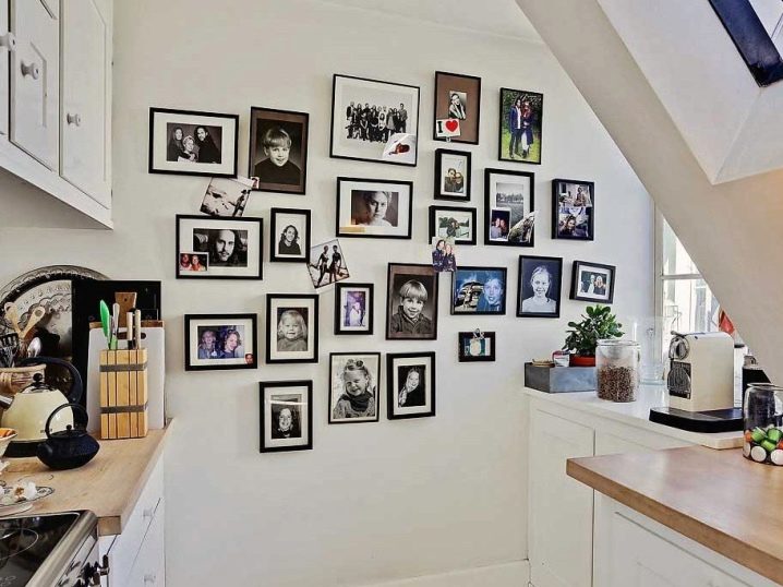
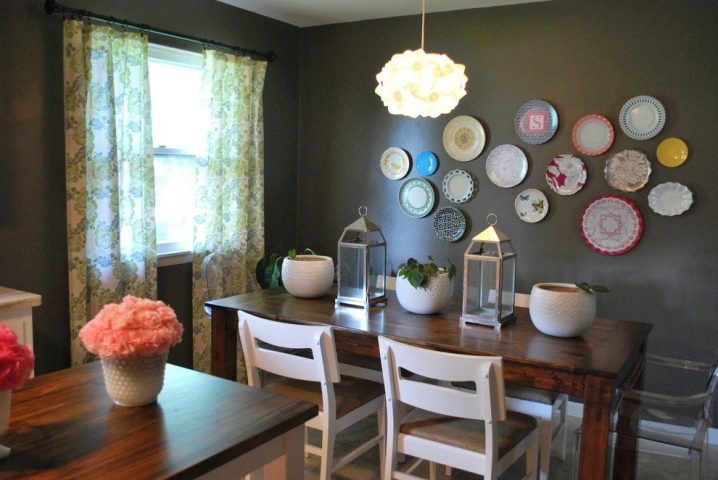
The free wall can be decorated with photographs or even vinyl records. If the room is decorated in the spirit of minimalism or retro, this will be very useful.
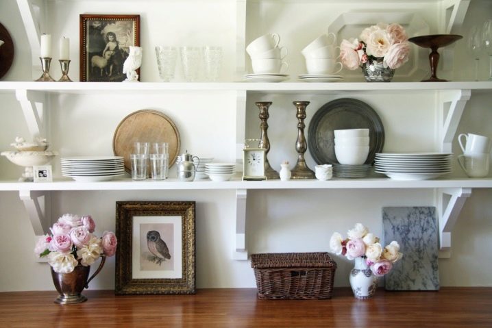
Shelves with dishes and souvenirs also serve as decoration of the kitchen. A cabinet with glass doors, which contains books, especially old ones, is not only a practical thing, but also an excellent decoration for a room where people can afford to relax in peace.
Decorations in the form of plates on the wall look original. These can be both self-designed decorative elements and souvenir dishes purchased during travel.
Design ideas
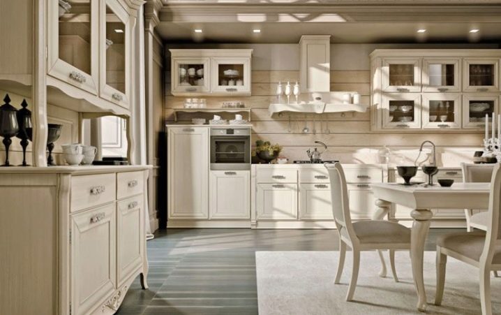
The Scandinavian style kitchen is light and full of light. Smooth transitions from tone to tone create a calm atmosphere in which it is pleasant to work and relax.
The competent combination of a white headset with elements of decoration and furniture in the interior, where a large window is provided, gives the impression that the kitchen is more spacious than it really is.
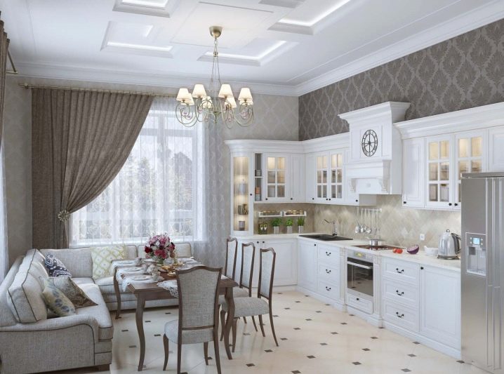
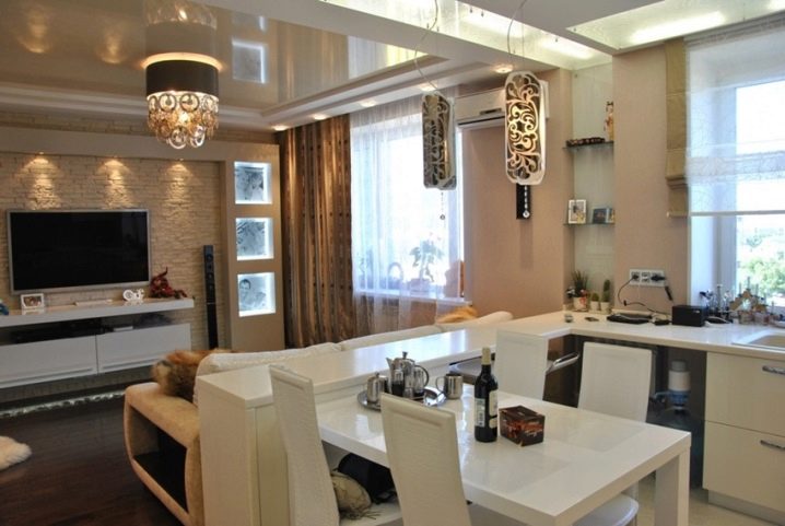
Thanks to two windows, it is possible to simply delimit the space of the working area and the recreation area. Top and side lighting play a role in this. The interior looks very modern.
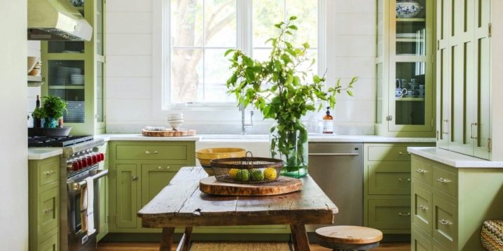
The kitchen in light green tones and a rough wooden table, on the one hand, looks modern and functional, on the other - in such an interior there is a deliberate rustic simplicity. This design will organically look first of all in a country house.
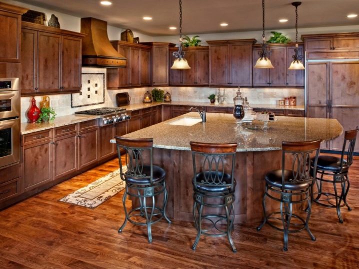
A large kitchen allows you to use dark wood or materials for it in the design. Sophisticated lighting compensates for its disadvantages. But beauty and impressiveness are in plain sight.
Watch a video on the topic.


The comment was sent successfully.