Kitchen design with an area of 13 sq. m
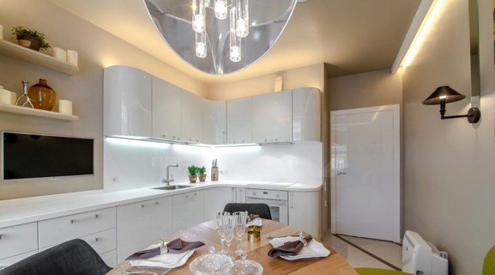
Arranging a kitchen is a complex and creative task. When its footage is 13 square meters, several cozy corners can be placed in it, combining them with a specific design style. In the article we will consider the nuances of creating a harmonious kitchen interior of 13 sq. m, we will focus on the receptions through which the room will become comfortable for each member of the family.
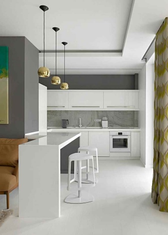
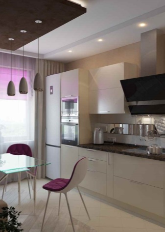
Design
Before proceeding with the purchase of furniture, gluing wallpaper, flooring, a visual inspection of the existing room should be carried out.
It is important to pay attention to its design features. For example, the dimensions of window and door openings, protrusions or niches on the walls of the kitchen will become weighty elements.
In addition, communications carried out along the walls or located on the ceiling can complicate the design.
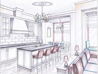
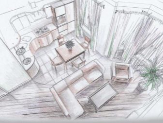
A visual inspection will allow you to draw up a design project, which will necessarily take into account the height of the ceiling, the curvature of the walls, the distance from the floor to the window sill, the width of the window, the side it faces. The location of the windows is of particular importance: the choice of color scheme depends on it. For example, cold paints cannot be used in a kitchen that faces north. Here you need to soften the visual perception with warm colors.
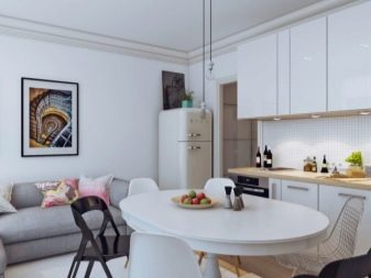
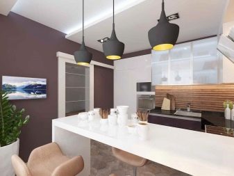
The project can be complicated by the presence of a bay window or balcony.
In this case, it is especially important to think over the arrangement of furniture, because nothing should interfere with the comfort of household members.
After an approximate design is drawn up and a schematic plan is drawn, you can start repairing.
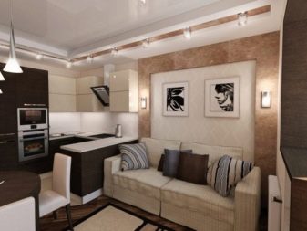
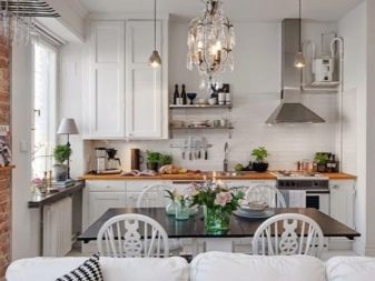
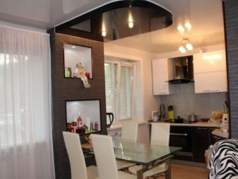
As for the ceiling, in the case of curvature of the walls, frame technology will be chosen. It can be a one-, two- or even three-level plasterboard design, a frame structure, as well as a stretch canvas. If the ceiling is high, you can build a suspended structure or a floating type option.
In this case, the accent is chosen for a certain functional area of the room. It should not stand out from the general design of the ceiling, and therefore the lines, color and design will depend on the interior elements.
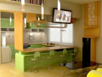
The decoration for the walls will have to be selected based on the degree of humidity in the room, since the cladding should be practical.
It is important to choose materials that are free from mold and mildew. In addition, the cladding material must be durable. Floor finishes must be abrasion resistant, easy to maintain and aesthetically pleasing.
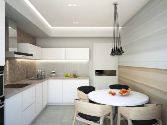
Layout
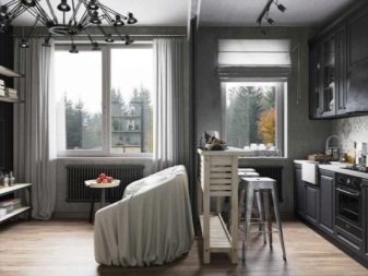
Having weighed all the pros and cons, they examine the shape of the room, since the layout, arrangement of furniture, its dimensions, the number of headset modules, as well as storage systems for necessary items will depend on it.
Let's note the main types of kitchens and a layout suitable for them.
- Linear single row used in an elongated or narrow room. In this case, the headset, as well as the stove and refrigerator, are placed in one line along the wall. Today it is fashionable to buy a single-tier kitchen or a set without upper (wall) cabinets. Due to their absence, the kitchen seems larger.
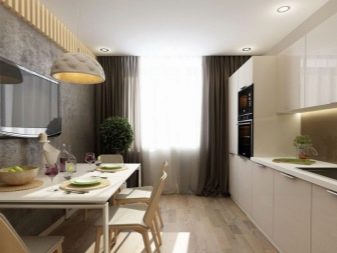
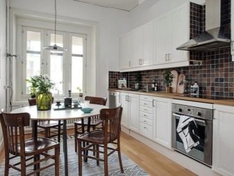
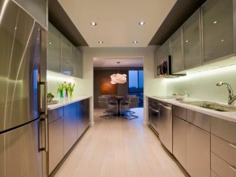
- Double row linear the layout is good for wide rooms, since furniture placed along two parallel walls visually conceals the width of the room. Placing furniture along two walls allows you to do without upper cabinets, which, in turn, will allow you to use them for shelving, wall panels, modular paintings.
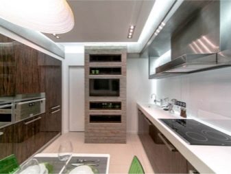
- L-shaped type the layout is considered universal for rooms of a standard type. Sufficient width allows the kitchen to be positioned along two adjacent walls. In this case, the dining area will be located opposite the headset.
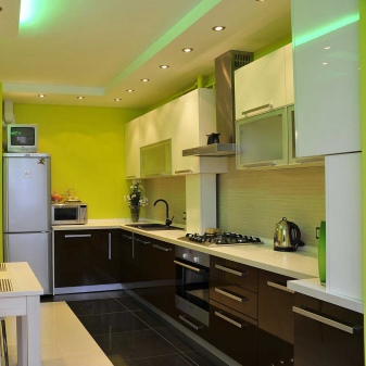
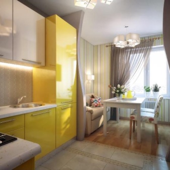
- U-shaped option the layout is suitable for kitchens whose shape tends to be square. Such a kitchen will take up a lot of space, and its installation will significantly reduce the space of the kitchen. To avoid visual imbalance, you will have to beat the congestion of the modules at the expense of the upper cabinets.
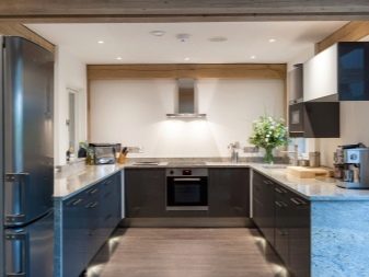
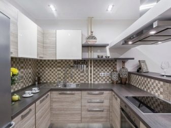
- C-type the layout is somewhat reminiscent of the previous version, it is also designed for wide rooms. However, here the shape of the furniture is smoother, which improves the aesthetic perception. The corners of the so-called letter "C" can be quite small, for example, in one module.
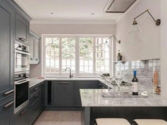
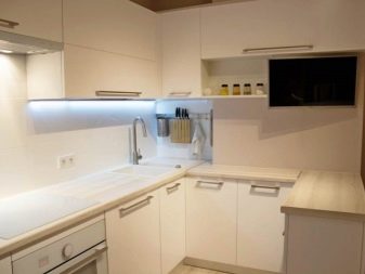
In addition to the main varieties, kitchens with a peninsula or an island can be distinguished. In fact, the first modifications imply the presence of modules attached to the headset perpendicularly.
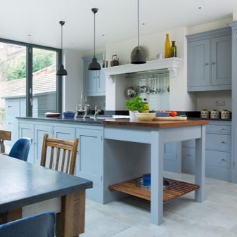
Islands are separate elements of the headset that are installed separately. At the same time, they can be located not only opposite the main furniture, but also in the center of the kitchen.
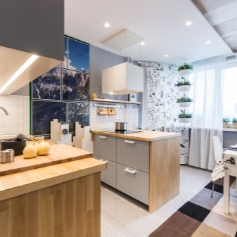
Zoning
Zoning means an unobtrusive demarcation of space into separate functional zones. This is a cooking area, a dining room, a place to relax.
Considering that 13 square meters is not so much for several spacious areas, zoning will have to be done with great care.
For example, in order to save space to accommodate a compact sofa, you can use not an ordinary table for eating, but a bar counter.
As for zoning techniques, this involves:
- wall cladding;
- floor coverings;
- central and auxiliary lighting;
- partitions, screens;
- furnishings.
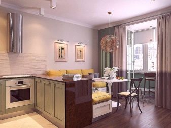
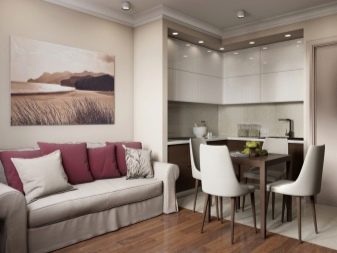
Delimiting space into separate corners will unload the kitchen, giving it order and organizing each zone. At the same time, zoning can provide for the use of two or even three techniques at once. For example, you can highlight the dining area with a separate lighting and highlight the cooking area with a floor covering by choosing tiles for it. You can highlight the cooking area in the headset with a bar counter combined with a work table, and also separate the guest space by the counter itself.
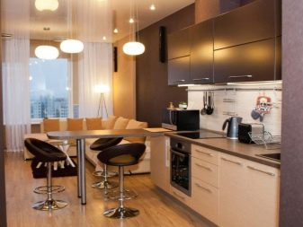
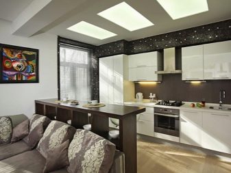
You can use the reception of visual partitions by turning the bar counter so that it divides the kitchen space and the guest corner. If the room has a bay window, you can highlight it with your own lighting. The technique of highlighting the dining space by means of wall cladding looks great in the interior. For example, it can be a photo wallpaper, a plasterboard panel with a print or spot lighting.
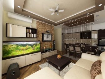
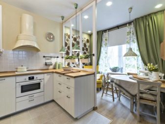
Secrets of harmony
You can create an atmosphere of home comfort in any kitchen. In a kitchen of 13 sq. m it's easy. The size of the furniture will be subject to the number of household members, as well as its quantity. For example, a bachelor needs a minimum set of kitchen units and a small dining table. If the family is large, they choose compact furniture with a well-thought-out storage system for dishes and kitchen utensils.
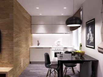
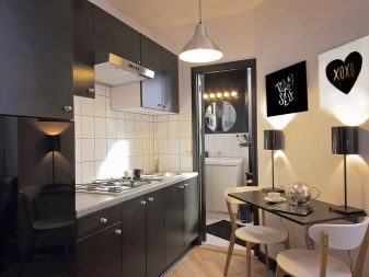
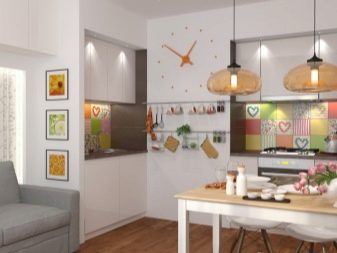
The number of accessories should be dosed, you should try to avoid excessive variegation and sharp color contrast. Color solutions should be soft, if there is little natural light in the room, white should be added to the interior. For example, the ceiling, furniture decoration, headsets, chandelier lampshade can be white. If you want colored paints, you can replace white with beige, milky, ivory.
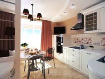
If this is a room with a balcony, you cannot put the dining table near the balcony door. The maximum that you can take up the corner to the doorway is a narrow panel-table of a hinged type to accommodate small household appliances. As for the bay window, it should not be insulated with furniture either. Sometimes it is he who is used to install a kitchen set.This is possible if the ledge has no windows.
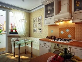
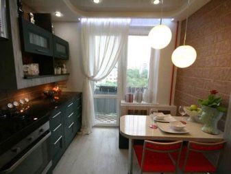
Choosing elements of arrangement for the kitchen, you need to think over its style. The style should not differ from the design of the entire apartment (house), since a change in emotional color will lead to discomfort in the room. Fashionable design directions are different branches of the interior, for example, it can be modern, high-tech, Provence, minimalism, classics and even a loft, although in the latter case the style will be conditional, because an open plan is needed here.
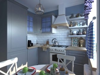
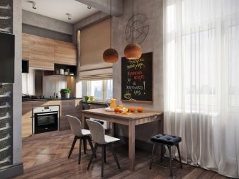
Design options
Nothing tells about the harmony of design as illustrative examples.
- Kitchen interior with space dividing by means of a dining table-peninsula. Separate lighting of the guest area with sofa and tea table.
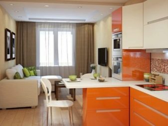
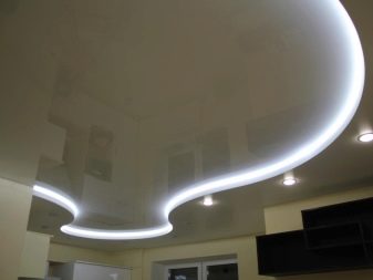
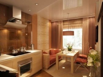
- An original solution in warm colors with a combination of dining and guest areas. The use of a two-level ceiling design as a separator of functional areas.
- Using a kitchen unit to divide the space into two zones: the kitchen and the dining room. Combination of floor materials to define the boundaries of the cooking area.
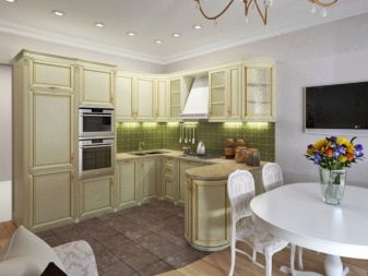
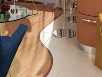
- Corner furniture in a kitchen design without a door with a wide aisle. Involvement in the arrangement of the sofa as a place to relax. Allocation of dining space with a carpet.
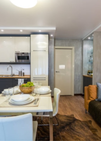
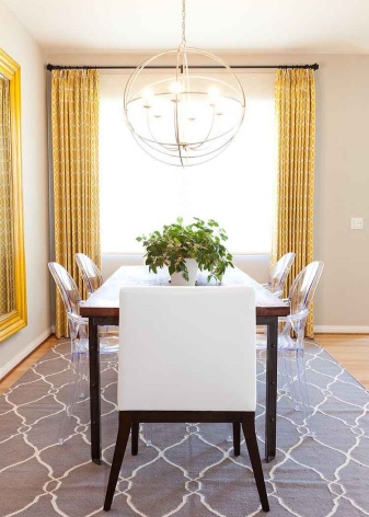
- An example of zoning a kitchen using a narrow dining table. Arrangement of a part of the room for a cozy living room with a soft shaggy carpet.
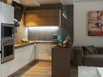
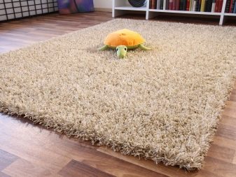
- Another design option with kitchen zoning. Drawing boundaries with flooring and using the floor cabinets as dividers divides the room into three corners: a cooking area, a dining area and a sitting area.
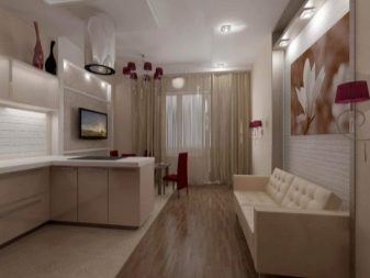
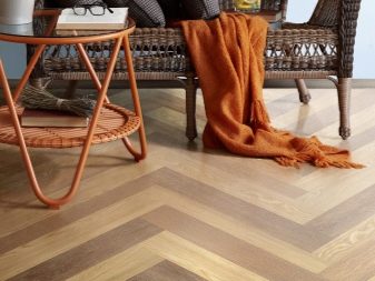
- This example clearly demonstrates the division of a kitchen using a narrow table with a wall panel. Used different lighting for kitchen corners.
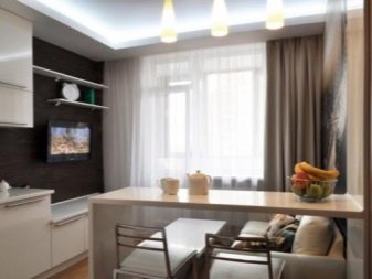
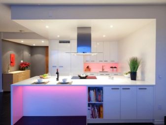
- This kitchen, if necessary, can be used as a guest bedroom. A headset with a built-in bar counter allows you to lay out several users. Backlighting adds a homely feel.
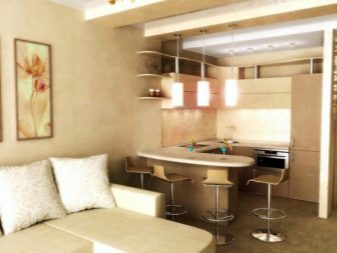
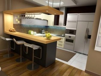
- The most complete organization of space in the design of the kitchen. The compact rounded cooking zone saves space for the guest space, being a partition or functional divider.
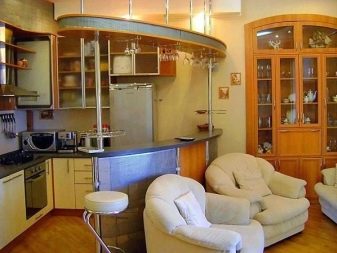
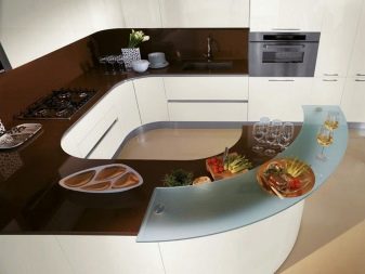
Kitchen interior design ideas in 13 squares can be very diverse, be it a project with a balcony or bay window, or a layout with a broken perspective. You can use fresh flowers, pots, decorative panels, including those with built-in lighting, in the arrangement. The headset itself can be traditional or built-in. He can have both low and high legs.
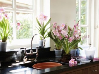
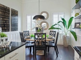
Sometimes, for convenience, mobile dressers or side tables are included in the design. Some people like decorating the kitchen with a cupboard. With a minimal set of kitchen cabinets, a bottle holder with a convenient storage system can be included in the interior composition. It can be used for storing jars of spices, dishes, wine, dish detergents and even kitchen towels.
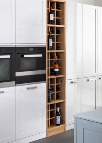
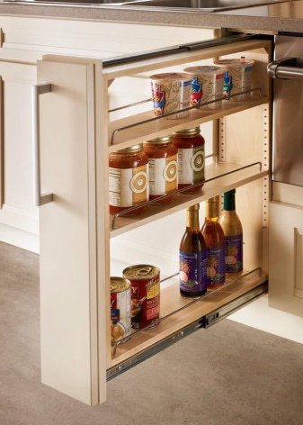
Do not complicate the kitchen with an abundance of elements if it has more than two functional areas. In this case, the luminaires should be small. For example, spot lighting with equal steps would work better. It is also important to consider the style: for example, a minimalist interior implies a laconic design of furniture, which should be manifested in its shape and fittings finish.
See the following video for lighting in the kitchen.


The comment was sent successfully.