Kitchen design options with an area of 11 sq. m
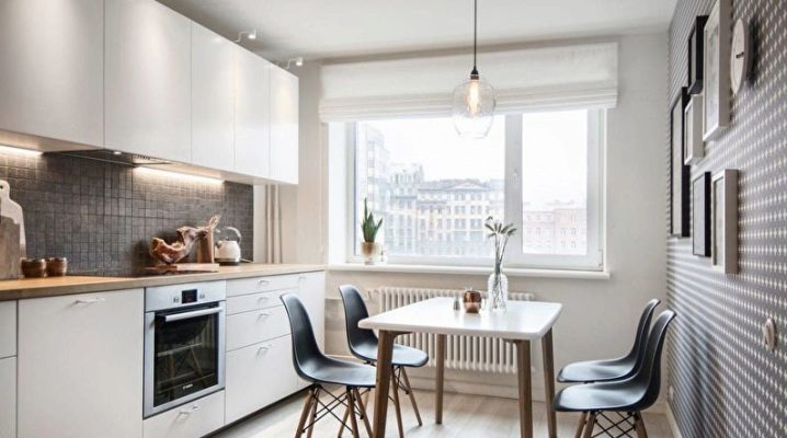
In modern houses and apartments, the kitchen is often the most versatile room in the house. Food is prepared here, it serves as a dining room where the whole family gathers. In the old house layouts, the kitchens were small and did not provide room for design and interesting solutions. Today, an 11-meter kitchen is absolutely common.
This area allows you to make the room as comfortable, functional and effective as possible.
Layout
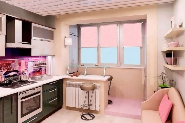
Kitchen 11 sq. m with a balcony allows you to experiment with design and layouts. As a rule, this is a rectangular room, the size of which is sufficient to equip the zoning of the working and dining areas. You can place a spacious kitchen set, even if the room is narrow. It is quite realistic to include in the project a bar counter, a sofa, an island-type table. A project with a balcony exit should ensure its convenient use - nothing should interfere with the ability to freely get to the balcony or loggia.
Regardless of the number of square meters, kitchen design begins with the layout of the entire room. There are 5 main types of layouts available in 11-meter rooms, each of which has advantages and disadvantages:
- parallel (in two rows);
- in the line;
- U-shaped;
- island;
- corner.
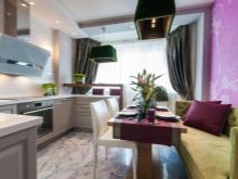
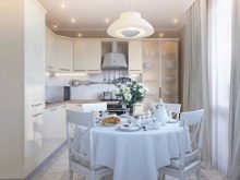
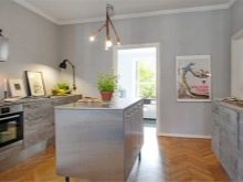
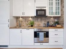
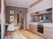
Linear view
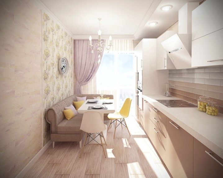
In such a project, the headset is placed along the wall, the dining area is located against the wall opposite. Among the advantages of this scheme:
- ease of planning, the ability not to touch communications;
- the ability to accentuate the dining area by placing the set on a short wall and part of an elongated one.
There is also a minus:
- you will have to place all the functional elements in one row, and this is not very convenient for the cooking process.
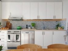
Corner view
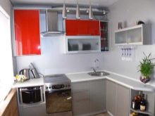
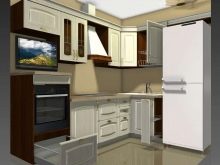
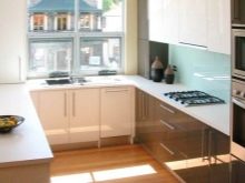
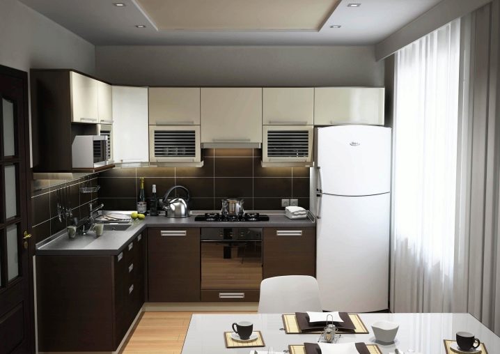
It is arranged in an L-shaped manner, it is a more rational option, especially if the kitchen is not narrow, but has the shape of a square. Advantages:
- the corner in the working area is extremely convenient for cooking, allows you to comfortably place all the kitchen functionality;
- there is enough space for the dining area. There are practically no drawbacks in the corner kitchen.
Parallel view
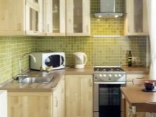
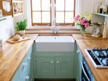
The layout in two rows assumes the location of the headset on two walls, in parallel. It must be borne in mind that the width of the room should not be less than 2.5 meters, otherwise the room will be cramped.
Advantage: it is possible to successfully arrange the functionality for work. Disadvantage: the narrowness of the passage will make the room cramped, and the furniture may seem bulky.
For a more ergonomic work area, place the stove, refrigerator, and storage units on one side and the sink, washing machine and dishwasher on the other. The dining area can be placed near the window.
U-shaped view
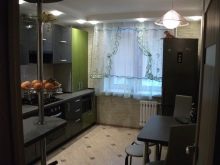
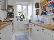
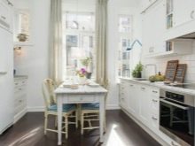
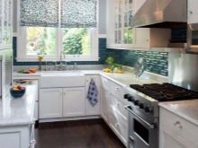
If the width of the kitchen exceeds the mark of 2.5 meters, this option can be considered. It is good in that it allows you to maximize the work of the corners, it is a pleasure to cook in such a kitchen.
However, there are disadvantages: if the kitchen has a balcony, it is very difficult to include an exit to it in the layout. In addition, very little space is left for the dining area.
Island view
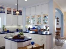
It involves combining any of the above types with an island table in the middle of the room. A table is allowed as a work area and a table for eating.The obvious advantage of this layout is its convenience, you can cook, communicate, look after children at the same time. If you have connected the kitchen to a nearby space as a studio, then this is a great option. However, the main disadvantage: an 11-meter room is not enough to accommodate both an island table and a headset.
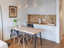
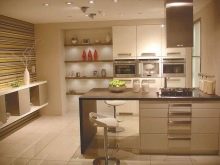
When choosing a layout, immediately think about what your kitchen furniture will be like. Ideally, this is a built-in headset, in which you can fit all the necessary kitchen gadgets, while giving a lot of space for storing food and dishes.
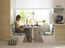
Moreover, furniture designers are constantly offering something new and original. The dining area can be decorated in a corner variation.
It is important that the furniture is selected in the same style, does not violate the harmony of the overall composition.
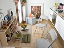
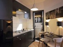
Finishes and colors
Before proceeding with the repair, it is necessary to think over not only color schemes, but also materials. The kitchen space requires a special attitude to the materials, because they will be exposed to heat, steam, water, cleaning agents. Temperature fluctuations are common in the kitchen, so the floor, walls and ceiling must be resistant to such influences.
The floor covering must be resistant, not prone to light damage, scratches. It is good if the stains are not too visible on the surface, otherwise you will have to wash the floors very often, because every drop will be visible.
- A win-win option in this situation is high-quality linoleum. It is very easy to care for him, his resistance to external influences is very high. In addition, the modern design offers a huge number of options for tiles, laminates in all possible colors and prints.
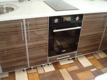
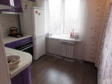
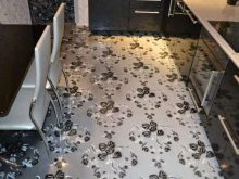
- An excellent solution is tiles, but only if the apartment has underfloor heating, or it is possible to install them.
- A classic kitchen requires the use of natural materials, the best of which is specially processed wood. Among the disadvantages is the high cost.
- A more budgetary analogue of wood is laminate, which looks very similar to it, but costs much less.
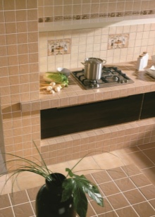
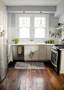
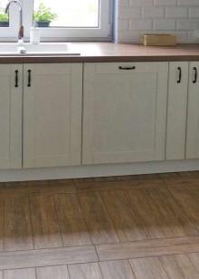
You can decorate the walls in the kitchen in different ways, including combining different materials. The main thing is that they should be easy to clean and not be damaged by detergents, not flammable. Feel free to combine washable wallpaper with brickwork, tiles, plaster and paint.
As for the ceilings, different options are possible here:
- drywall:
- tension;
- made of plastic;
- rack and pinion;
- bleached.
The most comfortable and durable are tension and plasterboard. Drywall can be whitewashed, and the tensioner can be simply washed.
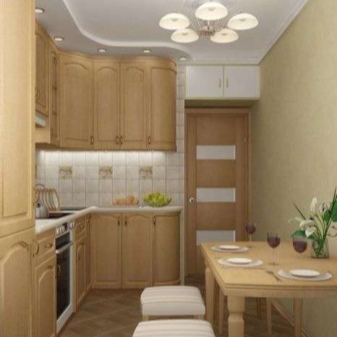
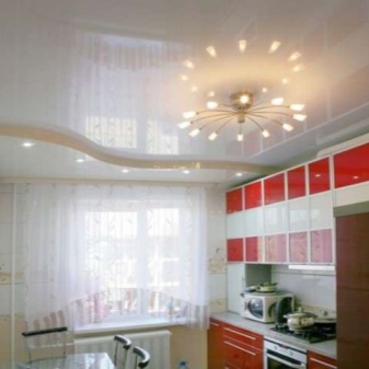
A very important design element is the window opening. It can be formatted in different ways depending on the initial data:
- standard glass unit;
- double-glazed window with access to the balcony;
- panoramic design.
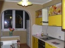
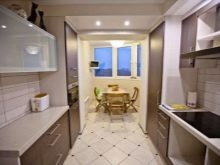
The latter option will make the room especially bright, but the air temperature in the room may drop. Another common solution is to combine a kitchen with a balcony. It will increase the area, but will require high-quality insulation and permission from many authorities. There is no way to completely demolish the wall, since it is load-bearing, however, you can consider variations with an arch or a differently decorated remote doorway.
After choosing the quality of the material, you should consider the color composition. Color plays a vital role in the design of any room.
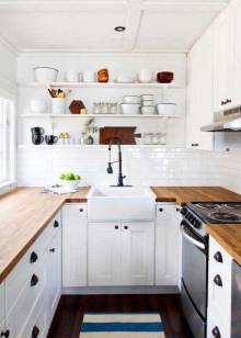
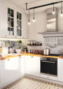
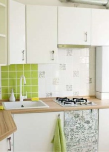
Snow white
This range is incredibly popular with designers, its great advantage is the ability to increase space, add air, space. A plus can be considered the versatility of white, it fits perfectly into almost any style and is perfectly combined with other scales. White is not only aesthetic but also functional. Bright shades, pastel colors, black and gray look great in combination with white. Geometry stands out among prints, and there are practically no exceptions for styles.
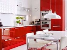
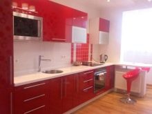
Red
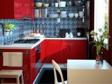
This color can be incredibly versatile, you don't have to go for a blood red option. The berry and wine range also looks luxurious. An excellent duet for red will be white or beige. A red kitchen can be not only bright, but also incredibly elegant, but this will require careful thought over the details.
Red is too self-sufficient, it is impossible to overload the interior with other bright colors. Don't choose red for bulky pieces of furniture.
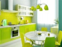
Green
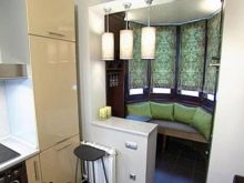
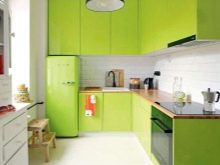
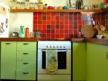
This is one of the most popular colors in the kitchen interior; housewives love it very much. It is not surprising, because it is very cozy, relaxing, cheerful. The green kitchen is very comfortable for perception. The best combinations of greens are obtained with beige, brown, white, lemon, olive. Catchy and interesting projects can be created by combining greens with purple, peach.
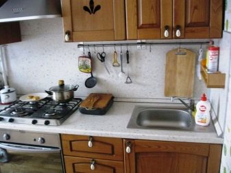
Brown
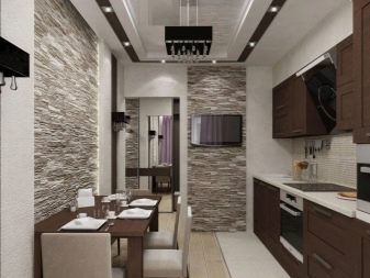
This is a canonical solution, the most traditional and not boring at all, if taught correctly. Any color will sooner or later get bored, and the classic shades of wood are eternal. They don't go out of style. Choose a coffee, walnut range, complement it with elements in shades of beige, green, gray.
If you prefer a dark brown color, think carefully about the lighting so that the room is not gloomy.
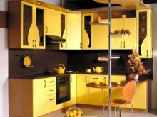
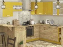
Yellow
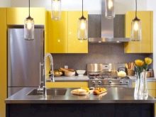
Such a cuisine is very optimistic, all shades of the sun, lemon perfectly raise the mood. In addition, yellow can be very muted, pastel. It combines very well with other scales, especially with green, brown blue and blue, white.
Decor and textiles
The interior of the kitchen should be not only beautiful, but also practical. Textile design, ideally, does not make the composition heavier, so you should not opt for bulky elements. Designers recommend taking into account the following rules for the use of decorative elements:
- place pictures and other decorative elements at the level of the gaze, as symmetrically as possible;
- the design of the hood will perfectly hide the box or hanging cabinet;
- exclude dark shades of curtains if there is a lack of light in the room, in addition, the light range expands the space;
- beautiful chair covers in the general style of the room will give it expressiveness and style;
- kitchen design can be very practical; use dishes, plates, books, flowers as decoration elements;
- be sure to think over the lighting and general lighting of the room, the right light is a great decorative nuance.
Lighting and illumination
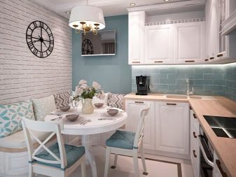
The choice of lighting in the kitchen should not be approached thoughtlessly, since the correct organization of light is very important for the work process and the overall perception of the room. Try combining general, decorative and work area lighting. Each of them requires a different power: bright light in the workspace, soft and diffused - as a decor.
Observe the minimum distance from lamps to water - more than 70 cm. Lamps that change the angle of direction are very convenient.
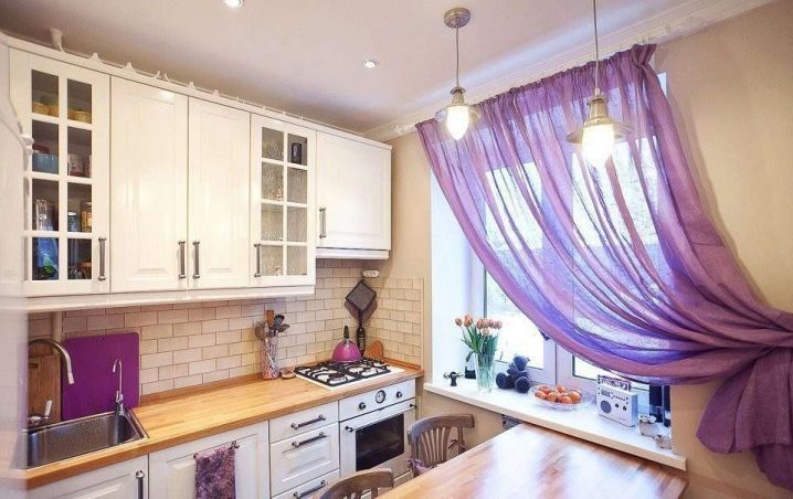
Styles
Almost any style can be realized in the interior of an 11-meter kitchen with a balcony, it all depends on your taste and desire. Let's consider the main style directions.
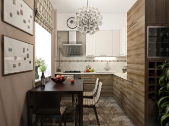
- Modern - functional, practical and quite cozy. Minimalist design trends are relevant today, natural materials, laconic colors, little or no decor are preferred.
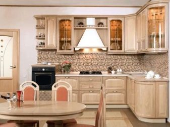
- Classical - always fashionable, sophisticated and expressive. Clarity of outlines and regular shapes prevail. Mostly decorated with environmentally friendly furniture, the decor and palette are natural, restrained.
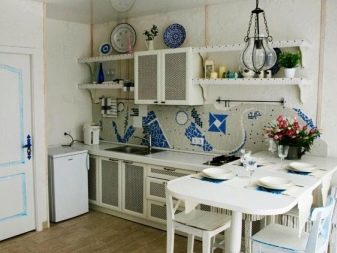
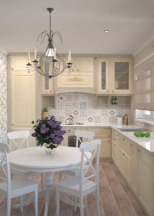
- Provence - cozy, romantic country style. Semi-antique furniture and decor, soft, warm, color palette. The decor is preferable in the style of hand-made, clay, wood.
- Retro - allowing to interweave elements of different eras and times. Sideboards, sideboards, cabinets, bookcases, tables on one leg are used as furniture.The colors are deep, retro photos and wooden elements are perfect as decor.
- Eco - very creative design, while not damaging the environment. Furniture and all design elements must be environmentally friendly, you can combine wood, metal, glass.
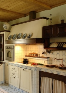
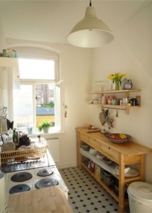
Interior design ideas
A bright, comfortable kitchen in a warm range looks very cozy and attractive.
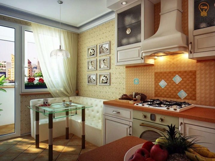
White is a safe bet, making the kitchen look bigger and more airy. The bright decor enlivens the overall picture.
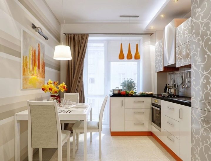
Competent use of space allows you to place in the kitchen not only a functional work area, but also a comfortable dining room.
A corner L-shaped kitchen is an excellent solution for such an area.
Combining a loggia or balcony with a kitchen makes it possible to experiment with design and increase the area.
Kitchen design 11 sq. m. in a Mediterranean style, see the next video.


The comment was sent successfully.