Posters for the kitchen: selection rules for the interior
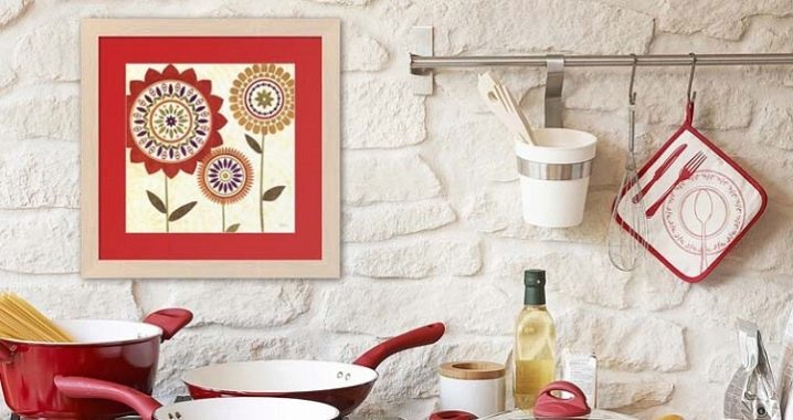
The word poster is of English origin, post means "to paste" or "hang", which is what happens with ads and posters. This name was assigned to artistically designed posters.
Since the end of the last century, the so-called art posters have appeared, which convey the image of artistic compositions. Disputes about whether to consider them as posters or reproductions of paintings are still going on, the designers did not come to a consensus.
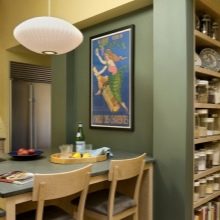
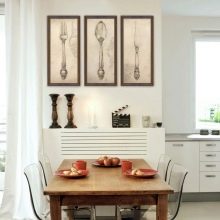
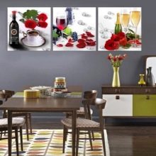
Peculiarities
In the interiors of our houses, posters have appeared recently, unlike Americans and Europeans, who have been decorating their homes with a similar type of decor since the last century. This does not mean that the walls of the apartments have become like bulletin boards. Modern technologies make it possible to produce high-quality products obtained with the help of computer programs.
Today, posters are printed on coated paper, acrylics, photographic paper and even canvas. They do not fade under the influence of ultraviolet radiation; it is easy to remove dust from them with a damp cloth. Some types of products are expensive. For their decoration, baguettes made of wood with decorative carvings are used. You can choose frames and cheaper, or you can just pull the canvas onto a stretcher. The main thing is that the image should please, reflect the mood and essence of the owner, then the time spent in the kitchen will seem pleasant, and the room itself will be original and cozy.
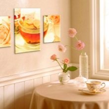
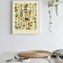
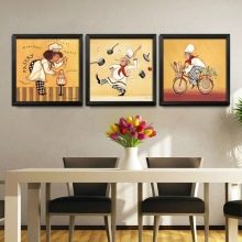
Where to begin?
If you have an idea to introduce a poster into the kitchen interior, you should start by determining the place for the future canvas. But more often it happens the other way around - an empty wall leads to the idea of filling it with an image.
Let's consider what you should pay attention to.
- The selected place should be visible from all sides, not falling under curtains or open doors. Then you need to measure it. The dimensions will tell you whether a vertical or horizontal drawing is required.
- Before ordering a poster, you should take a look around the situation, feel the color scheme of the interior. The palette of the canvas can match one of the shades of the kitchen or, on the contrary, stand out with rich, catchy colors.
- In addition to the color scheme, it is necessary to link the image with the general stylization of the kitchen. For minimalism, techno and other modern interiors, abstraction, computer graphics are suitable. Still lifes, floristry, landscapes can be introduced into classical and any other historical design. Even a specific kitchen theme: fruits, coffee, dishes with food - is performed in different styles, from ultra-modern hard-to-recognize images to imitation of 19th century retro posters.
- When everything is taken into account, it is time to remember which theme is close to our character, mood, emotional background and choose a poster that meets not only all design requirements, but also our state of mind.
At first glance, it may seem that the choice of canvas is not an easy task, but in fact, today a large number of online stores offer a variety of products. The most demanding aesthetes can order their own poster from any printing company.
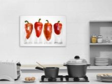
How to choose the right one?
There are some rules for choosing posters for kitchen day.
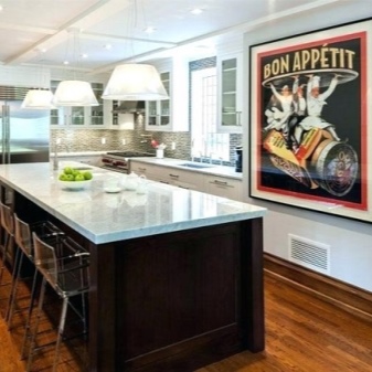
- Looks more impressive in a large room large posterlocated in the dining area. It is important that the center of the picture is at eye level.You can decorate the kitchen with a modular composition of two or three images or two medium-sized canvases hung on different walls.
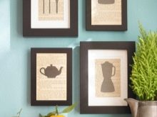
- Mini art - tiny images in frames - suitable for styles that require a lot of decor: small vases, candlesticks, clocks, plates, sea shells. These include the areas of shabby chic, Provence. Their posters should be retro-directed, repeating images of advertisements of past centuries.
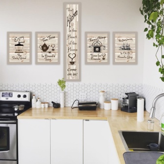
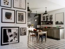
- Mix compositions are composed of figures of unequal size. You can arrange them in different ways, for example, make the largest one in the center, or hang them in ascending order. Sometimes they just decorate the wall without regard to the size of the frames. To decorate classic interiors, a mandatory rule should be compliance with symmetry, therefore, the frames are hung in a line, square or ladder.
- An interesting trick for kitchen design - use of collages. On a single basis, various types of images are applied, united by a common theme.
- For kitchens, not only mouth-watering themes with a grocery set are appropriate. For some styles, you can choose urban images with monolithic skyscrapers, or pictures of cute street cafes on the outskirts of Paris. For pop art, bright poster collages are suitable. The modern style kitchen will be adorned with elegant black and white images.
Bright abstractions carry not so much a semantic load as an energy charge and are needed by kitchens where young people live.
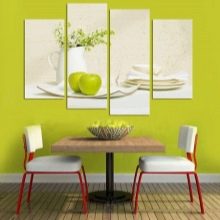
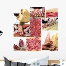
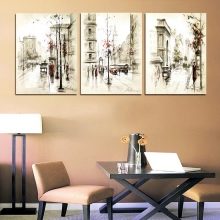
Beautiful examples
In the kitchen, there can be images on any positive topic, the main thing is that they do not spoil the appetite. Of course, the food theme will always prevail in such a room.
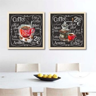
- Coffee plots are especially popular in this area.
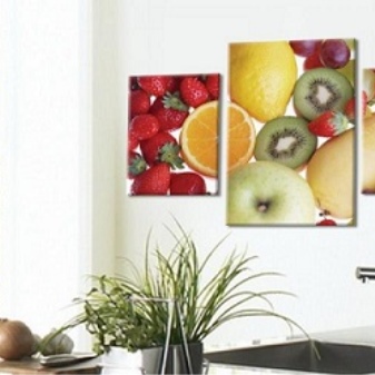
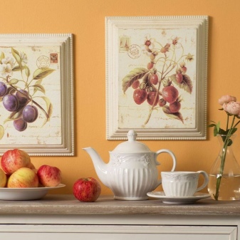
- The fruit and berry theme is not inferior to the coffee one. It can be easily matched to any interior, as the fruits have bright, juicy and varied colors. If you take a macro shot against a white background, you will definitely find a fruit or vegetable that matches a particular design.
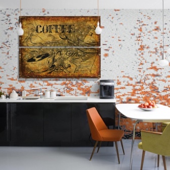
- In a gray monochrome kitchen, just one bright poster can turn everything around and revolt the mood to an emotional outburst. A motley multicolored space, turning around, converges at one point, from which it is difficult to break free and take your eyes off.
Such plots cannot be called appetizing, but for some styles they are a strong design decision.
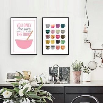
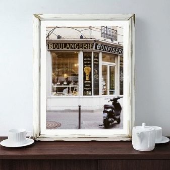
- Many people prefer to see posters of quiet street cafes in their kitchens. They create an atmosphere of peace and tranquility as opposed to the real hectic life of the city outside our windows.
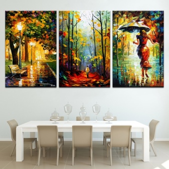
- Rainy autumn parks or London streets in the old part of the city are also conducive to a calm, even melancholic mood. Such pictures are needed by romantic natures. For them, there is nothing better than dreaming about love on a rainy day, sitting in a cozy armchair.
- Vintage rustic posters are great for all country styles.
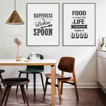
- Pictures with inscriptions are gaining popularity. It doesn't matter that they are in an incomprehensible language. To stylize the poster into the interior, the background on which the inscription is made is enough. But if the hostess of the kitchen wants to convey her character to those around her, she will choose a poster that will be understandable to everyone.
Today, not in every kitchen you will find decor in the form of a poster, go for it, someone needs to start. Moreover, this element amazingly transforms the space.
For how to easily and quickly make posters with interesting and inspiring inscriptions and quotes with your own hands, see the next video.


The comment was sent successfully.