Methods for zoning the kitchen and living room
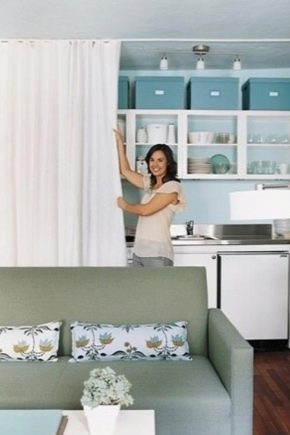
Zoning rooms is a necessary step in creating a harmonious interior. This is especially true when there is a lack of footage and a not entirely thought out layout of rooms, which is typical for many houses and apartments. And if, say, the developer considered it necessary to combine the kitchen and living room, one cannot do without an unobtrusive separation of the two spaces. How to do this correctly, using different methods, what needs to be taken into account - we will consider in detail below.
Pros and cons of zoning
Zoning is a tool for delineating spaces. Moreover, it can be done in different ways. This design technique has its merits.
- Zoning allows you to make two (or even three) of a single room, while different in purpose and functionality. This is a kind of budget option for transforming space.
- Dividing the space into sections of different purpose contributes to an unobtrusive organization, which eliminates the appearance of a mess of different zones.
- This allows you to beat the disadvantages of the layout of a particular room, presenting them as advantages.
- Zoning has several varieties, through which you can delimit the space without breaking the integrity of its interior.
- This technique gives a lot of opportunities for arranging furniture, accessories, it allows you to create a composition in a single interior style, hinting at belonging to it.
However, there are several disadvantages to zoning.
- It must be done thoughtfully so as not to split the space into unused corners, and it is possible that an uncomfortable and uncomfortable room will be created.
- It is difficult to beat it in rooms with a broken perspective, in which the walls can be sloped, or even triangular or abound with incomprehensible protrusions and kinks.
- Dividing a room into two functional zones can deprive the space of the feeling of air and spaciousness, so it is often impossible in small apartments.
- As a rule, when dividing a room into a kitchen and a living room, you have to additionally think over separate lighting, and this is additional work, the cost of calling the masters, purchasing lighting devices and the subsequent repair of the walls or ceiling.
Visual tricks
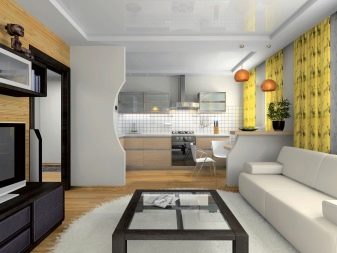
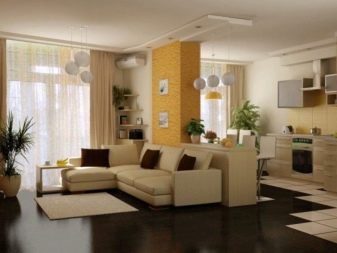
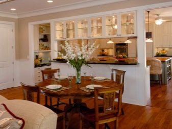
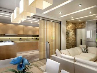
You can zoning the combined space in different ways. To do this, you can use various wall cladding, separate lighting of individual functional areas, accentuating the floor, arranging furniture and imitation of fencing. Each type of room division has its own nuances.
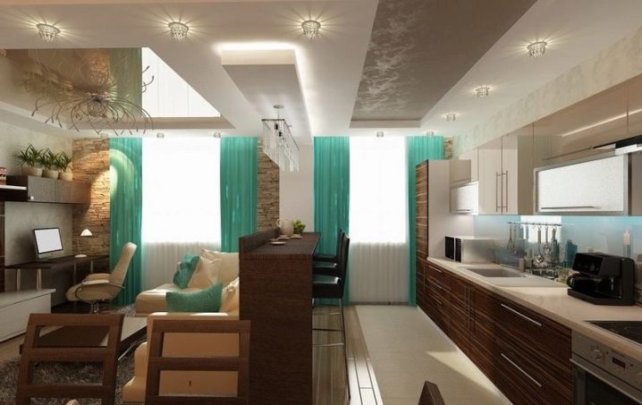
Lighting
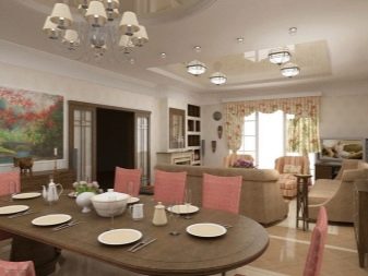
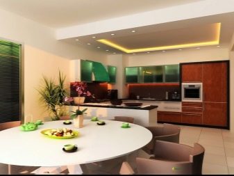
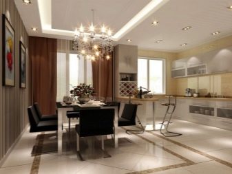
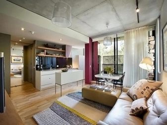
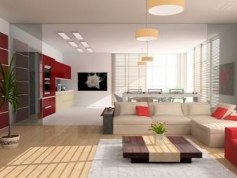
This technique can be called one of the most common and successful zoning methods. It allows you to compensate for the lack of natural lighting in the room, which is especially important when the light flux is directed and is not able to illuminate the corners of the room. If initially the room had only central lighting and wall lighting, it makes sense to designate each zone. For example, you can accentuate the guest space with a beautiful chandelier and spotlights to highlight the dining table.
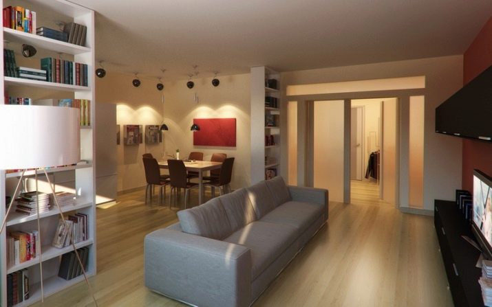
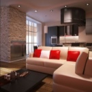
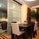
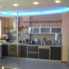
There can be a lot of combination options, it depends on the height of the ceiling, its design and the size of the entire room. You can bet on the same shape of the luminaires by placing them in each zone.Several small lamps in a row above the bar and a similar design chandelier above the coffee table surrounded by a set of upholstered furniture will look good.
With regards to lamps, it is worth noting: their shape, size, number will depend on the style and nuances of the layout. For example, for "Khrushchev", powerful options on long hangers and chains are undesirable, even if you want to keep the interior in a classic style. This style loves space and scope, otherwise it will simply not work to express the palace solemnity. Modern design trends involve the use of panel lamps that can be positioned both in the cooking area and above the guest space of the room.
Floor zoning
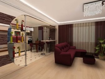
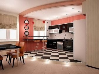
Dividing the floor so that it does not look fragmented is not an easy and creative task. This can be done in different ways. For example, due to floor cladding of different sizes or patterns in related colors. The separation of two functional areas with a contrasting finish will look beautiful. For example, you can choose a dark color for the kitchen and a light color for the guest space. To soften the connection of two contrasting tones, you can put a cladding between them, the tones of which will be related to each of them.
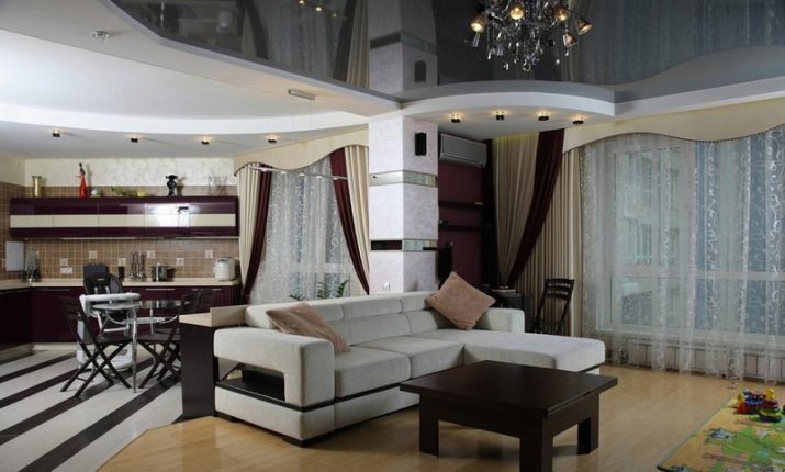
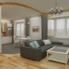
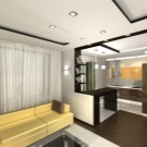
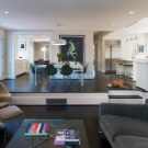
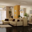
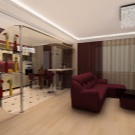
You can beat the zoning by means of different directions of laying the floor tiles. The original version is an imitation of carpet, which is laid out in the living room area, denoting a border tile, like the edge of the carpet. Someone prefers to use different types of coatings for zoning a room. Often, such a combination allows you to achieve a special effect and a clear organization of two areas of the room. You can choose a combination, for example, tiles with linoleum, choosing a tile material for the kitchen area and linoleum for the guest room.
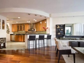
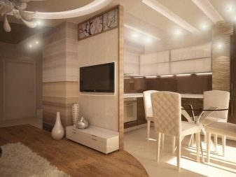
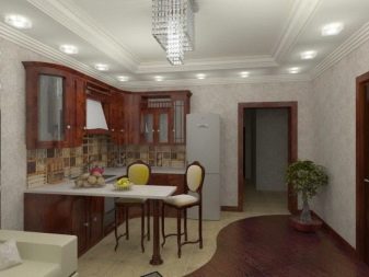
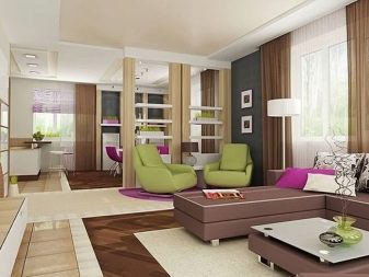
If you don't want a complicated floor decoration, you can do it easier: put a soft carpet in the guest area. This will allow not only to designate a separate space, but also to fill it with an atmosphere of home comfort. In order for the coating to look uniform in the existing interior, you can choose a color that will suit two different areas of the room. The size of the carpet is selected individually, usually it covers the area where the set of upholstered furniture is located.
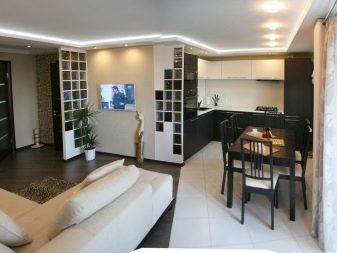
Choosing different wall finishes
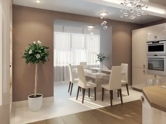
Perhaps this method of zoning a combined kitchen and living room can rightfully be called one of the most affordable options. It does not require large financial investments and labor costs, because you can even designate two different spaces with a standard wall cladding - wallpaper. Easier than ever - to stick different wallpapers for the kitchen and living room areas. This looks especially harmonious when the two zones are indicated by the existing protrusions.
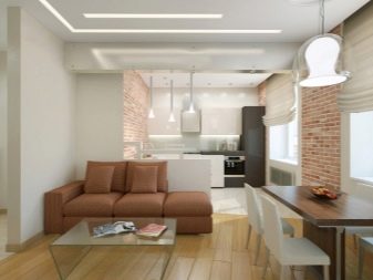
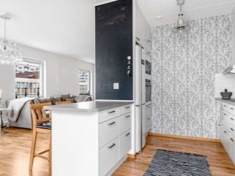
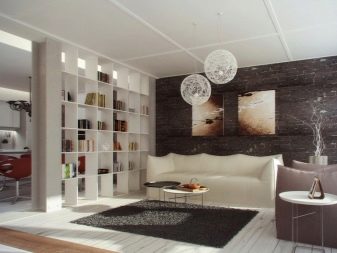
When there are no protrusions, and the style does not provide for an abundance of contrasts, the choice of different cladding should be approached especially carefully. Here you can highlight some separate part of the wall, hinting at the boundaries of the zones. You can create the illusion of delimitation using textured wallpaper and panels without a pattern. For example, the entire room can be pasted over with plain panels, and in the kitchen area, you can choose, say, embossed coatings with the effect of brickwork.
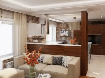
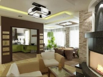
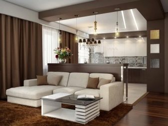
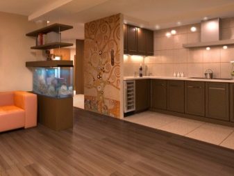
The living room can be decorated with a photo print that will add a special mood and support the chosen interior style. By the way, with the right choice, wall murals can visually make the space larger, endowing it with the necessary emotional coloring. The hall can also be accentuated with photo wallpapers under a canvas in the form of a panel, which will add a touch of luxury to the interior. To make the design of such a room look unified, it is enough to support one of the color shades, using it in the design of the kitchen or dining space.

How to divide a room with furniture?
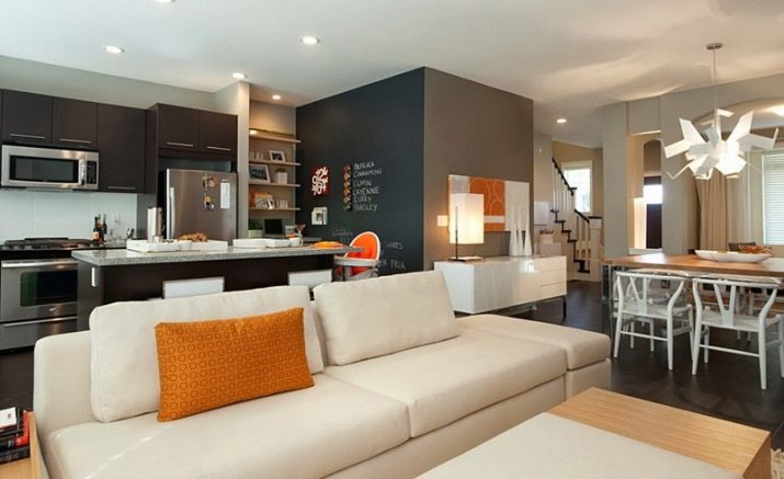
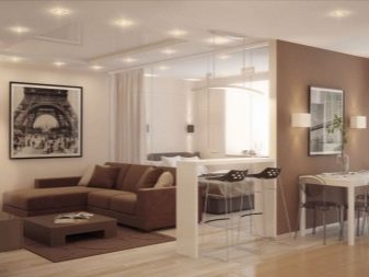
You can also achieve harmonious zoning of the kitchen by arranging furniture.For example, sometimes turning the sofa is enough; you can also cope with this at the expense of the bar counter, which sets clear boundaries between the different zones of the room. A narrow high table with high chairs, which can be installed in the desired place of demarcation, is also suitable for these purposes.
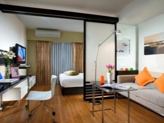

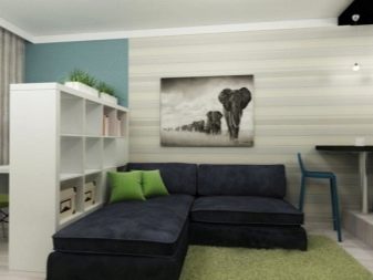
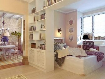
Sometimes racks, shelves, cabinets and dressers are used for separation. In each case, the products are selected in such a way that their installation does not interfere with movement around the room and the operation of the furniture itself. A sofa or shelving turned towards the living room will already separate the space. If there is enough space in the room, you can divide it into a living room and a kitchen using a dining area. To do this, it is enough to place a dining table with chairs between the two zones.
We put partitions
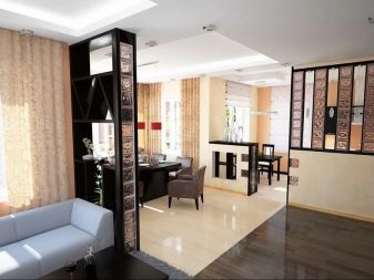
You can fence the combined space based on its footage. For example, if the room is very small (up to 18-20 sq. M), this is undesirable, because, in addition to darkening, the effect of uncomfortable cameras will be created. If the room is small but light, asymmetrical partitions can be made. Let's say one of them can be the height of the entire wall, the other - no more than the height of the desk. To make them look interesting, you can beat their shape using not only straight, but also curly edges.
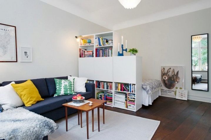
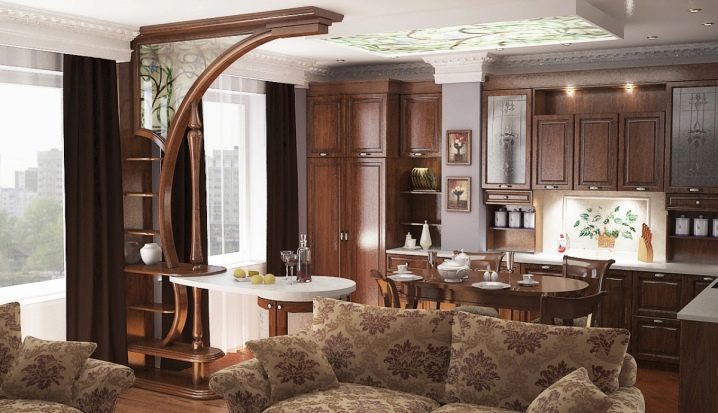
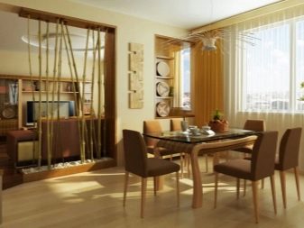
When giving preference to partitions when zoning, it is important to understand: their thickness and width are selected based on the total footage of the room, the chosen style and interior design. In this case, the partition can be not only deaf, but also through. For example, it can resemble a frame, which will allow its lower part to be used with sufficient width, as a tabletop for fresh flowers or a floor vase.
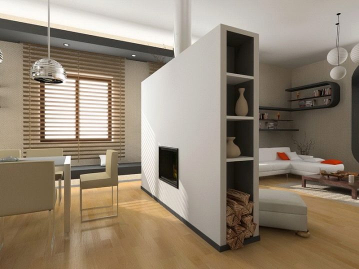
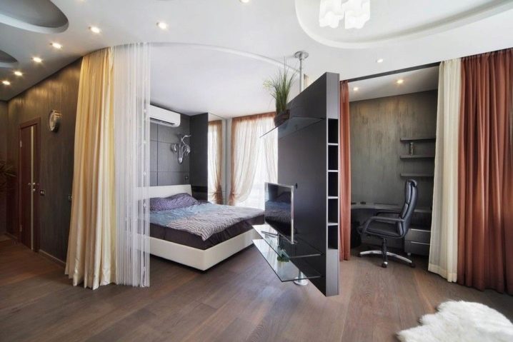
If there is enough space in the room, you can separate one area from another with sliding walls. Moreover, they can be different: both for the entire height of the walls, and small. The design options for the room with such partitions vary, but the beauty of these walls lies in the use of glass. And this, in turn, contributes to the introduction of lightness and air atmosphere into the interior.
The partitions must be installed correctly. If the room itself is small, a hint of demarcation is enough, while the partition can also be symbolic. For example, someone uses textile screens or folding options that imitate compartment doors for these purposes. The latter products, like sliding walls, are convenient in that, if necessary, they can be folded, visually increasing the footage of the room.
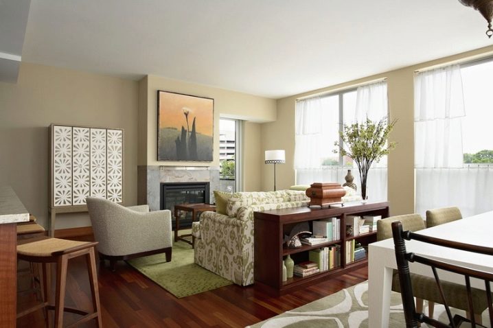
Successful examples in the interior
Finally, you can turn to some of the most interesting zoning ideas collected on the Internet.
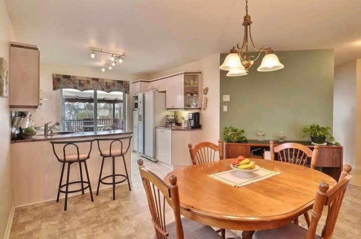
The bar counter divides the room with a broken perspective.
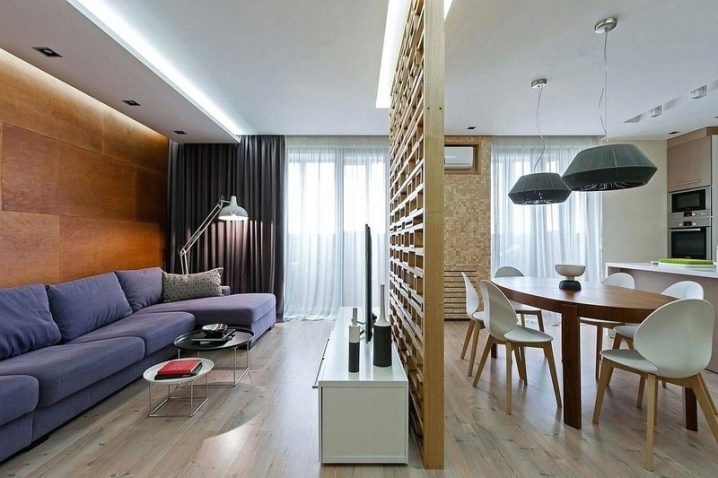
A wooden partition for the entire height of the walls harmoniously divides a large and wide room into two small ones.
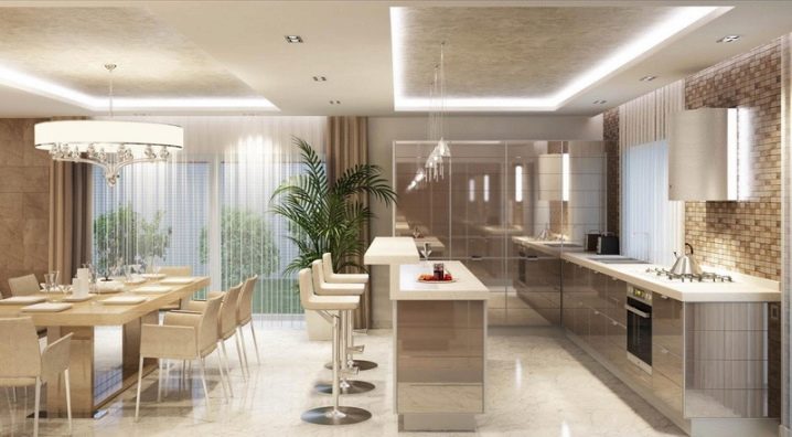
The contrasting finish of the floor subtly zones the dining and guest areas.
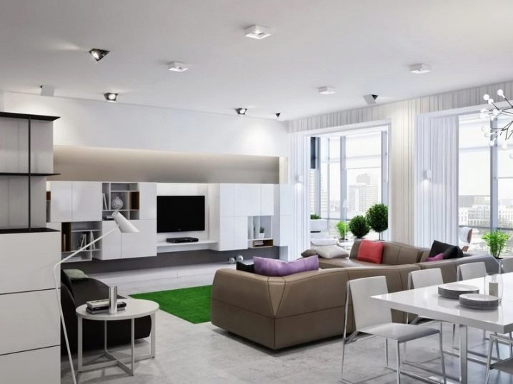
Separate lighting of two different areas of the room looks holistic and modern.
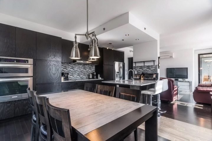
Designed with individual lighting techniques for the dining area and cooking area.
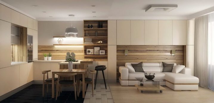
Furniture turned from each other in different parts of the room clearly enough indicates the boundaries of each functional space.
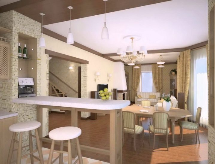
The use of different materials for flooring different areas. The color scheme and different textures allow contrasts to indicate the boundaries of two areas that differ in purpose. Accent wall coverings represent the kitchen area, playing on the flaws in the layout of the room.
For information on how to zone a kitchen-living room with a partition, see the next video.


For a long time I have been studying zoning techniques for the living room and kitchen, I did something like the advice here. It turned out gorgeous, it became much more comfortable and it is not a shame to invite guests.
The comment was sent successfully.