How to combine the kitchen with the living room?
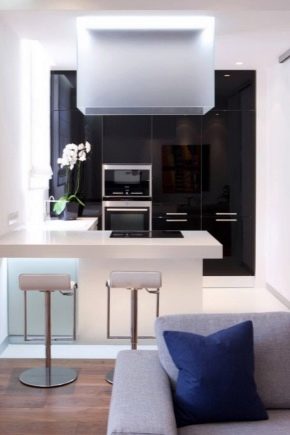
Apartment owners often suffer from a lack of usable space. And if the main living rooms are still quite decent in size in most cases, then there is not enough space in kitchens and living rooms much more often. The desire to unite these premises is logical, but such a step must be taken with caution, taking into account all the positive and negative aspects.

The advantages of connected rooms
They are obvious:
- more space appears for life;
- the territory looks brighter, more joyful and even cleaner;
- the number of available design options is increasing;
- you can show your individuality to the fullest.


disadvantages
The most difficult thing that distinguishes the connection of the kitchen with the living room from a simple overhaul is the need to coordinate the work, to obtain permission. If the wall connecting adjacent rooms is part of the capital structures of the house, it will be impossible to obtain a permit. And attempts in this case to carry out the work on their own, without approval by state bodies, can lead to the appointment of a fine, to the termination of the social employment contract, or even to the collapse of the house. After the redevelopment of the room, the commission is again presented, which must confirm that the project does not violate the basic rules.


In addition, you need to take into account the following circumstances:
- even powerful hoods do not save 100% from the spread of bad odors;
- the possibility of privacy both in the kitchen and in the guest area disappears;
- you will need to clean more often;
- the need to constantly observe how they cook or eat suits only a part of the people.


Features of redevelopment
The desire to combine the kitchen with the living room is typical mainly for the inhabitants of small-sized housing. But they are the ones who most often face difficulties along the way. Often all the walls that can only be touched to mix the premises are load-bearing, it is unacceptable to break them. In some cases, the formation of an opening with retaining supports helps. However, architectural supervision authorities do not always agree to even such a half-hearted solution.


Combining a kitchen with a gas stove and a hall is categorically unacceptable. - even if the separation wall is not important in principle. This is due to safety regulations that do not allow the installation of gas appliances in the living space. And dismantling a gas stove, as well as installing it, is possible only with the permission of industry supervisory authorities. You will also have to install electrical wiring, which will allow you to supply current to the electric stove. In many places, the total capacity of external electricity does not allow for such a step.


Admittedly, cooking on an electrified hearth will immediately increase costs. Therefore, sometimes you have to make a compromise, for example, combine a kitchen with gas equipment and a living room using:
- a door;
- mobile partition;
- fixed separator.




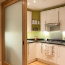
When such a barrier is folded, it opens an unobstructed passage. If necessary, it is shifted as tightly as possible. It is not recommended to go for the trick, putting a temporary partition before visiting the controllers and putting it away for storage after they leave. After all, such restrictions are not invented in vain, they are associated with concern for the safety of residents and their property.It is better to immediately choose the option that will allow you to arrange the entire space flawlessly and clearly, relieve you of aesthetic problems.


Alternatively, you can make a shared room by installing a sliding door. The classic swing type will not work. It is desirable that the appearance be similar to a sliding wardrobe. But in the choice of decoration material, residents are not limited by anything, designers advise to be guided by personal taste. Most often, in one room, created from two, they put a glass door - it allows you to really pull together dissimilar parts and make them lighter.



Zoning rules
Even with the closest possible confluence of the kitchen and living room, one must not forget that these are two dissimilar parts of an apartment or house. We must try to emphasize their difference, doing it subtly and without rough opposition. The widespread opinion that it is possible to solve such a problem only by introducing special elements is erroneous. And yet, it is worth first considering crushing the territory with special accessories. In apartments built in 1960-1970, the ceilings were made very low, which is why splitting by raising the floor or forming tiers on the ceiling immediately disappears.


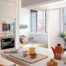


Stationary architectural space dividers can be quite different in design, but at the same time, relatively low products divided into blocks should be preferred. An excellent choice is to use a small-width bar counter. This design does not absorb too much space and immediately makes the room more expressive. But the problem is that more and more people are doing this. And the once original, fresh solution gradually turns into a design stamp.
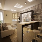


The use of the remainder of the previous wall in this role will turn out to be somewhat more individual. It is only necessary to remove it from the very beginning not to the end. Partitions based on drywall are gaining more and more popularity. It is easy to form exactly the composition that is needed from it, to embody the most daring and non-standard ideas. When using drywall, you can arrange the barrier in some ethnic style or turn it into a more practical element, equipped with small shelves and sometimes shelving.
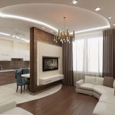


All of these ideas are good, but many will not like them. Often the opening connecting the former separate kitchen with the corridor is laid. A living room is used for the passage. When everything is finished, a cabinet or refrigerator will be put in place of the former door. It is logical to plan everything at once so that there is a working area equipped with a hood nearby.
Along with architectural techniques, one should not neglect the methods of visual fragmentation of a single room. You can even combine them. It is allowed to use differences in flooring as an accent if the kitchen area is limited. Ceramic tiles are installed in it, which for many decades have fully met all the expectations of people. The rest of the space is usually covered with laminate, this technique allows you to achieve a brilliant visual effect and save money.


To decorate the guest area, they often also use traditional parquet or carpet. The use of contrasting tones helps to avoid mixing dissimilar parts of the room, to enhance the accent. It is important not to forget about lighting. With its help, you can cover up insufficiently attractive areas and focus on the most valuable, in the opinion of the owners, places. Most often, the working area of the kitchen is illuminated pointwise, and the use of chandeliers is recommended for the guest block.


But the light from the ceiling does not always satisfy guests or gathered members of the same family. In such a situation, they should be able to turn on a floor lamp or other wall lamp. Any piece of furniture can be used to divide the space.Sometimes a large dining table, placed at the junction of the kitchen and guest areas, is sufficient in itself as an accent. This solution is useful to keep in mind for anyone who wants to solve a problem quickly, cheaply and with a minimum of physical effort.


With all the simplicity of splitting the room with color accents, you should not make them as pretentious as possible, to achieve extraordinary originality. When one wall blazes orange, and the other is painted like a green meadow, only bewilderment and even irritation arises. It is extremely impractical to use a sofa for differentiation, although it is recommended by many "experts". The fact is that even with a fairly large distance to the stove, a considerable part of fat, soot and the like will be deposited on it. Of the cabinets, those with open shelves are preferable.


If you have available funds, you can think about the demarcation of a decorative fireplace. Or even real, additionally warming up the room. Another option is a chain of flower pots. Like a large aquarium, they will perfectly fit into an environmentally friendly room. All other considerations are at the discretion of the homeowners.
Room design
No matter how well thought out the division, it plays a subordinate role in comparison with the design concept. Since they begin to connect rooms mainly with an acute lack of space, the design should also be built accordingly. Light colors of paints and varnishes and finishing materials are extremely valuable, and the less sunlight gets inside, the more significant this circumstance. It is useful at any opportunity to use mirror elements that make the atmosphere cozier. If a simple light room seems boring and not expressive enough, it is perfectly acceptable to put furniture with facades of rich colors.

Since the kitchen and living room for most people associate with something calm and cozy, a proven classic style will almost always be a win-win option. Then the interior is abundantly saturated with balanced, softened colors. The walls in a simple modification of the classics are covered with wallpaper. If there is a desire to make the environment more elegant, to show your aesthetic tastes, you can use decorative plaster and painting. But a cloth covering is needed only where there are claims to luxury, in which case it is required to supplement the composition with furniture with gilded decorations.

In any case, classic furniture is strictly wooden, even a hint of synthetic materials will immediately destroy its charm. You will have to choose expensive materials for flooring. There are also not always funds for marble tiles. In this situation (or when the classic interior seems cold and indifferent, excessively pompous), it is worth thinking about the Art Nouveau style. There are already many more options for joining different types of materials.

There are no rigid frames for the use of colors. Still, the canonical version of Art Nouveau is the use of calm tones with graceful ornaments. It doesn't matter whether they will be on the walls or on the furniture, as long as the overflow of space is excluded. The opposite of cozy and harmonious modernity is demonstrated by the high-tech style. It implies the cold coloring of the room, on which the coincidences with the classics almost end.

There is only one more point of contact: many cutting-edge solutions and items are very expensive. Products made of glass or shiny metal will be indispensable attributes of such a space. In the kitchen area, only new compact equipment is required to be placed. It is very good when blinds are fixed on the windows. Auxiliary illumination of the spot format is indispensable.

It so happens that after redevelopment, a relatively large space is formed. Then it becomes possible to decorate the room in the loft style.Such a step requires careful consideration, and there is a lot of effort behind every “obvious and easy” decision. The traditional rule is: a loft is a brick (or imitation of it) on the walls and wood on the floor. There is no particular need to use curtains.

Multifunctional elements are more attractive than ordinary ones, the same bar counter, despite its seeming bulkiness, allows you to get rid of detached dining tables and cutting surfaces. If the total area is small, furniture is carried out in the form of a straight strip or the letter G. Where space allows you to use the loft style, you can resort to:
- U-shaped filling;
- the formation of islands;
- two-row placement.

Successful interior examples
Here is a very attractive example of the design of a connected kitchen-living room, the authors of which emphasized the contrast of dark and light colors. Sunlight pouring from the windows onto the light sofa and the floor is intertwined with brownish furniture. The L-shaped arrangement of furniture in the guest room and appliances in the kitchen area looks good. And here a clearly different approach has been chosen. White and various shades of green were chosen as contrasting tones; for a more natural interior, a plant was placed in a tub.

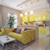
An elegant technique for zoning has been applied - in one part the lamps are convex, and in the other they completely merge with the plane of the ceiling. Local color accents are represented by light yellow kitchen furniture fronts and similar floors. Another way to combine dissimilar rooms is also presented here. The lush, solemn ambiance in the guest area is accentuated by exquisite flooring. Against the background of the dominant white color, the canary sofa becomes a bright and expressive element.
Watch a video on the topic.


The comment was sent successfully.