Kitchen-living room design: important nuances and real examples

A combined kitchen-living room in an ordinary apartment is no longer a rarity today. There are a number of reasons why owners choose to combine the kitchen and dining area with the lounge. However, in the combined part of the housing there will be quite a lot of diverse zones, therefore the design should be very thoughtful so that everything looks holistic, but does not merge.
Pros and cons of combining
If you still have these rooms separate, but the idea of combining them has been ripening for a long time, it is worth considering whether such a solution is practical at all or not. You should not rely only on what is so fashionable now - there are other advantages of such a combination:
- in cramped apartments, the absence of an extra partition allows you to free up additional space;
- increased interaction between those present in the apartment - the hostess can simultaneously cook and look after the children or communicate with guests;
- instead of the typical two TVs, one is now enough, which can be watched from almost any corner of an apartment or cottage.


True, there are some disadvantages for which you should be prepared:
- culinary smells, including unpleasant ones, will become regular guests in the hall;
- the kitchen in the process of cooking can take on an unsightly look, but if it is combined with the living room, this shadow will also fall on the latter;
- the ability to retire and hide from the noise decreases, and if all kitchen appliances work at once, then the same TV from the kitchen may not be heard.


We highlight the functional areas
The fact that there are no walls between the rooms does not mean that they do not need to be separated at all, otherwise the apartment will be a complete mess. Another thing is that the divider may not act as an obstacle at all, being simply different finishes of the floor and walls, or have additional functions, being a bar counter or a wardrobe. Separation by slight differences in floor or ceiling level is also permissible. Theoretically, a hallway can also be included in the composition of the new room, but it is advisable not to remove all the barriers between the kitchen area and the place where households sleep, so that smells do not interfere with rest.


The combined space is traditionally divided into two or three main zones, although with the presence of space and imagination, this can not be limited. The following are quite typical components:
- kitchen in the classical sense of the word is a place where they are directly involved in cooking, everything you need should be present here, including equipment, utensils and a work area;
- a living room, which in this version of the interior is almost guaranteed to take on the functions of a dining area as well, and therefore one of the key elements of its furnishings is a table with chairs;
- the recreation area is rather a bonus in the form of a coffee table and a sofa or armchair, which will be used on a daily basis by the owners of the home.


However, zoning is not always so categorical. For example, a narrow bar counter installed between the kitchen and the living room serves as a frequent zone divider - it looks stylish and is relatively inexpensive, and, importantly, can be used instead of a table. If the last statement is true, it turns out that the dining area no longer fully belongs to the living room itself - with an abundance of guests, they can be seated both in the living room and in the kitchen, while sitting at one common table.


We draw up a design project
The general idea of how the kitchen should turn out, combined with the living room, should not become a signal to start any work. The fact is that during the repair process, unforeseen circumstances almost always arise, which were ignored completely in vain - as a result, it often turns out that either it does not work out to complete the project at all, or it strongly does not correspond to the plan.
Theoretically, a design project can even be drawn up independently, if there is a desire and at least some skills., however, it is better to trust a professional in this matter. For most ordinary people, such a project is a banal layout of communications, which, of course, should not be forgotten either, but nevertheless, attention should be paid to design, because otherwise a good half of the apartment will be ruined. For this reason, it is necessary to draw everything in the smallest detail and with strict observance of proportions - you should not just imagine, but see how best to arrange the furniture and how well it will be in harmony with the vending technique and window textiles.


At the same time, the pursuit of a stylish and unusual design should not interfere with functionality, which is very relevant in the kitchen part of the combined room. For example, the same furniture should not interfere with access to sockets or valves, otherwise an elementary breakdown of such a small and inexpensive thing can turn into a full-fledged repair of the whole kitchen-living room. When composing a project, be sure to pay attention to the fact that all equipment has access to sockets, and that which is connected to water can be connected to the water supply and sewerage system - without this, even a chic idea of arrangement does not make any sense.

Zoning options
Although we combine the kitchen with the living room, the human subconscious usually still has the idea that there should be a separate area for each occupation in the home. It is not necessary to separate them with whole walls, opening up large spaces, but it is necessary to highlight at least the same kitchen, which is relatively dirty and has a completely different, specific finish.


Consider several popular solutions, in addition to the already mentioned difference in wall and floor decoration.
- Partitions, although not in the form of a wall, are used regularly. It has already been said about the recently very popular bar counter - at its very low cost, it assumes quite wide functionality, without obstructing the view, but clearly dividing the space. A solution similar in meaning is a double-sided cabinet - it does not have a partition, so its contents can be reached from any side. Finally, the ever-relevant solution is the sofa, which is simply turned with its back to the kitchen part - then it looks like a small wall, without completely blocking the view.
- Actually, the union of two spaces does not mean that there should not be a wall between them at all - it can be left, it will simply be somewhat smaller, and then the passage can no longer be called a door or an arch. Such a wall usually has a purely symbolic meaning, occupies only a small part of a possible passage and is usually specially made of drywall - it is given an unusual, beautiful shape, making it another interior decoration.
- The design of the floor or ceiling can also be a divider - I mean not even a difference in materials, but a curly component.In the first case, one of the zones is like a podium, raised in relation to the rest of the combined room, in the situation with the ceiling, it is simply made multi-level, where each zone has its own ceiling height.


We take into account the proportions
The kitchen, connected to the living room, is often designed to solve the flaws in the layout - not only to increase the space at least visually, but also in some cases to correct the unfortunate shape of each of the rooms. However, the pursuit of a fashionable combination of space can lead to the fact that just such a repair will lead to the "deformation" of the room. However, design often helps to correct such a defect.

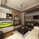


In particular, it is good if the kitchen was originally large (for example, 4 x 6 m) and the combination was not made to expand it, but if the kitchen part seems to be a cramped closet, it makes sense to "enlarge" it a little. For such purposes, a light-colored finish is used, which is not perceived by the subconscious as a sharp obstacle. In other rooms, mirrors could be used, which are not very appropriate in the kitchen part, but here you can achieve a similar effect by using glossy materials, furniture or appliances that reflect light well. It is worth playing with the color scheme even if the two parts (kitchen and living room) are somehow too disproportionate.


Too narrow a room resembles a corridor, which also does not look very comfortable. To "lengthen" a short wall, elements that are substantially elongated horizontally are used in its decoration, and the "corridor" walls, on the contrary, are hammered with vertically elongated elements. The latter method, by the way, is very appropriate even if the ceiling is too low. With the help of such little tricks, any room of an unsuccessful configuration - small, narrow, square - approaches the ideal in the mind of its owner.


Please note that individual parts of the kitchen-living room should not differ in size several times. The living room will almost certainly be a little more spacious, but the kitchen should not look like a cramped pantry in it - if the first is larger than the second, then this is already a problem. This moment can also be corrected by design methods, not only by "enlarging" the kitchen, but also "reducing" the living room, if appropriate.

Style selection
The stylistic potential of the kitchen is perceived by many people as rather limited - the layman sees in it mainly a utility room with an abundance of technology, therefore high-tech seems to be almost the only appropriate solution for the majority of our fellow citizens. Professional designers, of course, will not agree with this, who see much more options, and even have to combine the kitchen with the living room within common walls. In fact, fantasy may not be limited by anything at all, however, it is worth highlighting three styles that seem to be popular, but so far completely unfettered.


- The beauty of art deco lies in the fact that small decorative details play a completely non-secondary role here - they are turned into real art. In all other respects, the kitchen-living room can be ordinary, but there should be a lot of details, and they must necessarily impress, so an exquisite chandelier and light inlay on the table will be very appropriate.


- Chalet could be called a rustic style, but with a certain proviso - not in our understanding, but in the Swiss one. A room in this style suggests features that may not be homemade, but should at least mimic those. Most often, the desired effect is achieved through the abundant use of wood (or outwardly very similar materials), which should also look cute and rough.

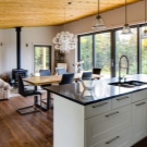


- Eco style Is a desperate pursuit of nature. Here, wooden elements will also come in handy, although they should not be abused, because what kind of concern for nature, if it is all cut down.But fresh flowers fit very well into this style, which can be decorated in a whole growth cabinet, which is a partition between the kitchen and the living room. The use of modern materials in our time cannot be avoided, however, for the eco style they are usually chosen in a characteristic range - white, green and shades of woody brown.


Color solutions
The trick of the kitchen-living room design is that you need to highlight certain boundaries between the individual zones, without breaking up the room - otherwise why would it be combined at all.


For harmony and unity, you should heed a few simple tips.
- The zones are almost always performed in different colors, however, the chosen colors should be well combined with each other, without provoking contradictions. The simplest solution would be to use two similar shades of the same color, but in general, the difference can even be in small things - for example, in the form or texture of the finish, slightly different patterns, and so on.


- In a large room, a bright accent is required, and not even one, but it is undesirable to allocate them too large interior items such as a wardrobe or curtains. Due to the fact that the combined space turns out to be quite large, several such accents will have to be made in it, and together they will give a too variegated picture, therefore all large details should differ in a relatively faded shade so as not to ripple in the eyes.


- Usually, the kitchen and the living room are combined precisely for the sake of additional space and the fight against visual crampedness, and light pieces of furniture and the same finish will help to add light. The abundance of natural light will also help to compensate for the problem, and if the latter turns out to be even with an excess, it is usually diluted with furniture of a gray-brown color scheme. Other colors can also be used, but this solution is not standard and requires a certain artistic taste.


- An interesting observation of scientists is that warm tones push a person to eat something, while cold tones have a completely opposite effect. Considering that in the combined kitchen-living room the kitchen area is constantly viewed from anywhere in the apartment, people prone to gluttony may have an additional temptation, which will eventually lead to weight gain. In such a situation, you should not neglect the psychological subtleties.


In the context of choosing a color scheme, one should not forget that the finish will not be perceived without properly thought out artificial lighting. The kitchen and living room, connected together, are both one whole and two completely different zones, therefore this principle should be adhered to when installing lighting fixtures. This is achieved quite simply - you just need to make one general lighting for two different zones, and besides it, provide for your own one for each of them.


For a small room
In a cramped room, the main thing is not to create the impression of clutter in an already limited space, therefore, you should adhere to minimalism. A small-sized kitchen-living room will not tolerate large details, therefore they should be either small, or everything should be monochromatic in decoration. To increase the space, the color of the finish plays a special role - it should be light, therefore small rooms are finished in white or beige. Bright blotches are almost always inappropriate here, so they should be discarded.


For a medium-sized room
If the kitchen-living room seems average in terms of size and does not shock either by the tightness of the prison cell or the openness of the football field, you can not be particularly limited in choosing a color scheme, focusing on what you would like to see in aesthetic terms.Another thing is that in such a situation you should not go to extremes, because too light scale will "enlarge" the room and make it visually large and uncomfortable, but too dark finish will give the opposite effect, and then it will suddenly become cramped here.


Here, as nowhere else, it is appropriate to give preference to the design in gray tones. This color scheme is completely typical for most kitchen appliances, so it will not be difficult to avoid any difficulties in combining individual elements of the kitchen.
For a large room
An excessive abundance of free space in modern design is considered not a very good quality - in such a room a person feels almost as vulnerable as on the street. For a kitchen-living room, where comfort is a fundamental requirement, such a characteristic is unacceptable, therefore, the space should be visually reduced.


Few places where the now fashionable black kitchen with appliances in dark colors will be appropriate, however, here it will look as logical as possible. Of course, the situation can be corrected without thickening the colors - for this it is worth resorting to the finishing techniques described above, when the interior details stretched in the right direction and the patterns on the decoration make it possible to somewhat change the impression of the space.




Furniture selection
The furnishing of the kitchen-living room should fit into the overall style of decoration for this room and be sustained, if not in the same style for the two parts, then at least in related ones. The same applies to the color palette of furniture, of which only one or two items can be an accent, but not absolutely the whole furnishings. The difficulty in choosing furniture lies in the fact that stylistically completely different things are usually needed for the kitchen and living room, which are difficult to bring to harmony within the same room.


The aforementioned styles, which offer a certain "roll call" of furniture, can partially help with this. from different parts of the combined premises, however, the selection of the situation is never carried out after the repair has been completed. It is necessary to decide on the furniture in advance - for this, a design project is drawn up, which will show how well the selected (note - real-life) pieces of furniture are combined with the decoration. Moreover, experts advise buying furniture, as well as equipment, in advance - then you will definitely be sure that the models you like will not be sold out while the renovation is in progress.




In this case, it is worth playing up certain features of the room. For example, if the owner is lucky to have a kitchen-living room with a bay window or a balcony that goes into the room itself without a clearly defined border, put a table, if not a dining table, then at least for tea drinking, it is best there - the opening view should contribute to an improvement in mood and the appearance of themes for conversation. The kitchen, which turns into the living room, whose configuration is also complicated by a niche, involves filling such a cell with a large piece of furniture of a suitable size - in the living room it will be a wardrobe, and in the kitchen there will be a refrigerator.


Lighting
Lighting devices are the element that, in our case, should be able to both unite and divide. As a rule, overhead lighting is made general and turned on with one click of a switch, but if not, then at least stylistically some of the lighting fixtures in different zones of the combined room should overlap with each other - if this does not happen, why was it necessary to remove the wall at all and create one large room.

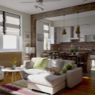


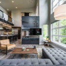

On the other hand, separate areas of a large kitchen-living room have completely different tasks. - so, for cooking, bright and directional light is desirable, while for a peaceful atmosphere of relaxation in the living room, the ability to turn on a soft, relaxed light does not hurt.To meet all the requirements, it is worthwhile to provide for separate lighting for each part of the room, which best suits the situation and allows you to pretend that these are still two separate rooms. At the same time, the absence of serious partitions between the two parts will lead to the fact that you cannot hide from the strong light from the kitchen area in the living room, and it is possible that guests are put to bed here or even the owners themselves are forced to rest. For this reason, it is advisable to think about the placement of individual lighting in such a way that it does not turn into a common one and allows each part to remain independent. Table lamps and small recessed lights are best suited for this purpose.


Creative ideas and design solutions
Even the fact that a combined kitchen-living room is no longer a great rarity today does not negate the emergence of new original solutions that are constantly offered by the best designers. In particular, while ordinary people are thinking about decorating a room and creating a modern design while maintaining all the necessary functionality, specialists who are really not devoid of imagination are experimenting, including with planning.


In a one-room apartment, a studio apartment is often created for the aesthetic concealment of tightness. - a common space, which also includes an entrance hall, which simply makes no sense to separate. This option, on the one hand, is considered fashionable and very creative, on the other hand, you should not expect solitude here at all, unless you live alone - you have to sleep in the same place where literally everything else is located, except, perhaps, the bathroom ... Naturally, this is somewhat uncomfortable, because thoughtful design specialists, unable to single out a completely separate bedroom, try to at least somewhat highlight a place to sleep from the general picture.


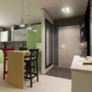

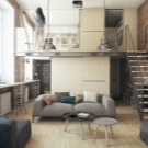
A very fresh and unusual idea will be a bedroom on the second tier, while the first can be productively used for other purposes - for example, put there a computer table, a coffee table or just an armchair, an aquarium, a TV - whatever, if only it was useful and not particularly disturbing sleep. It turns out that even in the studio it is still possible to retire, even if such seclusion is not complete.



In the case of a two-room apartment, the situation is somewhat different. There is a separate bedroom here, and hardly anyone will think of making such a large studio, which will include all the premises of the "kopeck piece", but then the completely integral kitchen-living room will look too large - all other parts of the apartment will seem like appendages. The problem is solved with the help of an arch, but not a typical one, in terms of the size of a standard door, but wide and high. In fact, in this case, the wall between the living room and the kitchen is not completely absent - it is preserved, but it is rather a minimal edging for a wide passage and takes up no more than a third of its width. Such a partition is made of plasterboard and can have a bizarre shape, and in some cases even suggests a useful application - shelves can be built into its projections for storing various things of light weight.


Rebuilding the building by adding new windows turns out to be very problematic even in a private house, but the transfer of the internal walls allows us to make the ratio of windows in different parts of the kitchen-living room change. So, two rooms initially had one window each, which is standard for modern urban planning, and after renovation, there may be both a living room and a kitchen with two windows (although the second happens less often), while the second part will be devoid of natural light at all. This approach to planning can be quite justified. - for example, in an unexpectedly dark living room, a full-fledged relaxation area can be organized with a projector that allows you to watch movies or sports broadcasts over the entire wall, which can be very positively received by guests.

Important Tips
When the advantages of unification seem to be more significant than the disadvantages, and there is even a common vision of the future of a large room, you should think about some more points, mainly of a technical nature, without which the result may be disappointing. To begin with, it should be borne in mind that nothing can be re-planned in an apartment building without permission, even if you are a professional architect and you know for sure that you will not harm the building. Before starting work, you must obtain a special permit for the unification of premises., and upon completion, it is also worth fixing the changes in the BTI, otherwise the chain of subsequent repairs from the neighbors may still destroy the house.

Next, you should pay attention to the fact that it is advisable to choose kitchen appliances such that they have minimal noise. Even if no one ever sleeps in the living room, the same refrigerator can interfere with a simple rest there, but if guests are accommodated here or even household members sleep overnight, then the roaring unit will obviously not add comfort. A particular difficulty lies in choosing a hood, since it will probably make a lot of noise - for a large combined space, a powerful model is needed that can keep the atmosphere in order. The issue can be solved with the help of special mufflers, but this, of course, is an additional cost. Finally, the design should be thought out in such a way as to dispense with large fabric curtains - the material tends to absorb the smells that are full of the kitchen, and with it the living room, and these scents are not always pleasant.

Examples of good design
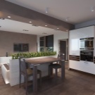
Abstract reasoning about design makes little sense unless it is backed up by visual examples. In the first photo, you can see a kind of classic example of a combined space, in which the decoration of different zones is almost identical (except for the floor), and the stand acts as an obvious divider, at the same time playing the role of a table. This, by the way, allows you to use the living room space exclusively for receiving guests, it is generally designed as a recreation area. Long curtains made of fabric here, apparently, either often change, or are "alive" due to the excellent hood, although it is also possible that the owners cook themselves quite rarely, and even then they mostly manage with a microwave.

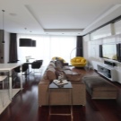
The second example shows a rather extravagant renovation, as if hinting that everything does not have to be prosaic and by standards. Here, almost every detail has its own shade, creating the illusion of "parrot coloring", but this is only at first glance, because in general there are only two colors - yellow-brown and coral-pink, they are simply represented by a lot of shades. Actually, the kitchen area is expressively separated from the recreation area and the dining area, which are so combined with each other that there is no clear line between them. The lighting is striking, which seems to be of the same type, allowing you to perceive the image of the room as a whole, but at the same time it is different - in particular, in the living room there is an opportunity to turn on a table lamp, not being limited to the "overhead" light.

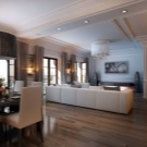
The absence of a wall in a combined kitchen-living room should not be perceived as "all or nothing" - the wall itself can be left, but so that it does not interfere with a full view... Moreover, it should be left as a decoration, because modern materials such as drywall make it possible to make the opening connecting different zones curly and truly beautiful - this is clearly demonstrated by the third example. Here, on the verge of the zones, there is also a countertop, but it is so competently inscribed into the interior that it is practically invisible - most likely, it is used as a working surface for culinary exercises.The unifying element is not only the general decoration of the walls, but also the dining table, which is purposefully placed at the junction of the floors of two different types, only emphasizing the harmony of separation and unity.

See the next video for more details.


The comment was sent successfully.