The subtleties of choosing furniture for a small kitchen
In houses built in the 60s and 70s, the kitchens are quite miniature and do not exceed 12 sq. meters. There are a large number of design templates and solutions that allow you to visually "expand" the room, making it more spacious and comfortable.
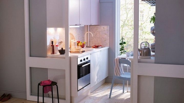
Layout rules
Repair and re-equipment of a small-sized kitchen means proper planning, a good design project, and an accurate calculation of the amount of materials.
To expand the space of the kitchen, the following techniques are most often used:
- manipulation of color shades;
- original design;
- stylish furniture;
- mirrors are installed on the walls and ceiling.
After approval by the family council of the final design project, you should proceed directly to the actions themselves.
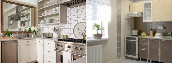
After all the construction work is done, the rubbish is taken out, the placement of furniture begins. The job is not the easiest one. Often tables and chairs are made to order - this is the only option when they can be placed in a small area.
Often, construction companies take over the arrangement of furniture, working on a pre-approved project, in which it is agreed in advance: where and how to arrange it.
In addition to installing a table, cabinets and chairs, proper zoning of the room plays an important role. This topic is especially relevant in those apartments where the partition between the kitchen and the living room has been dismantled.
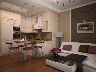
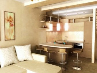
Such a layout is in great demand among young people under 30 years old. Zoning implies the presence of:
- dining area;
- places for cooking;
- places for rest.
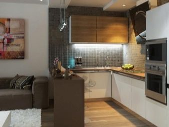
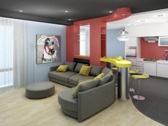
Most often, zoning is marked in different colors, and if everything is done correctly, then such tricks can significantly expand the space of the room.
Much attention is paid to furniture, which can be an effective tool for expanding the boundaries of the room. Also, furniture can add more functionality to the kitchen, when during the preparation of food everything is at arm's length.
When placing furniture in the kitchen, the "triangle rule" first of all appears, when the refrigerator, sink, stove are arranged in a certain order. This rule is the main postulate that sets the correct trend.
The main criteria that determine the placement of furniture in the kitchen:
- ceiling height;
- availability of communications;
- the location of door and window openings.
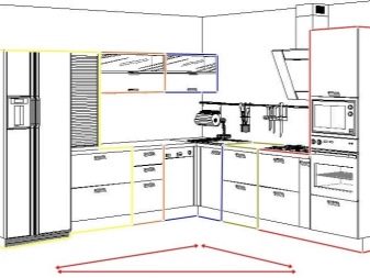
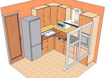
Here, the linear arrangement of furniture is most often used, when furniture and cabinets are located along a long wall. Creative people often have oval or semicircular kitchens. In this case, you should additionally make custom-made furniture and cabinets according to the original design. It is not cheap, but it looks quite impressive and unusual.
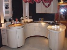
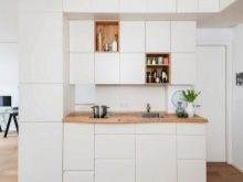
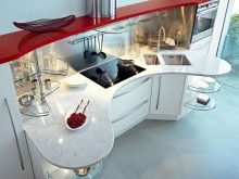
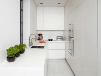
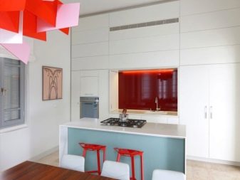
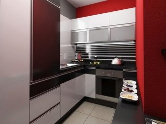
One of the most popular styles is minimalism, it is especially suitable for small rooms where a small amount of improvised tools, dishes and other accessories are required. Minimalism allows you to use literally every square centimeter with benefit, the usable area is "exploited" with maximum efficiency.
With a similar design of the kitchen, there is almost no decoration at all, while contrasting bright colors, strict lines can often be observed.
Another style that has firmly entered life in the last decade is high tech... It appeared in the 70-80s of the last century.Science fiction literature and cinema have greatly influenced its development.
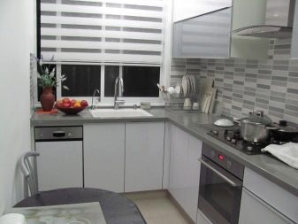
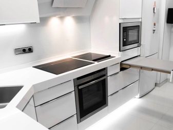
High-tech is contrasting lines, many metal panels, cool undertones and colors. Peculiarities:
- straight strict lines;
- neutral or cool colors with metallic highlights;
- the use of metal, glass, PVC panels;
- active use of various gadgets;
- original lighting.
High-tech main tones:
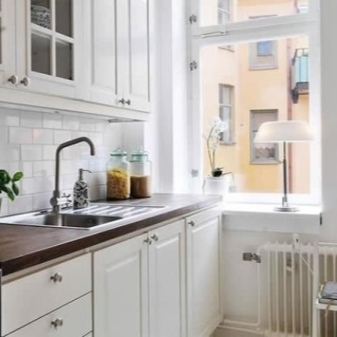
- White;
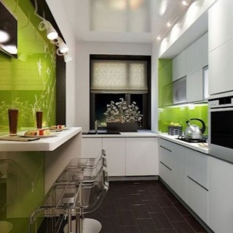
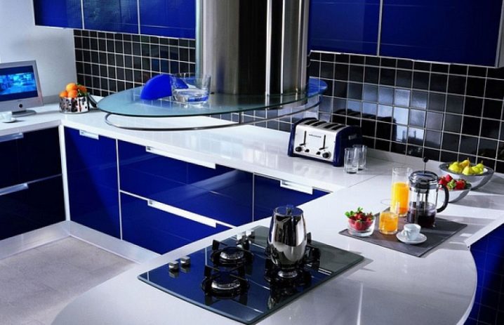
- Navy blue;
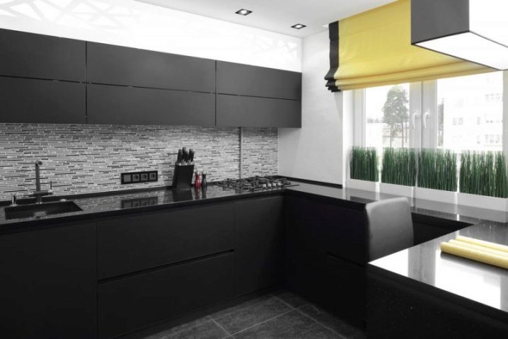
- black;
- Gray.
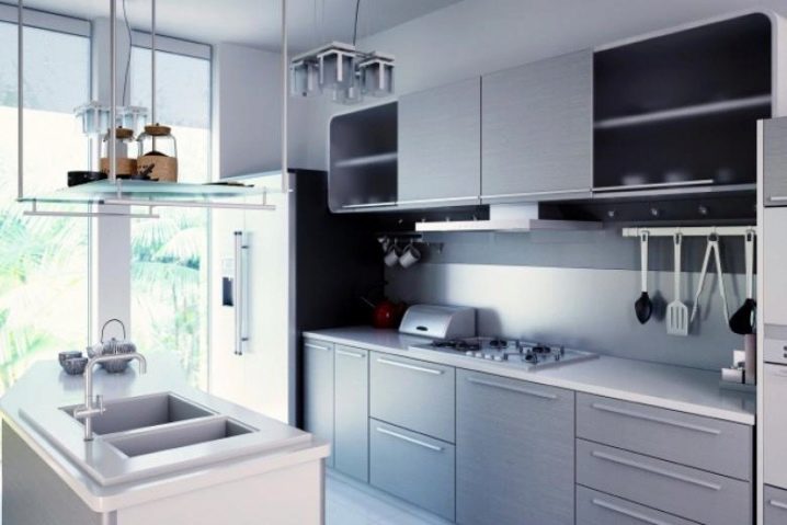
The high-tech style does not accept small decorative elements, they must necessarily be large in format and clear outlines. Light shelves with many different niches will look organic in the kitchen. Glass and metal pencil cases will also look appropriate. Metal blinds are mounted on the windows, which can be rolled up. It is also appropriate to use natural fabrics (cotton, linen).
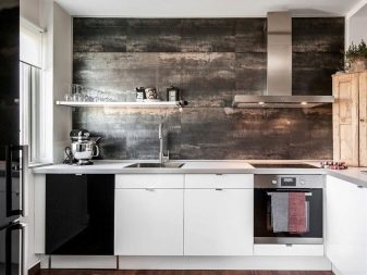
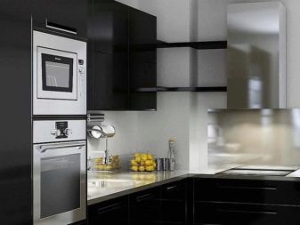
The walls are pasted over with non-woven monochromatic wallpaper, which can be painted with glossy paint. Mirror or glossy panels made of PVC are often mounted on the ceiling. High-tech style is most often the use of LED spotlights or linear lamps.
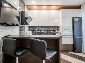
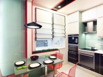
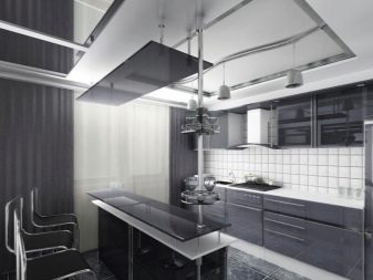
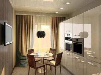
Another style that is in high demand is modern... It is dominated by metal and plastic wall decoration, contrasting furniture and decoration layouts are used.
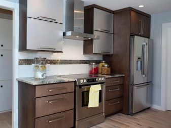
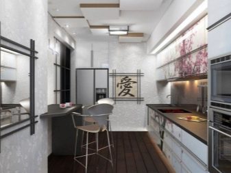
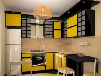
Japanese style - this is, first of all, the simplicity of forms and the severity of lines. The colors of the walls and furniture are mostly light, there are many patterns, hieroglyphs, textures and colors.
In Russia, "Japanese" motives "are very popular, therefore, such a design of the kitchen is in great demand.
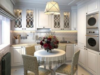
Classic style it is also often used, but it is not recommended for small kitchens. Taking up a lot of usable space, it is heavy.
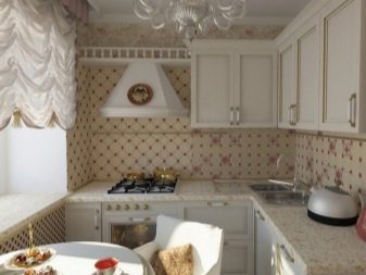
Types of kitchen furniture
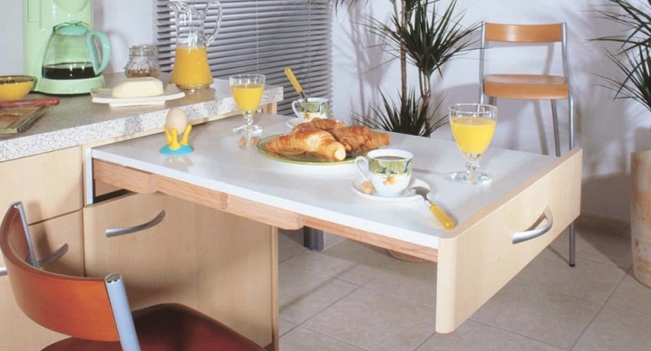
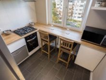
In small kitchens, a window sill is actively used, which can become an organic continuation of the dining table. A wooden table is often made folding, if necessary, it can be increased by 2-3 times in area in a few minutes.
Chairs can take up too much space, so it is wise to use folding benches that attach to the walls.
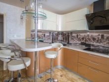
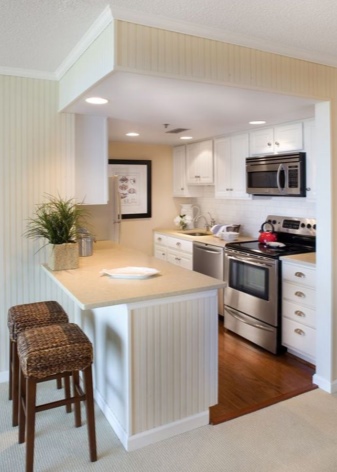
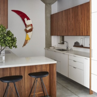
They also use (much less often) a bar counter, which can be of various shapes and heights. It is often part of a window sill or closet. The bar counter zones the space, at the same time gives the room an original style.
The walls are painted in a light tone. He visually "pushes" the room.
Also often used:
- photowall-paper;
- Venetian plaster;
- textured surfaces.
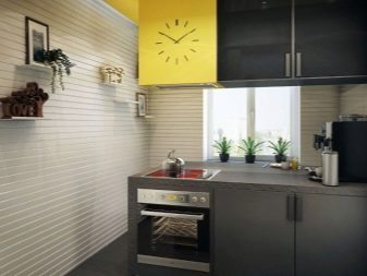
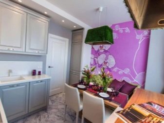
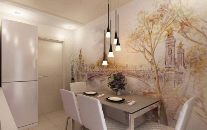
Photo wallpaper may not do the best "service", so they must necessarily have a light shade, only then it will increase the area of the kitchen.
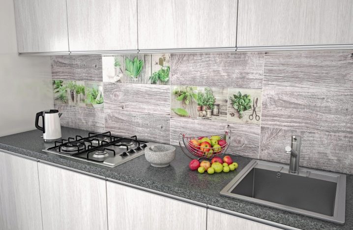
The apron is made traditionally from tiles or porcelain stoneware, and large textures or patterns are not used, since they significantly reduce the space. 1.5 square meters of cladding is enough to solve the problem of decorating the space above the sink.
The tiles should be light shades.
The layout of the luminaires is of great importance. Small kitchens are lit up as much as possible. Bulky chandeliers or chandeliers will look inorganic.
Luminaires should be compact and bright, LED technology creates a harmonious lighting system.
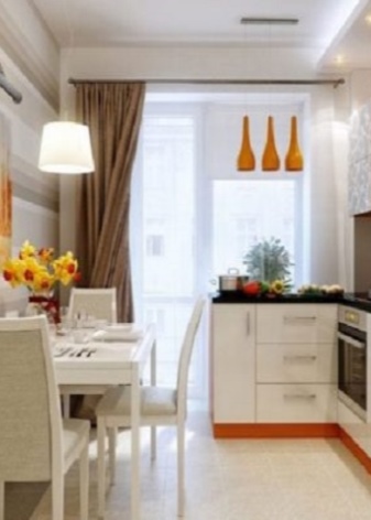
The window in small kitchens should be as large as possible, which also makes the room more spacious. A bulky furniture set cannot fit into a small kitchen, no matter how functional, for example, a couch with a berth, armchairs or an ottoman. The maximum that can be placed from the furniture is a table and four chairs.
On the walls you can hang:
- cabinets;
- shelves;
- built-in modules;
- corner shelves.
It is possible to store a large amount of dishes in several small wall cabinets.
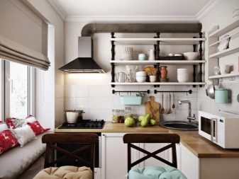
The roof rails are a useful addition, they are placed above the table top in the form of a fastening strip, to which the clips are screwed. On such "hooks" you can hang an impressive number of scoops, colander, etc.
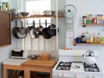
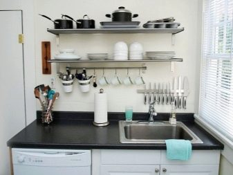
You cannot write off drawers in cabinets, which can also accommodate a large number of useful things in the household. With the right layout, every cubic centimeter of space can be used to its fullest.
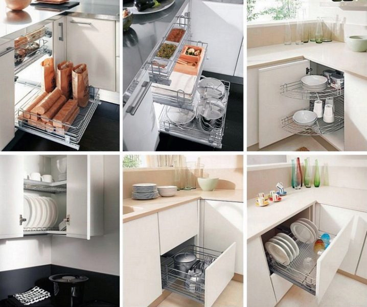
Play an important role in the kitchen:
- fridge;
- Dishwasher;
- microwave;
- coffee maker and more.
Each unit should be matched to the kitchen format.
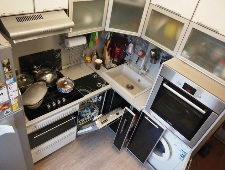
For example, in a small kitchen of 6 m², you need to put a small refrigerator.
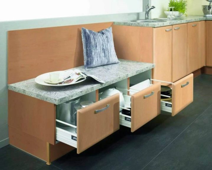
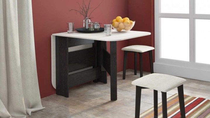
All the dishes can be stored in the lower cabinets; for this purpose, you can even use benches with drawers. You can order furniture in a furniture workshop or make it yourself. For example, a small kitchen table can be made collapsible - depending on the circumstances, it can become longer or shorter.
The transforming table is an original device. It can be easily increased if necessary.
The use of collapsible modular furniture in a miniature kitchen makes it possible to quickly increase the usable area.
Materials (edit)
Particular attention is paid to the materials from which the furniture is made. This is a fundamental question, since furniture will be in the kitchen for a single year in conditions of high humidity and temperature. The material should not "emit" toxins.
The following criteria must be met:
- durability;
- health safety;
- strength.
MDF - the material from which tables and cabinets are made in rooms where the percentage of humidity is higher than normal. MDF has a low cost, it is easy to process, it is also distinguished by its wear resistance. Suffice it to say that hot steam has no effect on such a material.
For the last decade, natural wood furniture has been in great demand. It costs a little more, but it is wear-resistant, does not contain toxins.
Most often used for its manufacture:
- spruce;
- Pine;
- Linden;
- ash.
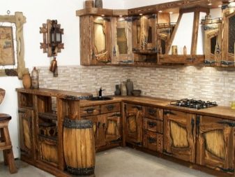
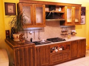
Each tree has its own density coefficient, safety factor, thermal conductivity and other characteristics. The puff tree (multiplex) is also actively used.
Furniture made of this material can be used both in compact rooms and in kitchens of large canteens and restaurants.
Chipboard - this is also a versatile material from which a wide variety of furniture is made. In the second half of the last century, chipboard products became widespread.
Its advantages:
- low cost;
- strength;
- functionality.
The disadvantage of chipboard is the presence of formaldehyde. It is not recommended to use this material directly in the kitchen, as such furniture “emits” harmful substances for many years.
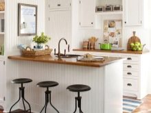
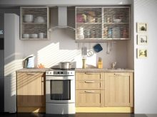
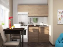
For the last 20 years, PVC furniture has been produced with increased strength and functionality. The color of the plastic can be very different. The advantage of modern plastic furniture:
- ease;
- environmental friendliness;
- strength;
- color does not fade;
- has a different texture.
Plastic furniture can be compactly located in the smallest kitchens.
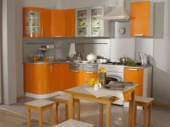
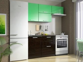
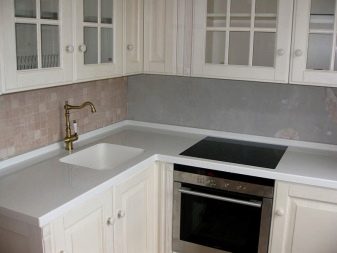
Artificial stone looks very presentable and even luxurious. Such material is not cheap, but it can serve for many years without losing its attractive appearance. Most often, stone countertops or aprons are chosen.
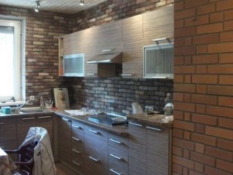
Definition with style and color
When choosing furniture, various basic options are considered, then an appropriate project is drawn up according to the selected sketches.
First of all, furniture should be distinguished by high moisture resistance, reliability and durability. If everything is done correctly, then in a relatively small area you can place everything you need, while the versatile aesthetic goals will be observed.
You can also "wrap" some elements of furniture with a special film that will match the desired shade.
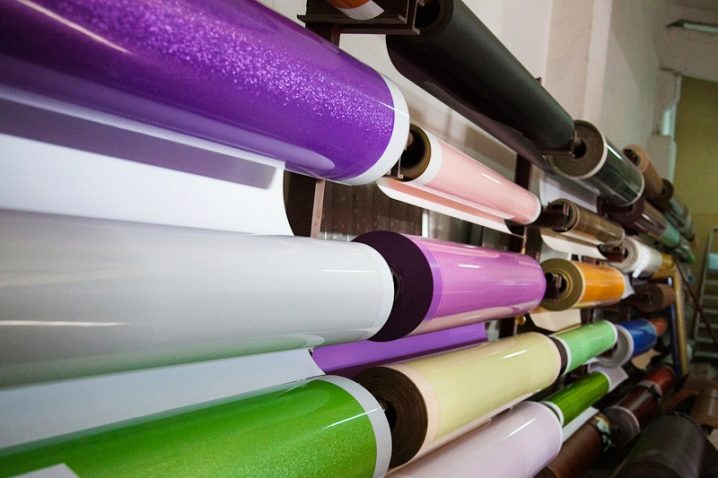
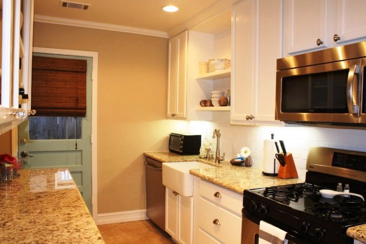
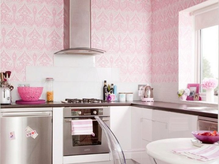
Color design matters a lot. It is well known that the light colors in which the walls of the room are painted "make" it more spacious. In such cases, colors are most often used:
- cream;
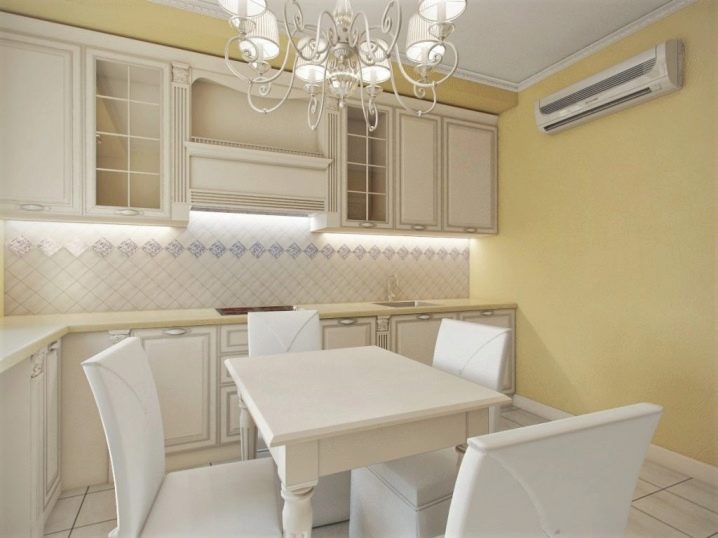
- yellow;
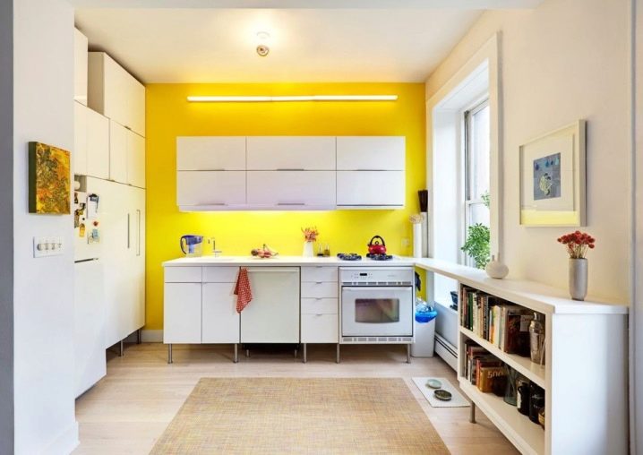
- beige;
- pink;
- blue.
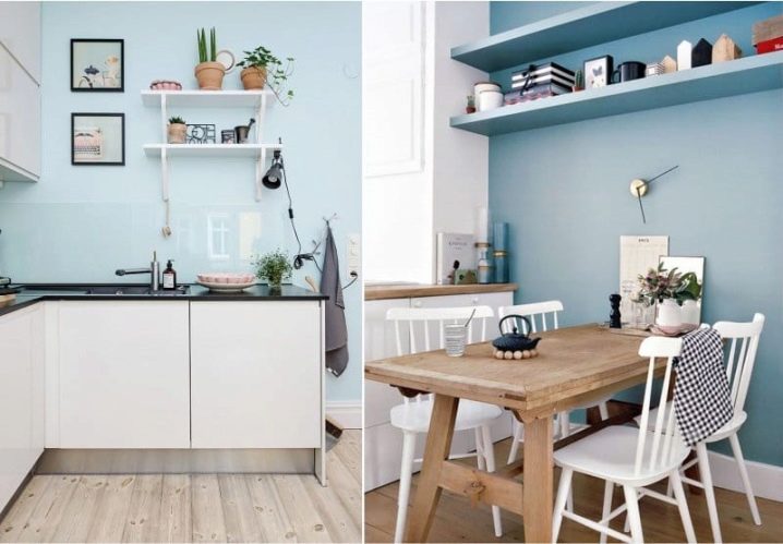
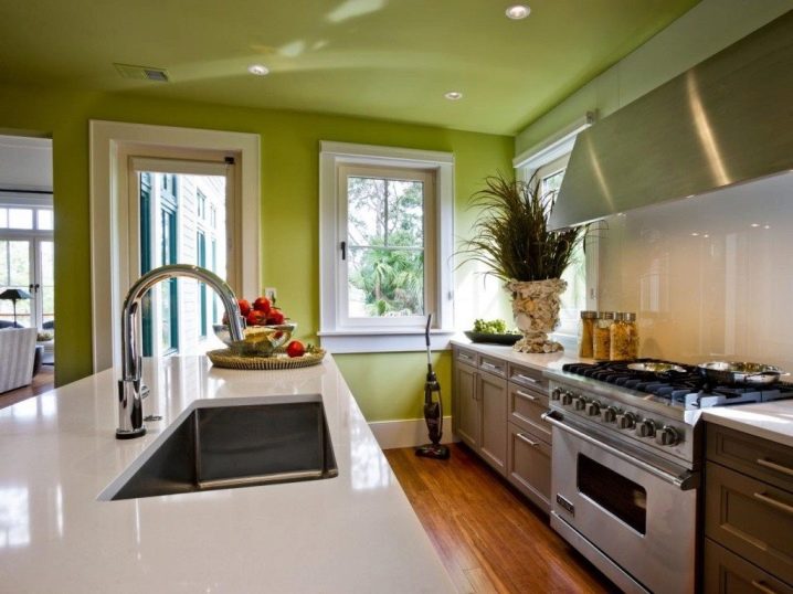
Bright color is also often used. Here it is necessary to know the "golden mean", a sense of proportion in this matter is an important quality. Glossy paints also "expand" the space, successfully reflecting light.
All ornaments or graffiti must be in miniature format only.
Placement options
Arranging a miniature kitchen is a rather difficult task: furniture, cabinets and household appliances should be assembled in a small area. Each element must find its place, so that it could be easily used. In total, there are several algorithms for placing furniture.
In the case of a linear arrangement of the arrangement, one wall is selected, and furniture will be placed along it. Individual items will form a functional "complex" that will fully meet all the vital needs of the owners. In this case, the width of the room should be at least two meters.
One of the main conditions for the arrangement is that the refrigerator and the stove should not be closely adjacent to each other, therefore, most often they are fenced off with lockers.
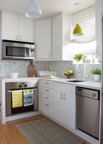
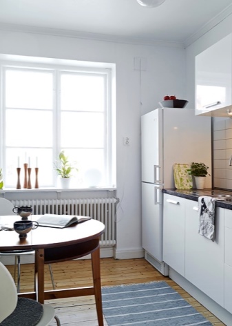
Corner layout is the placement of cabinets and shelves in the corners of the room, using niches between the supporting structures. This technique allows you to use a fairly significant amount of "dead" area with maximum efficiency.
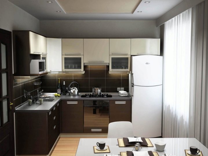
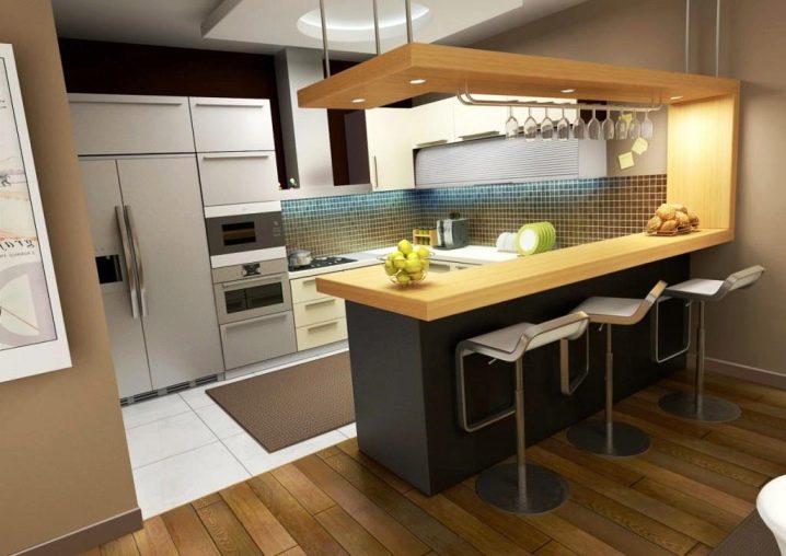
The island layout requires a certain usable area, for kitchens 6 sq. meters it does not fit. In this case, the bar counter is actively used, which is the center of gravity of the entire composition. Cabinets and other items are placed along the walls.
Beautiful examples in the interior
Many small kitchen designs use light colored curtains. Most often, white tulle or satin curtains come into play. Rattan roller blinds are often successfully used. Roman blinds, which resemble an accordion, are also popular.
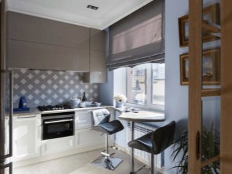
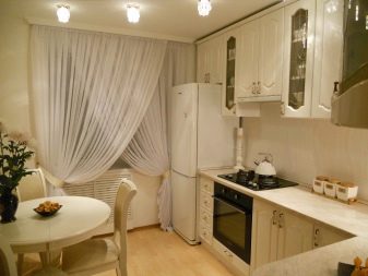
The ceilings in the kitchen should be light in color.
Sometimes, in order to "expand" the space, mirrors are mounted on them.
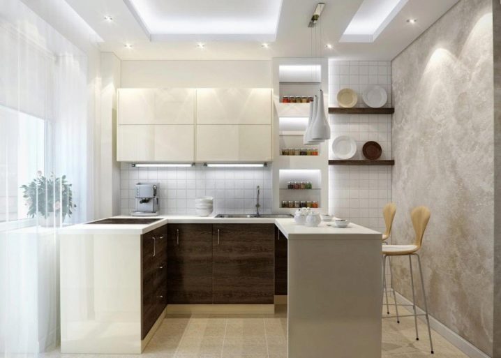
In recent years, stretch ceilings have become fashionable. They take only a couple of centimeters of height, but they look very impressive. Glossy film is also often used, which allows you to "expand" the space of the room.
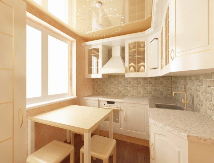
Linoleum, tiles or porcelain stoneware (has a high strength factor) are usually used as flooring. Light-colored material (especially porcelain stoneware) looks very impressive.
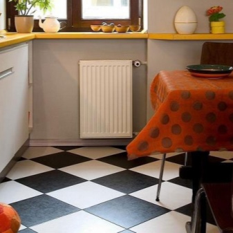
Using the windowsill as a table.
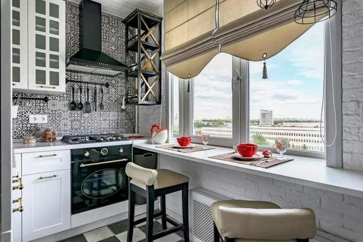
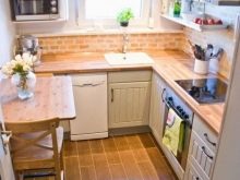
Correct corner layout.
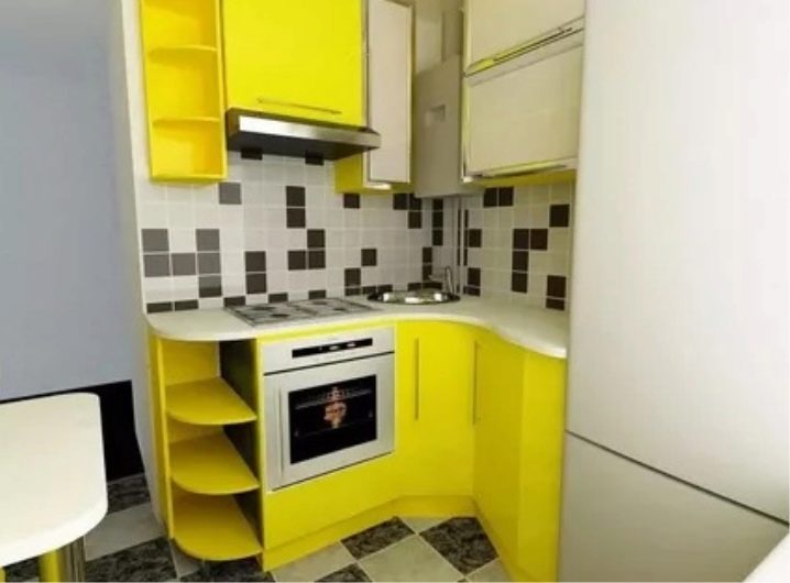
An example of the placement of the lower cabinets.
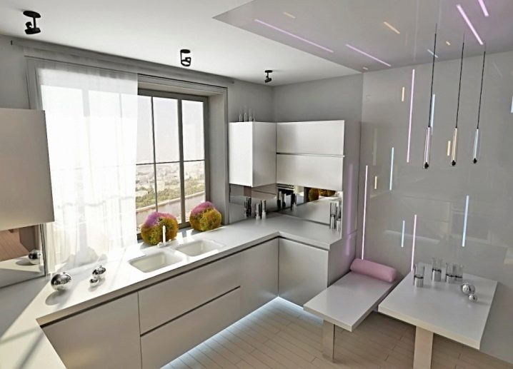
One of the options for the layout of the bar.
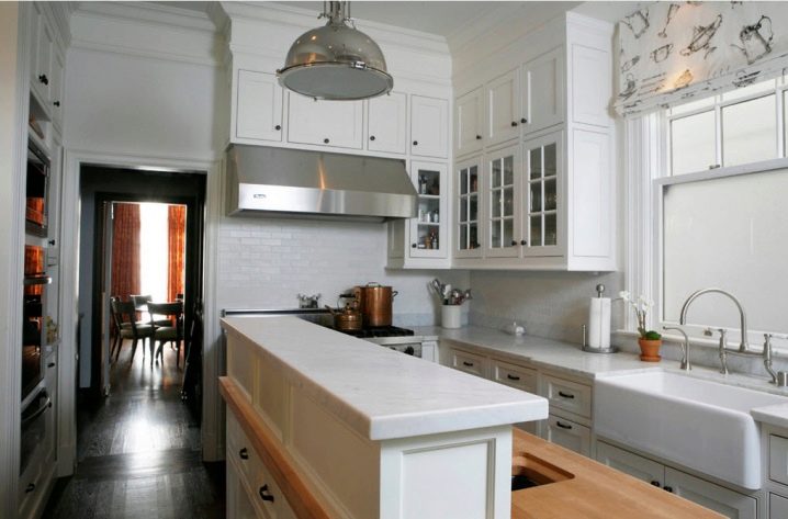
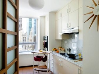
An example of arranging furniture in a narrow kitchen.
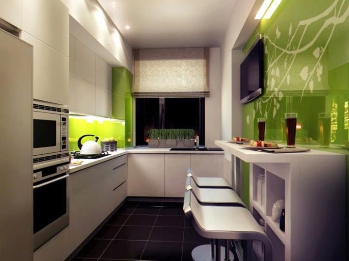
Tips from a specialist for arranging a small kitchen are in the next video.


The comment was sent successfully.