Kitchen design with an area of 10 square meters with a balcony
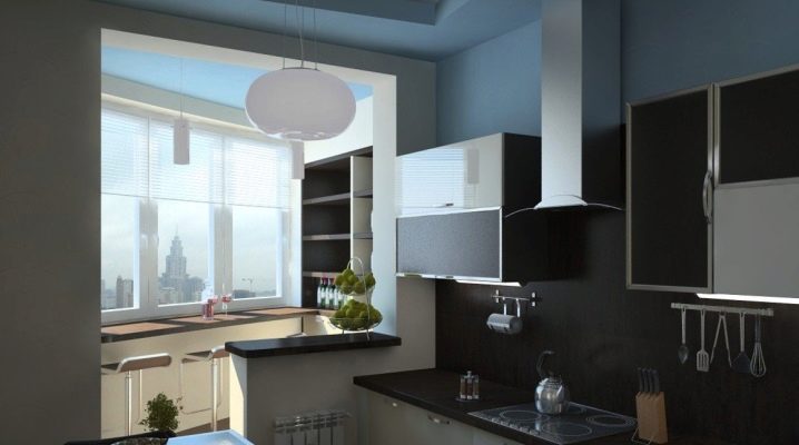
A kitchen with a balcony can seem like a very attractive solution. But it is not easy to correctly realize its aesthetic benefits. Meanwhile, it is worth considering the basic recommendations in order to exclude ridiculous mistakes.
Peculiarities
Speaking about the design of a kitchen of 10 square meters with a balcony, we must immediately clarify that this is neither more nor less. Of course, in comparison with the miniature rooms of Khrushchev's apartments, this opens up more opportunities for life. And more design ideas can be implemented. However, you still need to act responsibly and thoughtfully. Some of the design solutions that show themselves well over a larger area will look unnatural in such a space.
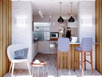
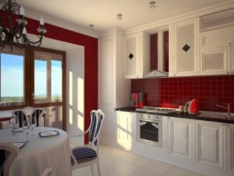
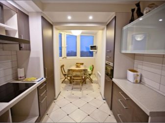
Kitchens with an area of 10 sq. m with a loggia, you can arrange a full-fledged, albeit compact in design, headset. It will also be possible to supply all or almost all household appliances there. In exceptional cases, the kitchen is combined with a loggia, if it is glazed or insulated, placing there a semblance of a winter garden or an office. This solution will satisfy the needs of families of up to 4 people inclusive. Therefore, any design project must take into account such requirements. When the placement of each of the planned objects is roughly outlined, you can select the style.
Basic approaches to design
Despite all the efforts of designers to show originality, a number of proven approaches have developed, and it is not recommended to deviate from them without consulting at least professionals. There are three main areas:
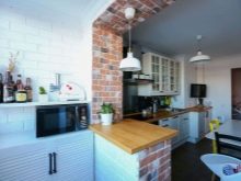
- for lovers of creativity and non-standard formats - loft, minimalist design and Scandinavian style;
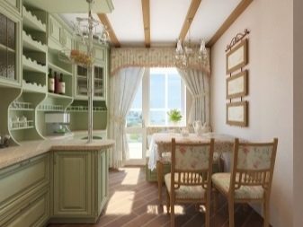
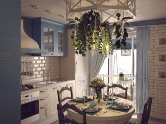
- for connoisseurs of the traditional way - country or Provence;
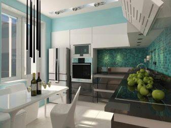
- for those who seek to arrange a more modern home - hi-tech.
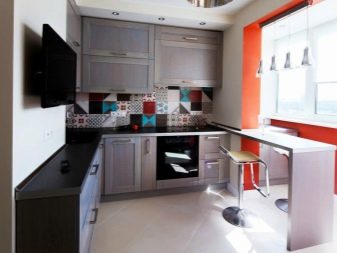
A minimalistic composition requires the use of headsets with the least amount of fittings. But you should definitely leave the mechanism that allows you to open by pressing. It is advisable to leave less furniture. But the amount of free space, on the contrary, is critical. Light sources must be efficient, but excessive backlight intensity is not acceptable.
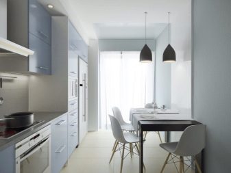
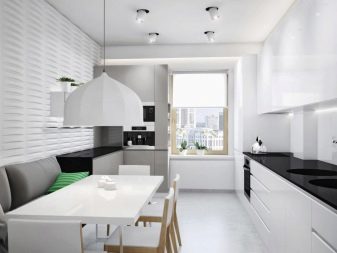
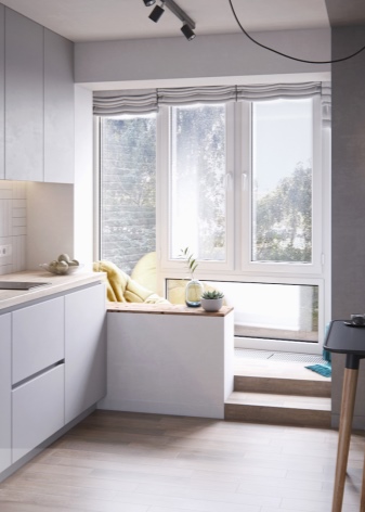
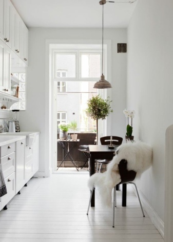
Scandinavian design embodies two motives - lightness and freshness. Along with light colors, tones are used that evoke the idea of fields and meadows. The advantage of this approach is clearly the reduction in owner's costs. Kitchens in the Scandinavian format have been in high demand for several seasons. No wonder: when creating such a room, considerations of functionality are put in the first place.
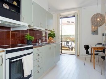
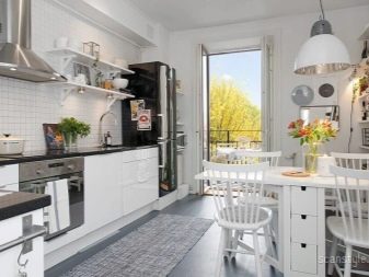
For people who constantly prepare food, this is very important. After all, external beauty fades due to unnecessary or unproductive work. The predominant color is white; so that it is not too boring and sterile, many of its subspecies are used. As for materials, unconditional preference should be given to natural substances and structures made from them. In an authentic Scandinavian interior, they try to keep the upper shelves of the headsets open, while the cabinets reach all the way to the ceiling.
Interior design rules
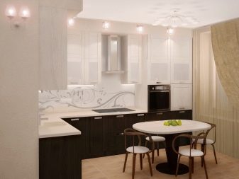
Kitchens with an area of 10 sq. m mainly use a corner layout. It is she who is ideal for placing work and dining areas.True, if the short wall of the corner set falls onto the wall with a balcony, it may be difficult to place furniture.
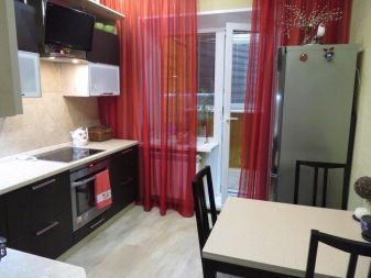
Then it is better to give preference to a linear or parallel circuit. It is advisable to choose furniture that performs different tasks at once. The more compartments and individual shelves in the cabinets, the more comfortable it will be to live. The main thing is to figure out how to play it all out.
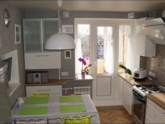
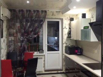
When choosing the color of the walls, both the color of the headset and the level of illumination are taken into account. Of course, on the shady and light sides of the house, the approach will be different. It is strongly undesirable to use large ornaments with an elaborate plot. If you want to experiment with bright inclusions, you should only use individual richly colored objects. But when using completely light furniture, it is allowed to design single walls in rich colors.
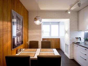
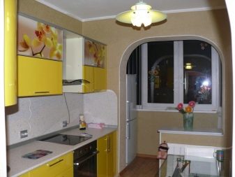
How might it look like?
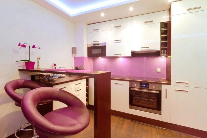
The photo shows the interior of a light ten-meter kitchen of an original look. The tiered ceiling is complemented by light blue local lighting. Most of the walls are decorated in white. The floor is paved with dark laminate. Pink blotches enliven the atmosphere and make it more fun, more pleasant.
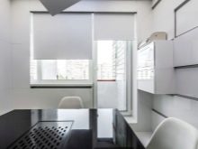
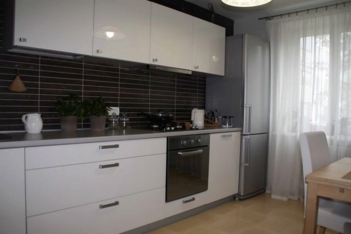
And here is a generally bright room, in which a stylish black wall is made for expressive contrast. White furniture fronts and light yellow floors prevent it from creating an emotionally tense atmosphere. The gray refrigerator fits harmoniously into the overall composition. Spot lighting was abandoned in favor of a full-fledged chandelier. Potted flowers help to complete the formation of the atmosphere in accordance with the general concept.
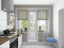
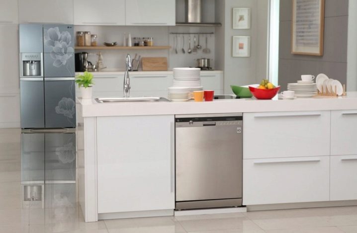
The photo shows the lightest kitchen possible. Only the light gray slab panel is wedged into the white facade. The cabinets are also painted in snow-white colors. Tableware was used to create bright color accents; the very arrangement of them is carefully thought out. Open shelves and hanging fixtures for kitchen utensils are actively used.
Overview of the kitchen of 10 sq. m with a balcony, see the video below.


The comment was sent successfully.