Original kitchen design options in Khrushchev

In the modern world, it has become customary to decorate the kitchen of a home in a certain stylistic design theme. This is good when the space is not limited by square meters. However, in such apartments as "Khrushchevs", the arrangement of the premises may seem problematic.
It is worth considering the principles of creating a harmonious design in a tiny kitchen.

Zoning rules
It is not easy to create a kitchen design in "Khrushchev", because often the layout of the premises itself leaves much to be desired. The builder could complicate the walls with ledges, narrow doorways, small window openings, or obscure niche positions and sloping walls. In such conditions, it is difficult to resort to standard furniture placement. We have to use zoning techniques or the so-called harmonious division of the room into separate functional zones.
Zoning will allow you to introduce a clear organization into the space, without interfering with the functionality of the room. Usually it involves dividing the room into two zones: dining and cooking.


The separation is carried out by the following methods:
- the use of separate lighting for different functional areas;
- the use of different wall finishes for different areas;
- floor cladding separately for the dining area and the cooking area;
- by installing furniture;
- creation of partitions.


Each type of zoning is subject to the design features of a particular room. Therefore, before arranging furniture, you have to carry out a design project, in which it is necessary to take into account all the nuances of the rational placement of furniture elements. You need to leave enough space to move around the room so as not to injure yourself on the furniture.


Lighting devices are selected based on the illumination of the room itself. Usually kitchens in "Khrushchevs" have small windows, they are dark, so such a kitchen looks visually "heavy".
Zoning a small area should not reduce the degree of illumination, here, most likely, you will have to resort not to partitions, but to arrange furniture, taking into account the layout of the room. This means that you need to choose furniture and other interior details in such a way that they stretch out the imperfections of the space of a small area., bringing the effect of spaciousness to it.


You can highlight the cooking area, kitchen apron, highlight the dining space. These nuances are also incorporated into the project: a bright room seems more spacious and comfortable. With regards to furniture, everything will depend on the assortment of the store, prospects, the presence of constructive protrusions and niches of a particular room. It can be linear, angular, or even U-shaped.
Furniture can have a peninsula as well as an island. The degree of appropriateness of this or that option will be determined by the square meters of the small kitchen and the preferences of the household.


Styles
Given the small size of the kitchen, the choice of a stylistic solution will have to build on the modern trends in interior design. They all strive for minimalism and strict functionality. This is what makes it possible to bring the visual effect of spaciousness and harmony into the space.
If there are a lot of things in the room, it will create a sense of clutter.Therefore, a style that welcomes a large number of small interior elements is contraindicated here.


You should not choose styles such as boho, empire, classic, kitsch, avant-garde, Arabic, Roman and English for small-sized kitchens. These areas need space.
They will not look in the confined space of a small room. These styles cannot be recreated even if the apartment is converted into a studio layout. Some of them will not have enough ceiling height, others need pomp, but it will not work to harmoniously arrange massive furniture in a tiny kitchen.


One of the best solutions will be the direction of minimalism. All small elements of the interior are removed from sight, everything must be strictly functional.
The same can be said for the Bauhaus style, which is characterized by practicality and a focus on simplicity and rectangular shapes. The number of decorative elements is reduced to a minimum here, the style resource is metal, plastic and glass. The basic tones of the design can be white, beige, light woody, light gray.
So that the room does not look dull, dynamic colors are added to the interior, carefully choosing the colors of contrasts and dosing them. For example, shades of green perfectly draw out a boring interior, while they are found in different styles.


You can make a kitchen in the Gzhel style, adoring a duet of white and blue. If you like country style, you can take it as a basis, focusing on rustic wood furniture and identity. For those who do not like any excesses in the interior, you can turn to the direction of constructivism, striving for the geometrism of space and high functionality of each piece of interior.
Another good solution for decorating a tiny kitchen can be the contemporary style, whose credits are modernity and democracy. Proportionality of forms and lightness of furnishings are welcomed here. These are necessarily built-in cabinets, functional shelves or shelves, as well as space zoning.
Furniture should be low, lamps should be simple, and curtains should be single-layered.


Subtleties of design
To harmoniously equip a Khrushchev kitchen, you need to consider the appropriateness of each material and interior element used, choosing furniture and accessories, taking into account wall and floor finishes. In addition, you need to take into account the location of the windows, because this nuance will affect the background temperature of the room.
It is worth considering the main points of the design.


Floor
Floor finishes are selected taking into account financial capabilities. It can be laminate, linoleum, floor tiles, porcelain stoneware. When choosing a coating texture, you can rely on anti-skid options. In addition, you need to choose a cladding that is resistant to abrasion, since the kitchen is a place with high traffic.
Considering that the space of the room is small, you can stay on linoleum: here the number of joints, which are sore spots of any cladding, is minimized.


As for the color of the finish, you need to build on practicality and aesthetics. Let's say too dark floor will look ugly, as well as almost white... The second option will quickly lose its aesthetic appeal and turn yellow in places of greatest traffic.
The color of the coating should not match the finish of the doorways or skirting boards. This reduces the versatility of the interior.
The priority is given to woody tones, possibly with a grayish undertone. As for the texture, you can use coatings for laminate and board.


Having chosen the coating material, you should carefully consider its drawing. It is undesirable to decorate a small kitchen with floor cladding with a complex or even bright print.
If the drawing will stand out against the background of furniture and household appliances, this will make the visual perception of the kitchen heavier.... Such a nuance can lead to a reduction in the number of furniture parts used.


Walls
By and large, in a small kitchen it is difficult to walk around to contrast wall decoration. Most of its space will be covered with corner or linear furniture. The strip between the drawers will be covered by the backsplash panel. The rest of the space can be pasted over with light wallpaper. This is the best option for the kitchen, inexpensive and allows, if desired, to update the wall cladding without requiring a global preparation of the walls.


To add variety to the interior, you can use photomurals for glass instead of skins or MDF panels for a kitchen apron. Such an apron will look extraordinary and interesting.
If the layout of the room allows you to clearly distinguish between the cooking area and the dining area, you can accentuate the second area with photo wallpaper. At the same time, their correct choice can contribute to the visual increase of the kitchen.


Wall murals can be laid out as a whole composition or as a panel or a small picture. At the same time, you can choose such images as the view of the metropolis from the window, the view of the sea coast from the balcony.
Images with a view of old streets look beautiful in the interior of a small room. When choosing one or another option, you need to correlate it with the chosen style, taken as the basis for the design.


Wallpaper can be selected washable. This will simplify the maintenance of the cladding, as well as postpone the time for subsequent repairs.
It is undesirable to buy gypsum stone for kitchen cladding: it is afraid of moisture and is erased during cleaning. Do not burden the space with another artificial stone: this texture looks good from a distance. In a small kitchen, it will seem cumbersome.


Ceiling
Today, an ordinary ceiling seems boring and mundane, so when decorating any room in a dwelling, I want to focus on its unusualness. But in a small kitchen, you need to build on the appropriateness of such a design.
For example, multi-level drywall structures are inappropriate in it. This will hide the height of the ceiling, which will make the room look unsightly. In addition, when arranging a room, you need to use the rule - the less, the easier.


Considering that the kitchen will have to place a kitchen set, a refrigerator, a table and chairs, as well as useful household appliances, it is necessary to compensate for the occupation of the space with visual freedom. And in this case, the best solution would be brevity.
The simpler the ceiling design, the more spacious the room will appear. For example, instead of drywall, you can make a stretch ceiling. It looks quite organic, beautiful and modern.


If you choose the right texture of the PVC film from which it is made, you can visually raise the height of the walls. For example, for this you can use panels with matte and satin texture.
Mirror and glossy options for decorating the ceiling of a small kitchen are not suitable due to their reflectivity.
Reflecting everything that is in the kitchen, thereby they will complicate the interior and give it a clutter effect. It is preferable to do without drawings: in conditions of limited space, they are not needed.


Lighting
When looking for decorations for the interior of a house or apartment, we pay attention not only to furniture and accessories, but also to the decoration of lamps. Comparing lighting devices with the limitations of a Khrushchev kitchen, it can be noted: here we need conciseness and moderation in size. A large chandelier will visually distort the room not for the better, so you should refuse a huge chandelier with crystal and candles.
To prevent the ceiling from looking small, you can buy composite lamps.... For example, you can choose a main lighting fixture for the dining area and multiple spotlights for the auxiliary lighting.


Today they can be built-in, they can be positioned pointwise, as well as along the perimeter.Given their small size and sufficient power, such lamps will make up for the lack of illumination in small kitchens better than a single central lamp. Given the direction of their luminous flux, you need to place lighting devices with an equal pitch, otherwise the corners of the room will remain shaded.
As for the cooking area, here you can use a flexible tape with LEDs located on it in one or two rows... They shine brightly, while they are characterized by low power consumption. You can integrate the backlight into the kitchen apron, which will make it possible to add originality to the interior, as well as visually distance the wall with the kitchen set.


The zoning of the dining space will look harmonious in the kitchen. In this case, the lamps should be located from top to bottom, so as not to "hit" the eyes and thereby not irritate the household.
For example, if they are located above the bar, then it is quite logical to illuminate this place with small lamps of an identical design or with one panel.
It is better to place built-in lighting devices in the cooking area. Wall sconces with shades and forging for kitchen lighting are not suitable.


How to choose and install furniture?
In conditions of a lack of quadrature, it is worth choosing ergonomic furniture for arranging a small-sized kitchen. It should be comfortable, roomy enough, durable and practical. You need to select it in such a way that it does not clutter up the kitchen space, but fits well into it.
Opening and closing doors and drawers should also not create discomfort when moving around the kitchen. The main pieces of furniture in a small kitchen will be a kitchen set, a dining table, a refrigerator and chairs, while to create the effect of lightness and spaciousness, you can buy furniture with glass facades. Glass perfectly pulls the weight and brings air visualization into the interior.
If possible, appliances should be built-in and compact, like the furniture itself.


For example, if the layout of the room does not allow placing a table in it, you can get by with a bar counter. It is narrower than the table, but it is not devoid of functionality.
If one or two people live in the apartment, such a table will be quite enough for a meal. Chairs are also preferable to choose compact, avoiding unnecessary bulkiness.


As for the arrangement of furniture, everything here will depend on the characteristics of the room itself.
For example, if the kitchen is square, the furniture arrangement should be L-shaped. In this case, all key elements of the interior are located along two adjacent walls. This follows the triangle rule in furniture placement (placing the stove, sink and refrigerator in three corners to simplify kitchen work). This arrangement contributes to the most rational arrangement of furniture, in which households will have enough space to move around the kitchen. She will also allow you to put the table without blocking the passage. In other cases, you can put a bar counter near the cooking area.


If the kitchen is long and narrow, you will have to arrange the furniture in a linear fashion.... This means that the set with furniture should occupy one of the walls. Moreover, for such an arrangement of furniture, the use of hanging cabinets is relevant. Sometimes, floor-standing cabinets are not used.
If the furniture is selected compact, and after organizing the space, there is little space left, this allows you to create a tiny dining area against the opposite wall. At the same time, you can choose no more than two compact chairs for the table.


A parallel layout in a small kitchen is rather a rarity. In this case, there is no room left to place the dining table. In addition, the hostess will have to constantly maneuver from one work area to another, which will take a lot of time and effort.
U-shaped placement of furniture in a small kitchen is undesirable... The room will feel tiny and uncomfortable.
A corner kitchen with a peninsula or an island looks much better in the interior.


Textile
Considering that the windows in the "Khrushchevs" are small, you should not burden the room with massive curtains. Since the main style of the room will be modern design branches, similar curtains can be taken as a basis.
For example, it can be roller blinds that roll up to open. Such curtains are wound on a special shaft, and often their size coincides with the parameters of the window.


Plisse is an equally relevant option. When folded, they look like blinds. You can open them both from top to bottom and in the opposite direction. Their size does not go beyond the frame, so they also will not weigh down the wall with a window.
An analogue of pleated blinds and roller blinds are Roman curtains, which, unlike the two previous varieties, can be repaired.


What else to consider?
Depending on the choice of interior elements, several factors should be taken into account.
- The room will appear more spacious if the color of the furniture and wall decoration is light. This does not mean that you need to buy everything white: you can take a two-tone headset, decorate it with an apron with a bright accent. For the floor, you can choose a wood color in gray-beige tones.
- You should try to avoid colorful floral prints when choosing wall cladding. In addition to simplifying the interior, the elements of the picture will add small things to the general background, which is undesirable.
- If you really want something bright, a small panel or accentuation of a part of the dining space is enough. At the same time, the picture itself should not both merge with the tone of the wall cladding, and scream about itself in an acidic or black color.
- It is better to decorate the walls with textured wallpaper with a slight relief. The interior will look status and stylish. From the texture, you can choose coatings with a satin surface.

- It is preferable to furnish the kitchen with a corner. If communications do not allow this, they proceed from the possible options for the arrangement. For example, if an apartment or house is equipped with a gas stove, it is not always possible to change the place for it. If there is no desire to move the sink, and, accordingly, the pipes, special attention is paid to the choice of the headset.
- When choosing furniture, you need to look at the length of the walls to the door or window passage, since the headset should not cover anything. If there is a broken perspective, you can use this corner under the refrigerator.
- An interesting technique would be to install a semicircular kitchen according to the corner principle. The streamlined shape will help reduce trauma in a small space.

Beautiful examples of the interior
It is worth referring to the best photo gallery ideas.
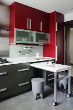
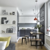
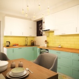
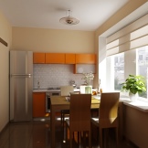
- Option with a demolished wall and a broken perspective. A corner set and space zoning by means of floor cladding were used.
- An example of arranging furniture along adjacent walls. Due to the light colors of the furnishings, the room is homely and cozy.


- Decoration of a miniature kitchenette with a gas water heater, wall cabinets and a small table with a glass top.
- An example of the most compact arrangement of furniture in a small kitchen. Compensation for the lack of illumination due to the large window.


- Original space optimization with a corner dining table. The use of bright colors in furniture colors.
- An example of a square kitchen design with a corner set, a compact table and laconic lamps.
- An example that clearly demonstrates the zoning of the kitchen by using the main and auxiliary lights.


In the next video, you will find an interesting version of the layout of the kitchen in the "Khrushchev".


The comment was sent successfully.