Design and layout of a 9 sq. m with sofa

Panel multi-storey buildings, built in the 1970s and later, in some cases were equipped with kitchens with an area of 9 sq. m. But the original design and the renovations once made are outdated long ago. It's time to re-examine this problem and remake the look of your home in a modern way.

Peculiarities
In the 9-meter kitchen, it is easy to organize both work and dining areas in full accordance with your needs. The easy accessibility of each point will greatly simplify the preparation of any kind of dish. Extra movements will be excluded. Moreover, there will be a lot of free space. But only on one condition - everything will be done as correctly and accurately as possible.


How everything can be done
The kitchen is 9 sq. m. it is possible to place:
- headset;
- technique;
- dining area for 3 or 4 people.
Sometimes it is practiced to expand the room by merging:
- with storage rooms;
- loggias;
- living rooms;
- hallways.


When choosing a kitchen layout, first of all, you should pay attention to the architectural characteristics of the room. Of these, a special place is occupied by the location of window and door openings, technical communications.
When choosing furniture, be sure to take into account its dimensions. It is very bad if the headset or part of it does not fit the walls in size. It is even worse if the height and other anatomical features of the owners are not taken into account.
Straight, they are also open, headsets are recommended for narrowed rooms, built according to the corridor scheme. They are also suitable for open kitchens located in a studio apartment.
Suppose that the front door and the window to the street are located in opposite walls of short length. Then the refrigerator forms a single row with cabinets, or the built-in version is used. It is recommended to place the dining table in this configuration by the window.


More often, preference is given to the L-shaped headset. It is he who allows the most rational use of 9 squares of the kitchen space.
This creates a comfortable triangle that minimizes movement between:
- washing sink;
- stove;
- refrigerator.


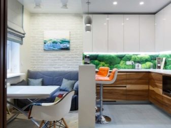
If you want to arrange a kitchen, combined with a loggia, a living room, a U-shaped arrangement of furniture is preferable. A tabletop or a bar counter is placed on one side. This counter will serve as both a workplace and a dining area.
Some designers advise using this layout also for square kitchens that do not have a window. However, this is not the best option, since it is not possible to set up a normal dining area.


Sometimes you can hear the opinion that the kitchen is 9 sq. m. it is worth displaying headsets with islands. But not all such sets of furniture are ideal for solving the problem. Often their excessive length interferes with the performance of the main function; it should also be borne in mind that the width of the countertop in such a composition is strictly limited.
As for the chairs, folding options are most correct, which will allow everyone to sit down and cook without unnecessary interference.


An important point
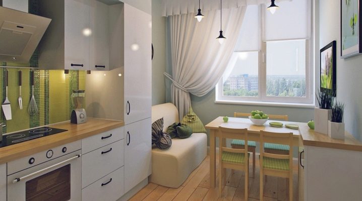
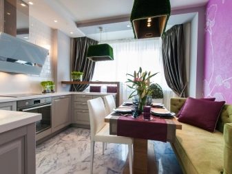
Before planning a kitchen design 9 sq. m. with a sofa, think over colors, select wallpaper, you must first figure out where it is best to place it. The key consideration here is space orientation. In the corner, they put special models, the so-called corner ones. Usually they have built-in drawers for storing various accessories.
There are also convertible versions that easily turn into a full-fledged sleeping place. There should be enough free space between the table and the sofa and between the sofa and the wall.
A typical soft sofa of compact size can also be supplied in the kitchen. In this case, it is recommended to install it close to the wall. Rectangular specimens are sometimes placed behind the kitchen table.


But the main requirement is still valid: freedom of movement throughout the kitchen.
It is also undesirable, of course, that the furniture becomes an obstacle to opening the refrigerator or the doors of the lower tier of the headset.
Interior design nuances
After carefully distributing all the components, you can start choosing a finishing concept. Otherwise, they may not be visible, or they will produce a completely different impression than we would like. Care should be taken when using saturated contrasting colors. A full-fledged harmonious interior is created using 2 or 3 basic tones. But it is better not to deviate from monochrome finishes unless absolutely necessary.
If everything is carefully thought out, you can use tiles with discreet patterns. Alternatively, photo printing is used.
To maximize the mood, they give preference to juicy, cheerful colors, such as yellow, light green, various shades of red. If desired, you can combine them with white and black palettes. And here from cold scales of turquoise or lilac, it is better to refuse.


If you want something natural, it is advisable to opt for warm beige and brown tones. It will reproduce the appearance of a tree or a wild stone. Those who prefer ultra-modern interiors will surely be delighted with the combination of black and chrome steel shades.
In some cases, designers have to struggle to visually increase the space. One of the most valuable methods of solving this problem is considered to be the use of built-in techniques. It is not only the most compact, but also often has improved technical characteristics. If you put everything you need in a separate stand, the problem of pulling wires to separate mechanisms is automatically solved.
It is worth considering in advance what is really needed from furniture and equipment, and what you can refuse.


The visual expansion of the kitchen is easily achieved with mirror-like textures and glossy surfaces. If the kitchen is a square in plan, the use of horizontal lines is an excellent way out of the situation. It is not necessary to decorate the walls like this - a headset with stripes becomes a good idea.
We must not forget about the functionality of the window sills. It is best to build countertops and sinks there, as well as storage systems.


To embody your color preferences and to create optimal patterns, you can use both photo wallpaper and tile-based panels. The choice of the place for the picture is determined only by expediency and personal taste. If done correctly, the desired effect is guaranteed.
For 5 mistakes when ordering a kitchen, see the next video.


The comment was sent successfully.