Kitchen-living room in the style of "minimalism": features and characteristics
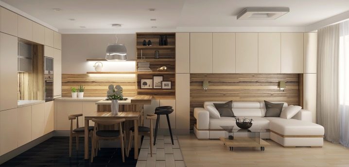
Today there are many styles of apartment decoration. Some have appeared quite recently, while others - decades ago. Minimalism, as a design style, is at the peak of its popularity. Although it appeared relatively recently - in the mid-60s, it came to the taste for extraordinary people who love order and those who want to visually enlarge their living space.
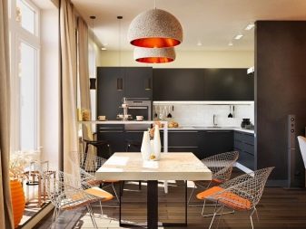
Design features
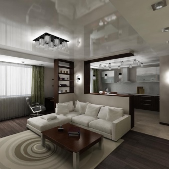
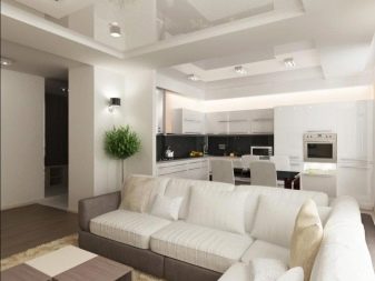
Paradoxically, it is possible to decorate a living room beautifully in a minimalist style only in large apartments. The very idea of such a design implies a large area on which only practical and functional furniture is placed. If the apartment is small, it will need redevelopment. The living room is combined with the kitchen and is separated by decorative elements - a column or a small partition. For such a redevelopment, you will have to conduct an examination and get a new plan. If a non-load-bearing wall is dismantled, then it will not be so difficult to do.
The inspection commission will not allow dismantling the load-bearing wall - it is life-threatening.
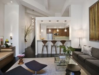
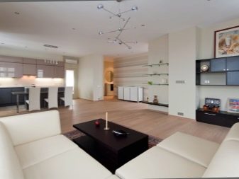
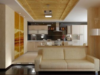
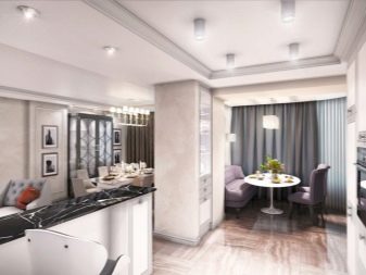
With the correct redevelopment and design in the style of "minimalism", the apartment is greatly transformed:
- Even in small apartments, it turns out to significantly increase the living space.
- The living room and kitchen are filled with sunshine, evoking a sense of comfort and tranquility.
- All modern technology harmoniously fits this design.
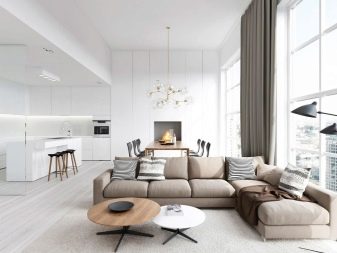
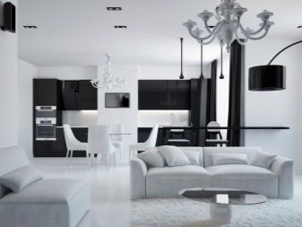
Materials and colors
In the kitchen, you need to choose materials that will complement the overall composition. You can, of course, use plates of porcelain stoneware, but if the color and surface structure are incorrectly selected, it will strongly contrast with the living room area. This will visually divide the overall style of the kitchen-living room and will look ridiculous.
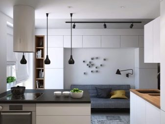
Walls
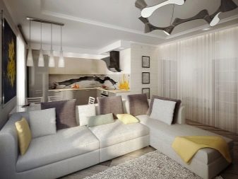
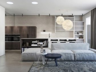
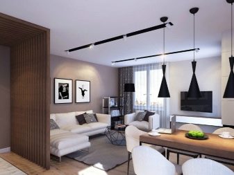
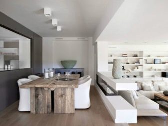
Wall decoration with minimalism takes the main place in the decor. In such an interior, they are the first to catch the eye. The design of the room in the style of minimalism initially assumes that a maximum of 2-3 shades will be used. Most often it is white, black and light gray. They make the interior visually larger and emphasize its simplicity and practicality. In this case, the walls of the room can be finished with embossed plaster. The main thing is that its tone is combined with the main color of the room.
Ceiling
In any case, the ceiling is finished with white materials. Moreover, it must have a perfectly flat surface. To level the ceiling, materials that do not contain sand are used. In addition, the white color of the ceiling will be combined with any basic shade of the room.
On the white ceiling, you can fix lamps of any shade and shape - in any case, they will perfectly fit into the overall design.
Floor
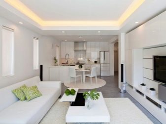
For the floor, it is best to use natural wood or materials that imitate its structure. Such materials are expensive, and prices can reach 100,000 rubles for an area of 20-25 square meters. To save money, you can cover the floor with linoleum that repeats the wood pattern, but it should be solid or without visible joint lines. But using natural materials such as wood or cork will be preferable.
Features in the choice of furniture
Undoubtedly, an important touch in the completion of the decoration of the room is the correctly selected furniture. It should not only have a strict design, but also fulfill its main functions.
It is best to choose cabinets built into the wall. They will save living space while remaining roomy. Instead of a coffee table in the living area, it is better to place a sofa with wide armrests. So you can combine two types of furniture into one - it will be both a place for receiving guests and a recreation area.
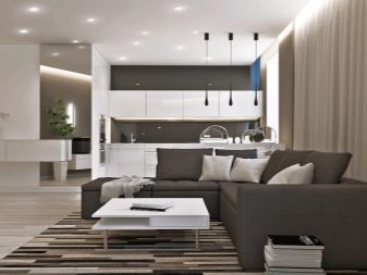
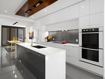
Large mirrors on the walls will perfectly fit into the overall style solution - they will add even more visual space to the room. It will be enough to install a large diagonal TV, and the interior of the reception area can be considered complete.
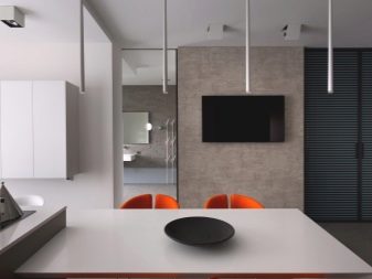
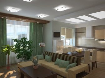
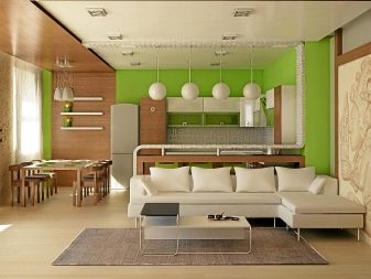
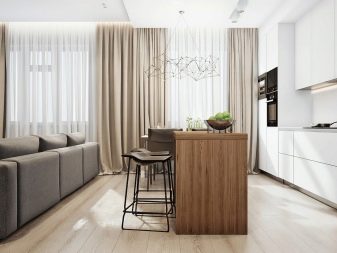
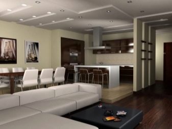
Kitchen furniture also needs to be chosen built-in. This will not only free up useful space, but will also become a logical continuation of the design of the living room. Handles and fittings are best matched to the main color, in order to avoid sharp contrast. To visually separate the living room and kitchen area, in addition to decorative elements, you can use additional furniture. For example, a bar counter would be a great solution.
Regardless of where the furniture will be installed - in the living room or in the kitchen, it is worth adhering to one rule: it must be functional and with simple geometric shapes.
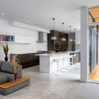
Who is the design for?
Of course, style preferences are personal. But minimalism is first of all practicality, and it will not suit all categories of people. Minimalism does not "tolerate" unnecessary details and things. It means that it will not work for families with children. Scattered toys, "walkers" and playpens will irrevocably spoil the overall style of decoration. A minimalist room is ideal for single people. Cleaning such a room will take less time, and its calm atmosphere will allow you to relax after a hard day.
See the next video for more on this.


The comment was sent successfully.