We create a stylish kitchen-living room interior
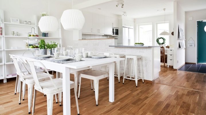
Lack of space or the original design of the home (in the "studio" format) often forces people to put up with the combination of kitchens and living rooms. But this does not mean that you just have to agree to the look that was given by the builders, there are much more opportunities for elegant design than it seems. You just need to know all of them and be able to apply.
Peculiarities
The interior of the kitchen-living room is becoming more popular from year to year, since the combination of these rooms allows you to simultaneously expand the space and give it maximum individuality. In the combined room, both a classic restrained style and a modern solution can be used, when the emphasis is on the openness of the space.
It is difficult to carry out a certain format in one part of the roomand in the other, the opposite. Only professionals can implement such an idea correctly and adequately, without violating the design canons.
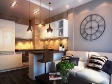
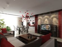
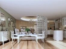
Speaking about the merits of the fusion of kitchens with living rooms, we should mention the emergence of a wide, fully open space that can be easily broken down into certain functional parts. The creation of closely spaced dining and work areas can significantly reduce unnecessary movement around the house, make culinary manipulations not so tedious. Right in the process of working on lunch, dinner or breakfast, it will become possible to talk with other family members. But remember that you will need to buy household appliances that create the lowest possible noise level.
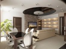
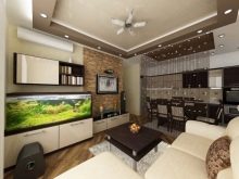
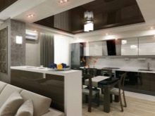
In the studio, connected rooms are already present, but in the "Khrushchev" apartment the intermediate wall will have to be demolished. It is important to know that this kind of manipulation requires obtaining permission, otherwise the redevelopment is considered unauthorized and entails punishment - a large fine or even eviction. If, instead of getting the most out of your living space, you want to make good use of the large space in your cottage, consider a combined dining room. With the correct implementation of the plan, it will be possible to create an attractive room full of air and freshness, pleasing both the owners and guests.
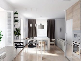
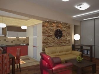
Merging the kitchen with the hall is a serious decision, and with all the advantages that have already been discussed, one should also remember about possible problems. So, in Europe and the USA, where such a move is widely used, at home they mainly heat up ready-made semi-finished products, and do not engage in a full cycle of culinary work. Even a very powerful hood will not eliminate all odors, they will still reach the remote corners of the room. In addition, the jointly assembled kitchen and hallway will get dirty as intensely as a stand-alone kitchen space. And due to the large size of the territory, it will be harder and longer to put things in order than we would like.
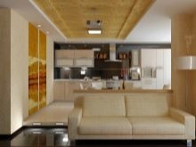
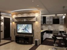
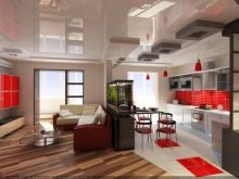
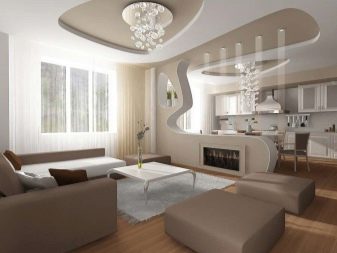
An alternative solution is to partially overlap two rooms, when the partition is dismantled approximately to the middle (in height or length). The resulting space allows you to organize interesting zoning using drywall sheets; in other versions, screens, a sliding structure, a bar counter or just an elegant curtain help to separate functional areas.
Styles
In addition to general considerations, when designing kitchen-living rooms, it is also necessary to take into account considerations of a specific style.
The Scandinavian format allows you to solve several problems at the same time:
- increase the space in the room;
- create a larger workspace;
- allocate an area for a solid table;
- to organize all this territory as comfortably and comfortably as possible.
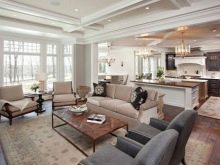
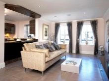
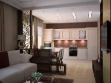
It is permissible to use rectangular arches to visually delimit the kitchen and living areas; it is very important that these rooms do not merge with each other. The Scandinavian style is characterized, first of all, by the maximum introduction of light colors into the interior, by the intensive use of natural materials. At the same time, not a single designer will deny himself the pleasure of using bright decorative objects. Contrary to popular belief, the predominance of white paint makes the kitchen relatively resistant to pollution, the room ceases to be soiled.
An important advantage of this color is its compatibility with many other colors, which allows you to experiment without violating the Scandinavian canon.
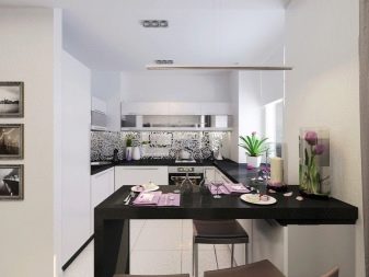
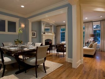
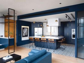
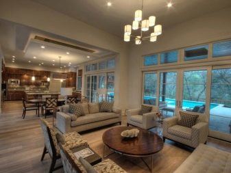
Can be no less attractive neoclassicism... Freeing up space is achieved through the use of built-in equipment, the use of relatively narrow upper cabinets. One of the walls is most often made accent, covering it with wallpaper or other covering with a not too bright ornament. You can use figurines, small vases to decorate space. It is easy to add minimalism motifs to this or to any other style, you just have to choose furniture with laconic geometry and not too flashy colors.
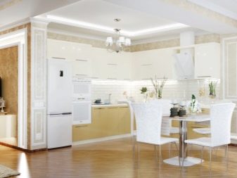
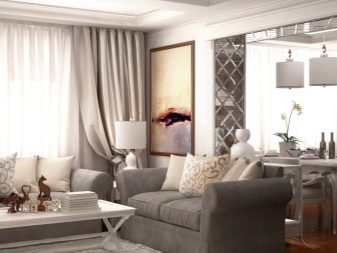
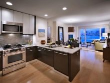
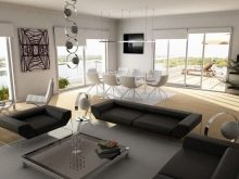
Classic interior a kitchen combined with a guest space is appropriate in almost all cases; if you don't know which option is best to choose, stop there. Extremely clear lines, expensive natural wood furniture, the exclusion of unnecessary details and decorations will undoubtedly please many people. In situations where you want to combine classics and modern motives, to achieve high practical qualities, it is recommended to choose a loft.
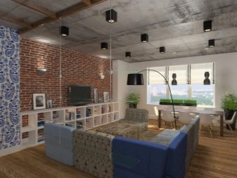
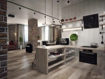
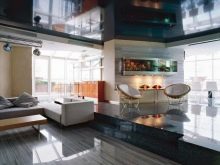
Format high tech it is distinguished by expressive straight contours, an abundance of glass and metal structures, a preference for household appliances hidden inside furniture products. All this splendor is poured out by a certain number of spotlights.
Color solutions
The coloring of kitchen-living rooms is extremely important, it is this parameter that largely determines their perception. If, for example, you lay out the floor with gray porcelain stoneware, combining it with the metal facades of household appliances, plumbing fixtures and lamps, you will get a very attractive solution.
In most cases, they still try to create a visually monotonous interior, if several colors are used at once, they should be harmoniously combined. Since the kitchen is usually smaller than the living room, it needs to be made brighter, for example, dark blue or other rich colors.
But the part of the room where you will rest should be decorated in the most calm tones that do not provoke negative emotions.
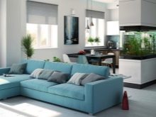
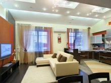
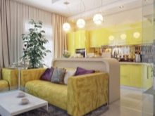
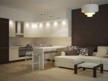
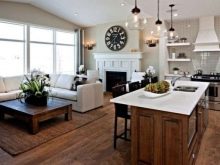
Light colors help to solve such an important task as the visual expansion of space. White paint can be quite varied, varying its shades, it turns out to create a completely interesting and fresh look. The original move is to combine white with cream, brown and sand colors, sometimes purple is added to them.
Decor items
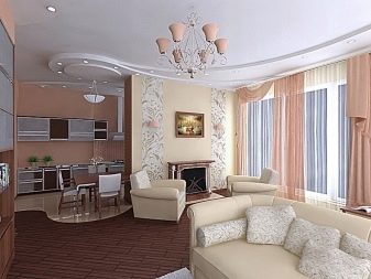
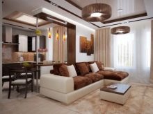
Decorative elements can play the role of both an external accent and a component that unites the entire room. In the latter case, they try to comply with the framework of the chosen style as accurately as possible. The introduction of a round chandelier just above it, and ideally above the dining table itself, will help to focus on the autonomy of the dining room.Ceiling lamps can also act as visual space dividers, especially when floor coverings have the same role.
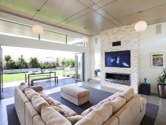
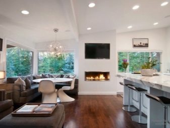
The number of combinations with a fireplace is relatively small: he either divides the territory into functional areas in the same way, or acts as the main organizer of it. The alternative to an old-fashioned hearth is a large television or other attractive-looking object.
Decorating ideas
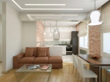
The kitchen area can be visually emphasized by the box located on the ceiling; lighting is often placed inside this box. If you place the structure around the entire perimeter of the room, it becomes a visual link. Venetian plaster can be used to cover walls and sometimes ceilings in interconnected rooms. But still other options are more familiar.
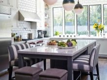

In the kitchen part, it is required to use only such materials that are not subject to the harmful effects of water, chemically active detergents, fats and carbon deposits. Most often, you have to choose between ceramic tiles, ceramic granite, natural and artificial stone. The guest piece of kitchen-living rooms is much more free, there you can be guided by your own tastes and design considerations. Laminate, carpet, linoleum are widespread; wealthier people sometimes choose a parquet board. Tiles are laid on the walls, all kinds of wallpapers are glued, varnishes, paints and enamels are used.
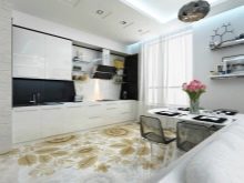
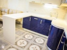
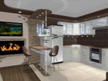
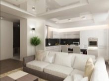
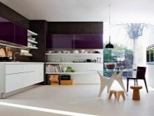
Try to keep the overall style of the space identical in all main areas, on all surfaces of the room. Fashionable and stylish tones of 2017-2018 are not limited to light shades, bright blue tones will also look quite attractive. In addition to color combinations, you should also think about what textures will be used in a particular case, for many decorative materials they are very diverse.
How to choose furniture?
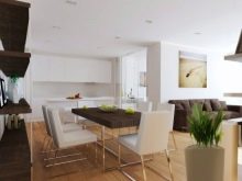
The catalogs of Ikea and other furniture stores provide many opportunities for choosing the right products. But it is imperative to take into account the basic principles and points so as not to be mistaken. In the dining area, it is recommended to put not too large tables and soft chairs, thereby achieving true comfort. A low-hanging chandelier will help to make the space more elegant.
A sofa can act as a limitation of the recreational part, corner options are especially good in this case.
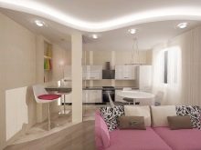
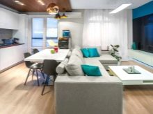
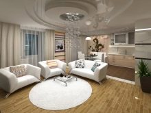
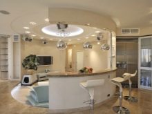
The oak plank finish of countertops and bar counters makes them much more attractive and luxurious than simple options. Where it is required to put a full-size folding table, it is recommended to use furniture arranged in the shape of the letter G. Often, designers prefer to use furniture that looks like a designer to decorate kitchen-living rooms; if the space is not only common, but also as open as possible, experts believe that corner kits are the best solution.
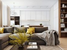
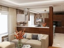
The color of the headset absolutely cannot be done in such a way that would not be combined with the color of other furniture. The tonality of the facade can be identical to the color scheme of the walls (and then the furniture seems to be "lost from sight"), or it can be in sharp contrast to it. If the general layout of the apartment is studio, glossy facades will be the most attractive.
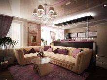
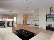
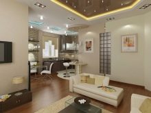
Options for different houses and apartments
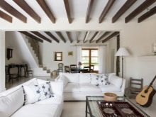
For a country house and a similar style apartment, it is very good to use ceiling beams. A more aristocratic interior requires appropriate design elements, among which bay windows attract attention. It is impractical to use them in city apartments, since too many permits will be required, sometimes they may not allow changes in the bearing wall at all.
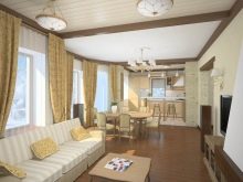
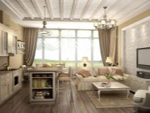
In a small apartment, an attractive solution is to combine the living room and the kitchen without demolishing partitions; to avoid the need to coordinate such a step, simply remove the door and replace it with a stylish arch.But always one that opens up a wide perspective and a free view of the kitchen space from the living room, and the guest space from the kitchen. Please note that stylistic and furniture novelties do not always look good in a small apartment, if you cannot understand whether they are acceptable, consult with experienced designers.
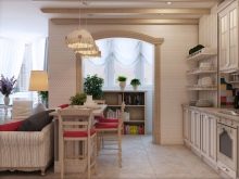
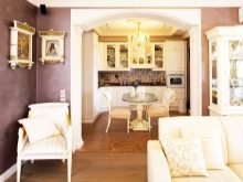
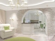
The differences between the Russian approach to a combined kitchen and living room from the European (American) one should not be ignored. Decide immediately whether you need to erase the boundaries between parts of the room to the end, or it is better to leave clearly defined boundaries separating the functional areas from each other. The conditional division of space is achieved, for example, thanks to the kitchen "islands", especially if their different faces are decorated in accordance with the fragment of the room to which they are facing.
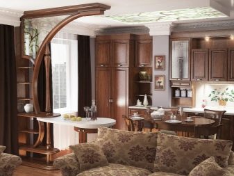
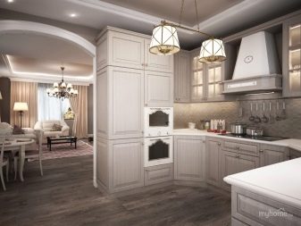
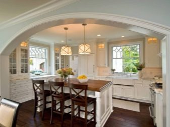
Important: in a house equipped with a gas stove, the complete demolition of the wall between the kitchen and adjacent rooms is prohibited due to safety rules. Designers often find a way out by using part of the structure under the bar counter, and at the same time leaving a semblance of a doorway.
Such a move will help to increase the illumination and to clearly observe the territorial division.

Projects for the area
Let's characterize several projects for decorating a kitchen connected to a living room.
If the total area of the dwelling is 30 sq. m and more, it is still desirable to combine not only the kitchen and living room, but also a loggia (balcony); by creating a common space out of them, you can make life more comfortable and expand the possibilities for experimentation. Kitchens measuring 8-10 sq. m will look good subject to clear zoning.
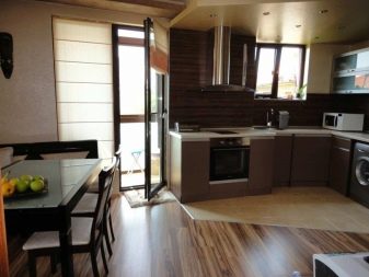
When the common space is very large (the area is 20 sq. M, 21, 25), the demarcation is also important so that the functionality of each part is emphasized favorably. The thought of the difference between the two comes from the use of dissimilar floor coverings.
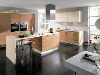
A 16-meter merged room can be finished in a Scandinavian style:
- if its parts are passable, it is recommended to concentrate all the furniture on one of the sides;
- the kitchen set is most often placed in the shape of the letter G;
- it makes sense to choose a built-in refrigerator and a high-height pencil case (hiding all the necessary equipment);
- they refuse from the upper cabinets, otherwise a not too large area will be overcrowded, completely open shelves will act as a replacement for them.
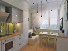
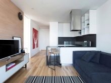
With an area of 15 and 17 sq. m, the approach will be about the same.
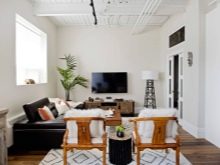
We create a setting for the shape of the room
If you want the house to have a square living room, but it does not quite meet this requirement, you can move the front door, then the similarities will increase. When the square is created or exists initially, you can safely install even voluminous furniture.
A rectangular kitchen-living room does not look very attractive, but there are a number of ways to decorate it more elegantly, to smooth out imbalances. You should start working with the formation of the most detailed sketch, where all pieces of furniture and all aisles will be displayed, the distances between them are marked.
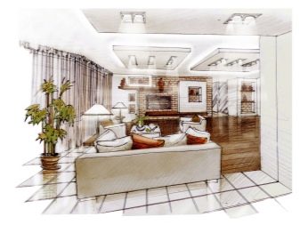

Important: do not leave passages less than 0.8 m, they are completely impractical and even outwardly look very bad, it seems that the room is overloaded. In rectangular rooms, it is imperative to clearly highlight a certain object that will concentrate all attention and serve as a semantic organizer of space.
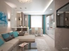
Beautiful examples
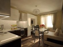
A bright, welcoming kitchen-living room is ideal for any country house, with rare exceptions. Light yellow walls and ceiling with an abundance of white stripes, snow-white furniture, many light sources will emphasize this idea. On one of the walls, attractive photographs and small paintings can be placed, collected in an accent species group.
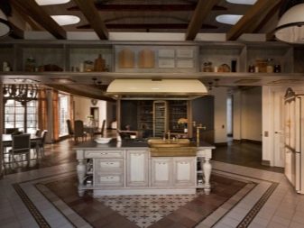
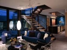
And here the designers were clearly inspired by the idea of the most natural home. A huge room with a staircase is almost all decorated with light wood.The only exceptions are floor mats and a few accessories. Windows of strict geometric configuration look solemn and festive. Several multi-colored pillows are an excellent combination with a white sofa; the staircase is favorably set off by decorative objects exposed along it.
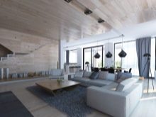
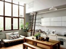
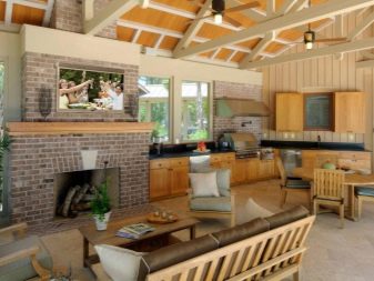
The kitchen-living room in the country can at first cause bewilderment with the excessive overflow of space. In fact, it is used quite competently and clearly. The developers pay tribute to naturalness, making abundant use of wood and stone, placing a small plant in front of the fireplace and a larger one to the left of it. The whimsical configuration of the ceiling, where pleasant yellowish boards are visible behind the white decor, carries the same idea.
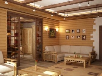
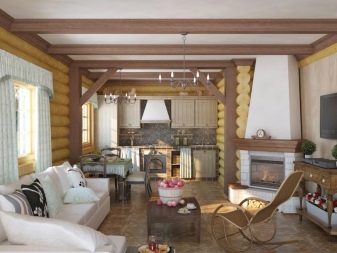
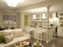
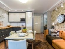
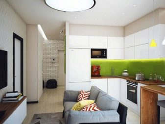
In a small kitchen-living room, you have to reluctantly bring everything closer together, and here - the sofa is far from the kitchen furniture and the stove just enough so that you can walk freely. White and black colors are favorably set off by the green deepening of the kitchen part of the room. The main luminaire is on the ceiling, circular in shape, with a nice black rim, giving a cool white light. More attractive lighting fixtures are hung directly above the working area.
See the next video for more on this.


The comment was sent successfully.