Tile apron design options for the kitchen
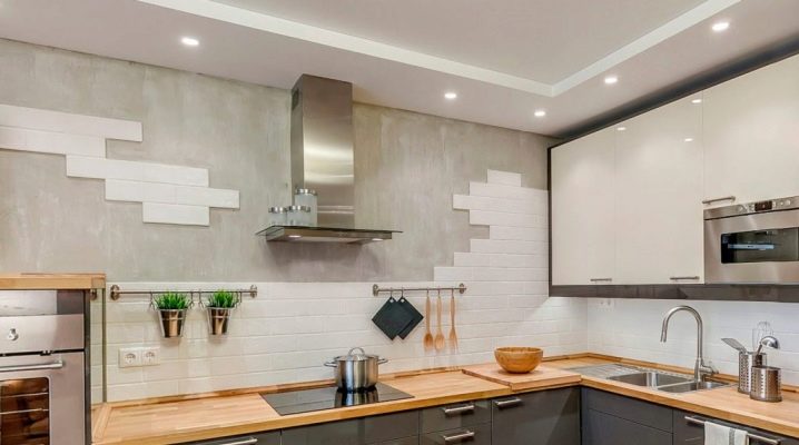
A kitchen apron made of tiles is a traditional element of the interior, harmoniously combined with the set and bringing notes of home comfort to the atmosphere of the kitchen. Even some 10 years ago, tiles were the main material of such cladding. Today she has to compete with skinny, MDF panels, laminate. Despite the competition, it is recognized as one of the best materials. Let's consider in detail the different design options for a spectacular tile backsplash.
Peculiarities
The modern tile market is packed with offers that can satisfy the taste of even the most demanding customer. However, not every product is worth buying: it is important to consider the thickness, size of the dies and geometry. Wall tiles are used for the apron. It is thinner and lighter than the floor-standing counterpart.
Regarding the size, it all depends on the size of the kitchen. The larger it is, the larger the parameters of the dice can be. If the kitchen is small, a large tile for an apron is not suitable: it will visually reduce an already tiny room.
In addition, a lot depends on the pattern and color, because it is they who set the basis for the mood of the apron in the design of the kitchen.
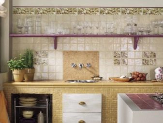
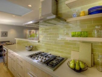
Regardless of the choice of a particular tile, it must correspond to the general concept of style, chosen as the basis for the interior composition. For example, you cannot overload the design of an apron with a print if the interior requires space and air, which is achieved by minimalism. Often the focus here is on simplicity and small image size. In addition, the apron can be designed in the form of a specific composition, located in a specific place (say, above the stove or sink).
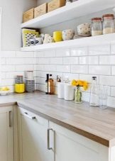
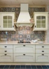
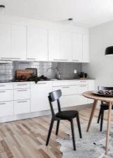
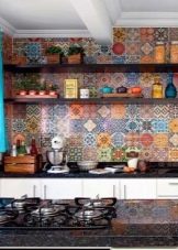
Apron tiles can be different. Today it is easy to choose dies that will attract attention due to the texture even without a complex pattern. For example, if earlier glossy tiles were used for aprons, today you can pick up elements with a matte, satin surface.
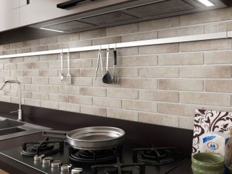
In addition, on the market for similar products, you can buy tiles with a relief, due to which you can create the effect of a wide variety of building materials from marble to brickwork.
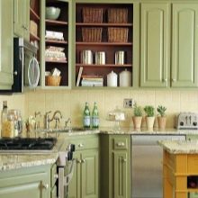
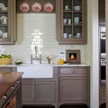
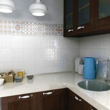
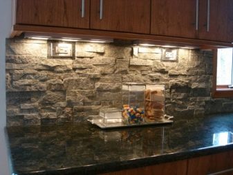
If the design requires it, you can use not only ceramics for the manufacture of an apron, but also porcelain stoneware, clinker, majolica and stone. Plaster dies, although they look voluminous and impressive, do not withstand the conditions of the kitchen. Gypsum is not resistant to water, it wears out, is quite capricious in care and quickly loses its original attractiveness. The mosaic can be ceramic and porcelain stoneware. For the apron, you can use options on the net, which simplify laying and speed up it several times.
Color spectrum
Color solutions for kitchen aprons are subject to the peculiarities of the style and the room itself. Despite the fact that they depend on the color of the existing interior items, their shades can be very diverse. Speaking about the color of furniture, it is worth noting: it is undesirable for the color of the kitchen apron to match it exactly.
Of course, the shade can be related, but its exact coincidence will merge furniture and an apron into a single color spot, which will deprive the interior of its versatility and doom to boredom.
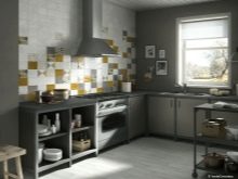
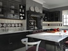
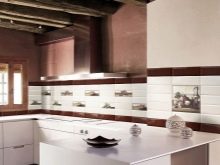
Color solutions for kitchen aprons are subject to the peculiarities of the style and the room itself. Despite the fact that they depend on the color of the existing interior items, their shades can be very diverse.Speaking about the color of furniture, it is worth noting: it is undesirable for the color of the kitchen apron to match it exactly. Of course, the shade can be related, but its exact coincidence will merge furniture and an apron into a single color spot, which will deprive the interior of its versatility and doom to boredom.
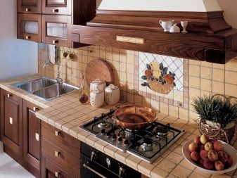
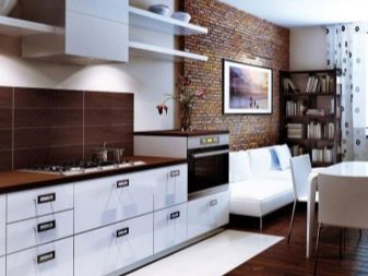
In addition to neutral shades, natural colors are fashionable, namely: beige, coffee, brown. And also in fashion yellow and green tones, through which you can make the kitchen bright and cozy. At the same time, it is important to use tiles with a combination of two or three tones for kitchen aprons. For example, a combination of shades looks beautiful in the apron drawing:
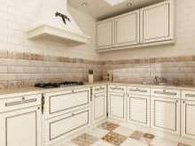
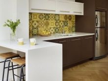
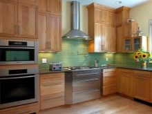
- light green paint, beige and gray contrast;
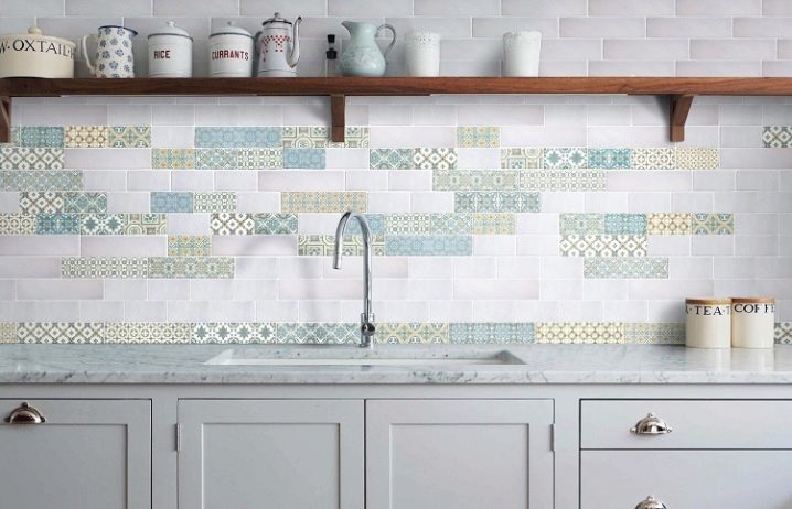
- beige, orange and brick;
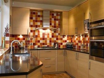
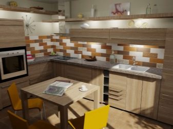
- khaki, gray and milky;
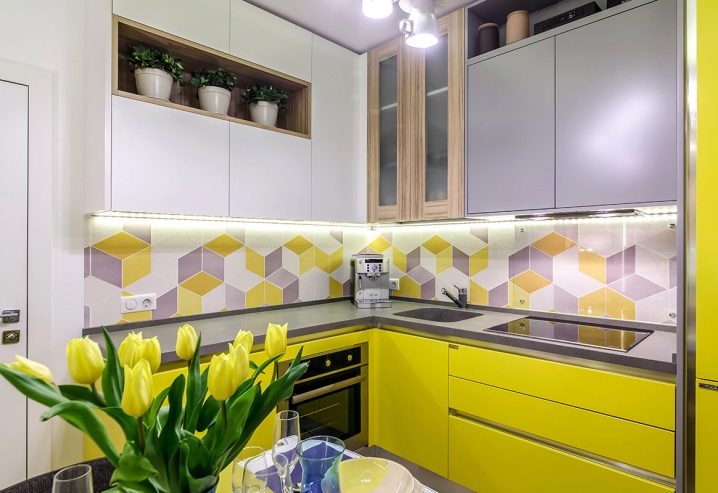
- marsh with orange and gray;
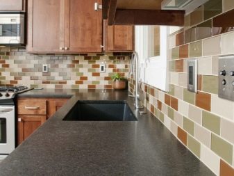
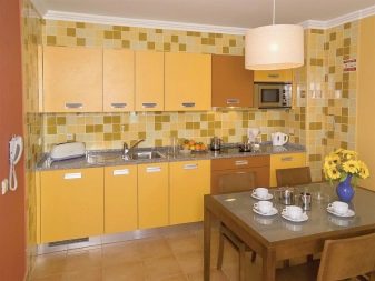
- white with marsal and gray-green;
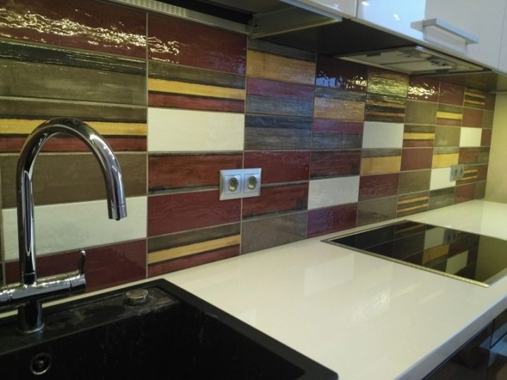
- orange with brown and gray;
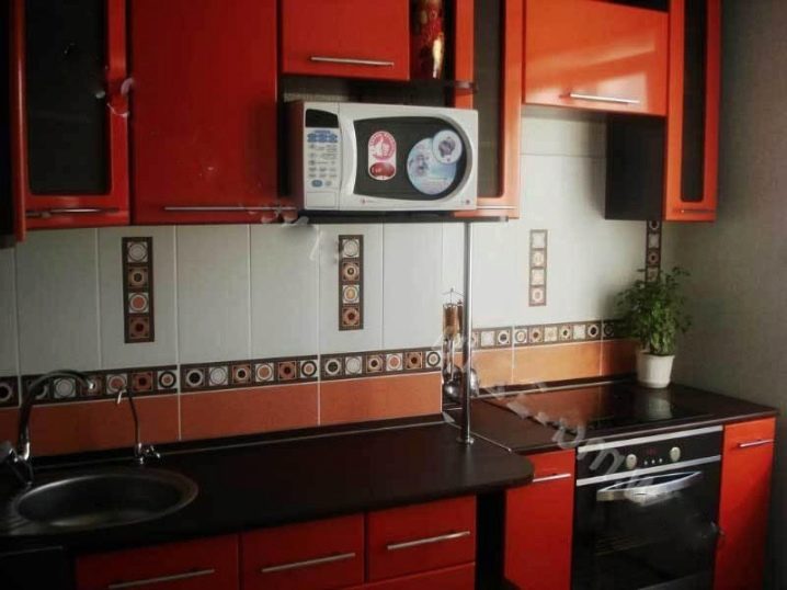
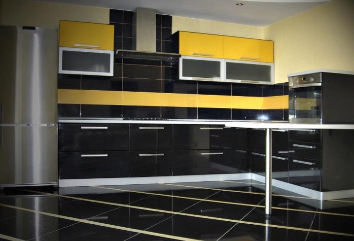
- white with black and mustard;
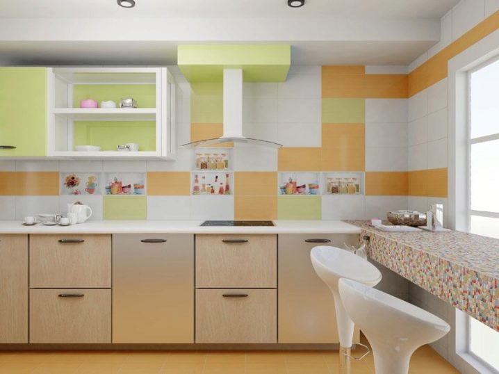
- peach with green and milky.
When choosing your option, it is worth considering the compatibility of tones with a kitchen set and existing furniture. One of the shades for the backsplash can match the color of the ceiling light, countertop, cornice or slab tone. At the same time, it is not at all necessary that there be a lot of the matching shade: even a small amount will be enough to create the appearance of an interior ensemble. For example, gray tiles are quite suitable for a white kitchen, but at the same time there should be a bright contrast in the interior or in the design of the apron, otherwise the kitchen will look dull.
When choosing a multi-colored tile, you need to pay attention to the coincidence of its color in temperature with the existing furniture or wall decoration.
Design options
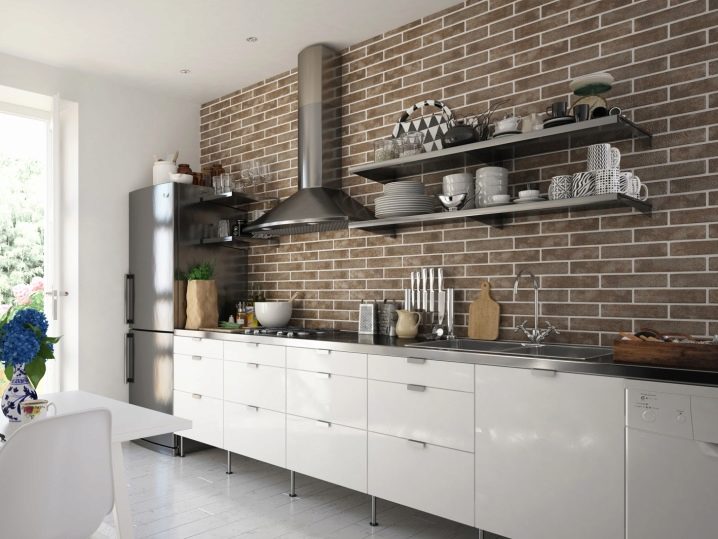
A tile kitchen apron can be very diverse. At the same time, the layout can become a tool for introducing a special mood into the design. For example, when laying with a shift and using rectangular dies, you can make an apron for a brick, which is now considered especially fashionable in the interior of kitchens. If you use at the same time products with a relief, you can achieve great reliability, thereby bringing notes of high status to the interior.
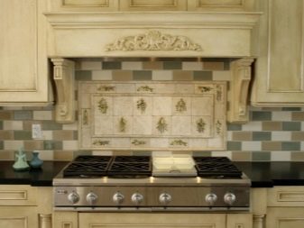
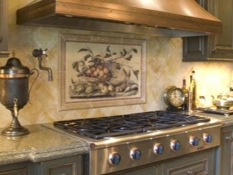
Simple styling with the formation of crosshairs can look no less interesting in the design of the apron., if at the same time use the techniques of a panel or create a certain composition from a mosaic. By the way, the second option looks especially harmonious if you give the compositions the appearance of small paintings with the theme of a particular style. For example, it can be birds among the grass, soaring in the sky, as well as still lifes with dishes and fruits or flowers. Of course, the laying of such a tile is very laborious and demanding to maintain the identity of the joints.
However, the appearance of such an apron will be special.
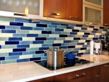
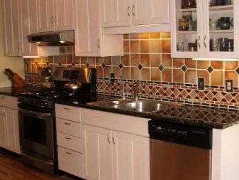
You can combine tiles with each other using dies of different sizes and colors. For example, laying square tiles with a small diamond between large elements looks harmonious in the design of an apron. At the same time, you can use different color contrasts in the design, using up to three to four shades for one apron.
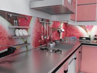
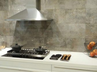
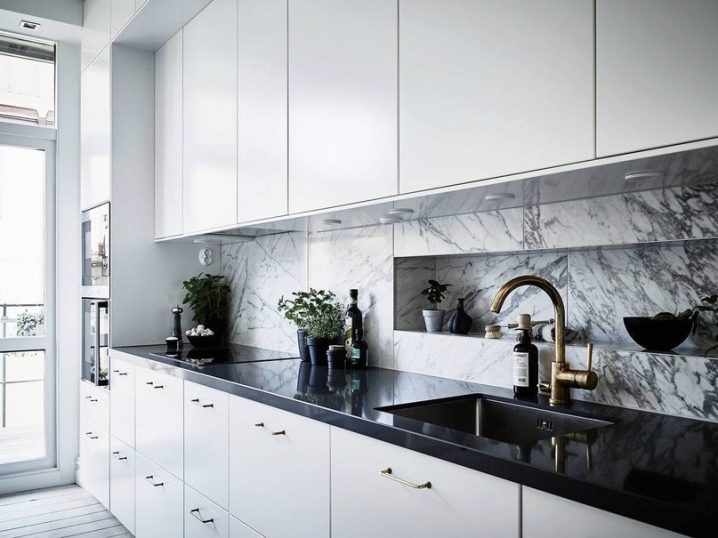
If the design requires minimalism, you can get by with plain tiles or strips with stains that imitate stone or marble. From ceramic tiles, you can lay out an apron with a decor in the form of a border. But also a decorative strip with a pattern can be positioned in the center of the apron.
If you thoroughly approach the theme of the print, this design will look original and beautiful.
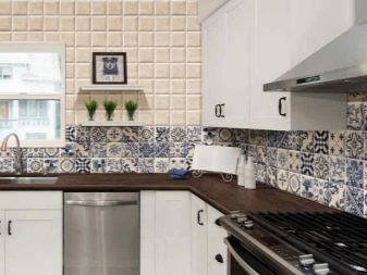
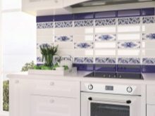
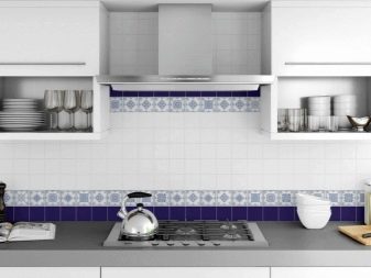
You can lay out a drawing under Gzhel using a variety of prints. This design will be especially appropriate if the kitchen itself is made in white or blue colors. At the same time, bright blue colors will relieve the kitchen of boredom, whether it be aprons with patterned stripes, flowers or geometric, floral prints in white and blue tones, as well as patchwork. A white apron with a small panel accentuating any ledge on the wall will look no less beautiful.
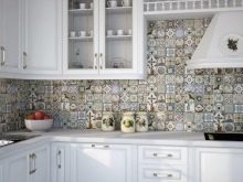
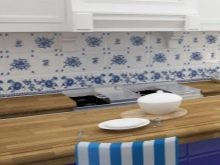
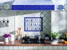
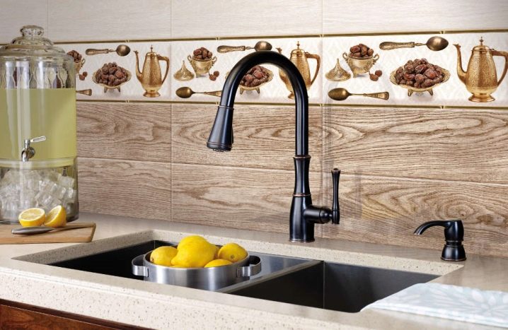
If the style requires it, you can lay out the apron under a tree using tiles with this pattern. As for the relief, such dies really look unusual. However, before buying them, you need to weigh the pros and cons, because, unlike glossy tiles, they are more difficult to maintain. At the same time, when choosing one or another option, you need to correlate it with the general concept of stylistics.
For example, if there is already enough wood texture in the kitchen, you should not buy tiles that look like wood: such a kitchen runs the risk of turning into a wooden box.
Styles
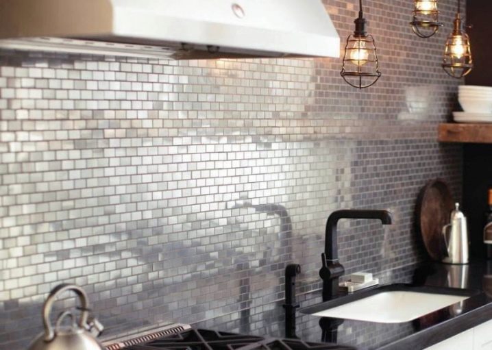
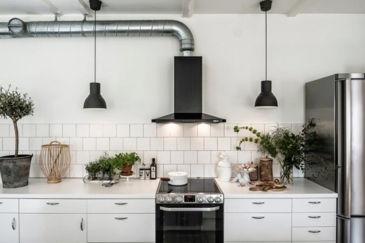
In order not to hesitate when buying tiles, and to arrange the cooking area correctly, you need to build on the specific style of the room. For example, if this is a creative direction of a loft, then a deliberately rough texture is needed here. This can be an option for a brick or tiles with a metal effect. The whole room should look like an interpretation of an industrial facility. You don't need anything superfluous, no decor: there will be enough brickwork with a shift.
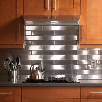
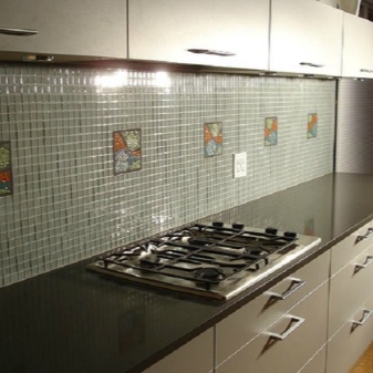
And you can also combine square matte tiles with mosaics, placing small elements in a strip along the bottom of the apron. Modernity requires elegance, a demonstration of texture and all kinds of gloss. In this case, the tile can be glossy, monochromatic, but decorated with a border with a convex pattern and gilding.
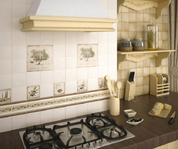
If finishes are chosen for classic interior trends, pomp is needed here. You can choose a decor for an apron with gold monograms or a semblance of stucco.
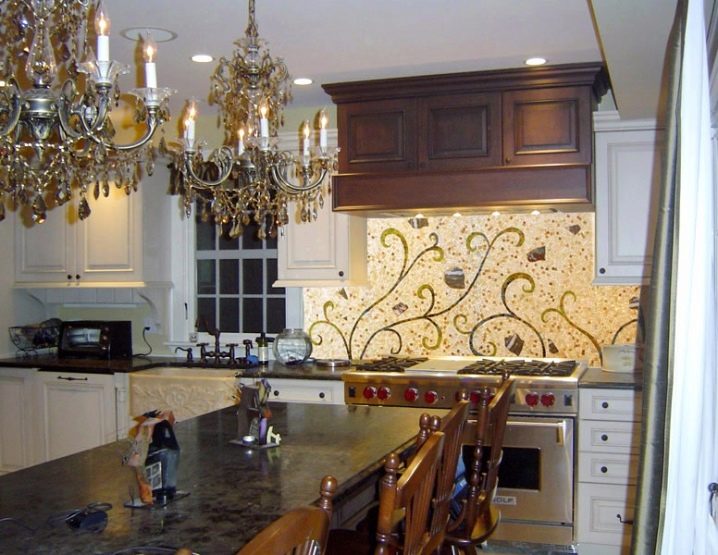
If the kitchen is made in country style, you can order hand-painted in the workshop. Painted tiles in the form of a panel in the design of the apron will look unusual. She may well become a decoration of the kitchen, harmoniously fitting into its interior. Patchwork wall tiles look no less impressive in the design of a kitchen apron.
It goes well with discreet furniture and set.
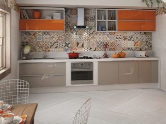
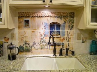
So that the diamond tile design does not seem too banal, you should not lay out the entire apron in this way. It is enough to accentuate one part with this styling (for example, a ledge or, conversely, a niche). This is a great option for decorating an apron in Provence or country style. Design ideas can be very diverse. The main thing is to consider: a sense of proportion should be observed in everything. Even trends such as avant-garde or kitsch can lose their eccentricity if there is too much diversity.
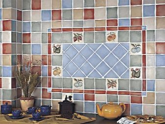
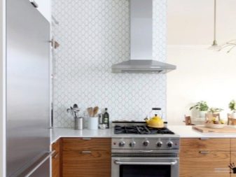
How to choose?
Often, the choice of the right tile confuses the buyer, because it is difficult to accurately select the shades and sizes, reducing the amount of trimming. To simplify the task, you can use special programs, thanks to which, you can calculate the required amount of material for laying.
It is worth adding to it a stock of about 10% of the total amount of necessary material (during work, a marriage is possible, and it is rare to take it home without breaking a couple of elements).
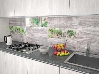
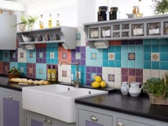
If you need to choose a single-color and patterned tile, you should start from paired varieties. This will simplify the selection task, since the standard companion tiles are perfectly matched to the base and finish shades. Here you do not have to select tones that seem similar in display cases, but at home may be different in temperature. Modern paired material, as a rule, is characterized by a high cost, however, the geometry of such a tile will be the same, and therefore it does not have to be calibrated.
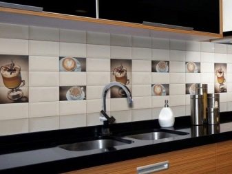
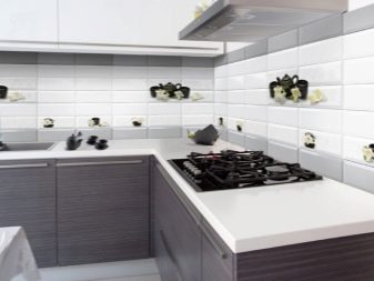
When calculating the amount of purchased raw materials, one must proceed from the type of apron (it can be linear or angular). More material is spent on the second products, but here it is often possible to use edging dies in inconspicuous places.
If you are in doubt about the calculation, you can contact the seller who will help you calculate the correct amount of material.
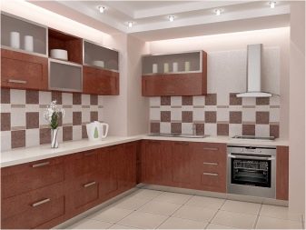
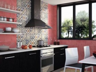
As for the quality of the backsplash tile, you can be scrupulous here and check each element with your own eyes. This will allow you to see if there are defects on the dies themselves.In addition, visual inspection will show if the batch number is the same, which may affect the shade mismatch between the base and finish dies. You need to take tiles from one batch. This eliminates the risk of buying a different-sized material that differs in thickness, as well as in length and width dimensions.
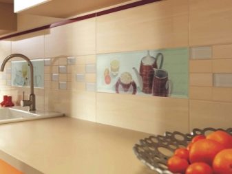
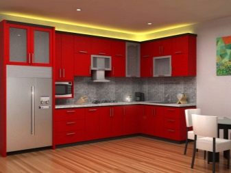
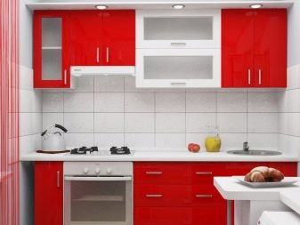
Regarding the shade, you need to build on the main color of the interior. For example, a red kitchen needs a softening tone. This can be, for example, a material in white or white with a silvery pattern. Weighting the red tone is unacceptable: you cannot be in such a kitchen, it will put pressure on the household. In the same way, for a dark kitchen, it is worth choosing tones that will soften some imbalance and add light spots to the interior.
If the kitchen is light and located on the sunny side, you can make an apron using bright colors to finish it.
Beautiful examples
Nothing will demonstrate the capabilities of a kitchen backsplash made of tiles like illustrative examples of a photo gallery.
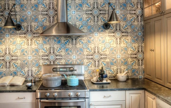
The Moroccan-style apron attracts with a combination of muted shades against the backdrop of light furniture and dark countertops. Traditional cross-hair tiling was used.
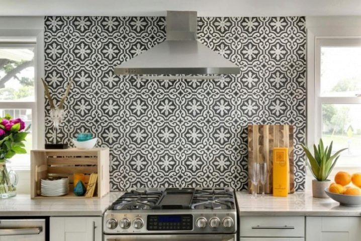
An example of the use of black and white tiles in the area of the slab with installation up to the ceiling. The addition of colored accessories brings a certain mood to the kitchen design.
An original solution for the loft style using mirror tiles. A special atmosphere is conveyed, this material visually expands the space of the kitchen.
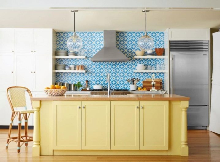
The use of blue and white tiles with simple ornaments allows you to revive the interior of a white and beige kitchen. At the same time, the apron does not look colorful: both the shelves and the dishes are quite harmonious here and do not create the illusion of disorder.
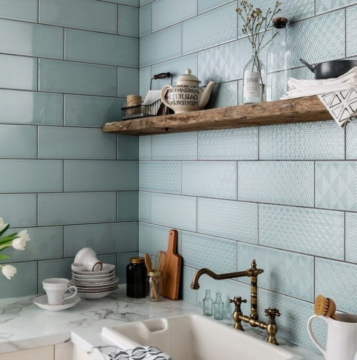
This example shows the possibilities of playing with textures. The use of glossy plain tiles for one side of the apron and dies with various ornaments on the other side looks fresh and interesting.
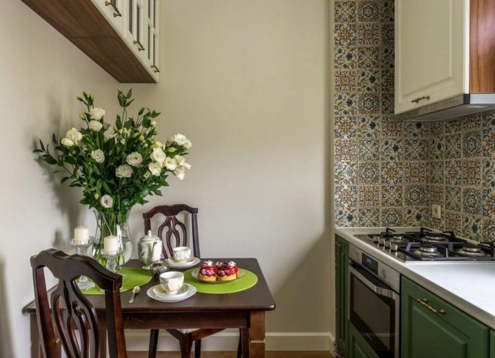
A great solution for a small kitchen. Despite the seemingly variegated color and laying to the ceiling, the apron does not spoil the interior, but accentuates the cooking area, separating it from the dining space.
This example is particularly successful in conveying the simplicity and laconicism of a loft with its simultaneous status. The use of a narrow strip of an apron and ordinary white tiles against the background of deliberately exposed communications looks natural and effective.
For tips on laying a tile backsplash, see the video below.


The comment was sent successfully.