Apron for the kitchen from tiles: how to choose and design?
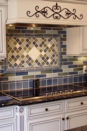
The design of the kitchen space without a kitchen apron looks unfinished, the design concept is not fully implemented.

Peculiarities
The tile for the apron for the kitchen should naturally be as strong and resistant to damage of various kinds. You will have to select this material as carefully as possible. The slightest mistake can lead to serious consequences, and they relate not only to style. Very strict requirements are imposed on the process of laying a kitchen apron on the wall. Many manufacturers offer ready-made tile kits, but you still have to choose them as carefully as possible.

Advantages and disadvantages
Using backsplash tiles is a common choice.
This material:
- serves for a long time;
- allows you to significantly facilitate care;
- not damaged by moisture and various caustic substances;
- resistant to ultraviolet radiation;
- differs in a relatively affordable price;
- allows you to flexibly customize the design, choose almost any concept.

But it's important to remember the weaknesses of tiles:
- the presence of seams (making cleaning more difficult);
- the need to process these joints with a new portion of grout every few years;
- the complexity of the installation;
- high labor intensity of dismantling works.

Views
There are many varieties of kitchen tiles that are suitable for decorating an apron. In modern apartments, Scandinavian style or French Provence are often used. In these cases, it is recommended to cover the wall with small squares (the side of which is 12 or even 6 cm). A similar solution is also perfect in a small room, it allows you to successfully distribute the territory into designer stripes. Thus, it is possible to visually enlarge the space of the room.

Along with the usual white tiles in a rustic style, beige and gray options can be used. The choice between matte and glossy finishes is practical. Often whole panels are formed, which display:
- vegetables and fruits;
- fruit trees;
- flower arrangements;
- holistic landscapes of the countryside.


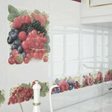
Sometimes a kitchen-cafe is created. Then you can form inserts with world-class sights, with natural landscapes. In a rustic style, reproduction of brickwork is appropriate. For this purpose, rectangular tiles are used. If you use small rectangles, you can harmoniously arrange an apron in the Scandinavian spirit or in the loft style.


The "hog" tile is best combined with the "loft", "provence" and "country" styles. Also, such material is perfect for reproducing interior designs from the beginning of the last century. Where it is planned to reproduce natural stone as accurately as possible, it is advised to use porcelain stoneware. The matte surface of this closed-cell material allows you to create an analogue of marble or granite, as well as other finishing stones. The only problem is the high cost of such a coating.


Sometimes seamless tiles are found. Those who use it may not care about the quality of the grout. But you will have to think carefully about all the design moments. It is advisable to evaluate the quality of the material in advance. It can only be cut with a specialized tool. If these difficulties do not frighten - apply seamless tiles without further hesitation.


In most cases, classic ceramics are used. It is distinguished by an excellent combination of aesthetic, strength and functional characteristics. Mosaic blocks are perfect if the tonality is right and a premium grout is applied.


Recommendation: this material is suitable not only for an apron, but also for a shelf, window sill, countertop. Some owners will like a mirror apron much more. Matching inserts, especially glossy ones, help to visually expand the walls. If you use matte mirror designs, you can create a harmonious interior in a spacious kitchen. But in both cases, it is necessary to select only a tile in which pores are completely absent. If you do not pay attention to this moment, then later cleaning will become a real torment.


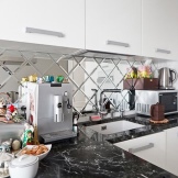
A more original move is a tile made of high-strength glass. With its help, you can reproduce the appearance of not only granite, but also a silvery surface or even an ice floe. Caring for such a decorative coating is simple. However, it is still worth abandoning the use of abrasives. A wide variety of colors allows you to choose a design to your liking. For masking various technical boxes and other protrusions, it is recommended to use tiles of the "honeycomb" format.


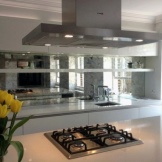
Hexagonal blocks can have a size from 6x6 to 48x48 cm. The so-called volumetric tile looks beautiful. Its varied texture can make an unforgettable impression. As always, the ease of cleaning is worth paying attention to. Often, in practice, three-dimensional blocks are combined with smooth ones (zoning is usually carried out vertically).


Glass aprons, called "skinned", deserve a separate discussion. Technologies have been developed that make it possible to make on their basis a three-dimensional drawing with a unique design. Installation of such a canvas is possible even without contacting professionals. However, you will have to give up the idea if the wall is not 100% aligned. In such a situation, the force when pressed will be distributed unevenly - a fragile product will simply burst.


Depending on personal preference, the following types of tiles can be applied:
- transparent;
- matte;
- equipped with a tinted film.


The color of the material varies according to the wishes of the owners. Various photographs can be used to make the composition more interesting. "Skinali" is good because the pictures that have ceased to fit into the space of the kitchen, are tired or are damaged, can be easily changed. Glass aprons of this kind are often made backlit. Their serious disadvantage is the increased price (in comparison with the options from the tile).


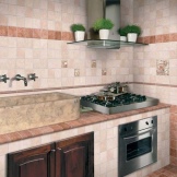
Classic ceramic tiles are easy to clean. They tolerate contact with aggressive substances and even significant temperature fluctuations well, and small contamination will be almost invisible (this means that they will not cause disturbance during the cooking process).


Another positive aspect of ceramics is its fire resistance. Thanks to this property, no matter what excesses occur in the kitchen, the coating will not suffer. In general, during long-term use, it retains its original color, and its saturation is not lost either. When ceramics are heated, they do not release toxic substances into the air. It is precisely because of such an attractive combination of characteristics that it is advisable, first of all, to consider ceramic tiles when choosing (only in some cases it is worth giving preference to other options).



It is important to remember about the relative disadvantages of ceramic aprons:
- great complexity of installation work;
- significant labor costs;
- long installation time;
- the complexity of dismantling.


How to choose?
There are a number of nuances that allow you to choose a tile for a kitchen apron. It is recommended to give preference to products with as few seams as possible.It is best to choose the smoothest material possible. Ideally, you should buy medium to large flat tiles.

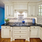


Experts recommend purchasing ceramic tiles with moisture absorption level A, or even better - AA. If you stick it on, then you can safely use all existing cleaning products. Experts advise using matte and semi-matte material. It outperforms glossy blocks in abrasion, scratch and splitting resistance.


In addition, in many cases it is necessary to clean the kitchen walls with abrasive materials. With regular cooking, such a need will appear. Attention should be paid to the colors. The classic option - immaculate white tiles - should not be overstated. It is not difficult to find such a material, it is practical, however, when combined with light grout, you will have to clean the seams as carefully as possible. This will significantly increase the expenditure of forces. The solution is either the use of a contrasting dark grout, or the replacement of pure white blocks with beige, light gray tones.


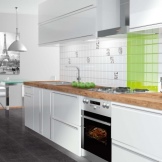

The dark finish looks beautiful only in catalogs and on store stands.
In real life, dark material quickly becomes covered:
- various spots;
- grease and oil splashes;
- water stains;
- dust.


If glossy tiles are used, then fingerprints can also be seen.


The next step is to estimate the material requirement. It is categorically impossible to buy it exactly as much as you need, according to calculations - you need a stock.
A reserve from 10% to 15% allows you to exclude negative consequences:
- manufacturing defects;
- transportation and warehouse battle;
- erroneous pruning;
- defects during installation and installation.
Even if the entire stock is not used during installation, the remains are retained. They will allow you to carry out partial repairs in the future without completely replacing the apron. In most cases, the apron strip is 60 cm high. But sometimes it is adapted to the very short or very tall height of those who will work in the kitchen.
It is also worth remembering about:
- setting of the tiled layer by 1-2 cm under the cabinets;
- tiles that will protect the area adjacent to the hood.

It is possible to reduce the labor intensity of cutting if you purchase material whose blocks are multiples of the apron size. At the same time, they certainly pay attention to the placement of sockets and other elements that interrupt the line of calculation.
When planning the location of the outlets from scratch, they allocate for them:
- the central part of a separate tile;
- the middle of the seams;
- intersections of seams.

Obviously, it is impossible to take into account all these subtleties and nuances simply by thinking. Even trained professionals must draw up drawings and diagrams. Often they are prepared on paper, since it is inconvenient to constantly check electronic documents during work. This approach should also be used by amateur repairmen.
Important: it is advisable to draw up such schemes even when contacting specialized teams of tilers. Your own project is safer.
Experienced consumers and professional builders rarely buy material from the first store. Most often, they write down all the identifying signs of the tiles they like, indicate the sizes, and then, in a calm atmosphere, work out various layouts, compare them with each other. At this stage, it is recommended to use graphics programs, special software in order to imagine as clearly as possible how everything will look. This rule should be followed even by people who have developed spatial thinking and good imagination.

It is always required to buy tiles strictly from the same production batch, painted in the same tone. After all, between dissimilar parties there is a difference, albeit subtle in the store, but clearly visible after the calculation.
It is recommended to check the ceramic tiles for belonging to the same batch when purchasing both in brick-and-mortar and online stores. Connoisseurs advise to make sure that the tone is consistent. Each manufacturer designates the exact color with special alphabetic or numeric codes. It's worth taking a few minutes to find information about this designation.
When a question arises about the tone in which the tiles should be painted, you need to pay attention to the style of the room and the house as a whole, to the chosen design concept. If the kitchen is decorated in a classic spirit, in the Provence style or imitates the old Russian style, it is recommended:
- tiles imitating stone;
- majolica-style material;
- imitation of cotto ceramics;
- metlakh blocks;
- small square tiles (most often 10x10 cm).
Modern interiors are well compatible with large format blocks. They can reproduce any extraordinary texture. This is not only a natural elite stone, but also high-quality leather, monotonous mosaics, reproduction of a brick wall. Sometimes they use material with an increased length (not a square, but a rectangle or trapezoid). Brightness and color diversity should be characteristic either for the interior as a whole, or only for the apron - otherwise a powerful color overload arises.


Sometimes you have to plan your finishing without contacting the designers. If you don't have your own experience, you must opt for a win-win solution. We are talking about tiles of the "hog" type. In some sources it is called "metro". This option fits perfectly into both severe conservatism and radical ultra-modern surroundings.
The characteristic features of this material are:
- glossy finish of uniform color;
- slightly beveled edges;
- rectangular configuration;
- block sizes from 7x12 to 10x25 cm.
In most cases, the "hog" is laid with a shift, like brickwork. But alternative solutions are implemented without problems. Skillful craftsmen plan these finishes in a randomly chosen manner. If it is not possible to choose a material of a suitable size for the "hog" or any other layout, there is no necessary design, it is worth looking at the floor tiles departments. Their mechanical resistance helps to successfully use the products for displaying on the wall.


Laying methods
In the design of kitchens in the 1970s and 1980s, aprons of 16x16 or 18x18 cm tiles were often used. Do not dismiss this format. Until now, this option is versatile and easy to implement. This finish can be used in kitchens of any size.
It is often recommended to create a panel made of horizontal stripes and diluted with decorative inserts. If the area is very large, then use a tile of 24x24 cm.Sometimes such material is used in kitchens less than 9 square meters. m. However, in this case, you will have to prefer the horizontal layout. To imitate wood or a natural stone surface, blocks with a length of 48 cm are used, their width is either 12 or 18 cm (depending on the choice of consumers).


The classical calculation method has been known for a long time. It is used when no special difficulties are foreseen, but you only need to prepare an apron in the shortest possible time. Laying out the tiles diagonally, they solve two problems at once: raising the ceiling and expanding the space. The herringbone method is more laborious, but the wall is more unique and immediately attracts attention. If you make vertical lines, you can narrow the room, and if you use horizontal masonry, the space will appear wider.
The checkerboard pattern involves the use of tiles of two different colors. You can easily "fit" additional shades into the environment. But only on condition that they are supported by accessories, furniture. Some designers recommend using tiles of dissimilar types that are dissimilar in size.This option is difficult to implement, however, this way you can create a luxurious interior with well-thought-out details.

If you decide to make a panel, you should carefully consider its colors, as well as the style of the drawing. It is advisable to pay attention to such an often overlooked moment as a way of visual delimitation from external space. This can be a bright color stripe (contrasting to both areas), a change in geometry, a convex frame. It is very important to think over the drawing: its theme and embodiment. The slightest mistake, carelessness or superficial approach can lead to additional costs.
If the kitchen is completely neutral in color, abstract compositions can be used. In a classic interior, a garden theme becomes a good choice. When the room is decorated in the spirit of solemn classics, pictures with pompous, chic buildings, architectural monuments will do.

But all these are only preliminary recommendations for search. The final decision can only be made by the owners of the house themselves, after consultation with the designers.
Design options
This photo shows one of the attractive solutions for decorating a kitchen backsplash from tiles. The designers tried to make sure that it was not too assertive, but also did not get lost against the background of other components.

And here is a mosaic of light and dark tiles of small size. A narrow strip on one of the sections widens to cover all the available space. In the rest of the area, it is framed with absolutely white material.

Everything is different here. A large cabinet made from above, divided into many compartments, is painted in a light brown color. For the design of the apron, a contrasting volumetric tile was chosen. The blue areas, surrounded by a white convex lattice, look original. Local illumination is used to create an additional effect.

An example of using a plain rectangular tile. The light red color of the main part of the apron is interrupted in several places by darker blocks with intricate patterns. The result is a striking contrast to the white cabinets.

But sometimes it makes sense to create an even more original interior. The photo shows an apron, where it is difficult even to find white tiles with a glance. They are there, but they are set in the background. Very graceful inserts with still lifes are made. The combination of such inserts with accessories is thought out quite carefully. Therefore, it is not worth creating such compositions without the help of professional designers. You will have to take great risks, sometimes make serious mistakes.

If your kitchen is quite light, and a powerful stream of sunlight "pours" into its window, then an expressive composition of miniature dark and light tiles can become an attractive solution. The molded mosaic is successfully included in the classic interior. However, the same design approach can be applied to other styles as well. The main thing is that the kitchen has an average total area.

Another original approach is immediately visible here. Dark furniture and household appliances are perfectly combined with elegant light "bricks", laid with a breakdown of rows. A flawless white grout has been applied between them. A whole picture with plant and fairy motifs was made over the gas stove.

And here an even more original design move was made. Slightly convex tiles are placed, laid not vertically, but in the form of letters L, intersecting at different angles. There is an impression of “tiled waves”. The design, dark with reddish shades, harmoniously intertwines with the reddish natural wood of the cabinets. He does not look alien in relation to the gas stove, to the dark countertop.

The most vigorous and expressive composition. White, red and sunny yellow tiles in different places are diluted with inclusions of drawings.Harmony is ensured by the fact that, in general, white is actively used in the kitchen, as well as local accents. You can create an attractive composition by manipulating one color. Most of the wall is covered with light blue glass blocks, and only in the center are oblique dark blue "bricks".

It can be clearly seen here that the use of mirror tiles can be a great addition to a white kitchen. Important: individual small squares are purposefully made as shiny as possible so that they stand out against the general background. Sometimes PVC tiles are used. The photo below shows how beautiful a seascape on a wall can be. The main thing is that the main composition of the space is light.

This is what a kitchen apron might look like for an exemplary classic interior. A combination of light brown and dark brown bricks was used. Skillfully used local lamps turn out to be an attractive feature of the composition.

Here's how to complement a kitchen with orange accents with a unique patchwork backsplash. The silvery tone, harmoniously combined with other colors, becomes quite an attractive solution.

But you can skillfully use black and white. Here you can see that such a composition goes well with red and white kitchen furniture.

And here is shown the most colorful apron. There are black and white, red, beige, blue and black squares, figures with crosses and many other types of tiles. A combination does not seem pretentious in only one case: when it is well thought out. Therefore, it makes sense to use the services of designers.

Red, blue and yellow tiles allow you to create an original composition. The diagonal layout of the individual elements, combined with intricate design shapes, looks exciting. For a better experience, light countertops and dark brown furniture can be used. An apron made of light-colored tiles with floral patterns may turn out to be no less attractive and rather fresh solution.

It is not difficult to see, however, that a combination of white and pale yellow colors can give a good result. To prevent the apron from looking too faded, you can insert a miniature panel depicting vegetables and fruits. This composition looks best on a white background. A clearly defined frame helps to focus attention on it.

All these options are not an absolute dogma, they can be flexibly changed to suit your taste and in accordance with individual preferences.
Five ways to design an original apron in the kitchen are waiting for you in the next video.


The comment was sent successfully.