All about the color "oak"
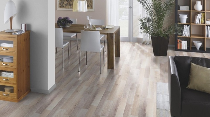
The color "oak" is often used for furniture and interiors, there are windows in the color "oak". It is necessary to figure out what colors rustic and marsh oak, sedan and mocha, truffle and other shades are combined with. And you should also learn about the features of using this color in various rooms.


Peculiarities
The most important characteristic of the color "oak" is that it is a color that is as close as possible to the color of natural wood. It creates a sense of stability and visual harmony. At the same time, the oak color is flexible and can be very diverse. It is easy to adapt it to the needs of a wide variety of people. There are subspecies of oak with dark, almost black wood. The specific color depends on:
- from the type of tree;
- his age;
- growing conditions;
- processing specifics.




Shades overview
The rustic oak color is very popular. Products with this color are widely represented in parquet collections. But it is important to understand that aboutThe absence of a single standard forces us to carefully find out what exactly a particular manufacturer means by rustic. In Western European practice, in contrast to the domestic one, rustic parquet is much more widespread. Therefore, its assortment from foreign suppliers is noticeably higher.
The shade of swamp oak looks noble and sophisticated in almost any room. This coloring adds to the visual high cost and impressiveness.
The natural look of swamp oak can range in color from light to unsaturated reddish brown.

As for the oak sedan, this color:
- perfectly soothes and harmonizes the psyche;
- very light;
- characterized by brownish pores;
- creates a golden patina effect.


The color of mocha looks like a coffee of moderate saturation, diluted with a few drops of milk. The descriptions note the sensuality and increased emotionality of this tone. When used correctly, mocha can be calm and harmonious. The most correct way to use this tone is:
- in the bedrooms;
- guest areas;
- kitchen rooms.
It is critical, however, to balance the warm and cool colors correctly. With mocha, you can balance the color and compensate for the excessive brightness of other colors. The texture is selected according to your taste, taking into account the characteristics of the environment and the general design concept. If the room is small, mocha can be a relatively small accent. With a large enough area, it is more correct to use it for accent walls.


Truffle oak, according to suppliers, fits perfectly:
- into minimalism;
- high tech;
- into constructivist premises.
If the surface has a deep relief, it is perfectly combined with furniture in natural colors from any other wood. There are a large number of color combinations, both light and relatively dark. Therefore, again it is necessary to find out what exactly the manufacturer meant. The use of "truffle" in emphasized urban interiors is encouraged. It can be combined with various intense colors. This, of course, does not end the list of possible options.


Irish oak color is as close as possible to what is commonly called natural oak color. It blends perfectly into the design of any wooden house. At the same time, in a suburban dwelling, the situation acquires completeness.
In city houses, this color allows you to create a sense of living nature.


As for the European oak, then this color is able to create a positive attitude for almost the entire period of operation.
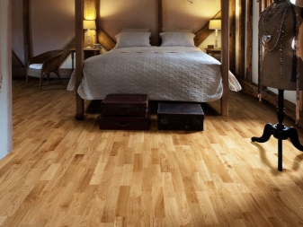

But the American oak looks different. This is an elegant light golden decorative solution. Of course, the mood rises from him. The presence of both light and dark areas is allowed. The most appropriate option is in the style of eco-minimalism and similar solutions.
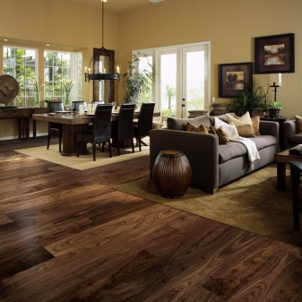

The undertone of tobacco can be very different. In any case, when you get acquainted with the doors designed under it, it is easy to notice: there are both dark and almost gray tones. Dark colors can also alternate.


And here honey oak is perceived very well and harmoniously, simultaneously transforming the environment and giving it a pronounced emotionality. The interior seems to be transformed and gives a subtle effect of charm, the style direction can be almost any in this version.


An alpine color is best for laminate flooring. And natural old oak has ripe wood. Tones are typical for her:
- Brown;
- light brown;
- mixed with red brown.


The choice between these options is largely a matter of personal taste. As for a color such as tobacco oak, it is prized for maximum elegance. The silkiness of this surface is beyond any doubt even among the most inveterate critics.
In some collections, tobacco colors are combined with white gloss. A typical name, for example: "Kraft tobacco kronospan oak".
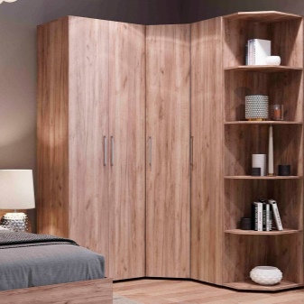

It is believed that the material that has a Scandinavian color, according to the assurances of a number of manufacturers:
- brings notes of characteristic northern firmness and energy;
- creates the effect of a pleasant frosty morning even on the hottest day;
- embodies the aesthetics of the fjords of northern Europe, Andersen's tales and romantic stories about the Vikings.


But many people reasonably prefer the cognac oak. This color allows you to stand out and show the nobility of tone, pattern. The color of cognac is in great demand in modern interiors. The ratio of it and other tones is selected in accordance with the general approach (style). This color can be safely used in Scandinavian living rooms, where it is often diluted with white and pastel shades. Cognac color:
- calm;
- cozy;
- adjusts to a business mood;
- goes well with light neutral colors;
- equally well suited for work and for creative activity (hobby).


You can safely experiment with the tone of cognac, and in any room. He can perform quite confidently and accentuated role. The modern interpretation of the cognac color is perfect for bathrooms. To reinforce it, use:
- fittings;
- decor;
- textile products.


Latte oak - like mocha - got its name in honor of one of the coffee options. Peace of mind and the absence of any "cutting" effect is guaranteed. Demonstrates a stable and stable position in society. At the same time, milky notes soften the accentuated roughness and hardness of the brown tone.
Along with the power of character, the color expresses tradition and quality, and this color is also universal and suitable even for the most original design.
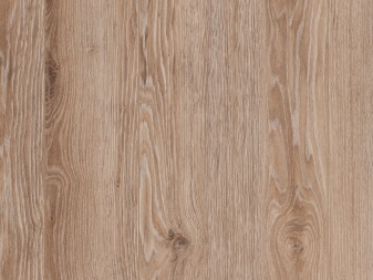
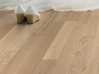
The color of Cremona definitely deserves a separate discussion. It got its name in honor of the specific color of musical instruments produced in the city of the same name. This is always a very light and elegant decorative solution. In part, it is close to the milky color, but should not be confused with it. Important: completely natural Cremona wood is very expensive, but the solution is to use veneer.


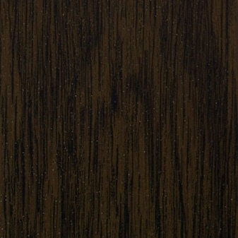
Wenge oak color is compatible only with walnut... As for the champagne tone, its most important characteristic is self-sufficiency.You don't have to think about combining with other colors, the main thing is that there is no sharp visual contradiction. Among the important properties, it is worth noting:
- excellent contact with various light shades;
- the possibility of forming a contrast with saturated dark colors (which allows you to prepare a completely individual-looking room);
- harmonious combination with green.
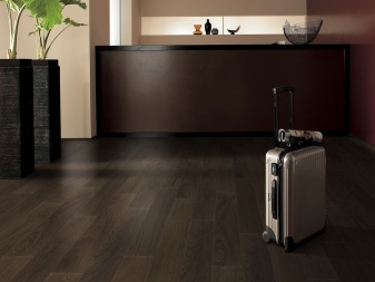

What colors does it match?
Speaking about the combination with other colors, one cannot fail to point out the main combinations with champagne oak. It pairs well with colors:
- white;
- beige;
- black;
- gray.
Together, they allow you to expand the visually decorated room. But you can combine champagne with all kinds of shades of brown. The natural landscape becomes the standard for searches - together tones are found very often. You can also try the combination with "cappuccino" or "cinnamon". As a result, freshness, naturalness and comfort are demonstrated at the same time.
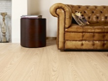


In rooms decorated in a techno or modern style, champagne can be combined with metallic colors. Designers note that it looks luxurious and respectable. The solution is optimal regardless of the area of the room and the degree of its illumination. There is a feeling of a silvery shimmer, which can be played up in the key of a certain mystery or just a zest. Additional use of reflective surfaces is encouraged.
Mocha is most often combined with green. Ideally, if it is an apple color. These tones are best used as accents:
- curtains;
- lampshades;
- sofa cushions;
- armchairs or chairs.


Orange, red paints can also be used in the interior along with mocha. But their use should be localized as much as possible. Attempts to use red or orange headsets will inevitably only lead to a feeling of total bad taste. But the combination with the yellow color can be carried out more massively. The combination with a light blue sky tone looks very original.
As for the color of the truffle, it goes well ... with itself. Rather, we are talking about its light and dark shades. You can also try combinations with bright accent colors:
- turquoise;
- emerald;
- the color of juicy berries;
- chartreuse.
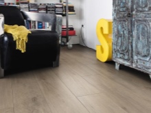


To keep everything calm and harmonious, you must adhere to a simple monochrome scale. She herself reveals all the advantages of this color deeply. To avoid the feeling of boredom and monotony at the same time, you can experiment with textures, surface textures. Cognac color is best combined with other tones that create an autumn mood. It is this property that it should be used primarily for the formation of clear interiors.
Latte color has two main characteristics: neutrality and softness. They are obviously interconnected. All combinations with latte in one way or another embody good taste and aesthetic sense. Latte forms excellent combinations with terracotta and beech colors. As additional inclusions, you can use:
- chocolate;
- lactic;
- green colors.


Use in different rooms
The color "oak" is used in different rooms.
In the living room
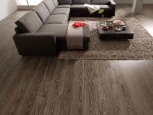
Typical for this room is the dominance of the brown shades of oak. These tones are perfect for an autumn mood. But at the same time, they are universal and can be used regardless of the season. You can use a variety of associations, including references to the style of a wooden house. The decoration of this part of the house is also welcomed in tones of cognac, they will immediately create a characteristic classic mood.
You can adjust the ratio of cognac and other colors at your discretion. In this case, the general style of the room must be taken into account. It is quite possible to put made in cognac color:
- sofas;
- dressers;
- soft armchairs;
- racks.


In the bedroom
For this room, the oak color is chosen in such a way as to demonstrate the maximum comfort and guarantee a relaxing stay. Cognac colors for a table or cabinet made of solid wood will fit almost perfectly. The main colors are combined with colors:
- beige;
- white;
- pistachio;
- mint.


Even if there is a place for work or a creative hobby in the bedroom, the color of the cognac oak is quite appropriate:
- it does not decrease concentration;
- does not distract attention;
- dramatically relieves boredom.
A golden brown palette will look good too. Its important property is visual diversity. But it should be understood that golden oak is doubtful in a modern style bedroom.
Both for him and for classic surroundings, thick dark tones are excellent. And to create maximum luxury, wenge colors are recommended.


On the kitchen
In this room, not only the countertop, but all the furniture can be made in oak color. Important: at the same time, it must be assembled into a typeface, that is, follow a monolithic concept. You can also do stylistic experiments. The rich oak color in them often becomes one of the accents or is combined with light, but equally saturated colors. If you have funds, you can generally make doors from natural oak - they will definitely look gorgeous.


In the nursery
For her, the color of milk or bleached oak, which is selected, guided only by its own design taste, is ideal. It is most logical to use a parquet board painted in an appropriate way. It will have a pinkish or light brown tint. At the same time, it is important to ensure the optimal combination of floor colors and furniture tones.
According to the designers, furniture in such a room should be painted like wenge.


In the hall
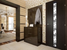
For the hallway, stains of stained or bleached oak are most appropriate. The second option, especially the various ash tones or sonoma, looks very attractive in any environment. Antiquity lovers often choose coatings and products with a patina effect. Important: all the components of the kits should be balanced in style and appearance, only under this condition the visual nobility of oak wood will fully open. It is most logical to put a natural oak cabinet in this room. It will execute:
- functional;
- design;
- space organizing role.


In the office
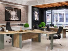
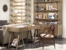
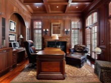
It is difficult to find a better color for a home office than "oak". This is the solution that both ordinary people and respectable leaders choose. The oak color immediately shows the respectability of the owner and the weight of his ideas. It is very good, if not just an oak decoration is made, but natural wood itself is used. But that depends on the budget.
But it is important not only where the oak color is used, but also for what purpose. Quite often, buyers of plastic windows choose oak color. According to some reports, this option is preferred even by up to 40% of customers in certain regions. And they can be understood - such a choice guarantees external respectability and harmoniously fits into any environment. The required coloring is provided by lamination with a special film. And you can also experiment (first in the virtual simulation mode, of course) with imitating the color of oak:
- curtains;
- wallpaper;
- hinged shelves;
- hanging cabinets;
- decorative panels.


As for the stylistics of the premises, the color "oak" does not go so well with anything as with country-style decoration. Or, if you like, under his French branch - Provence. If, nevertheless, the English direction is chosen, then a combination with the coloring of ash and mahogany is appropriate. Simplicity of shades and the absence of even a hint of pretentiousness are welcomed. You can not just use oak color, but use it in handicrafts.
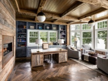
If the room is decorated in a rustic style, it is quite logical to use country oak laminate. He will demonstrate both comfort and naturalness of the composition. But oak colors are also acceptable in the loft style. In this case, you can also use natural oak furniture.
It is not necessary, however, to act so stereotyped - a window sill painted in a suitable way will be no worse.
Examples in the interior
- Laminate type "bleached oak" looks great in a large and bright room. The flooring works well with light gray walls. Furniture colors should be chosen very carefully.

- Saturated golden oak in some cases will look at least as good. The combination with light gray furniture, light walls and the same decor items fully justifies itself.
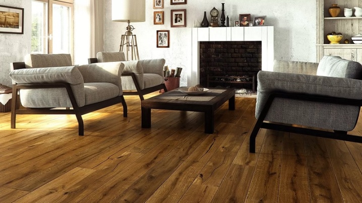
- Dark oak furniture is perfect for a living room. It matches perfectly with a very light, glossy floor. Wallpaper with floral patterns is also not perceived as alien in such an environment. The snow-white ceiling and the original chandelier only add to the impression. The dining group on the colorful carpet looks like a standard of the classic spirit.


The comment was sent successfully.