Modern apartment design ideas
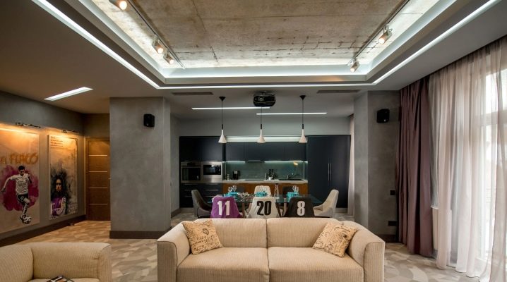
Fashion trends extend beyond clothing and footwear, personal accessories, cars, travel destinations and career choices. They also regulate the style of home space decoration. Having decorated the dwelling in accordance with the latest trends, you can not be afraid of obsolescence of its appearance for several years. Therefore, it is necessary to find out what approaches are popular now, how they can manifest themselves in individual rooms, how to combine design requirements with the creation of a comfortable environment.
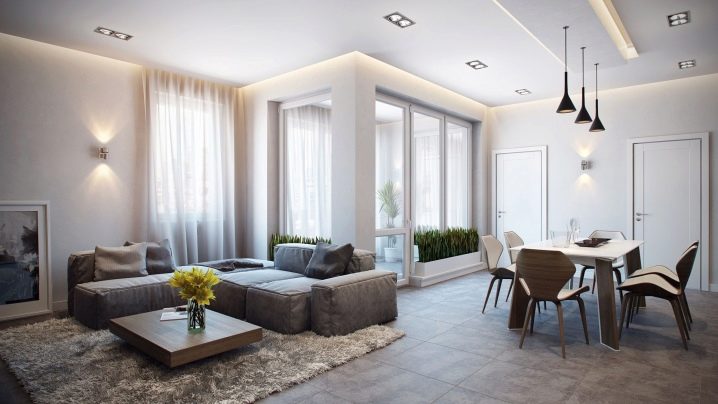
Main fashion trends
The Italian design of an apartment is equally appropriate in both large and small spaces. The expression of this approach is the use of arched structures, columns; it is advisable to install wooden furniture, and not products from other materials. No matter how hard you try to introduce more decorations, they should not negate the brevity and elegance. The space is saturated with various details designed to improve perception and make it fresher.
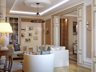
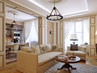
The modern style is not something uniform, monolithic, like most other formats. In it you can find notes of minimalism and country, loft and classics, pop art.
Unconditional priority is given to those solutions that are outwardly unique, demonstrate both the well-being and aesthetic tastes of the residents, and look beautiful and practical. More and more often, designers use metal parts for decoration, which have a very different practical purpose. Matte surfaces are also in vogue.
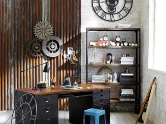
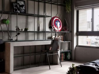
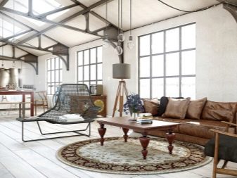
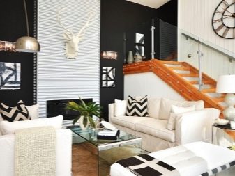
A mandatory feature of a modern style in an apartment, no matter what decoration products are used, is the lightness and unobtrusiveness of the created environment. If you want to make it less homogeneous, it is enough to introduce a detail made in pop art format or in any ethnic style. As before, clean, straight lines should be used.
Rounding corners, diagonals completely contradict the modern style.
Apartments of a small or standard area will remain the predominant type of urban housing for a long time, and therefore the combination of different premises into one will remain a characteristic feature of modern fashion. When replanning, partitions and even individual walls are removed, which helps to expand the available space. After such a procedure, it turns out to be easier for designers and residents themselves to implement ideas.
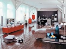

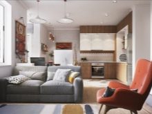
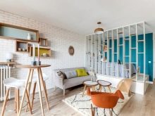
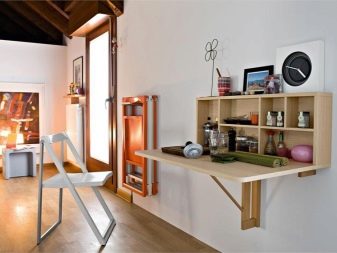
In order to rationally use the area that is already available and rarely resort to redevelopment, many people use lightweight furniture and transforming products. Instead of a large writing desk in most apartments, a light console is enough, all the same, the amount of written work is unlikely to be large. The modern tendency to use folding furniture options is due not only to the desire to save space, but also to the preference for minimalistic design.
If you need not only a real, but also a visual effect of reducing the occupied area, you should prefer furniture, which to one degree or another is made of durable glass, transparent grades of acrylic or plastic.
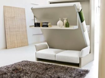
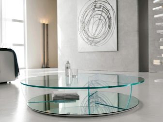
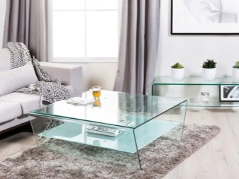
New items of household appliances, made in a futuristic spirit, will take their rightful place in the middle of a room decorated in high-tech style, in this regard, the design of 2017 has not changed.The current trend of the outgoing year in the high-tech style was the embedding of technology into furniture, especially when selecting non-standard design elements.
Decorators recommend not using too thick colors, concentrated paints.
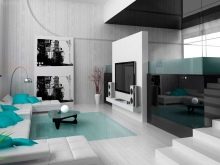
Interiors are fashionable where all ideas are embodied by manipulating white, black, gray and blue. But the geometry may well not be the same as usual. It will even look great.
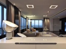
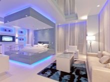
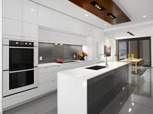
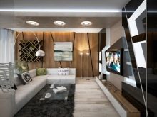
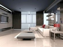
Style selection
When making repairs in a new apartment or in an old house, it is advisable to give preference to natural finishing materials. They, in principle, do not go out of fashion, and even after decades you will not have to regret your choice. The variety of suitable materials and designs is quite large, they allow you to embody any, even the most non-standard idea.
The best designs by modern designers rarely go without the use of wood.
Its use brings beauty and unique texture, facilitates the approach to harmony. In addition, woody surfaces can be easily combined into one composition with details of both light and dark colors, if the contrast effect is used correctly.
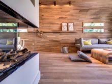
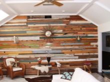
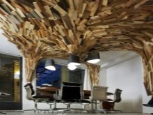
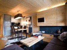

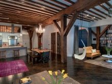
To emphasize solutions of different colors, beautiful interior details, it is advisable to add multi-level lighting, especially in large and multifunctional rooms. When choosing a design approach, always look at alternatives to it, for stylistic solutions that achieve the goal you need by other means.
For your information: the design of all rooms should be chosen more or less uniform, only world-class designers will be able to design them contradictory and at the same time cozy.
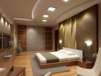
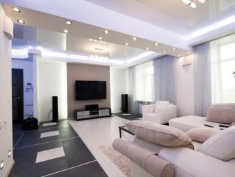
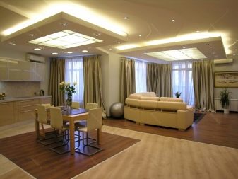
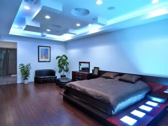
Stylish design avant-garde will surely appeal to those who like original design solutions, catchy accents, unique forms and manipulations with light and shadow. Creative people - experimenters in their hearts can safely choose expressionism, with its help a gorgeous result is obtained if everything is done correctly.
The modern edition of this style is distinguished by a combination of prevailing strict elements with bright and juicy parts of the room, aimed at developing positive emotions.
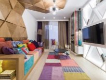
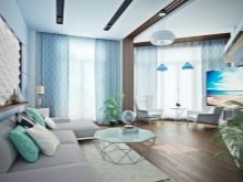
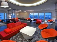
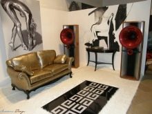
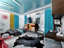
If used indoors modern style, saturated paints should be used very limitedly and only in the main functional area. Don't forget the sophistication and sophistication that any contemporary room must match. Be sure to use textiles, make sure that harmony is maintained in different places between the shades.
Install only the most necessary furniture, discard any accessory that has no direct practical value.
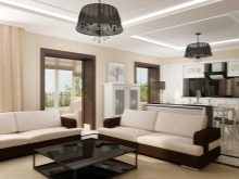
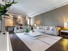
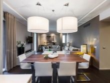
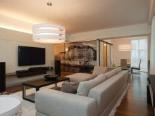
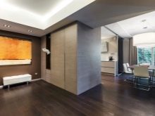
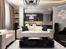
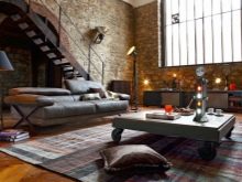
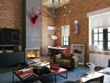
Loft - a kind of hybrid of home and outdoor space, and the amount of furniture here, in contrast to Art Nouveau, is not limited. It should be strict and simple, not have a single excessive emphasis. Wall decoration using various types of plaster, mirror panels, imitation of natural stone and brick is in fashion. But dwellings created by methods of large-panel housing construction should be decorated differently.
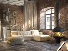
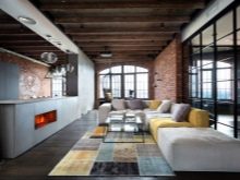
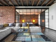
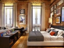
It is recommended to decorate apartments in a panel house in the spirit of country or in more pronounced ethnic styles.
The hallways, as before, are equipped with compartment wardrobes, and bedside tables are placed along the walls, shelves are hung on the walls themselves. Thanks to this step, there is no need to increase the corridor area to 20 sq. m, radically reducing living space to make it comfortable and functional.
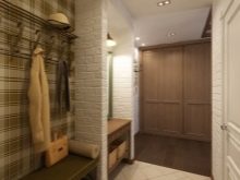
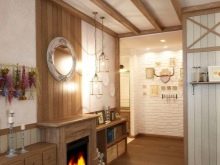
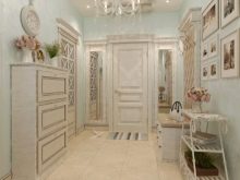
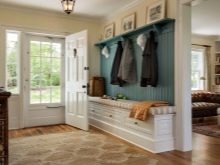
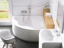
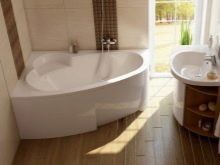
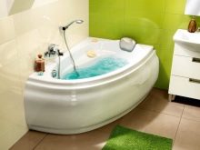
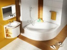
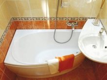
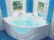
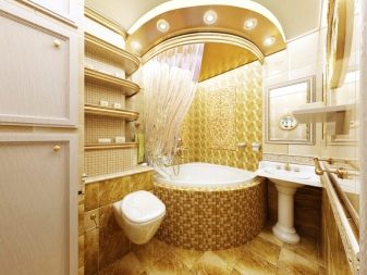
In combined bathrooms, corner baths are quite fashionable, while excessively dark colors should be avoided. Design solutions that pay maximum attention to storage systems will help to increase the return on usable space, to turn even an apartment of 53 m2 or less into sufficiently spacious housing.
Color solutions
White color and its various shades will forever remain one of the key options for interior design. They allow you to showcase the elegance of furnishings and decorative details of any other color.
In addition, light colors in the interior:
-
Externally increases it;
-
Provides concealment of architectural flaws and mistakes in decoration;
-
Creates a feeling of freshness and weightlessness.
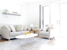
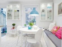
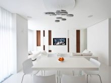
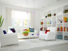
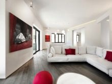
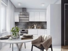
According to experts, a snow-white interior should be diluted with a maximum of two other colors, including their shades too. A fashionable and elegant solution is the use of wood imitation as additional paints (whether it will be light or dark - this is your personal decision). Such a step will help create a fresh and non-flashy environment, as calm and friendly as possible for people.
If you are not afraid of more decisive experiments, it is worth replacing the gray tones with bright ones, and at the same time diluting the white color with occurrences of woody surfaces.
But keep in mind that it will not be easy to maintain harmony, do not introduce too many catchy tones, let them touch only some accent detail or part of the room.
In medium to large rooms, it is worth using contrasting colors to emphasize the geometric properties of the rooms and visually divide the area into zones.
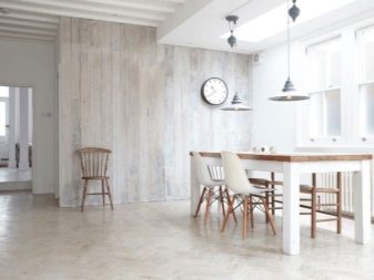
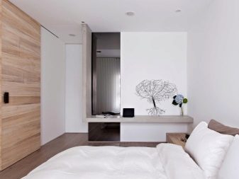
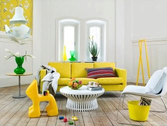
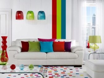
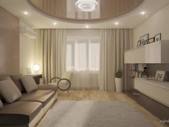
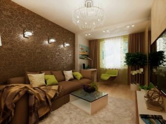
Remember: decorating in beige tones or in other calm colors is the squeak of fashion in 2017.
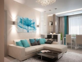
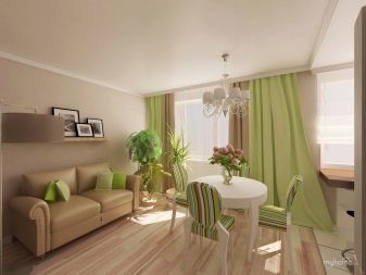
You can safely use azure-turquoise, deep blue, crimson or purple tones in addition to it. Extinguishing emotions coffee, creamy, cream colors should be supplemented with a color for chocolate. According to some experts, the so-called herbaceous greens will be popular in the near future, the meaning of which is not only a hint of freshness, but also the creation of a summer atmosphere.
Room decoration
In addition to the general requirements characteristic of the house as a whole and each of its parts, one should also take into account those fashion trends that apply only to individual rooms. Let's take a closer look at them.
Living room and kitchen
Living rooms of a modern look can be quite diverse; the classic approach - when a separate room is created, where the people living in the house and guests gather, does not require it to be used in any other way.
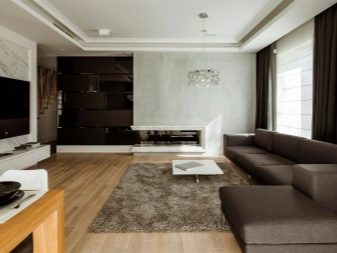
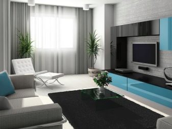
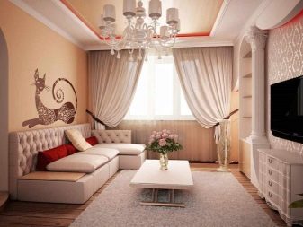
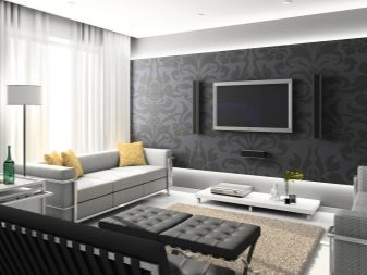
With a different scheme, the boundaries between the living room and the dining room are erased; such a step is advisable if combining the kitchen and dining area does not work out in any way.
The organization of the studio is quite popular, in which the line between the family hall, the dining room and the kitchen area disappears.
The latter also has a number of formats that fully meet the current fashion. In small rooms, one work area is often organized, and the placement of a dining group is refused. When there is a little more space, it is worth putting a dining table and chairs for it in the kitchen itself.
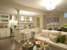
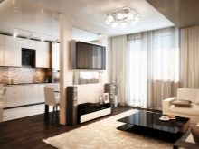
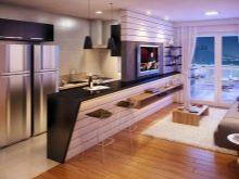
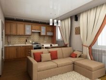
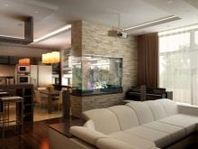
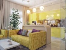
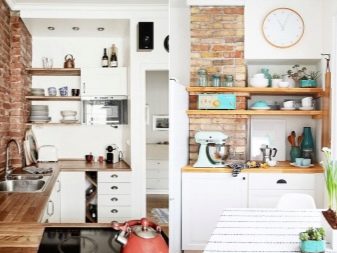
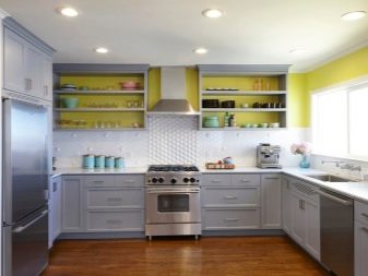
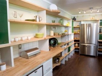
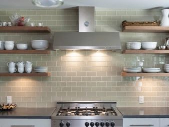
At the end of the 2010s, the kitchen space is being transformed: instead of the upper tier of cabinets, which had no alternative for a long time, open shelves have become fashionable. They allow externally to "unload" the room, to make it somewhat lighter and freer.
Designers do not urge to give up cabinets at all, they only note that it is better to use relatively small hanging products.
A kitchen set, as in the beginning of the decade, is best taken smooth and monochromatic. The simpler the concept and the less decoration, the better.
Bedroom
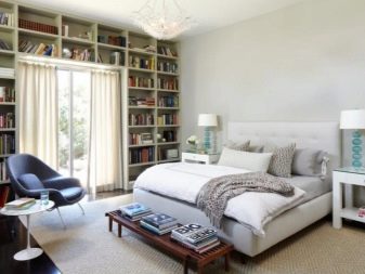
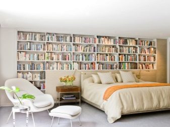
The sleeping quarters deserve no less attention than the kitchen space and the area for receiving guests. Most designers believe that the sleeping area should no longer be part of the studio. At the same time, even a very modest area set aside for a bedroom does not serve as an obstacle to the formation of a comfortable and fairly practical interior.
All functional parts, except for the sleeping area, should look as neutral as possible so as not to draw attention to themselves.
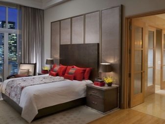
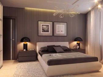
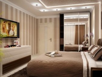
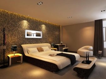
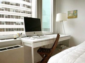
When creating a workplace, it is advisable to equip it with a console attached to the wall and held in the unfolded state on one support. When setting up a home library, it is advisable to put not weighty cabinets, but open shelves with shelves of light colors.
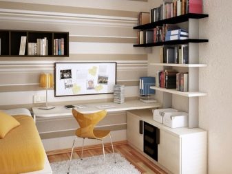
In a confined space, it is advisable to install a sofa bed.
On the walls, it is recommended to glue wallpaper with geometric ornaments or with discreet drawings in warm colors. If you create in this way the feeling of an old, romantic interior, you get a completely elegant setting; the effect will be enhanced by carefully selected overhead light or the sun's rays penetrating through blackout curtains. In general, a retro style is recommended for sleeping rooms in 2017.
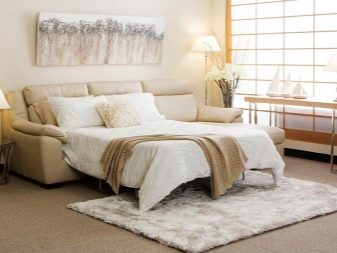
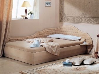
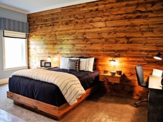
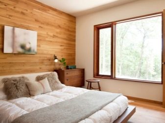
The use of natural wood will help to add a touch of comfort, regardless of the size of the bedroom. Some experts believe that velvet will soon be in great demand and popularity. Even if these ideas don't suit you, you can try other options inspired by the 1960s and 1970s.
Cabinet
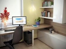
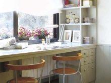
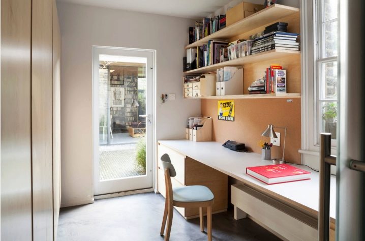
It doesn't matter if the study is created as a stand-alone room or as part of a bedroom, it is very important to adapt it to the future owner. Solutions with long, relatively narrow tables located along the glazed wall are popular. To the left of the window on this wall, you can hang one or more capacious shelves, and put a mobile bedside table under the tabletop on the same side.
When it turns out to use only a very small working area, it makes sense to install a table lamp with a variable position of the lampshade, an adjustable support.
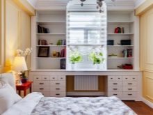
Classical-style cabinets are furniture made of expensive wood, massive in appearance, mandatory use of pilasters. Adding to the "minimal set" gilded elements, chandeliers with metal candlesticks, curtains reminiscent of theatrical backstage, you can create a very lush atmosphere.
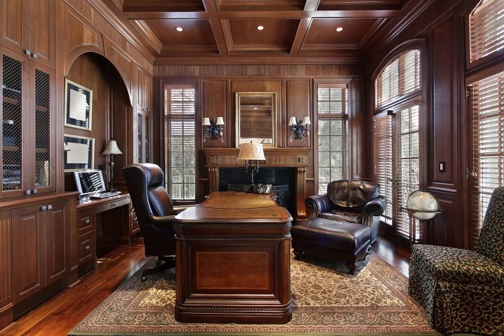
If you are not flattered by the idea of a palace or a luxurious mansion of a nobleman of the century before last as an ideal place to work, you want something more modern, the office can be decorated in an Art Deco style.
This direction is infinitely far from standard offices as they are used to imagine. It will not be difficult to create an atypical room configuration, even making a domed ceiling is quite appropriate.
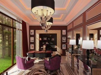
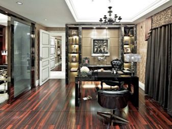
A modern home office is at the same time austere, minimalistic and exclusive place. Professionals are trying to resolve the contradiction between these requirements by introducing an unusual-looking detail and enhancing the decorative role of lighting fixtures.
Balcony
But if the design of the working area has not undergone significant changes over the past year, then the same cannot be said about the design of the balconies.
Do not try to put a refrigerator in there, this is impractical and will only dim the lighting in living rooms.
When organizing a miniature greenhouse on the balcony, designers increasingly suggest combining it with the dining area; all that is required is to put a small table and chairs.
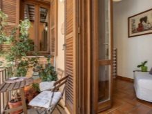
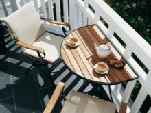
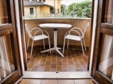
However, even if you absolutely do not like the idea of a greenhouse, you should use at least one plant for decorative purposes. Greenery is used in all the most advanced examples of modern balcony design. Lovers of greenery and nature should set up not just a greenhouse, but a whole winter garden. Instead of solid fences, latticed fences are often placed, diagonally graceful coatings are placed on the floor, and the strip adjacent to the wall can be filled with attractive pebbles.
An original solution - when a glazed partition is installed, the room is completely isolated from the street. At the same time, LED lighting in the form of long tubes is placed inside, the walls are painted in delicate light pink tones, a picture with a black and white image is hung on one of them.
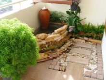
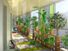
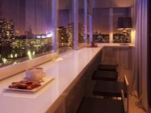
Among the materials that should be used when decorating balconies and loggias, plastic and wood are now the most popular.In this case, it is desirable to make all surfaces of the same color. A classic-format balcony will look good if you trim it with natural stone or brick. The Mediterranean style in this room betrays itself with the active use of white, blue and green colors; it is possible to use forged decor or jewelry associated with water.
With regard to functional use, loggias and balconies are now being actively converted not only into offices, but also into miniature gyms.
Whichever method of decoration you choose, consider whether the fasteners will withstand the stress created.
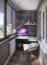
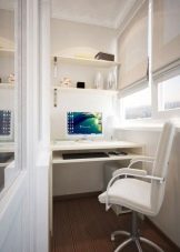


We could talk about the design options for the balcony for a long time, so let's return to the interior of the apartment and see what the designers have prepared for the children in 2017.
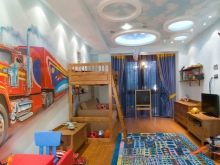
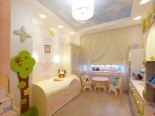
Wall decoration in a children's room should be as simple and concise as possible, completely safe in environmental and sanitary terms. Stickers and murals, contrasting joints are recommended as expressive accents. Experienced decorators will not neglect the use of an accent surface.
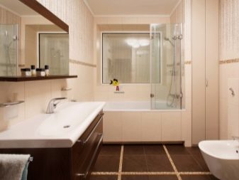
It doesn't matter if there are children in the house or not - the bathroom will be there all the same. And, most likely, its area will be relatively small, sometimes no more than 4 square meters. m. Therefore, any move aimed at expanding space will be an undeniable fashionable solution. It is worth using light shades, adding gloss, organizing mirror surfaces. Diagonal tiles, well-designed edging, and a print positioned to make the room appear taller are some more interesting tricks.
The design of apartments in the last couple of years has become more blurred in style., there are fewer and fewer rooms that would be clearly interpreted as classical or modern. Basically, they try to combine accents and single elements of various styles, to create original compositions on their basis. On the other hand, attention is increasing to the zoning of the internal space of dwellings and to its delineation according to a functional criterion. On the other hand, the tendency of overlapping has gradually emerged, when one room performs two or more tasks at the same time.
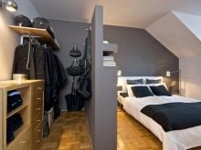
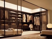
You can often see a dressing room located in the bedroom, a play corner in the nursery.
When a room has more than one functional area, they try to demonstrate the unity of style as clearly as possible. Wallpaper of the same color is a very good way to do this.
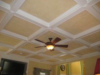
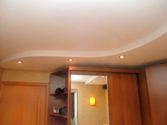
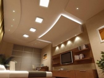
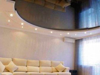
The plasterboard ceiling has now become an anachronism. Basically, they try, as in the design of walls, to achieve maximum simplicity. In some cases, only elements designed in the spirit of modern classics are being introduced. The most popular solutions are based on PVC panels, cassette systems. Fans of the original design can safely try to apply liquid wallpaper to the ceiling and use wood structures. As before, "floating" products correspond to the fashion, especially when placed around the perimeter of light sources.
As for the color of the ceiling, it can be either strictly monochromatic or multicolored, illuminated by LED bulbs and complemented by elegant decorative items. Glossy surfaces meet the requirements of the 2017 season better than others; in many versions, a low geometric relief and built-in lamps are used.
Variants and examples in the interior
Consider a few examples of how designers decorate living quarters in apartments in 2017.
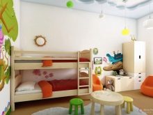
Decorators did not give up their attempts to present children's rooms beautifully. Fashionable in the past year are decorative elements of the most fantasy, fabulous look. The romantic mood is created by compositions in the spirit of the "enchanted forest". But this is possible only if there is enough space, and when there is not enough space, design searches are aimed primarily at compensating for the missing space.
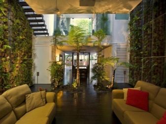
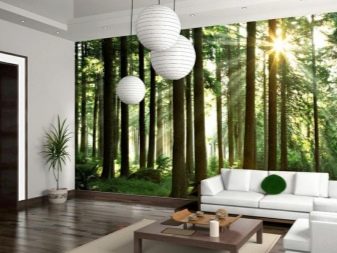
The solution is often two-tier structures with a mandatory fence for greater safety. Above there is usually a place to sleep, and immediately below it is a dressing room with all the necessary attributes - small wardrobes, a mirror, hooks.
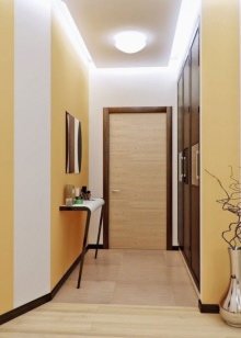
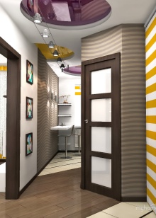
Respectable owners often try not only to refine the hallway, but also to decorate it as elegantly as possible. Moderately dark laminate and slightly lighter furniture are often used for this purpose.
In general, the higher the ceiling, the brighter the room appears.
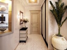
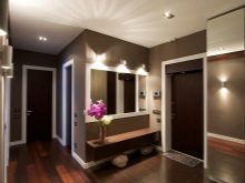
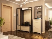
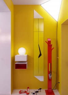
Decorators are not too fond of accessories, but they quite clearly carry out the task of decorating with their help. Here you can see how the combination of bright colors is favorably played on the average corridor area. The rich yellow walls are in harmony with the bright red hanger of the original form. This is a floor-standing structure, the lower part of which allows you to put umbrellas.
Opening the perspective into the living room by dismantling the doors, as well as a single color of the floor, which does not differ much from the color of the curtains, radically expands the space, destroys the very idea of crampedness.
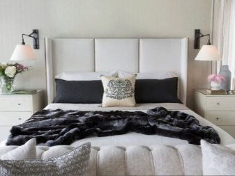
But if the corridor pleases first of all the guests, then the bedroom is a room especially for the owners. And here the scope for imagination is simply inexhaustible. Here in front of us is a room replete with light colors, sustained as symmetrically as possible. It is emphasized by the same type of lamps installed along the edges of the bed headboard, and by the same storage systems just below. But the flowers on the left and right are somewhat different, as are the vases in which they are placed.
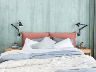
The authors of this project also took into account the idea of symmetry, but the romantic mood and natural atmosphere came to the fore for them. These motifs are emphasized by a background wall decorated with an image of an autumn forest shrouded in thick fog. The stands on the sides of the sofa are deliberately different.
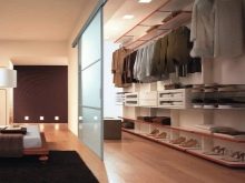
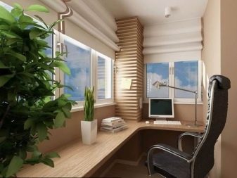
The transformation of a balcony or loggia into a part of a developed space is a rather old trend. The photo shows an office set up on a former balcony. Between any two rooms, they are now trying to use transparent sliding doors with a diagonal layout. They allow the premises to remain unified, but, if necessary, immediately divide the space into two autonomous zones.
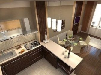
If the rooms are combined and the partitions are dismantled, then this path is not suitable. In kitchens-dining rooms, zoning with a corner set, bar counters and "islands" is popular. But if the premises are not interconnected, the problem of free space often comes to the fore.
Designers propose to increase the efficiency of space use due to niches that can accommodate open shelves with decor, and even furniture.
Studio apartment
This is a special type of housing, and it is not always wise to apply general schemes to it. In 2017, in studios, it is recommended to use as many partitions as possible, which not only visually divide the space, but also, for example, prevent the penetration of extraneous odors from the kitchen into the living area.
In one of the options, the main emphasis is on white and the lightest possible tones - the ceiling is snow-white, the walls are indefinitely gray, the flooring is noble in color with some interspersed with dark stripes. A moderately dark row of kitchen hanging cabinets can play in contrast with a light environment, while the dining group is much lighter than it.
In studios, as well as in any small apartment, it is now recommended to use more mirrors.
They are built into walls at different levels, some of which can be placed horizontally and others vertically. This solution adds light to the room and therefore can be easily combined even with rather dark furniture, which in another situation would seem too gloomy.
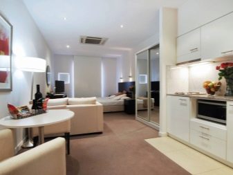
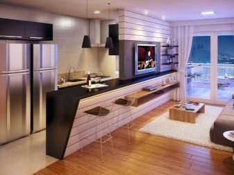
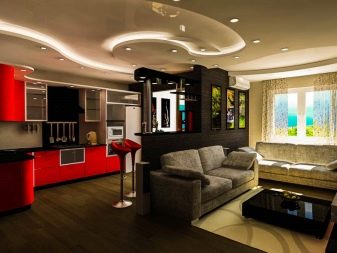
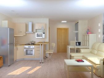
Experts recommend using scattered light sourcesto prevent the "hospital ward" effect.It is better to install spotlights on short walls, which will help out when you need to provide maximum illumination. Another interesting option is linear LED chandeliers, which are located parallel to each other along opposite walls. They allow you to visually stretch the space, thereby making the room seem much larger and more spacious.
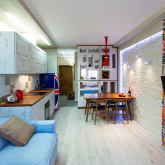
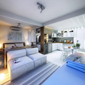
One room apartment
Here, as in the studio, maximum functionality is required. Designers have come up with a number of ways to provide it without detracting from the external grace. Often the hall is made completely utilitarian, and the hallway is at least partially converted into a space for experiments. Mosaic panels, decoration with textiles or stucco elements will look attractive here.
The trend in the design of one-room apartments now is to reduce the space allocated for the sleeping area, but at the same time rigor and conciseness must be maintained.
They completely abandon heavy cabinets: they are either not there at all, or options hidden in niches are used.
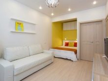
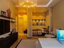
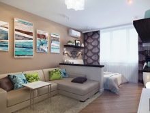
You can see an overview of the completed design project of the apartment in the following video.


The comment was sent successfully.