Room design: non-standard solutions
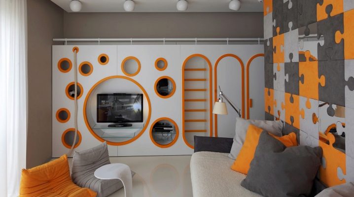
The design of a living room is a very important and serious stage in the entire renovation. The living room and bedroom are the places where we spend most of our free time and gain strength. It is important to create everything for your own convenience and take into account many nuances.
Room design rules
The correct arrangement of furniture is no less important than the furniture itself. For the result to please for a long time, take into account the advice of designers regarding this issue. Consider the options for arranging furniture in a limited space, since you have to deal with a small area most often in panel houses and Khrushchev houses.
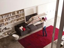
There are not so many possible options, some of them are more preferable, some less, some are completely inapplicable in certain spaces.
There are two main methods of furnishing:
- symmetric;
- asymmetric.
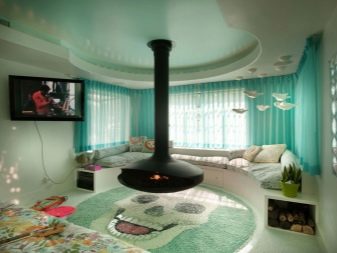
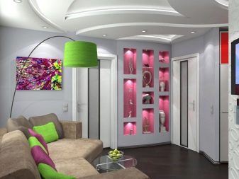
Symmetrical furniture arrangement means the arrangement of paired interior items on both sides of a given axis. An example is the bedside tables on either side of the headboard. According to this principle, shelves can be placed on both sides of the sofa, cabinets and the like. A TV is traditionally placed on the opposite side. This is a simple and laconic setting, familiar to our eyes. However, such an environment looks organic only in square-shaped rooms.
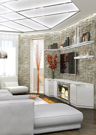
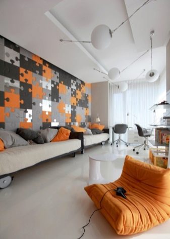
The asymmetric method involves alternating tall objects with low ones, which are located along the walls, which creates the necessary balance in the room. This method is usually resorted to by the owners of elongated premises.
Room 17 sq. m
In such rooms, it is best to adhere to standard furniture placement principles. In one-room apartments of medium size, screens can be used as zoning, which will help to separate the working area from the sleeping area. Such partitions are easily folded, and with the help of them the size of the zones is changed.
If, for example, the owners need to receive guests, then the screen is simply folded up and removed, and at night it is simply returned back. Also, do not forget about the lighting, because after working with its intensity, you can functionally separate one zone from another.
Rooms less than 17 sq. m
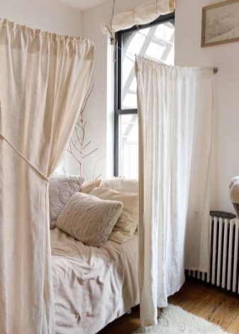
If zoning of such small rooms as 12 and 16 sq. m, 11 and 14 sq. m, the partitions will be too bulky, you can use curtains instead. Thick fabric will create complete insulation, and sheer tulle will slightly outline the border, while maintaining the generality of the room.
If the room has enough natural light, for example, a room with two windows, you can install a mirrored wardrobe opposite them, which visually add space and air.
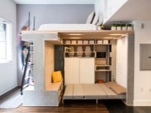
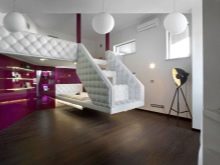
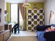
The sleeping area in a small room is best equipped with a folding sofa, which, when folded during the day, will take up a minimum of space. If one person lives in the room, then it makes sense to use a chair-bed. Cluttering with furniture is strictly contraindicated. The limited area forces you to get rid of unnecessary things and leave only the essentials. Mirrors, glossy furniture surfaces, open shelves create a more airy interior.
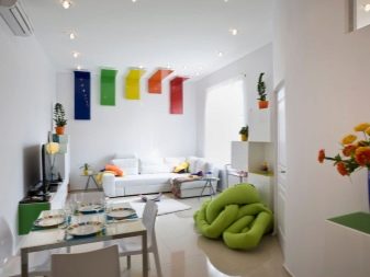
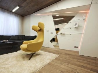
When decorating a room in a communal apartment, you must first of all think about functionality. "Smart" zoning will bring the necessary comfort to your home. To visually expand the space, it is better to decorate the room in light colors, pick up light tulle and mirrors.
Design features
The design style largely depends on the layout.The design of square rooms is easiest to create, and you have to smash your head over some non-standard options.
Checkpoint
In Soviet times, the walk-through room was a pervasive problem. Hosts struggled with the unfortunate rectangular layout in many ways, separating one area from another with screens, curtains, and even sofas and wardrobes. Below are some tips for increasing the functionality of walk-through rooms.
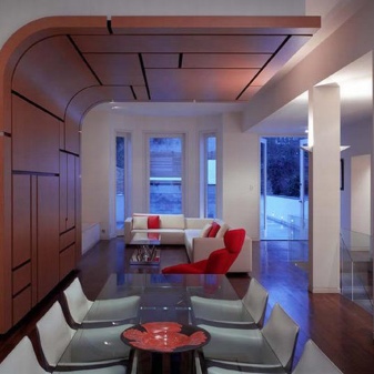
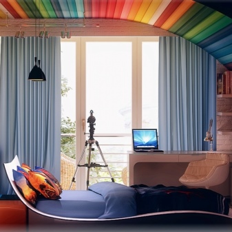
One of the modern ways of dealing with an uncomfortable room is an open plan layout that visually expands the room. It is necessary to remove the curtain walls and install glass partitions
It's a good idea to use the principle of symmetry. The space between the doors is taken as the axis.
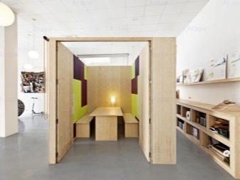
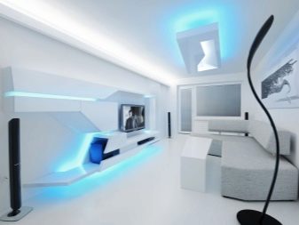
Many rooms turn out to be walk-through because of the actively used glazed balcony. In this case, it can be converted into an office.
Often, a living room is a room from which doors to all rooms go, which interferes with a comfortable arrangement of furniture. If you have such a layout, do not try to line all the furniture along the walls. Besides, there is not much free vertical space, if you subtract doors and windows. Use furniture for zoning the room. For example, the sofa can be turned with its back towards the kitchen.
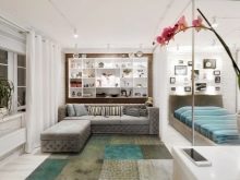
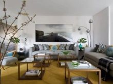
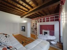
If the walk-through area does not allow you to exist comfortably at all, you can consider moving the doorway and separating part of the room in favor of the corridor. Such large-scale works require mandatory approval.
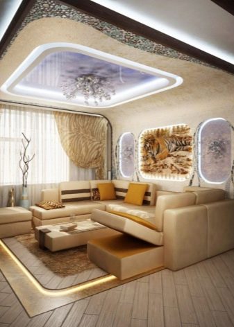
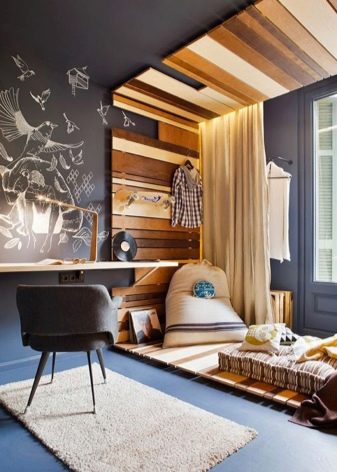
Studios
In the conventional sense, a studio apartment or open space is a combination of a kitchen and a living room. This significantly increases the comfort of life and expands the space.
The kitchen area is usually separated by a bar counter, which is not only very convenient, but also stylish. It is very important to install the TV in such a way that it can be seen not only from the sofa, but also from all points of the apartment. Thus, family members, doing different things, can watch the same TV program.

It is best to equip the dining area by the window. First of all, because of natural light, but also to admire the views from the window and communicate not only while watching TV.
L shaped
In such a non-standard room, it is better to choose an L-shaped sofa with wooden armrests so that you can put a cup or glass there.
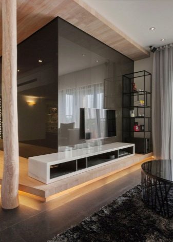
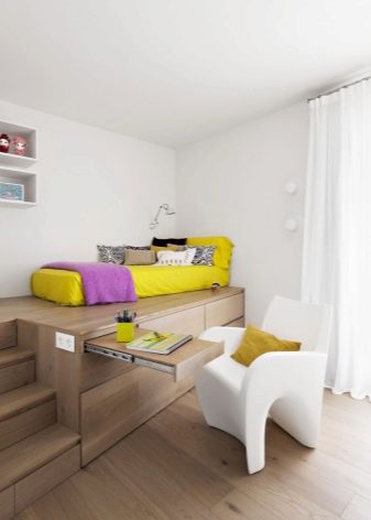
Use a screen to hide any of the zones.
Angular
The presence of two windows in a room is luxurious and beautiful, so do not miss the chance to create a cozy and bright space. Very often, such rooms are played out according to the principle of symmetry.
Large windows fit well with the minimalist style. The sunny side, and even the angular one, sometimes gives the tenants an inconvenience. A sunlit room should be darkened with blinds, curtains and tulle.
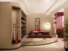
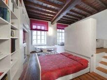

Decorate the room in light colors to add even more air. If the windows are located on opposite walls, then it is permissible to create a different design.
It is better to place the desktop next to the window in order to provide itself with natural light, but the location of the furniture should not obstruct the passage to the window area. Next to the windows, you can put two chairs, and between them a coffee table, a floor lamp or a houseplant.
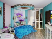
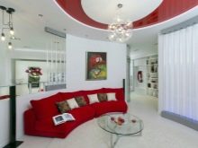
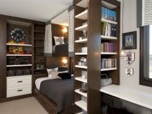
If you are lucky enough to have large windows from floor to ceiling, then arrange furniture opposite in order to admire the views.
By the purpose of the premises
The design of a room directly depends not only on its size and layout, but also on its purpose.
The living room is usually the most spacious in the apartment, which provides room for imagination. There are certain standards regarding style. The interior is designed either in a classic style or in accordance with new modernist trends.
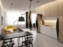

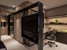
The classics do not become boring over time and do not have bright annoying elements, which cannot be said, for example, of a loft-style interior.No matter how original the design turns out, it is unlikely that it will be equally pleasant to the owners in 5-10 years. The guest room belongs to all tenants of the apartment and must be universal. The room should be comfortable to receive guests and spend family evenings.
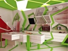
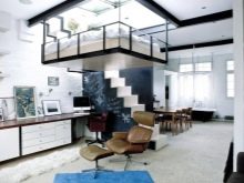
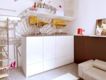
When choosing an interior for a bedroom, it is important to understand the characteristics of a married couple or the person living in it. In particular, it is necessary to take into account the gender of the owner and his preferences.
A woman's boudoir is always fundamentally different from a man's bedroom. The decoration of the apartments of the glamorous girl and the guy of the gamer will differ, which is quite natural, because the design of the room must correspond to the tenant.
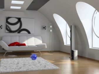
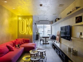
When decorating a room for a grandmother, it is necessary to take into account the needs of an elderly person, namely, the ability to reach the first aid kit from the bed, to get the right thing without having to bend low or stand on a chair.
The office is usually designed in austere and dark colors. Wood trim is often used in it, which creates an atmosphere of expensive classics.
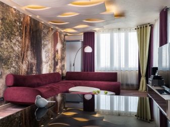
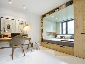
As for the kitchen, first of all you need to decide what it is about: a standard kitchen or a kitchen combined with a living room. Usually, the interior of the kitchen is chosen by the "culinary specialist" in the house. Cooking takes a lot of time, so it is important that all “kitchen” manipulations are as comfortable as possible.
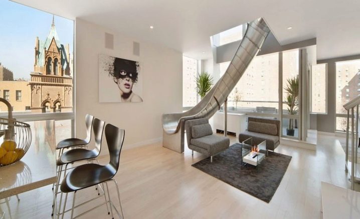
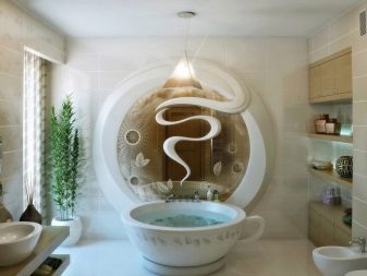
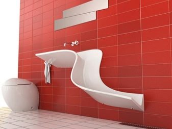
In the bathroom, the main thing is to use every millimeter of the area with benefit. Think about where it is better to place the washing machine, in some cases it is better to do it in the kitchen, where to hang the heated towel rail, whether you need a pencil case, and so on.
The tastes of children and adults differ significantly, therefore, in order to please the baby, but at the same time maintain practicality and functionality, start drawing up a project for a children's room with your child.
The design of the corridor depends on its size. If it literally has a size of 2 by 2, then you will not roam here. The main thing is to provide hooks for outerwear and a place for shoes. If the area of the corridor is larger, for example 4 by 4, then you can already think of a place where you can sit, a chest of drawers and a mirror, cute little things like a housekeeper.
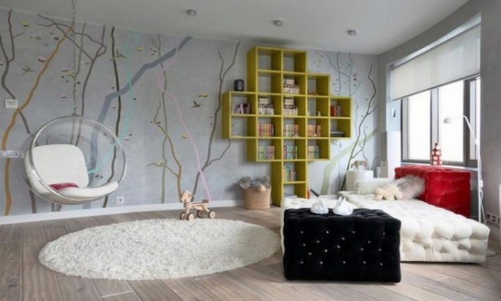
General recommendations for the design of a small corridor are simplicity and unobtrusiveness:
- no - colorful wallpaper;
- no - open shelves;
- good lighting;
- mirrors.
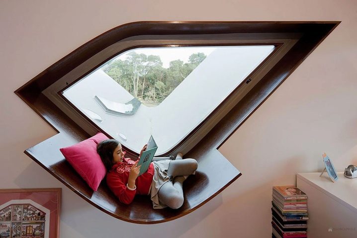
If you are the happy owner of a spacious hallway area, you can give free rein to your imagination and allow yourself a more interesting room decor and furniture arrangement.
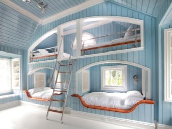
There can be many options for layouts: from standard and simple to unusual triangular and pentagonal rooms, bedrooms under the roof, and the like. Using general advice, you can create a comfortable and unusual environment in any home.
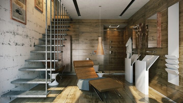
All of the above solutions will help you create a comfortable environment around you and spend time with benefit.
How to register?
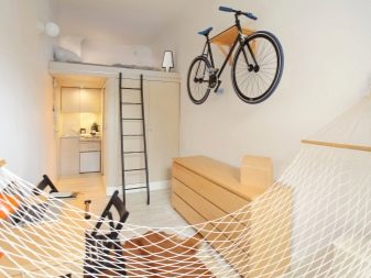
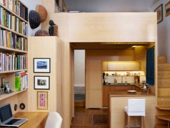
If your apartment is not as spacious as you would like, do not be upset - there are many unusual ideas for small areas. If cramped space hates you, then consider a redevelopment project. The room can be expanded by combining a room and a kitchen or a room and a balcony. To do this, it will be necessary to demolish one common brick wall.
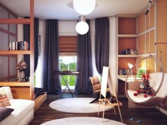
The space that appears can be equipped with a work area or, conversely, a relaxation area by placing bookshelves and an armchair there. If the resulting space is not so much, you can equip a niche for a built-in wardrobe instead of a balcony. Before starting work, it is necessary to agree on the project in the appropriate authorities. To do the redevelopment with your own hands, but if in doubt, it is better to turn to professionals.
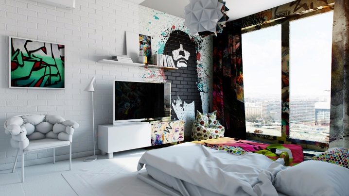
Color solutions
Classics are always in vogue, especially in small spaces.
- Light pastel shades such as ivory, milky and beige will bring warmth and air into the interior. Any furniture will do, the main thing is not to choose too bulky.
- Decorating the room in white, azure and blue-green colors brings freshness and vigor. The perfect solution for hot and tight spaces.
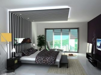
- Lovers of rustic comfort will appreciate the Provence style. Remember, carelessness should be light, don't go overboard with details.
- The smaller the room, the fewer decorative elements should be. In this sense, the minimalism style would be a great option. The laconic black and white range always looks dignified and stylish.
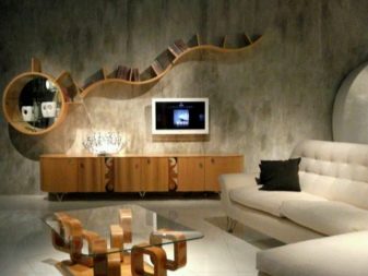
- All shades of brown add luxury and comfort: sand, coffee, terracotta.
- The yellow color scheme is always relevant. Check out the interesting and trendy shades of corn, mustard, and ocher.
- All shades of blue, from pastel to deep ultramarine, give the room a magical depth.
- It seems as if a floral scent fills a room decorated in purple, lilac or lilac.
Drawings and patterns
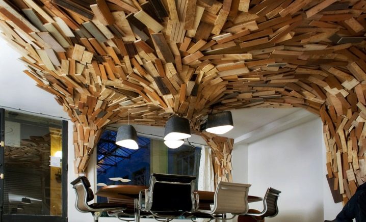
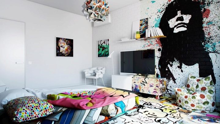
Everyone knows that dark colors and large prints hide the space, so it is still better to use a light palette in small rooms, but no one canceled dark and bright accents. It is also not recommended to use wallpaper with a large 3d pattern and large patterns in tight spaces.
Beautiful examples in the interior
All the things that surround us have an impact on our life. This is why it is so important to pay special attention to the design of the surrounding space. A beautifully and competently designed room not only pleases the eye, but solves the problems of poor planning, lack of space, hides flaws and increases functionality.
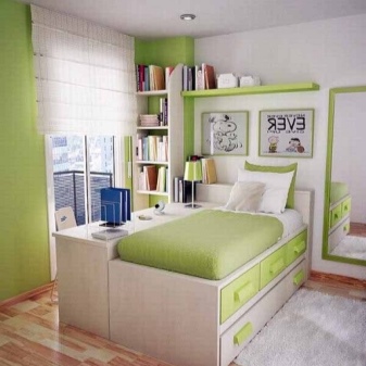
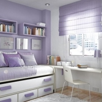
Below are examples that successfully combine aesthetics and convenience. At first glance, it seems that arranging furniture and not overloading the room is an almost impossible task. However, designers skillfully cope with the conditions of a shortage of square meters and non-standard layouts.
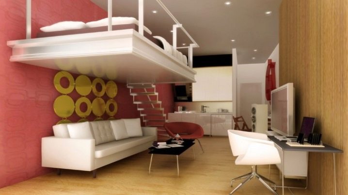
- A great option in gentle colors for a girl. The compact ottoman also serves as a wardrobe. The window area is effectively used for the desktop.
- Non-standard solution for a student's room. In the center of the nursery there is a whole complex that combines a desk, bed and wardrobe.
- A bold decision for young people. Ceiling seating and open shelving.
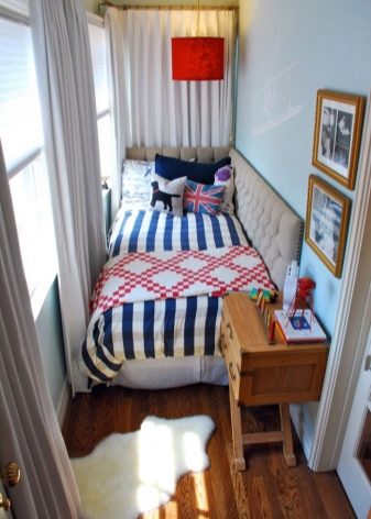
- A delicate and cozy little room, where there is nothing superfluous, but at the same time everything you need is present.
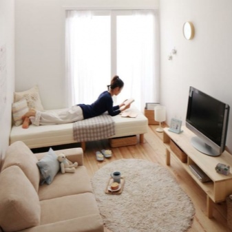
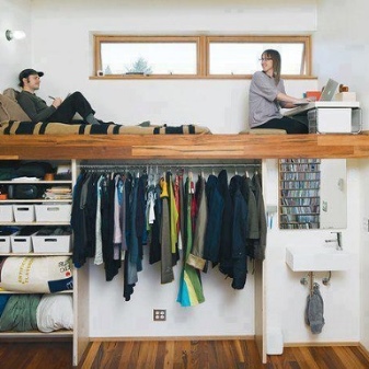
- Loggia converted into a children's bedroom.
- Here it is - the solution to the problem of a narrow and uncomfortable room.
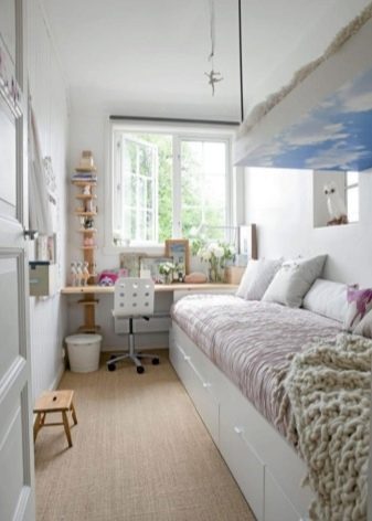
- A variant of the successful zoning of the sleeping area using textiles.
- The bed is successfully hidden in the closet. Practical and stylish.
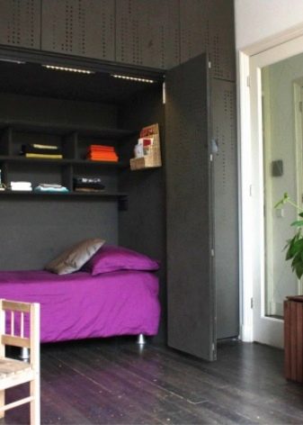
For non-standard room design solutions, see the next video.


Thanks for the helpful article!
The comment was sent successfully.