How to combine wallpaper in a children's room?
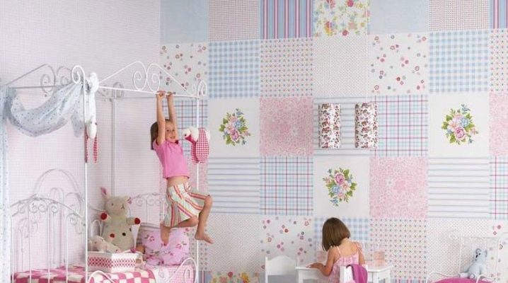
The process of pasting wallpaper in a nursery is an exciting event. It allows you to unleash your creativity and make your child's room special.
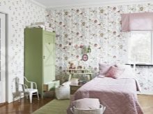
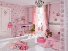
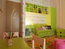
What is important to consider?
Wallpaper selected for combination should have approximately the same thickness, although it may differ in texture. They are chosen in such a way that they fill the space with light and make the room airy. These are, first of all, the light colors of the panels, which are able to visually increase the height of the ceiling and the width of the walls. To maintain this illusion, you should limit yourself to a medium-sized print.
It is important to pay attention to the color, because bright and rather catchy tones quickly get bored. In the future, they begin to irritate the child.
To make the room feel comfortable, it is worth choosing products in delicate shades of the color palette.
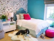
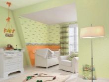
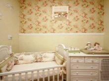
Strong colors should not be combined: for example, red and blue - being radically opposite colors, they can negatively affect the child's mood.
Wallpaper should be chosen so that their bright accent does not prevail against the general background. It is desirable, but in excess creates a depressing atmosphere. However, he will not allow the child to concentrate, for example, doing homework. A large print will visually reduce the space of the nursery, and no combination will fix it.
Views
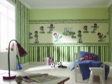
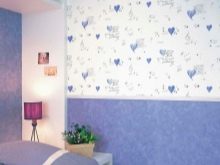
You need to select wallpaper based on the age group of the child. For example, it makes no sense to buy expensive wallpaper for a baby if repairs in an apartment with an update of the cladding are commonplace. There will be enough paper sheets here. At the same time, it is important to understand that contrast implies the use of a pattern with a print and a monochromatic base.
Vinyl or textile wallpapers are not needed on the walls of the nursery. The first of them are harmful, although quite practical, and the second option is very difficult to care for, and it costs a lot. In addition, both varieties are more suitable for decorating adult rooms.
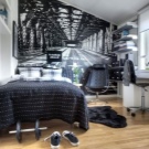
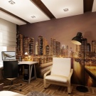
Photo wallpaper looks good on the walls of a nursery, as well as the so-called liquid wallpaper, which is smeared on the walls after dilution and infusion, forming a variety of patterns according to previously prepared templates.
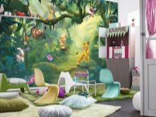
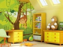
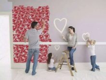
It is necessary to avoid decorating different patterns with variegated wallpaper alone - this will not only overload the interior background, but also introduce an atmosphere of disorder. The contrast when combining is selected in such a way that some wallpapers soften others. This is how the patterned wall cladding will look expressive.
You can buy companion wallpapers that initially have the same color scheme with an accurate hit of shades and a specific theme. Among such products, the buyer can choose options for the design of the walls of the nursery of different ages and gender.
Design ideas can be anything:
- accentuation of room zones;
- wall panels;
- whole wall decoration;
- exhibition-gallery.
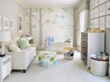
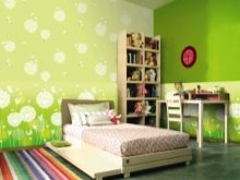
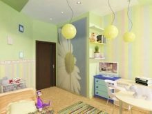
Drawing
With regards to the drawing, it is worth considering that nothing difficult to perceive is glued on the walls. For example, there is no need to decorate a room with elaborate African-themed 3D wallpaper.
It is impossible not to take into account the gender and age of the children, because the same bears on the walls of a teenager's room will look inappropriate.
At the same time, the adult theme is alien to children - such wallpapers will not be able to convey the desired atmosphere.
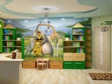
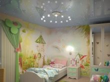
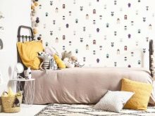
If striped wallpaper and pattern are selected as companions, then one type of panels should be simpler than others.
It is good to combine plain wallpaper with products:
- striped;
- geometric print;
- panels with floral ornaments;
- flower-themed companions;
- depicting cartoon characters or toys.
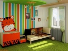
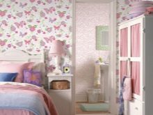
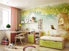
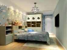
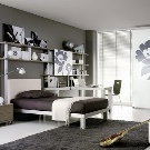
In some cases, children's rooms are decorated with not two, but three companion wallpaper. In this case, as a rule, those that do not have a picture or the simplest are taken as a basis. For teenagers' rooms, the best combination solution is a combination of plain panels with accent stripes with a thematic focus.
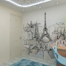
As a rule, the style is chosen based on the child's hobbies. For example, it can be anime or some kind of sketches of city landscapes, as well as the theme of glamor.
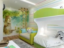
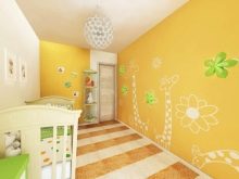
What's the best?
Conventionally, the child's room can be divided into 3 functional areas: play, sleeping and working. However, this does not mean at all that you need to highlight them all at once - this approach is devoid of expressiveness, since instead of a stylish design, you will get the appearance of pasting the walls with remnants left after the repair of other rooms. You can select a maximum of two zones, however, and this must be done correctly.
For example, you can decorate one of the walls with bright wallpaper and decorate niches with them in the rack located above the desktop. In this case, the main plane of the wall of the working area should be calm, monochromatic. Further support can be achieved with curtains to match the variegated wallpaper. Such curtains will stand out against the background of plain and light walls.
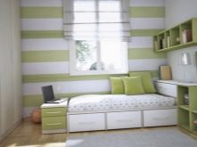
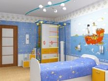
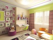
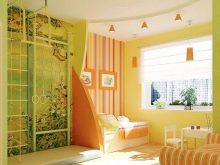
You can accentuate the play area with colorful wallpaper with a pattern. Firstly, such a solution is practical and will contribute to the durability of the wall cladding, masking accidental dirt. Secondly, the print is more appropriate in the child's play area. Calm wallpapers are good for concentration.
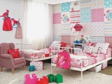
For a design to be stylish and modern, you need to take into account the very principle of combination. For example, a patchwork technique looks better on one wall, coupled with plain wallpaper, rather than a different wallpaper on each wall. It is more correct to accentuate a ledge or a niche than to glue different stripes on the walls by alternation.
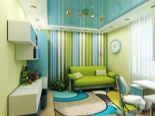
Against the background of a carpet, which is a frequent element in the design of a nursery, such decoration will be heavy, as against the background of a colored stretch ceiling.
What is undesirable?
Do not divide the room horizontally into several parts. Such a combination does not always look the way it was intended, since often this combination of wallpaper with each other visually reduces the height of the walls. It is undesirable to combine wallpaper in the room for different age groups and an abundance of borders. Combined wallpaper for boys can, for example, indicate a space theme.
Forget about clowns - these ideas are often doomed to failure, like huge drawings. The fact that an adult seems bright and cheerful may not like a child, and even more so a little one. The best ideas would be combined canvases with a monochromatic base, floral patterns: for girls - with butterflies, flowers, and for boys - from cars and airplanes to superheroes. A bright streak is undesirable, as are polka dots, as it creates ripples in the eyes.
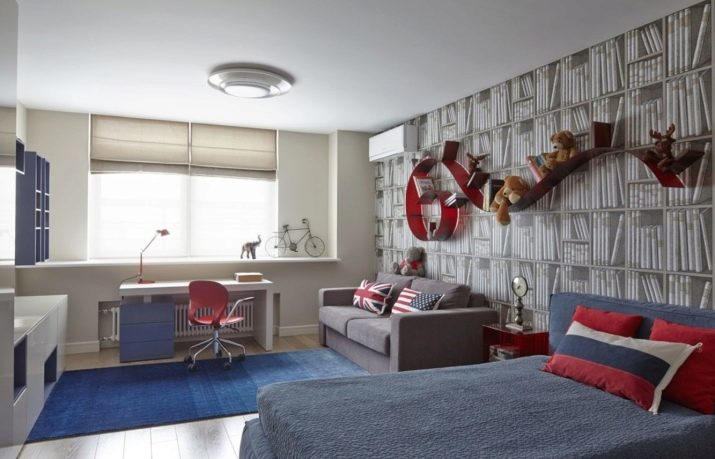
It is better to combine textured wallpaper with photo printing in a child's teenager, decorating the recreation area with them.

For tips on how to choose a wallpaper for your child's room, see the following video.


The comment was sent successfully.