Kitchens with dark bottom and light top
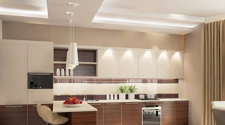
Approaches to the design of kitchen space have changed significantly in recent years. Instead of traditional forms, more and more designers' attention is drawn to the play with tone and composition. Let's take a look at one of the most requested solutions.
Peculiarities
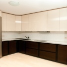
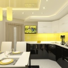
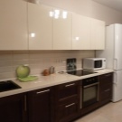
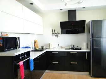
The combination of dark bottom and light top looks very attractive in the kitchen. Designers note that such a combination:
- harmonious (does not cause negative emotions);
- universal (can be applied everywhere);
- variable (can vary widely, adapt to personal tastes).
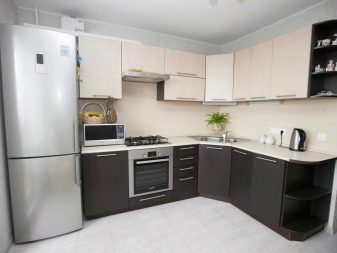
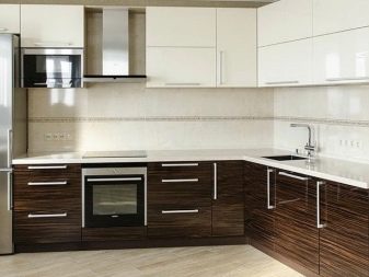
Dark tones visually “ground” objects. That is why they are assigned the role of supporting the interior composition. But for the same reason, dark colors are unacceptable in rooms with low ceilings. Experts advise not to use a pure combination of light and dark tones, but to dilute it with additional inclusions. To maximally emphasize the aesthetic merits of the kitchen, the facades are decorated with gloss.
Such a surface allows, due to the reflection of light, to expand the boundaries visually. This advantage is very important in a kitchen of any size. A glossy two-tone room can look good in a wide variety of styles. Usually they use smooth parts with a shiny surface.
Important: gloss retains its external attractiveness for a very long time, even with intensive use.
A two-tone kitchen, even with classic colors, will look spectacular and fun. Thanks to the transition of the intensity of the shades, you can use two colors in a wide variety of styles. It is possible to emphasize both practicality and comfort, to emphasize both versatility and pretentiousness. But the transition of colors also makes it easier to find the perfect balance between them. A two-tone kitchen will not be outwardly boring, even if the furniture is arranged in one line.
The dark bottom blends harmoniously even with large household appliances. You can also safely use massive furniture. Contrast itself creates an unusual feeling. Complementing a two-tone kitchen with bright details turns out to be much easier than in other options. It is easier to find the optimal place for each piece of jewelry.
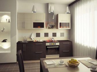
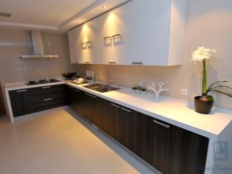
Combining a dark bottom with a light top only gets better when pastel colors are applied. In this case, the walls seem to move apart. In rooms of a large area, it is completely impossible to equip the interior of some kind of monotonous color. A purely light composition will look dull and inexpressive. But if you introduce the dark part, the situation will immediately become more pleasant.
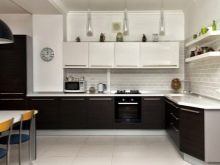
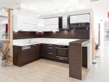
Combining colors
Diluting two primary colors with a third tone is a kind of art. This point should be approached thoughtfully and carefully. Most often, designers recommend adding a countertop as a contrasting element. The intermediate space sometimes turns out to be the connecting element of the top and bottom. If everything is thought out properly, the bundle will help to ensure harmony even with poorly matched facade tones.
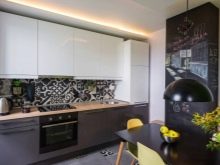
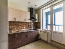
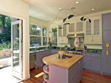
In a kitchen with a combined light and dark color, one mistake should not be allowed - excessive variety of colors. Every background surface must have a neutral shade.
Experts recommend using gray, light brown or anthracite colors. When saturated colors are used in the interior, it is necessary to minimize the use of prints and other images.Together, these design solutions can create the impression of a congested room.
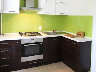
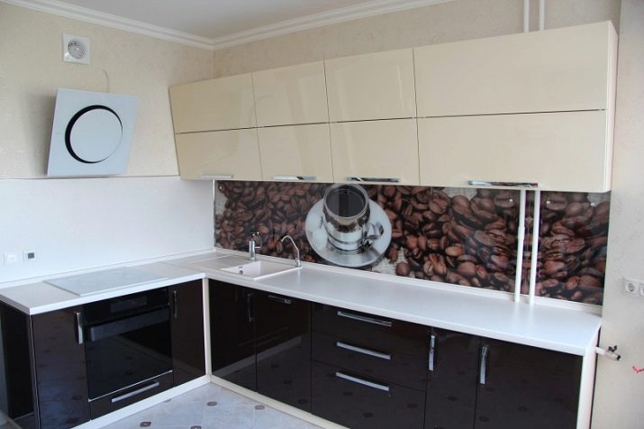
When a firm decision has been made to use prints, interior printing - these elements should fulfill the function of the second rich tonality. In this case, you can already use the white top tier. Usually the front walls or apron are decorated with large shots of wildflowers.
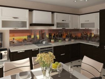
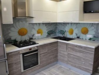
Dark wood-like areas usually embody the idea of peace, a conservative lifestyle. Therefore, the wooden bottom of dark tones usually has unexpressed, classic forms in execution. Any radical experiments with geometry are not needed in this tier.
When such different colors are combined, it is important to carefully select their optimal proportion. If there are too many pastel shades, the contours in the kitchen will visually blur.
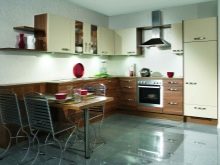
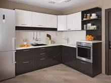
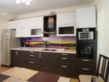
Dark colors are used only in an amount that does not create the feeling of a gloomy, cramped space. Skillfully combining them with light shades, you can achieve an impressive effect and create a brilliant classic interior. To many people, note that this combination seems like a trivial and boring choice. To add sophistication, sophistication, refresh the space, you need to use special techniques. One of them is the use of rich color accents in certain places.
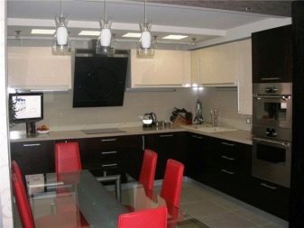
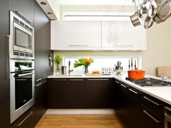
It only seems that you can combine a variety of colors, as long as they like them. In fact, when designing kitchens, you must follow strict rules developed by design practice. These rules are worth remembering when combining a light top with a dark bottom. The first and most important thing is not to use more than three colors. Normally, either two colors are used on top, or two colors below, and the other tier is painted monotonously.
Moreover, where two colors are mixed, one should have a dominant role. If such recommendations are not followed, the interior becomes unnecessarily colorful. A typical contrast scheme means that 60% of the space is given to the dominant color, 30% is reserved for complementary tones, and 10% is reserved for accents. When this proportion is fulfilled, you can safely and without any problems use rich, catchy accent colors.
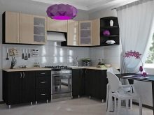
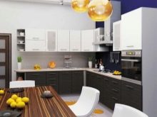
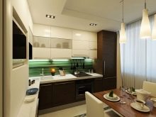
In this case, a coherent approach cannot be used, since according to it, the kitchen should only contain those occupying close places in the color spectrum. Psychological aspects are also taken into account. So, if one of the tiers of the room is painted in two similar shades, a poorly distinguishable stain may result. Experiments of this kind can only be trusted by professional designers or people with impeccable aesthetic taste. Therefore, if there is no experience, it is better to make the levels monochrome, or paint one of them with sharply contrasting colors.
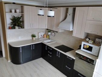
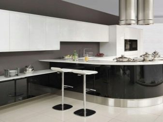
Many people make another mistake - they first decorate the room and then start to wonder if it looks good. There is a great way to avoid such a miss: you just need to use special software. It is not difficult to find suitable programs and services, including free ones. After spending only a few minutes, it will be easy to assess how good this or that composition looks. You can also take a photo of a design project as a basis, but you need to analyze how much this project takes into account:
- kitchen layout;
- its area;
- illumination level;
- placement of windows;
- personal preferences;
- basic design requirements.
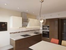
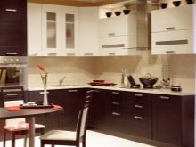
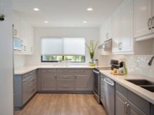
Another nuance is the compatibility of different colors. White color is considered universal. If it was used to decorate one of the tiers, the other can be decorated as you like. Gray paint, despite its practicality, looks good only in a large kitchen. It can be combined with reds, oranges and browns.
It's a good idea to combine green and brown. In this case, a pleasant-looking top will help increase your appetite and improve your mood.The brown color will embody the ideas of stability and traditional way of life. In addition to green, brown is also combined with light gray, yellow, and red tones.
Important: it is undesirable to use purple and lilac paints on their own, they are suitable only for the formation of accents.
Style solutions
The two-tone kitchen fits well not only in the classic style.
It turns out to be appropriate in other styles as well, such as:
- ordinary and Japanese minimalism;
- high tech;
- modern;
- country.
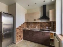
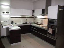
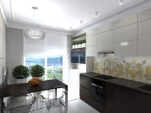
To perfectly carry out the idea of duality in the interior, you need not only to use a two-tone set, but also to paint the walls in a similar way. In any case, furniture should be painted more intensively than other surfaces. It is quite possible to conduct experiments, to show originality. So, multi-colored facades will look very bold and original, one of which is wooden, and the other is made of PVC. Even people who are used to going against the foundations of design like this composition.
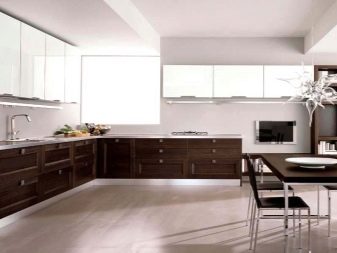
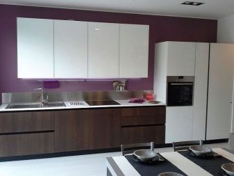
But those who want to get an impeccable classic kitchen, only decorated in an unusual way, should give preference to wooden facades. Not only can this material be dyed in a wide variety of ways, but it can also showcase good taste.
No matter how radical experiments are carried out, it must be remembered that the headset is only part of the room. It must necessarily fit into the overall concept. And sometimes because of her, it is better to abandon a suddenly liked idea than to create a ridiculous interior.
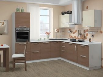
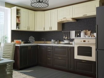
If minimalism is taken as a basis, furniture of simple geometric shapes should be used. Even pretentious pens and other decorative elements are unacceptable. Everything should be strict and functional, only through the play of colors can you show your originality. When the kitchen is decorated in the Art Nouveau style, it is very important that each detail individually and collectively creates a certain charm. Let there be some kind of mystery, understatement - this is fully consistent with the canons.
Beautiful examples
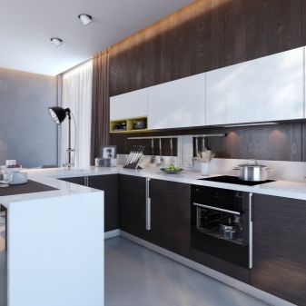
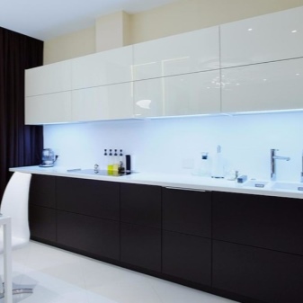
A two-tone kitchen can look very intriguing. The photo shows the lower tier of a noble dark shade. The facades of furniture and an electric stove are combined in one line. Above are hanging cabinets in a pleasant white color. Local illumination is used for maximum effect.
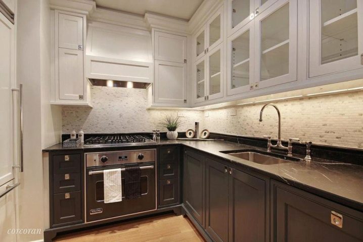
But you can arrange the bottom of the kitchen a little lighter. The photo shows the composition is no longer saturated brown, but a dark blue shade. The turn of the furniture set at the corner is rounded. Interspersed with bright colors are used between the tiers. The white fronts of the furniture located on top are interrupted only by a slightly darker hood.
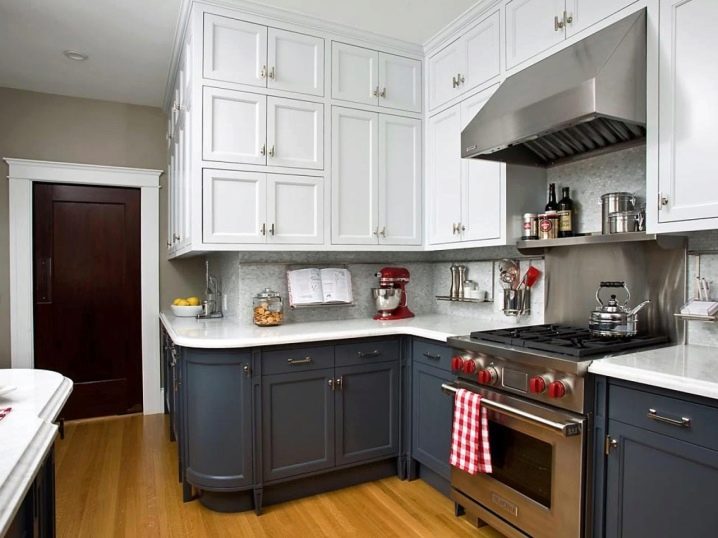
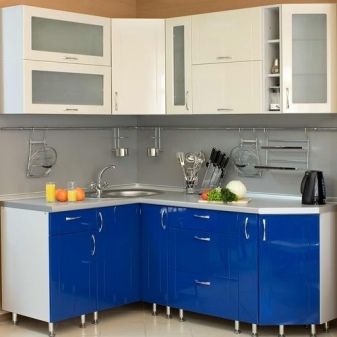
Sometimes, relatively bright shades are chosen as the dark bottom color. The photo shows just such a kitchen - with blue facades. A light gray wall without additional decorations was used as a transition. Against this background, juicy color accents look very attractive. And the upper tier is also not decorated in a simple white tone - a little olive paint is mixed with it.
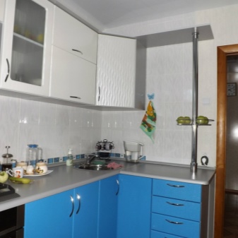
For an overview of a kitchen with a dark bottom and a light top, see the next video.


The comment was sent successfully.