How to choose the color of your kitchen?
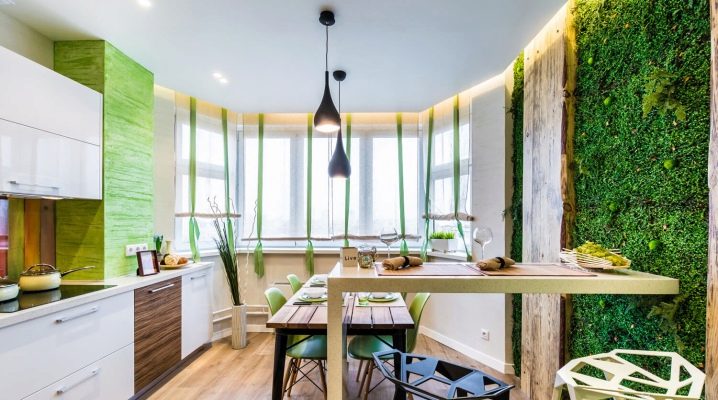
Competent selection of color shades in the interior is important not only from an aesthetic point of view, but also from a psychological point of view. The kitchen is one of the coziest places in the house, so the atmosphere should be inviting, not irritating to the eyes. The choice of the optimal combination of shades depends on taste preferences and the intended style of the interior. In addition to psychological comfort and aesthetics, it is very important that the color works in favor of the room: expanding the space if necessary, balancing bold accents.
How to create the most favorable atmosphere in the kitchen by combining color contrasts, we will tell you in this article.
Types of color combinations
Choosing shades in the interior of the kitchen is a fascinating activity that becomes quite simple if you understand the basic principles of color combination. There are not very many combination rules. Here are the main ones.
- Start from the number of shades. There shouldn't be too many of them. The maximum allowable number of contrasting colors in a design is up to 3, within the same range - up to 5. Background palettes (headsets, floor, walls) are fundamental, they should not contradict each other, for example, consist of different shades of white.
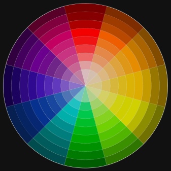
- Use a color wheel. The shades on the chromatic circle will give you a complete picture of how a particular color is in harmony with another. This rainbow scheme will come to your rescue more than once when choosing a color palette.
There are three main combination schemes.
- Monochromewhen shades are selected within the same palette. Suitable for creating elegant sophisticated interiors, but it can seem boring, therefore it requires a variety of textures, especially if the main background is in white tones.
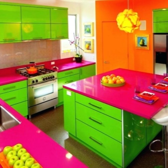
- Contrastwhen the opposite colors are combined on the diagram. Such a design is always very effective and expressive, but there is a danger that it will be too intrusive, therefore it requires dilution with neutral scales. It is better not to take pure colors as a basis.
- Harmonious. It uses combinations of nearby shades in the scheme. This is the most practical system, requiring catchy accents and interspersed with neutral scales.
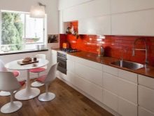
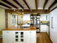
Other combination rules include the following.
- Don't overdo it with darker shades. Despite all the aesthetic effect of dark materials and objects in the interior, especially when combined with white furniture, a work surface and floor in black or dark brown will bring you a lot of trouble. Practicality is a prerequisite for the formation of a kitchen project, so if you are not ready to get rid of traces, stains, drops, fingerprints, crumbs and dust several times a day, try not to use wenge, wet asphalt, anthracite when choosing a floor, facades and work surface etc. White kitchen is much more practical in this sense.
- Consider lighting. Color in different light "plays" in a completely special way. If the kitchen is not on the sunny side, you should be careful when choosing pastel and muted shades, they will give a dirty impression.The color should help to improve the quality of the interior, therefore, in a non-sunny room, it is advisable to use warm colors of rich, deep shades of red, pink, citrus, as well as classic white. It is better to abandon the blue palette, gray and purple. If the window faces south, pastels, blue, lavender, mint will play in a completely different way, gently and elegantly. Catchy shades can crush and make the room visually stuffy, heavy.
- Apply a color pattern. If you are unsure of your design skills, paint a piece of paper in the color you want to use and hang it on the wall of your future kitchen. It is enough to see how the color changes in the morning, afternoon and evening to understand whether it will look as good as in a building supermarket.
- Consider the size. Small rooms are best decorated in light colors. All shades of white will help to visually expand the space, add air, light, and push the boundaries. The white palette, contrary to popular belief, is quite rich: boiling white, snow, ivory, eggshells and others. All of them are superbly combined with each other and with other palettes. So that the white kitchen does not seem dull, it is enough to add beautiful bright accents, diversify the textures used. In addition to white, light gray, light blue, beige, cream colors are very good for small rooms.
- Remember the properties of color. The cooler the range, the less it affects the increase in appetite, and vice versa, warm shades contribute to its excitement. Here you need to consider the lifestyle and goals that you want to achieve.
- Choose a starting point. This can be a kitchen set, wall floor or decor. The main thing is that you have something to push off from and plan further finishing.
- Don't rely on memory. Prepare templates and diagrams that you use in hardware stores and supermarkets, because it is impossible to remember all the successful combinations. You can also use special color matching programs.
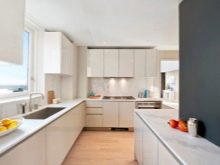
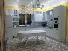
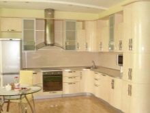
Rule 60/30/10
A table compiled specifically for such purposes will help to choose the shades correctly. It is called "60 / 30-10". The purpose of this cheat sheet was to help budding designers choose color combinations when creating an interior. After all, color balance is very important for an attractive design. The numbers 60,30 and 10 just indicate the percentage of dominant, second and accent colors.
It is not at all necessary to calculate everything down to the millimeter, the main thing is to follow the main idea of this rule:
- decorate most of the kitchen in one color - it can be walls, floor, set; most often the dominant gamut is neutral, the shades of which are close to each other, all white tones are ideal;
- about ¾ of the room is decorated with additional shades, there should be no more than three of them, as a rule, they are darker and richer than the dominant;
- the rest is made out in bright and as dark shades as possible, which should look like accents and details.
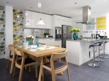
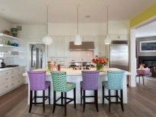
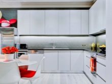
We offer you several ready-made combinations based on this rule. In the ratio 60/30/10 the following scales are perfectly combined:
- deep blue, brown, cream (beige, white);
- greens, blue, yellow;
- brown with a golden sheen, green, white;
- lavender, whiteness, black;
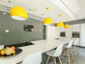
- gray, white, yellow;
- peach, yellow, brown.
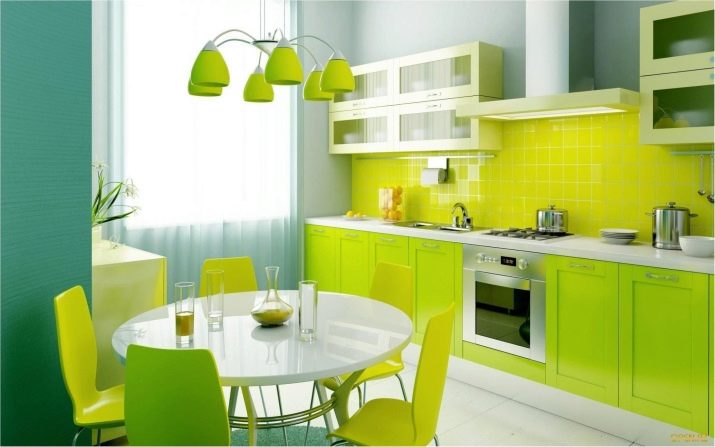
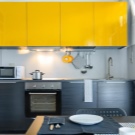
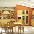
If we take a white palette as a basis, then you can pick up additional and accent colors from almost any gamut to it. White walls and headsets are the most versatile background for color and style solutions. If you choose, for example, red as a basis, it will be very easy to overload the room, but it is unlikely to create a comfortable design.
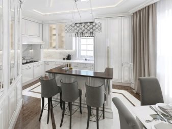
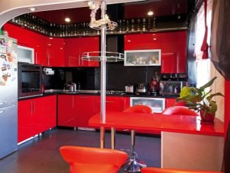
It is very important to remember that percentages are not indicated for colors, but for palettes. That is, 60/30/10 does not mean at all that you can only combine three colors.For example, green, mint and emerald are three shades of the same scale.
We make an accent
In order to choose the perfect color scheme, you need to choose what exactly will become the main focus of your kitchen. As a rule, designers suggest starting from the color of walls, furniture or decorative elements. Let's make a reservation right away: to make accents on everything at once is a failure, you will have to choose one thing, which will partially demonstrate 10% of the accent color.
Walls
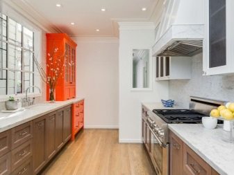
If your goal is luxurious wall decoration with materials of complex texture, expressive print or catchy color, give up bright furniture, complex decor, intricate flooring. A frilly background in the form of walls obliges to adhere to neutral shades in everything else. If this rule is violated, the walls will not make a gorgeous impression, they simply cannot be seen, many details will be distracting.
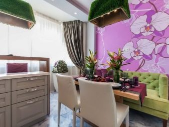
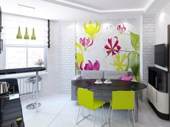
If the wall decoration is chosen ascetic, it is perfectly emphasized by complex, bright spots scattered throughout the space. Thus, you can arrange a lot of ornaments, decorative elements of expressive shades on a white or light monochrome background. A beautiful chandelier, paintings, pillows on the sofa - all this will be more than appropriate.
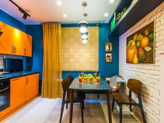
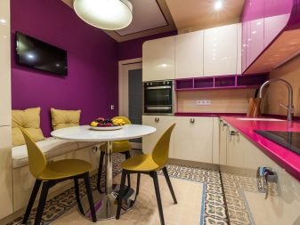
Let's try to consider win-win combinations with the most common shades.
White. The most practical color in terms of combination and aesthetics. It is perfectly combined with different palettes, giving the interior elegance and grace. A white background looks great with tints of light wood, which can be taken as an option. Absolutely anyone can act as an accent, with the exception of gloomy black and brown.
If we take the black scale as a pre-shade, then absolutely anyone can do 10% of the accent, without restrictions.
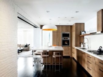
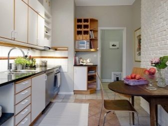
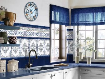
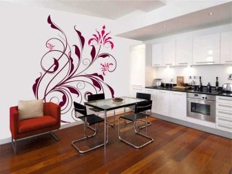
- Pattern and ornament. Catchy artsy walls suggest laconic color schemes. The best variation in this case is a patterned colored wall, monochrome furniture in two contrasting colors. Choose natural shades as a complementary color: white, brown, gray, black.
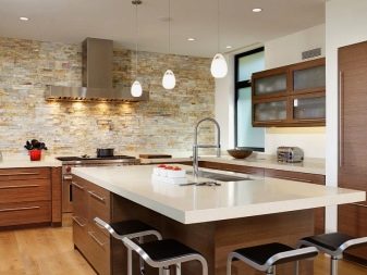
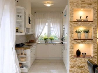
- The walls are in stone. This spectacular material is self-sufficient and expressive in itself, so it looks most luxurious in combination with neutral white, gray, beige. If you choose a color that is rich, bright, it will score all the charm of the stone finish. In addition, you will have to exclude plastic from the interior, only wood is combined with a stone.
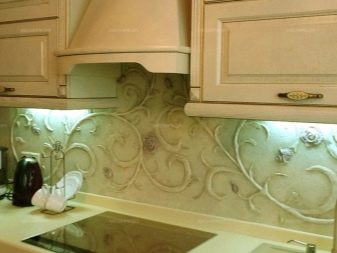
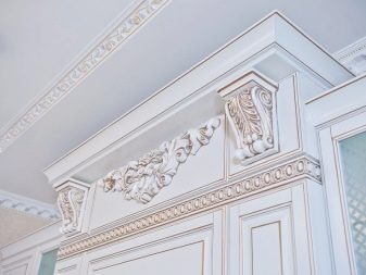
Modeling and plaster. If the walls are decorated with stucco, this in itself is quite pretentious and intricate, so the background color should be as simple as possible. But the modeling itself may well be bright and act as an accent.
Furniture
If the typeface is made to order, this simplifies the task, and you do not have to build on it, it will be easier to fit it into an existing project. If you are making repairs in a kitchen in which there is already furniture, you will have to make a start from it. Consider it as a complementary color and choose the main dominant and accents.
Most popular solutions.
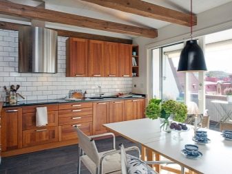
Wood. Choose white walls, this is a win-win option, then you definitely won't have to rack your brains over the accent - whatever you like will do.
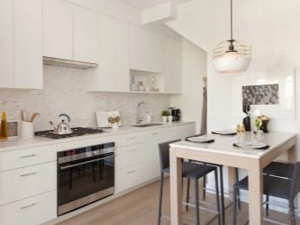
- White. Such furniture is especially good in contrast, while reading that the walls are the main background, the furniture is pre-shades. Combines with any palette.
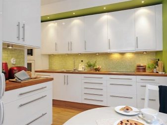
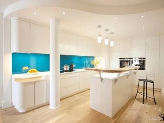
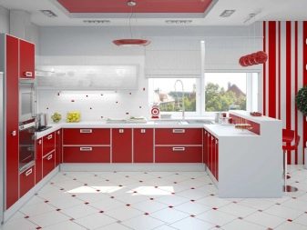
- Red. Here again white is among the leaders, as well as gray and all shades of metal. The combination of black and red is also very expressive, but at the same time, black should be accentuated and minimal. Triad white-blue-red - an original harmonious combination.
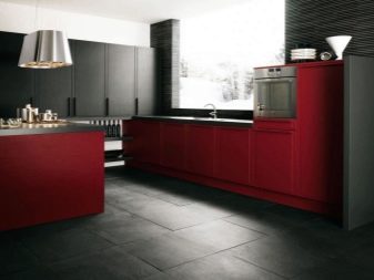
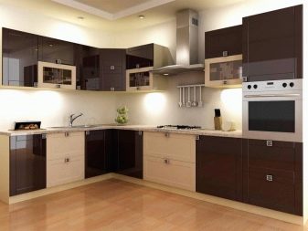
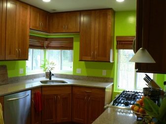
- Brown... Despite the fact that this is the natural color of the tree, it is very discerning for its neighbors. Simply put, it can only be combined with beige, sand, and white. Greens are perfect as an accent.An important nuance: if the headset is dark brown, the floor should be light, otherwise the overall impression will be sloppy, blurry.
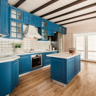
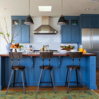
- Blue. The ideal background for such a solution is white, light gray or blue. Moreover, they should be as muted as possible, barely perceptible. No bright colors will work as a dominant.
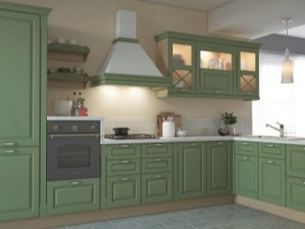
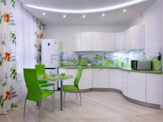
- Green. Very cheerful, bright, expressive color. In the kitchen interior, it is best to use the tones of olive, pistachio. But bright green or light green cuisine can be very interesting. True, here you will have to choose the most calm background shade. But the emphasis is better to build on contrast: lilac, yellow, blue and white are best suited.
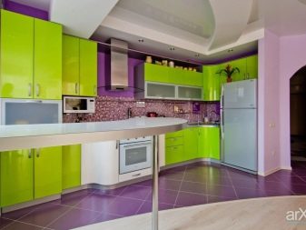
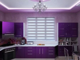
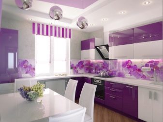
- Lilac. A very fashionable design solution that perfectly combines with shades of olive, salad, khaki, black, burgundy, white.
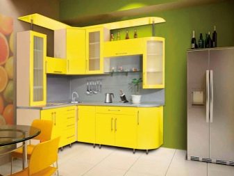
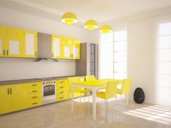
Yellow. This beautiful color in itself is capable of charging with a positive. Combine it with greens, lilacs, red. A bright kitchen looks best on a white background.
Decor
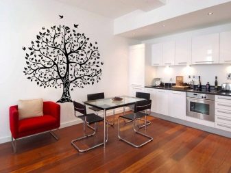
When choosing accessories and textiles for the kitchen, decide on the main thing - the decor has additional or dominant functions. If you want to flaunt your accessories as much as possible, choose a neutral backdrop. For example, white walls and wood floors do a great job. At the same time, remember that not every style "likes" an abundance of decor.
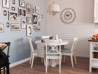
If you like to overload the space with trinkets, turn to boho, Provence styles. Lots of accessories and rich textiles in Art Deco. As for color, there are two rules here:
- decor is included in 10% of accent shades or 30 additional ones, variegation is not the best way to decorate an interior;
- try to match accessories and textiles in color either with each other or with other design items: curtains and tablecloth, or curtains and chair covers, apron ornament and plates on the walls.
Apron
The apron of the working area is one of the central details of the kitchen interior; almost all the mood of the design depends on it. Very often, the emphasis is on the apron, since this is the easiest way to accomplish and not overdo it. It is important to maintain neutral walls in order to present the brightness and expressiveness of the work area as beneficially as possible. But the headset can be made in the same range as the apron.
If you choose a bright headset, then the apron must be calm - this rule must be followed. Colored apron - monochrome neutral headset.
The most successful color solutions for a kitchen apron.
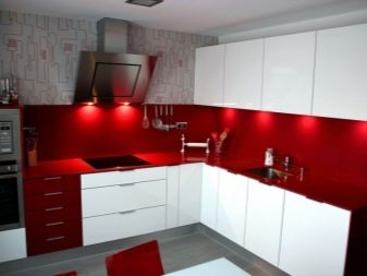
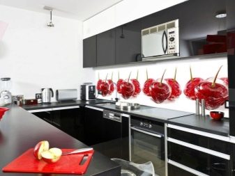
Red. Here you will have to restrain yourself with the desire to include the colors of the same range in the interior: burgundy, cherry, pink. Scarlet shades are good only in contrast, but not with any palette. Gray, black, beige are good choices, white is ideal.
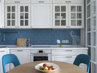
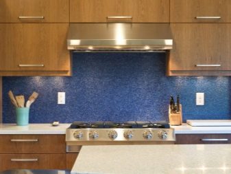
- Blue. Perfectly combined with white, all wood colors. Blue shades are good with white, black, turquoise, lilac tones.
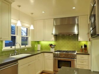
- Green. It gets along well with yellow, close in origin, all citrus shades, as well as white and sandy scales.
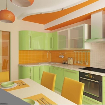
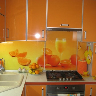
- Yellow and orange. Shades that are very popular in modern design, bright and cheerful, look great in the decoration of the apron. Of course, they go well with white, very expressive in combination with light green and brown. You should avoid blue, lilac, purple.
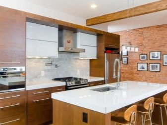
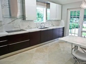
- Natural materials. Everything here is as simple as possible: if your apron is marble or imitates it, select the furniture to match the thin veins, if granite - complement the interior with something similar. For example, decorate window sills in this style. But don't overdo it, remember 10%.
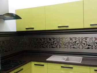
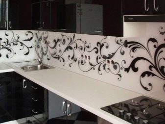
Ornament. This is a very popular design solution, a great accent that cannot be muted with a bright set, but it is worth duplicating in textiles, for example.
Fashionable colors of the kitchen set
If you follow fashion trends and want to style your headset in accordance with the latest trends in the design world, consider one of the options below.
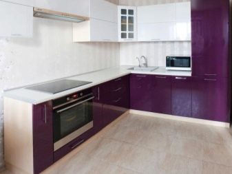
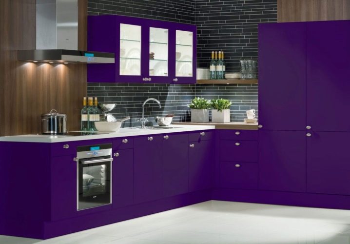
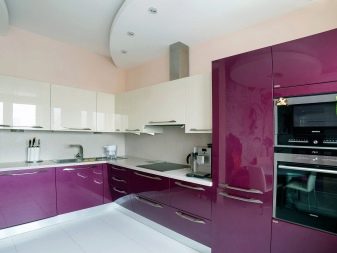
Purple purple - the hit of recent seasons, which does not give up its positions in design, it looks quite high-status and luxurious, however, one should observe the measure so that the purple scale does not press. A great solution is to add several decorative elements to match the light purple headset.
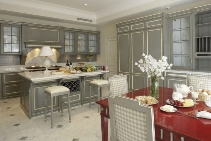
- Aristocratic gray. A very discreet and expensive shade. Due to its neutrality and unobtrusiveness, it allows you to experiment with color combinations.
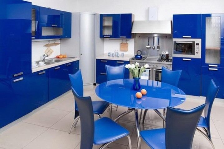
- Positive blue. It is positive, not gloomy, heavy. It's a good idea to fit a blue or light blue kitchen set into a nautical room. Be sure to add white and a little red there.
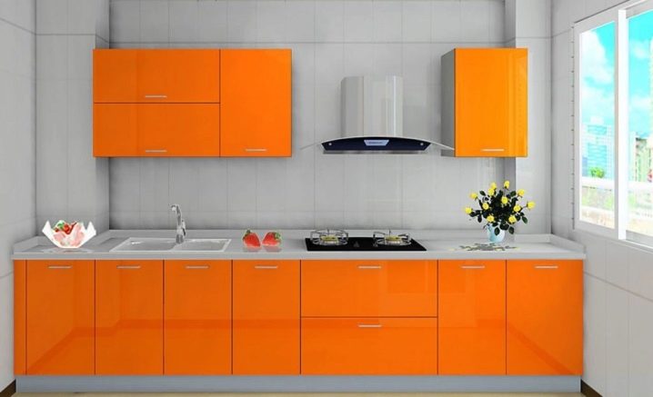
- Cheerful orange. Any shades of orange are at the top of popularity today. It is possible not to decorate the entire headset in this color, it is enough to combine the orange bottom or one wardrobe with another, less saturated color. Be sure to balance it with calm, laconic shades.
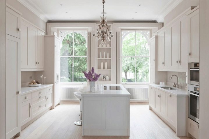
- Calm white. This solution can already be considered a classic, but it is more popular than ever in recent years. Versatile and able to expand the space, white is popular when choosing kitchen sets. He is also loved for the fact that it is elementary to choose any color combinations for him. It doesn't matter whether you choose a pastel color scheme or a bright one, it doesn't matter what style you prefer - the white headset will perfectly fit and play up.
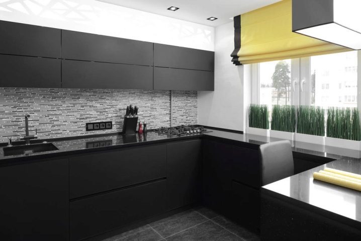
- Black minimalism. Another color that can become iconic in kitchen design. If he has not yet taken the position of white, then only because of his impracticality - the slightest flaws are visible on the black surface. But if this does not scare you, go for it, this is a bold and expressive decision. When in doubt about your design skills, choose the black and white combination, this is a win-win and luxurious option.
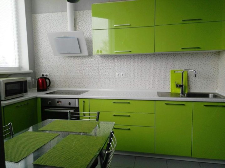
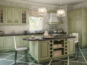
- Fresh greens. This palette is rich in shades, but olive, lime, mint prevail in modern kitchen design. In general, pastel greens look better in a kitchen interior, especially bleached options or facades with an aging effect.
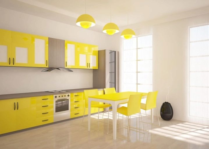
- Sunny yellow. A yellow headset will look best against a snow-white background. So his summer cheerfulness will be emphasized especially favorably. A yellow cabinet with elements of black, red, green will look good. It can be both top and bottom.
Passionate red. Such a headset can be incorporated into a classic project as well as into any modern one. It is important to choose the frame so that it does not argue with the red, but balances it favorably. It can be black, white, gray, beige.
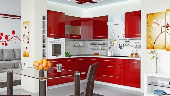
Successful color solutions in the interior
In order to make it easier to navigate complex but effective combinations of palettes, we offer you original and bold design solutions in the design of kitchens. Perhaps some of them will seem like a real find to you.
In warm colors
If your dream is a delicate light kitchen, then pay attention to warm colors, pearlescent, muted shades.
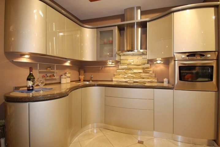
Cappuccino and beige are great on their own. If you dilute them with catchy decorative items in pink, purple, green tones, then your kitchen will be very stylish and expressive.
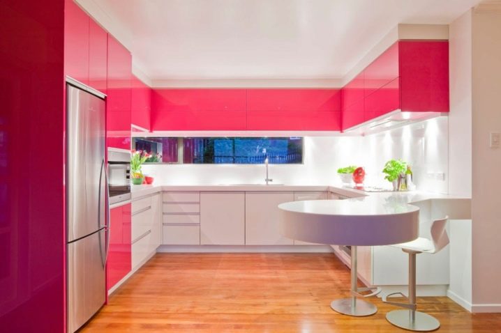
Warm shades of greenery are incredibly beneficial for the emotional mood. If you want to get away from banality, add light reds, lemon, light brown tones, for example, alder or cocoa with milk to the interior.
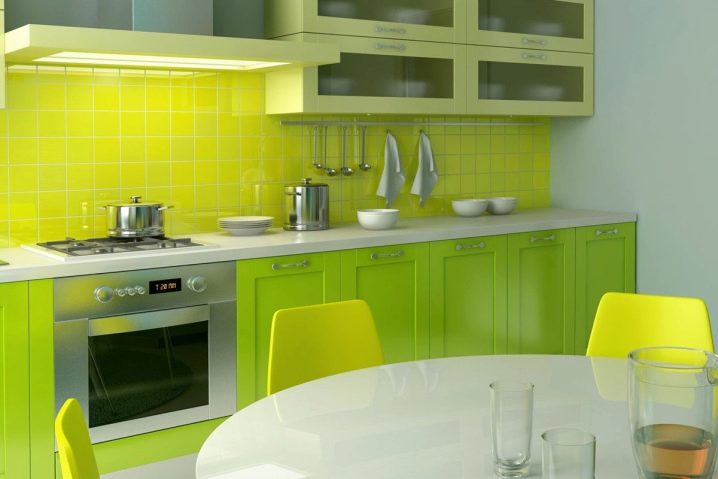
All greens are perfectly combined: marsh, emerald, aquamarine, sea wave with white wood and just a warm white shade.
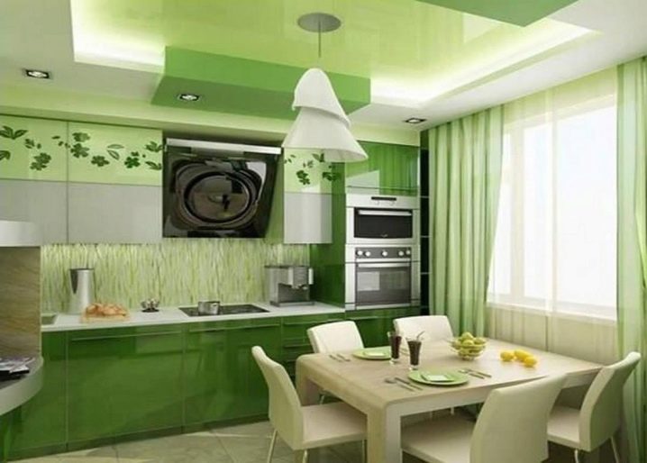
Try to combine the soft classics of the brown range with berry and wine shades: Marsala, raspberry, coral, as well as warm green, yellow, mustard tones.
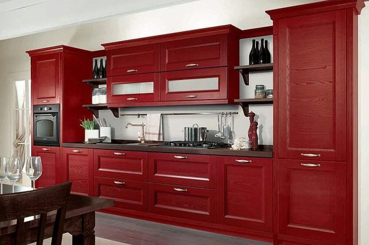
In cold colors
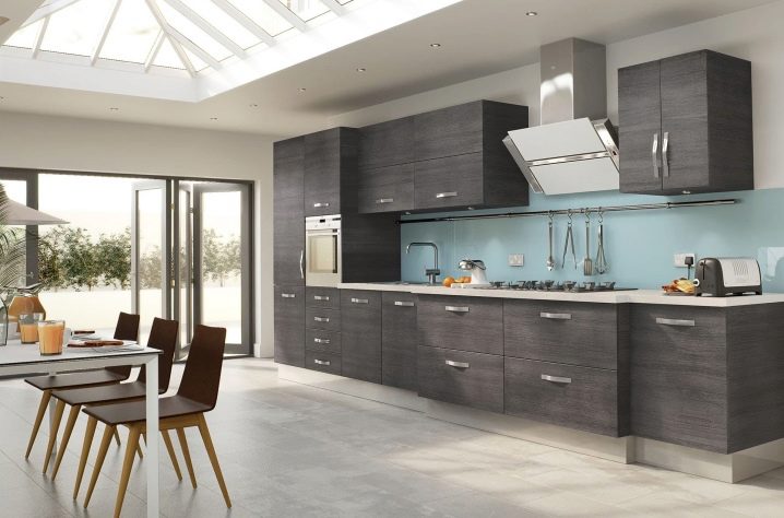
Cool, sophisticated shades will create the impression of a sophisticated, high-status design. White shades are among the favorites here, especially if you choose Provence or Scandinavian style. It combines perfectly with blue, all shades of blue, a la Tiffany color.
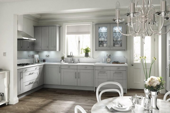
Fresh blues and pastel yellows will not allow the room to be too prim and cold. Lilac and purple are quite status and original, but they are not easy to combine. Ideally, it would be to assign them the role of accents, and take gray, snow-white or barely perceptible yellow as a basis.
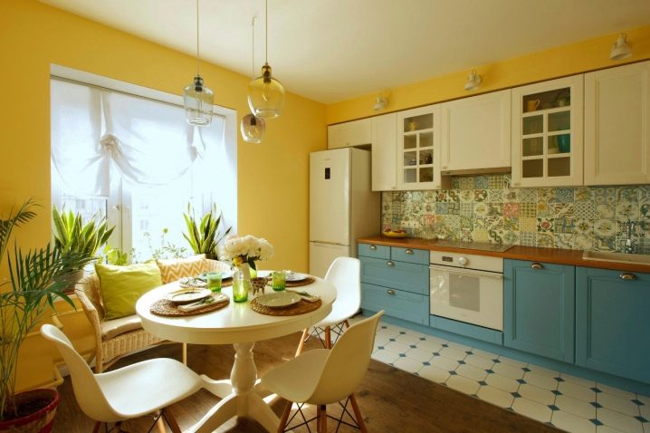
Status gray is very practical. It is currently in vogue and is good as the main background for a combination with turquoise, muted rose, blue.
In bright colors
A rich gamut is preferred for accent use. It is important that catchy shades do not obscure the rest of the colors. If you like unusual bright colors, then try to combine;
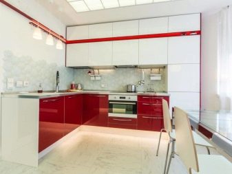
red and anthracite on a white background;
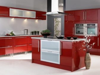
- red and green;
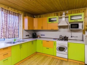
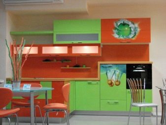
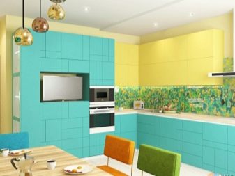
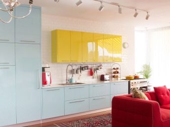
- turquoise and yellow;
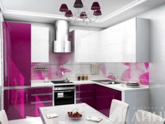
- shades of fuchsia and white.
We take into account the style
One of the conditions for a harmonious kitchen design is that the color scheme should correspond to the style direction. Very often, it is from the style that they are repelled in the choice of shades for decoration. In each interior, certain ranges look the most organically:
art deco and classics - choose muted, restrained, status shades of the most natural palettes, catchy accents are not welcome;
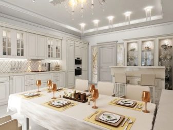
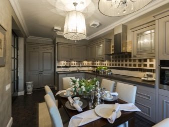
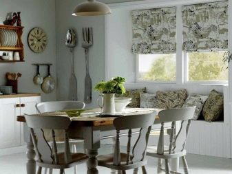
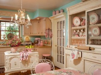
- provence, shabby chic, scandinavian - soft pastels and gentle laconic color schemes prevail here, there are practically no bright large spots, but small blotches on a general calm background are acceptable, for example, terracotta scale;
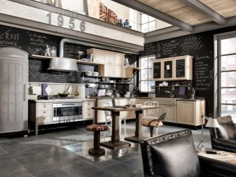
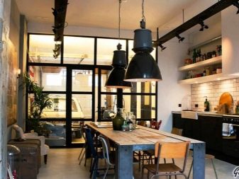
- industrial style, loft - here the favorites are metal, gloss, brick, wood, concrete and all the accompanying shades, bright accents are appropriate;
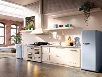
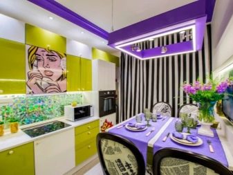
- retro, pop art - here, like nowhere else, rich, catchy, deep scales and cherry shades are good;
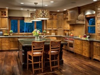
country, eco, minimalism they generally do not allow bright colors, the natural palette reigns supreme here: stones, wood, grass, sand, clay, walnut.
Design examples
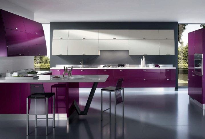
- Gray background, violet additional shade and white palette perfectly combine in a modern kitchen interior.
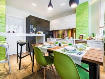
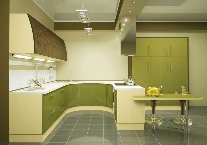
- The soft combination of greenery and subtle yellow is very well emphasized by the cool gray and natural brown.
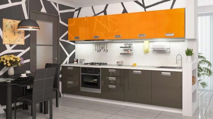
- White, orange and metal are in perfect harmony with each other. Laconic lines and shapes serve as an excellent background for unobtrusive accessories.
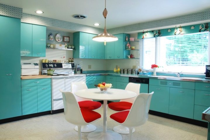
- Tricolor is the safest color combination in the kitchen interior. If one of the scales is white, the other two can be any. For example, blue and red.
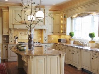
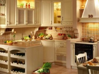
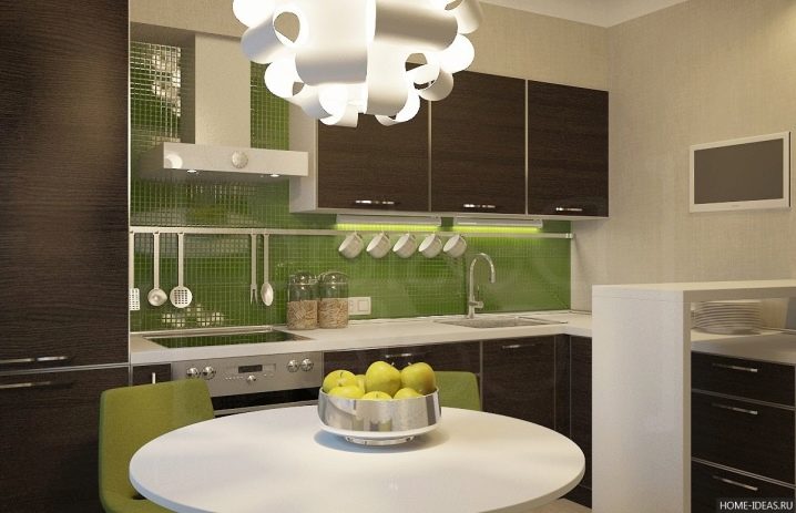
- The classic combination of beige and brown is almost impossible to spoil. She does not need bright accents, just add a little greenery.
How to choose the perfect color scheme for your kitchen, see below.


The comment was sent successfully.