Two-tone kitchens: selection and examples in the interior
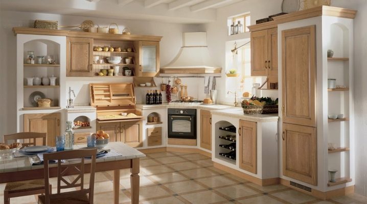
The choice of color scheme for the kitchen is one of the decisive factors that set the mood of the interior. The play of contrast can create a visual effect of enlarging the space; with the right choice of color, you can create a cozy and inviting atmosphere. The material in this article will acquaint the reader with the current color solutions and will allow you to choose harmonious combinations for a particular room.
Advantages and disadvantages
A two-tone kitchen means interior design in two primary colors. The advantages of this design are its aesthetic perception, stylish look and lack of overloading of the environment. This design technique is appropriate in different stylistic directions of the interior. You can use two shades in the design of classic, ethnic, urban, modern branches of interior design.
Such a design can be implemented for rooms of different sizes and degrees of illumination. The correct choice of contrast can make up for the lack of light inherent in most kitchens, while not depriving the interior of bright touches.
Various elements can be used for such an interior composition, including a kitchen set, dining area furniture, wall, ceiling, floor decoration. Besides. accessories and wall lights can be used.
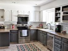
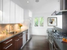
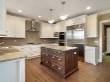
Two-tone kitchens can be very diverse. Through two contrasting shades, you can zone the space, introducing an unobtrusive organization into it, without breaking the integrity of the interior ensemble. This is an excellent solution not only for small rooms, but also for spacious kitchens-living rooms or studio apartments. In this case, one of the contrasts will be dominant, and the second will be its softening companion.
The use of two colors in the interior of the kitchen allows you to demonstrate the versatility of shades. In order to prevent boredom, you can use elements of related tones of both one and a second color when arranging. This approach will contribute to the introduction of expressiveness into the design, achieved by highlighting one color with another. In this case, the tones can intertwine with each other (for example, in a wallpaper pattern or a print of a kitchen apron, a flooring pattern, curtain colors, a wall panel drawing).
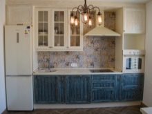
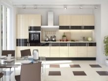
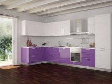
As for the disadvantages of two-tone kitchens, sometimes such an interior requires different color contrasts. In addition, it cannot be embodied in such design styles as kitsch, avant-garde and boho, for which it is important to use several juicy contrasts in the interior at the same time.
Sometimes it is not easy to create a harmonious kitchen interior in two colors due to the small selection of furniture and furnishing accessories. It is especially difficult to find an identical temperature of tones in shops of small towns with a poor assortment of furniture, lamps and finishes.
Often, furniture in such a kitchen has to be ordered, and this is an additional expense and is not always the expected result. Another disadvantage is the simplification of the interior of the open-plan room. Colors set a certain mood, which may conflict with the temperament of some household members. You need to choose the tones thoroughly so that every member of the family feels comfort in the kitchen.For example, pink and white are unacceptable for men, older households do not like dark colors, neutral ones can cause irritation, resembling a hospital ward.
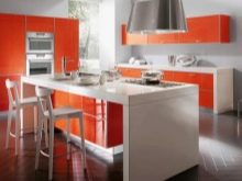
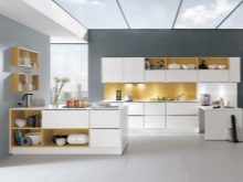
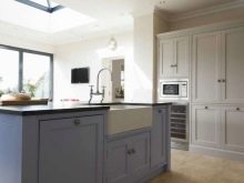
Types of kitchen units
Today, the kitchen set is a key element of furnishing. It is selected not only according to the principle of "light bottom and dark top". Modifications differ in the type of structures, their purchase is subject to the layout of a specific room, taking into account its features. All types of kitchen sets can be divided into three lines: linear, angular and U-shaped. Each of them has its own characteristics.
For example, line suites are sets of furniture that are installed in a line along one wall. It is an excellent choice for kitchens that tend to have an elongated and narrow rectangle.
Corner models are often called L-shaped. Their construction occupies completely one wall and partly adjacent to it.
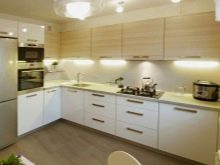
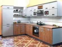
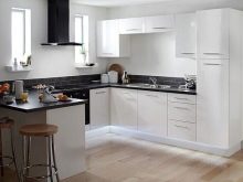
Constructions of this type can have a transformable dining table or be completely stationary. They are bought for wide kitchens with a shape tending to a square. U-shaped modifications take up space along three walls, which significantly reduces the usable area of the kitchen. They buy such products for spacious rooms or open-plan apartments, using them to equip a cozy kitchen corner.
By the type of texture, the headsets can have a glossy, semi-matt and matte surface. Moreover, the material for making a two-tone kitchen can be very diverse. It is made from glass, metal, plastic, wood, natural and artificial stone. Some materials are combined with each other, due to which it is possible to create a play of texture contrast and highlight one of them.
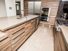
For example, gloss can decorate the surfaces of the upper drawers, the lower ones can be made of wood or have a stone countertop covered with glass.
As for the headset itself, it can be either built into a niche or modular, consisting of a certain number of wall and floor cabinets.
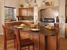
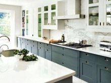
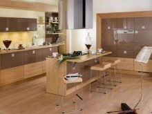
The technique for using two colors can be different. For example, furniture may have:
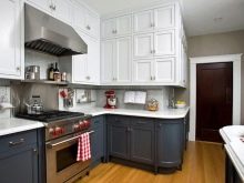
- light bottom and dark top;
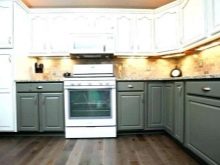
- two-color facades from above or below;
- dark top and light bottom;
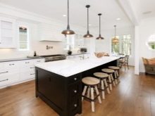
- color-contrasting cabinets and peninsula;
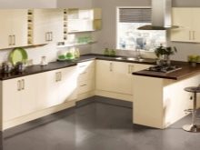
- light boxes and dark countertops;
- dark contrasts to match the dining table and chairs;
- light facades against the background of a dark apron;
- dark tables and drawers against the background of skinny or wall decoration;
- contrasting shade in relation to the color of the ceiling material.
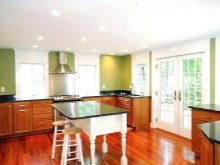
Popular colors
Today, when arranging kitchens and choosing color solutions, fashion trends suggest turning to soft and muted shades. The combination should be harmonious, not allowing rivalry between the two colors. For example, fashionable contrasts, according to designers, today are combinations:
- white and bleached azure;
- beige and pistachio;
- white and beige-gray;
- brown and milky;
- white and orange;
- white and red;
- lilac and creamy;
- blue and brown;
- lemon and purple;
- lilac and pistachio;
- lemon and light gray;
- white and blue.
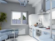
Duets of white with terracotta, green, purple, turquoise shades can also be called successful combinations. White is the favorite of the season: it has a softening perception and is able to ennoble any of the colored paints chosen for the design of the kitchen. In addition, it visually enlarges the kitchen space, making the ceiling taller and the walls wider. In addition to it, beige, milky and light blue are especially popular.
How to choose?
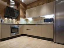
Choosing a kitchen for a specific room, you can build on several factors. For example, the key is the degree of lighting in the kitchen. If it is bathed in sunshine, you can choose furniture in a combination of light and bright (as well as dark) tones.If the room is small, dark shades will look bad in it.
The colors of the headset are chosen based on their perception. For example, green is considered a positive color, it is versatile and can both invigorate in the morning and create a relaxing atmosphere in the evening. Red can be annoying over time, blue can cause depression, and black can evoke negative thoughts. Indisputable win-win solutions are white, beige, peach, milk.
Gray needs an emotional color contrast (for example, green or amber brown, wine).
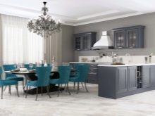
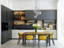
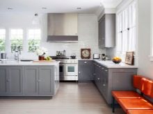
If wallpaper is bought for the walls, the headset should not merge with them, which means that here you will either have to select a related color, or contrast one contrast with another. For example, on blue wallpaper, the blue headset will be lost, even if its color is several tones brighter than the shade of the wall decoration. In addition, we must not forget that there should not be too much bright in the kitchen: the eyes quickly get tired of this. In addition, excessively bright colors are often the reason for the subconscious discomfort of households when they are in the kitchen.
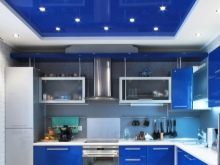
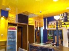
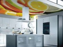
You can choose colors for stretch ceilings. When choosing such a solution, you can order photo printing on film, in which both headset colors will be used. In this case, the texture of the film can be similar to the facades of the cabinets or, conversely, differ from them. The gloss on cabinets and floor tables goes well with the matt and satin finish of the stretch fabric.
Styles
The undisputed favorites of two-tone kitchens are modern trends in interior style. Simplicity and uniformity of materials are the main criteria for such styles. Here, the emphasis is on the unusual texture, perhaps, its volumetricness, discreet relief patterns, through which an unobtrusive visual effect of increasing space (for example, stripes) is created or one of the functional zones is highlighted. Two colors are enough here to embody them in different materials, furniture, wall and ceiling finishes, the color of lamps, dishes and even household appliances.
For example, one of the styles of a two-tone kitchen can be laconic minimalism that does not accept embellishments and adheres to strict functionality.
A minimum of furnishing elements will be an excellent option for the embodiment of such a color scheme.
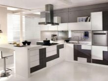
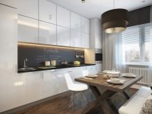
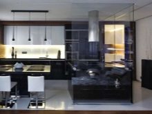
In addition to minimalism, modern style will become one of the best stylistics directions for the kitchen. This style seeks to demonstrate the beauty and manufacturability of modern materials through the glossy textures of the surfaces of the facades of the headset and the elegance of the ceiling design.
You can beat the two-tone kitchen in the styles of conservatism, constructivism, bionics, loft, chalet, provence, neoclassicism. Each direction will require its own attributes. For example, for the classics, you will have to add gilding, stucco molding, elements of palace solemnity, as well as massive furniture and heavy curtains to the design. For Provence, on the contrary, you need a certain rustic simplicity and the use of natural materials, as well as tones. Here, the focus is on the matte texture, the use of wood, as well as light colors of furniture and ceiling material.
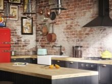
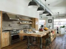
For a loft, deliberate rudeness and flaunting any communications are important. This is laconic furniture against the background of concrete or brick walls.
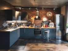
Beautiful design examples
Here are some examples of beautiful two-tone kitchen designs.
- An excellent solution for fans of minimalistic interiors.
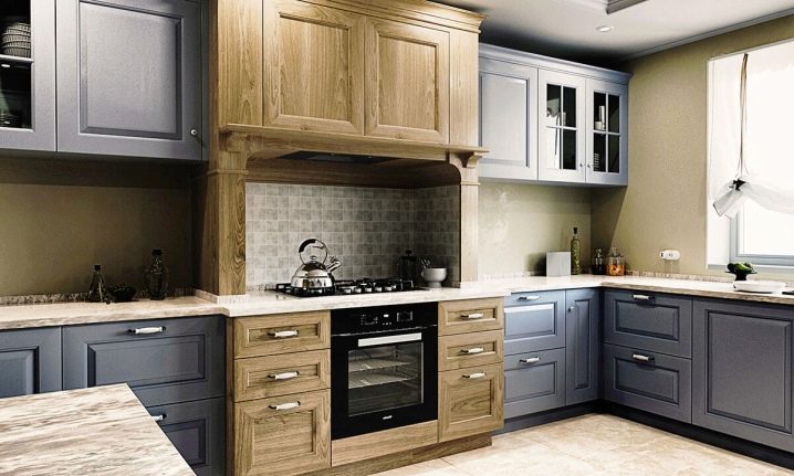
- A dynamic solution for a two-tone kitchen.
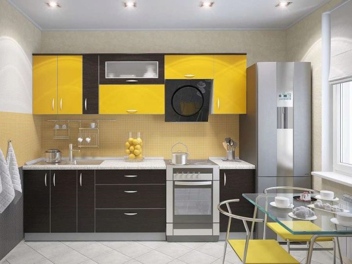
- An original design for decorating a spacious room.
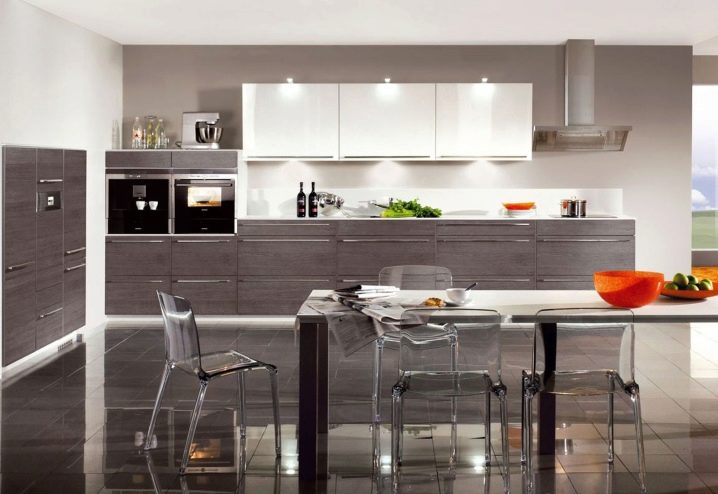
- A bright two-tone kitchen with softening contrast in white.
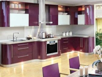
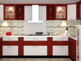
- An example of space zoning by means of two-tone furniture.
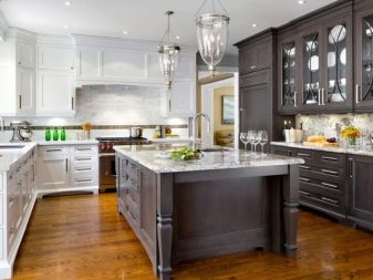
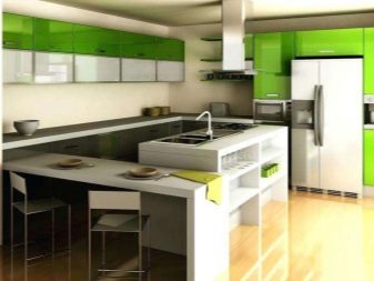
- Stylish interior of a two-tone kitchen with an accent on the dining area.
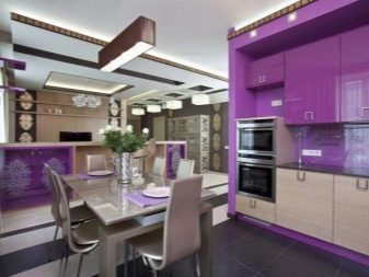
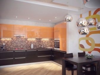
- Choosing a bright design for arranging a sunny kitchen.
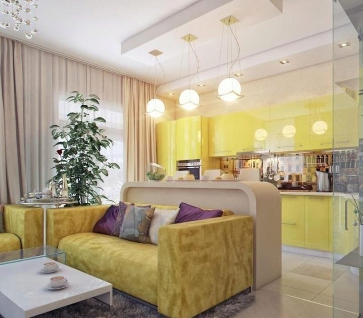
- Light furniture in the interior of a small kitchenette.
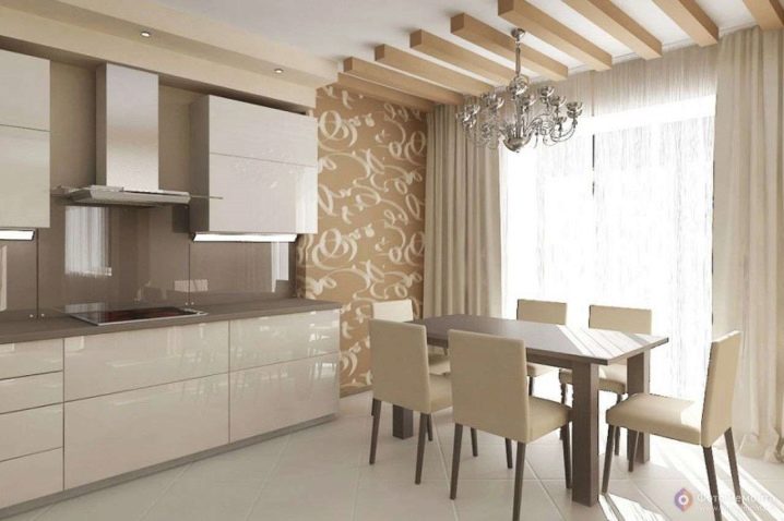
For tips on choosing a two-tone kitchen, see below.


The comment was sent successfully.