Colored kitchens in interior design
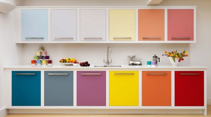
We spend a lot of time in the kitchen, and therefore it should be as comfortable as possible both in terms of functionality and from a psychological point of view, reflecting the tastes and preferences of the owners. Modern design offers a wide variety of kitchen interiors: calm and tonic, spectacular and soothing, bright or delicate.
Young people, thirsty for the multicolor of emotional perceptions, quite often give preference to multi-colored options, not stopping at the classic monochromatic and two-color sets of furniture that are popular in our time.
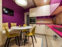
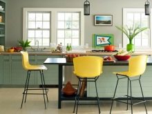
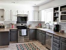
Designers recommend
When planning a colorful kitchen some recommendations of the designers should be taken into account:
- large interior items are preferable to do muted soft tones, and smaller details can be rich and bright;
- multicolor visually reduces space, so large rooms are desirable for multi-colored kitchens;
- for a visual increase in space, it is preferable to use light colors;
- colors found in nature have a beneficial effect on psychological perception; their combination in the natural environment obviously prompts the decision in the correct choice of the color composition;
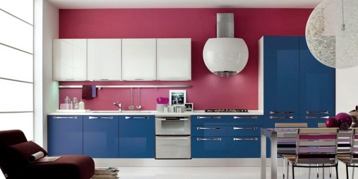
- walls in combination with a multi-colored set should be done in a calmly neutral color scheme;
- first of all, it is necessary to decide on the dominant tone of the furniture, and then select the colors that match it;
- designers recommend not to use more than three colors: tricolor furniture will create a multi-color effect and look stylish;
- the base color should be pure, not tinted.
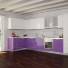
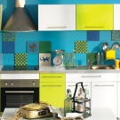
How to combine colors: the opinion of designers and psychologists
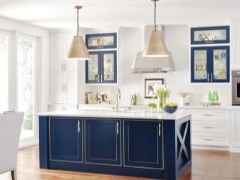
White is versatile and can be combined with almost any color. It looks very good when used with black, red and blue. The only drawback of white furniture surfaces is excessive soiling, requiring painstaking care.
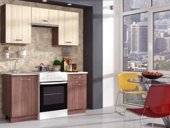
Quite popular in kitchen sets, calm beige is harmonious with blue, brown, gray and white.
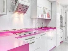
Glamorous pink is good in combination with brown, white, olive, gray and turquoise.
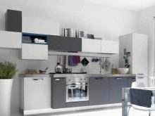
Gray is mistakenly considered boring. It is neutral and can act as a base, as well as as a component of a headset composition. Beige and cream, pink, red, purple, brown or blue will look spectacular against its background. Gray is suitable for people who are distinguished by calmness and prudence.
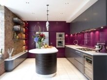
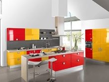
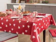
If you want to make the kitchen not just colorful, but also as bright as possible, red is often used. This color is combined with black, yellow, green and blue. Keep in mind, however, that too much red can be irritating and should be used with extreme caution. As an option - the use of decorative details or red textiles (pillows, vases, figurines).
If necessary, gray details will help to reduce the aggressiveness of the color. According to psychologists, red is preferable for strong-willed, self-confident people. It is believed that the red environment even helps to cope with hunger during diets.
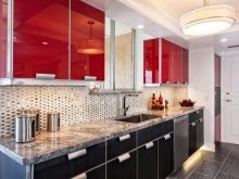
Brown, traditional in furniture, will open in a completely new way in combination with bright blue and pink. The time-tested classic version of combining brown with beige or with other shades of brown is popular.On brown surfaces, minor contamination is almost invisible, which naturally occurs during cooking.
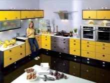
Will create a joyful sunny atmosphere orange in combination with any colors of the rainbow: with purple, green, blue, blue or lilac. Orange is positive for energy. He is preferred by cheerful, expressive people. For people who are more cautious and prudent, orange can be replaced with a more calm one - yellow, using the same color combinations. The combination of yellow and black is very popular. Headsets of a yellow-black chess composition with small fragments of details of the third of the matching colors look boldly defiant.
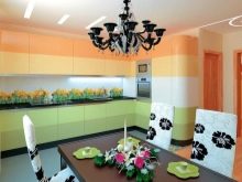
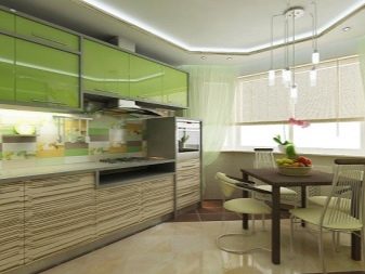
When choosing a base of green, which is recommended for creating an aura of tranquility, we select golden brown, light beige colors. Black and yellow are also in harmony with green, but they will somewhat disturb the serenity of the perception of the composition of tones. Green has many shades from jade to khaki: the color of lime, pistachios, emerald, sea - all these tones look stylish and have a beneficial soothing effect.
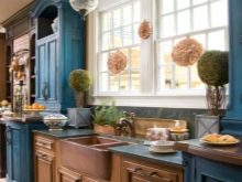
For a blue base color, you can use red, gray, orange, pink, white or yellow. The blue environment relieves the psyche of negative thoughts. This color is even considered a pain reliever and is recommended for migraines.
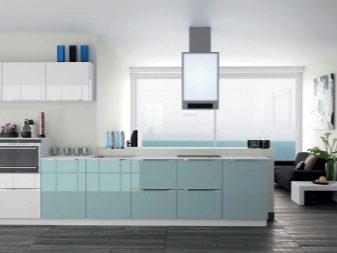
Lilac, green, yellow, orange, red are suitable for blue. The blue color fills the room with freshness and coolness. Such a basis is often used in modern or high-tech styles. Its plus is practicality, lack of soiling, the ability to hide minor contamination.
You should not be afraid to use the universal black color in the interior. It is perfect in composition with all colors. Black doesn't look austere when paired with orange, pink, yellow, white, or red.
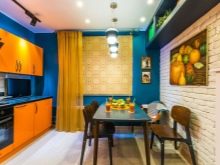
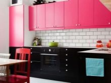
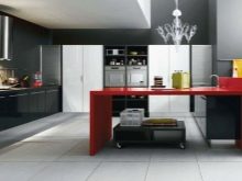
It should not be forgotten that glossy surfaces with their inherent brilliance will fill the interior with additional light and sparkle. They look more festive, but require special care, which is important in a kitchen. Rooms with glossy fittings visually look more spacious.
When choosing colors, it is necessary to take into account the factor of the location of the kitchen: when it is located on the south side, cold tones are ideal, and for the north side, warm ones are better suited.
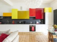
Colored inserts
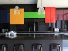
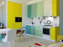
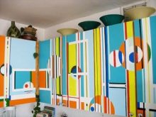
In order to make the headset more colorful and effective, you can use a variety of inserts that differ in texture and color. Colored inserts can be either simply in the form of geometric planes, acting as doors, shelves, or decorative elements. Their use should also be well thought out.
It should be remembered that a large drawing will visually reduce the space. Small, on the contrary, will increase it.
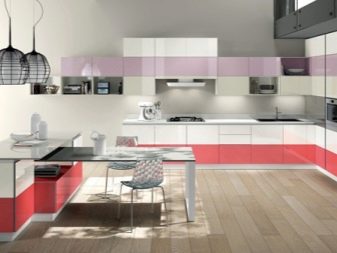
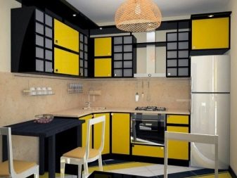
Geometric patterns in the form of intersecting lines, various shapes, reminiscent of Scottish kilts, can create the illusion of endless space.
Vertical patterns increase the height of the ceilings. Horizontal - make the kitchen wider.
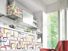
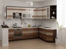
When designing a kitchen, one should not forget about the importance of textiles, decor, household appliances, kitchen utensils and lighting used in the kitchen. Everything should be harmoniously interconnected and repeat or harmoniously complement the color scheme used and maintain the stylistic orientation of the room design.
The kitchen should not only be beautifully decorated, the main thing is that it should be comfortable for those who are there. We are all different: rebels and couch potatoes, romantics and innovators. Having chosen your basic kitchen color in spirit, you should heed design advice on color matching. Having picked up 2 more colors, we get a three-color design, which will delight with its diversity.
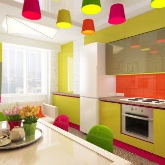
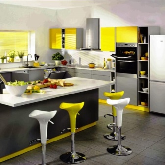
For information on how to choose the color of the walls and combine them with kitchen furniture, see the next video.


The comment was sent successfully.