Features of blue in the interior
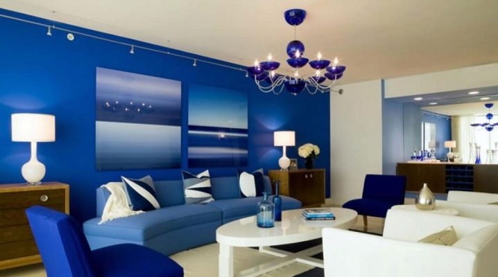
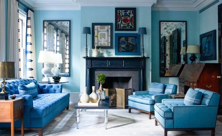
Many are afraid to include blue in apartment design projects, as they consider it too cold and gloomy. But if you correctly place accents and choose tones, the interior will turn out to be cozy and incredibly stylish. It is necessary to know the basic rules for combining shades of this palette, to observe the proportions of color balance. A variety of tones will allow you to choose both a deep, rich color, and a soft, muted, calm one. If everything is done correctly, the interior will turn out to be pacifying.
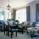
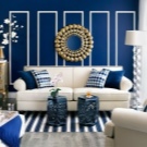
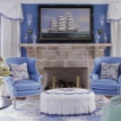
Meaning
Blue color, according to psychologists and doctors, has a beneficial effect on the state of the human body and psyche. Sineva works like a real color therapist, normalizing blood pressure, relieving tachycardia. In addition, this color is able to muffle appetite, so it will perfectly fit into the interior of the kitchen for those who are afraid to get better. Psychologists define blue shades as balancing, calm, stimulating brain activity.
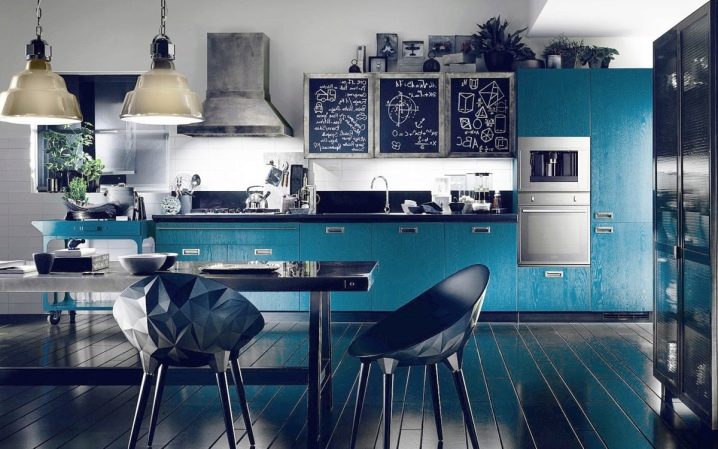
In nature, blue is natural and surrounds us everywhere: by the reservoir, the sea, over our heads. In the interior, such a color is rather difficult and demanding, although psychologically it has a very good effect on a person. Blue gives confidence, gives peace, satisfaction, stability. The variety of shades allows you not to limit the flight of imagination, to choose a tone for almost any style and mood. This color is appropriate for both chic and laconic designs.
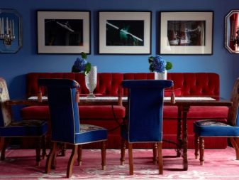
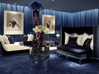
Shades
The color palette of blue is very rich, it includes a chic range from light blue to deep and rich dark blue. He is the most noble, moderately restrained, elegant, never flashy or vulgar. Different intensity of shades does not level their status.
It is customary to refer to the blue palette as blue and all its varieties, although some designers distinguish blue as an independent color.
In any shade they are very close, blue is a derivative of blue with the addition of a significant amount of whiteness. But by itself, the blue has enough varieties:
Prussian blue - a muted tone that goes into a juicy gray;
- sapphire - by analogy with a stone, deeper, more saturated;
midnight blue - lighter than Prussian blue, inexpressive;
- dark blue - noble, bright, juicy, slightly darker than the actual blue;
- blue is the brightest of the entire range;
- ultramarine - interspersed with sea waves;
- blue dust - between dark blue and muted blue;
- Black Sea - the most restrained tone, not dark, but laconic;
- denim - catchy, but not defiant;
- cobalt - slightly darker than jeans;
royal blue is a magnificent shade darker than blue, but one of the lightest and noblest in the blue range.
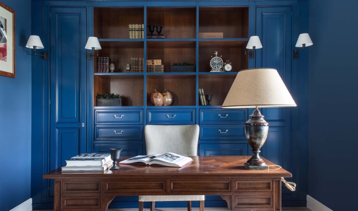
In addition, all shades have derivatives of light and dark types. All the above tones resonate perfectly with each other, ideally combine in one ensemble. It is much more difficult to combine this range with other shades.
Nevertheless, it is necessary to master this skill, since in the "undiluted" variation the color is unacceptable in the interior. It will be too dark and uncomfortable composition.
In order for the design to be beautiful, harmonious and non-irritating, observe the following rules:
use blue mainly as a complementary or accent color;
be sure to observe the proportions and dilute the composition with other shades;
blue is appropriate in both small and large rooms, but in the first case, it should not be too dark;
the larger the surface that you want to make in blue, the lighter the chosen tone should be.
What colors does it match?
The combination with other shades and scales allows for quite a lot of variations. The white and blue interior has already become a kind of classic, the red and blue and yellow and blue look catchy and expressive.
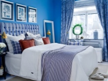
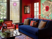
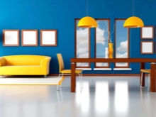
A popular combination is blue + orange, brown, light green, gold.
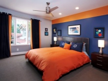
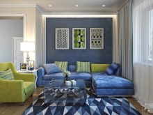
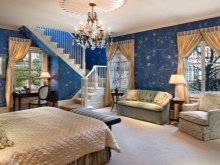
It is important to choose a combination that is not only organic, but also fits the overall style of your home or apartment.
We offer you the most popular color combinations.
With white
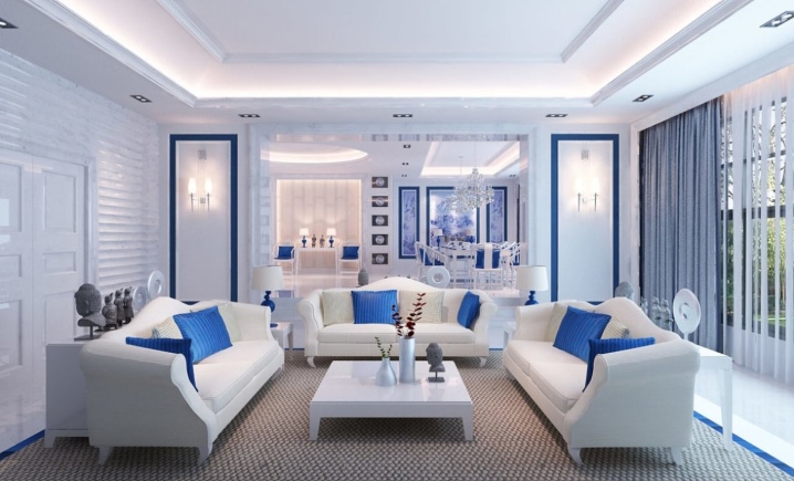
This magnificent combination will not only visually enlarge the space, but will also be quite bright, at the same time noble and elegant.
This combination is often used when decorating a room in a nautical style.
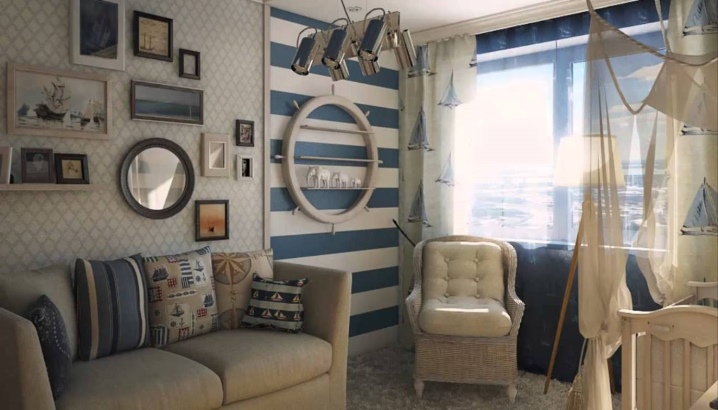
Feel free to take this combination as a basis for the design of a small and not very bright room. Use snow-white, boiled, milky as a base, and in the blue, decorate furniture, decorative items. It is important to observe proportions so that there are no bluish shades for more than a third of the entire palette.

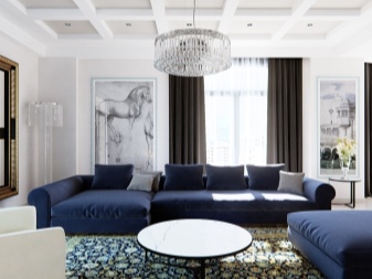
This duet looks great in a variety of ornaments, prints: painting, gzhel, stripes, rhombuses, zigzags and others.
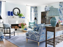
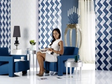
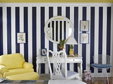
Ideal white and blue gamut in the design of children's, bathrooms, country houses, kitchens.
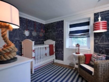
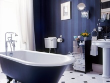
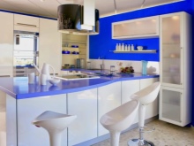
Add some warmth to the composition to balance the coolness of the selected shades. These can be details of coffee, cream, sand, ivory.
With gray
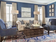
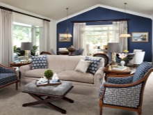
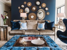
This is one of the most elegant combinations, designers often use it, since the range of shades is very close, they do not contradict each other, they complement perfectly. The interior in these colors does not bother, it looks comfortable and original.
Since this combination is very calm, low-contrast, it is suitable for a bedroom, living room, bathroom.
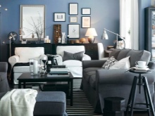
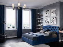
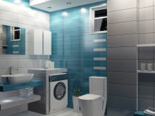
A very fashionable trick is the use of pearl shades of gray, which add a vintage touch to the entire interior.
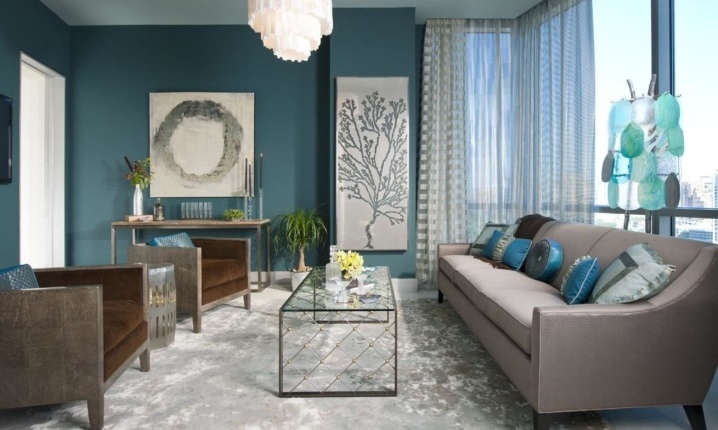
The light blue range will perfectly fit into the company, which will bring freshness and light mood.
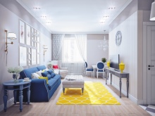
Neutral gray and noble blue make a great backdrop for bright unusual details such as sunny yellow. Choose a light gray as a background color and dilute it with bluish furniture in a rich tone. It is enough to add a few warm-rich accents to make it complete and harmonious.
The gray color perfectly balances even the brightest tones of blue, so you don't need to be afraid to include catchy details.
With yellow
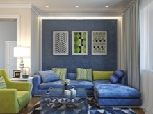
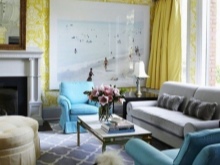
If you are not afraid to experiment and bright combinations are acceptable to you, you can consider blue in combination with yellow or orange. The yellow-blue room always looks catchy, stylish, the design is noticeable and expressive. This is a very juicy color scheme, where the warmth of yellow complements the noble coolness of the blue. When choosing this idea for decoration, leave the blue right for the main background, use yellow as an additional one.
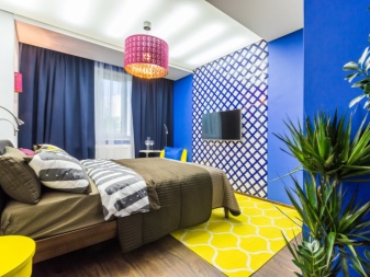
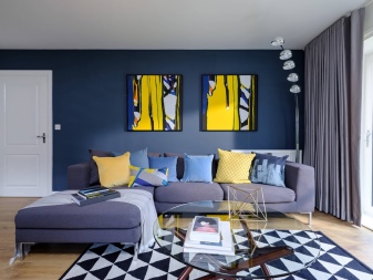
If you settled on shades of sea wave, light cobalt, turquoise, then warm tones of a sunny palette will suit them. If the blue is as cold as possible, then the shades of yellowness should be of the appropriate degree - neutral.
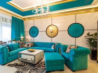
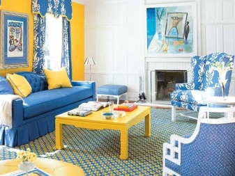
Remember that too cold shades, abundantly used in a design project, create the impression of uncomfortableness, sterility, and a state-owned room. Be sure to add warmth and light to the composition.
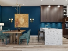
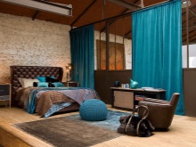
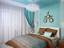
With brown
The brown scale perfectly soothes the saturation of the blue, adds warmth and softness to the interior. Shades of coffee, coffee with milk, cocoa, cinnamon go well with a blue palette.
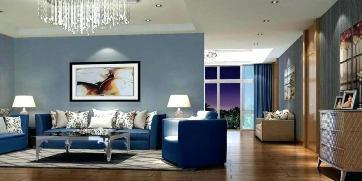
This combination allows you to create a status interior, a little prim, austere, but elegant.
These combinations are good in the design of an office, living room, hallway, library. Very often this tandem is used both in a classic style and in a modern minimalist style, for example, in industry.
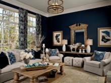
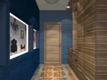
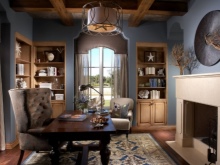
A harmonious composition can be created by combining the tonality of wood and blue decor: walnut, oak, chestnut and cherry go well with the palette of blue. Light blue variations such as turquoise, azure or cornflower can be used as the main ones, complementing them with brown elements. You can take light brown as a base and play with additional blue.
Both variations will create a very harmonious ensemble.
With beige
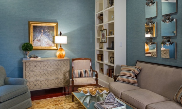
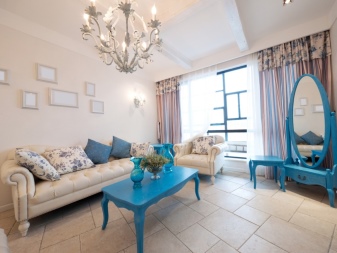
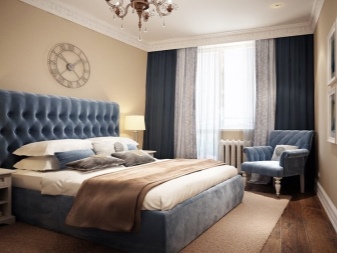
This is one of the canonical variations of the design solution in color. The freshness of blue is perfectly complemented by the coziness of the range of beige. At the same time, beige is able to balance even bright shades of blue, soften it, give it status and chic.
Ideally, beige is taken as the main background, on which bright blue details are advantageously located.
Terms of use in decoration
First of all, you need to decide in which rooms the blue color is most appropriate to use. Designers recommend sticking to the following concepts:
in the living room, blue is good as catchy accents: upholstered furniture, decorative elements, textiles, plots of paintings;
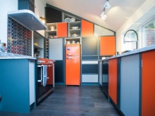
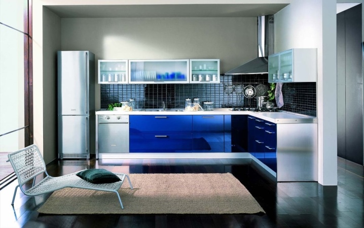
blue is ideal for decorating the kitchen, but only if you are not afraid to lower your appetite, you should choose contrasting combinations of combinations - with white, yellow, orange;
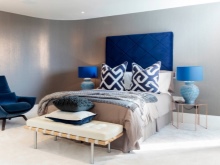
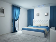
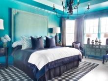
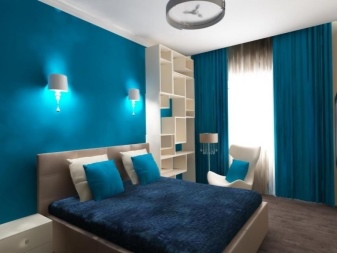
in the bedroom, blue is the most appropriate, it relaxes and invites you to sleep, the only thing is to avoid too gloomy, oppressive shades in large quantities;
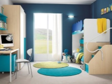
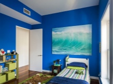
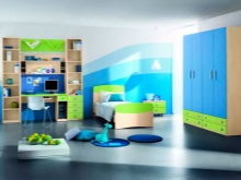
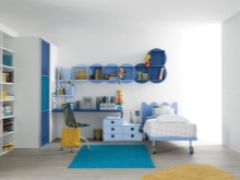
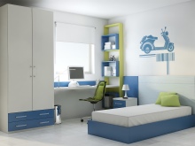
decorating a nursery, especially for a boy, blue can be chosen boldly, a room in a marine style will look especially bright and interesting, in any case, the companion of the blue should be cheerful;
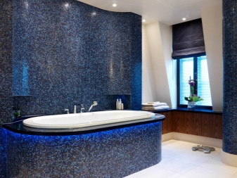
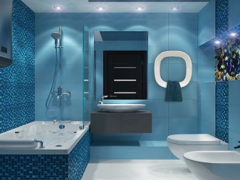
the sea nature of the blue is perfect for finishing the bathroom and toilet.
Ceiling
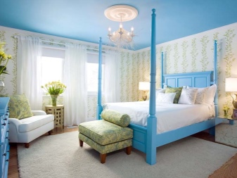
As for the ceiling, classic white has no rivals here. Light blue ceiling will be appropriate in the bedroom, nursery, bathroom, kitchen. Avoid dark and too bright shades of blue, otherwise the ceiling will put pressure on you, depress you.
Floor
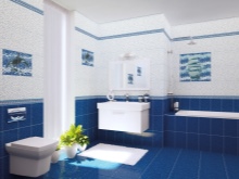
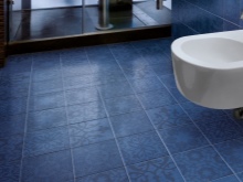
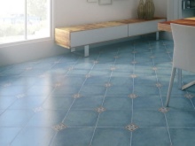
As for the floor and baseboards, the blue tiles will look great in the bathroom, toilet, hallway, kitchen. The blue carpet on the living room floor looks absolutely luxurious.
Remember that the darker and brighter your floor, the more visible debris and dust will be on it. So consider the navy blue floor from a practicality point of view as well.
Walls
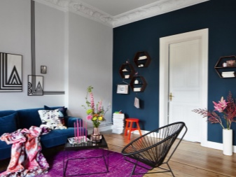
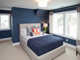
The most popular solution when choosing a blue scale as the main background is wall decoration. Wallpapers in blue monochrome or with elements in this range are very popular. The blue walls in the living room will look great, you can decorate one of the walls in catchy blue, making the rest more restrained. Blue walls will decorate the bedroom well.
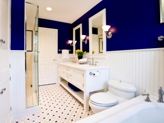
In the bathroom, more than anywhere else, blue tiles are appropriate in the design of the walls. In the kitchen, not only the walls can be blue, but also the apron of the headset.
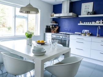
The main thing is to observe a sense of proportion, such a monochrome is not the best color scheme, choose one thing so as not to overload the interior.
We use it as an accent
If you decide to use blue as a complementary or accent color, there is much more variation here. This is the optimal solution in terms of color proportions, you do not risk going into gloom, making the design too cold and uncomfortable. Most often, furniture is chosen as accents:
sofas, armchairs in the living room;
in the bedroom there are beds;
chairs, a corner sofa and a suite in the kitchen.
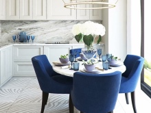
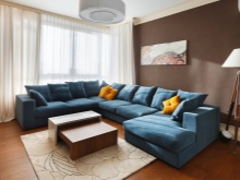
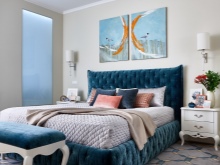
Textiles and decor are very popular in this palette:
curtains, tulle, curtains;
tablecloths;
chandeliers, lamps;
paintings and decor.
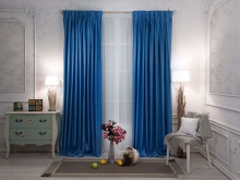
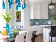
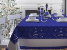
When decorating a bathroom and a toilet, you can go beyond the standard bluish tiles and choose a toilet or bath in this color.
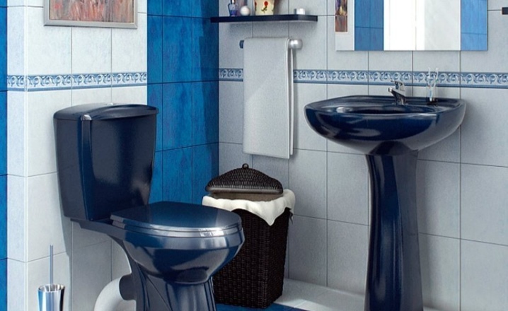
Remember that the accent in the chosen scale requires the predominance of a different shade in the design of the room.It can be beige, snow-white, yellow, lemon, light gray, brown.
Interior styles
This palette also looks great in different styles. Most Popular: provence, mediterranean, scandinavian, classic, loft.
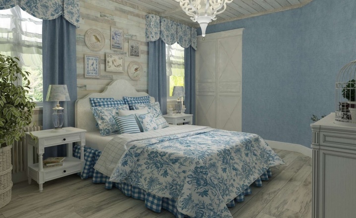
Provence... Soft and gentle rustic style, in which there is a lot of air, freshness. Bleached wood and white color predominate, as well as a light pastel palette. Since bright accents in this style are not implied, the blue is used in a muted, subtle version, mainly sky blue. Small flowers on white curtains, blue or azure decor are acceptable.
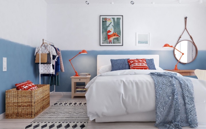
- Scandinavian... Laconic and restrained, predominantly light interior, in which blue can appear in a bright version, but in small quantities. This can be a painted shelf, an armchair, a picture on the wall, curtains. The main scale should be neutral.
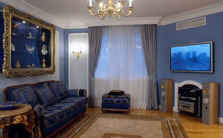
- Classic... This style is obligatory, there should be notes of restrained luxury in it, the nobility of blue fits perfectly into the concept. Combinations with brown tones, natural wood are appropriate. The combination of blue and gold looks impressive in a classic interior. You can take blue as a basis or as an accent.
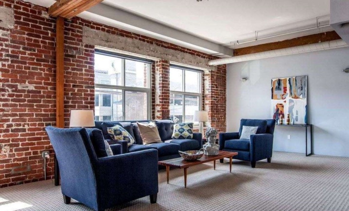
Loft... Modern minimalist style directions are perfectly complemented by blue. Loft style is distinguished by natural shades, rough finish. Blue can be used as catchy details: lamp, table, paintings, textiles.
Original examples
Living room
Bedroom
Children
Kitchen
Bathroom


The comment was sent successfully.