The color wheel in interior design
Numerous studies have shown that the psycho-emotional state of a person depends on the color palette in which the interior of the room where the person works or rests is decorated. Subconscious perception depends on the individual characteristics of a particular person (color preferences, age, character type, health status, social status). When choosing, it is important to take into account not only the general rules and recommendations of design specialists, but also the purpose of specific premises, and the wishes of the owners.
Color wheel concept
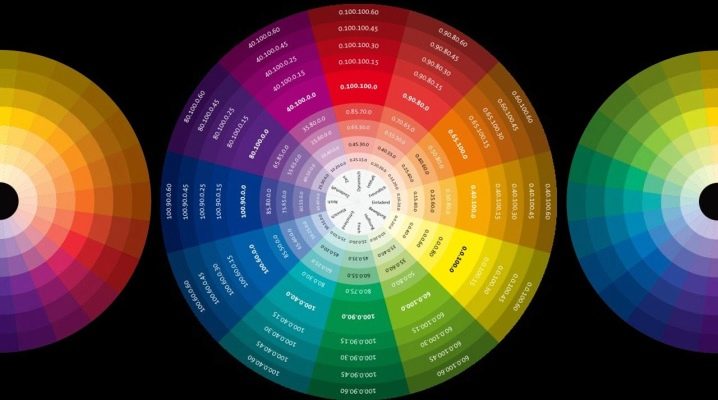
Research on the study of the spectrum of sunlight was first carried out by Isaac Newton. He organized the seven primary colors in a circular pattern. Later, during further research, scientists identified three basic colors: blue, yellow, red, and the rest of the colors - green, orange, purple and their all kinds of variations (shades) are formed by mixing the main ones.

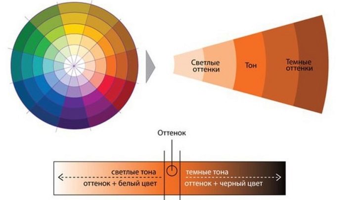
The color wheel is a circular model of the color spectrum, in which the luminosity changes with distance from the center, the brightness of the color increases.
The use of a circle in the selection of a color palette when decorating rooms allows you to avoid inconsistent colors in the interior and create a design style that fully corresponds to the chosen one.
Scientific research has proven that human vision can perceive many colors and their shades. The concept of the basic elements of the color spectrum will help you not to get lost in such a diverse palette.

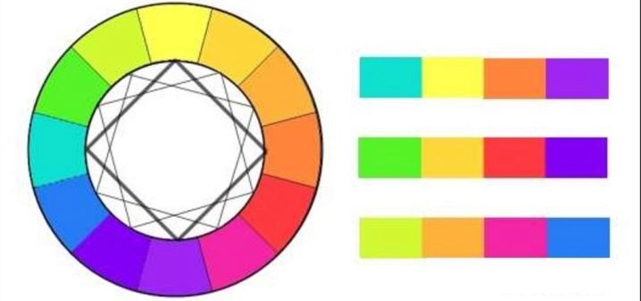
The colors of the spectrum are conventionally divided into warm and cold. Their location in the sectors is clearly shown in the image of the color wheel. Pure colors are almost never found in the decoration of premises, except perhaps in offices, cafes, clubs. In apartments and houses, neutral and mixed shades of colors prevail in the design, and bright ones are used in accentuating elements of the interior. Black, white, gray (with its shades) colors are added to them.
When choosing, most designers use a simple but effective tool - the color wheel.
How to choose the right color
The colors for the combination are selected depending on the intended purpose of the room to be decorated. With the help of color, it is possible to visually increase or decrease the space, create comfortable and cozy conditions in the room that contribute to a good rest. To avoid serious miscalculations, it is necessary to familiarize yourself in detail with the basic rules for combining colors and the general provisions of design.
It's not an easy process, but using the color wheel makes it much easier for designers. One important condition must always be adhered to: in one room for an optimal combination there should be from 3 to 5 colors (no more!). Another indispensable condition is to take into account all interior elements (floor, ceiling, doors, baseboards), as well as all pieces of furniture and decor (paintings, curtains, lamps, vases, pillows, accessories) - literally everything that is supposed to be placed in this room.
Currently, there are many color wheels for various purposes and complexity. From them, you can make up a wide variety of color schemes. Here are the most common key schemes for basic circle color matching.
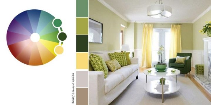
- Monochrome (analog) - consists of three adjacent shades of the same color in the color wheel, visually perceived evenly and calmly. Recommended for bedroom decoration.
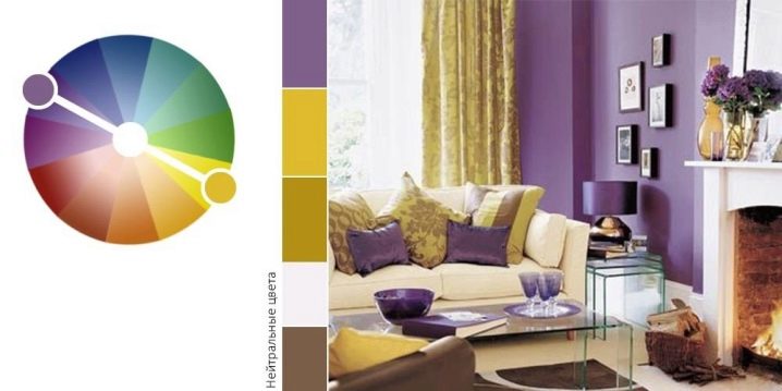
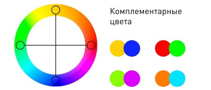
- Complementary (contrast) - consists of two different colors located in opposite sectors of the circle. Recommended for use in bathrooms and toilets.
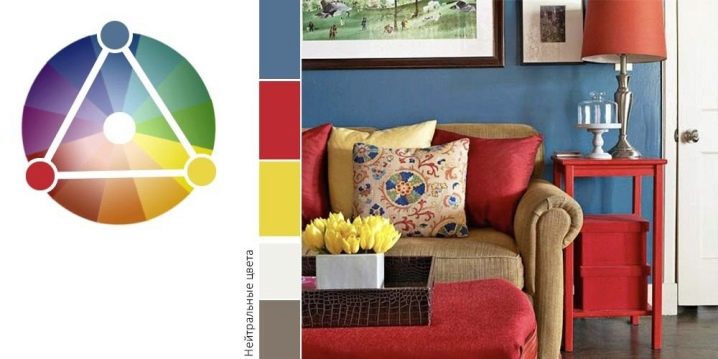
- Triad scheme includes three colors, which are indicated in a circle by the tops of an equilateral triangle inscribed in it, is considered a classic and a basis in design practice, and is most common in the design of residential premises. If a non-equilateral triangle fits in, then one of the colors with this choice is used as an accent one.

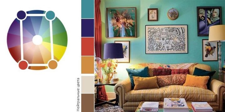
- Polychrome - according to a more complex color wheel than the base one, you can choose the right combination of four colors. A square or rectangle inscribed in such a circle will indicate with its vertices the colors with a harmonious combination. In this combination, one main color and two complementary ones will be chosen, and the fourth will become accent. A room with such an interior will always look fresh and stylish.
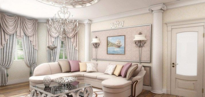
There is a concept of a complex combination of colors. This option is good for its versatility and consists of classic shades (white, gray, beige). Various color combinations of these tones will create a modern classic solution without the slightest risk, in which there will be no need to radically change the interior when replacing furniture or other elements.

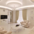

Interior options in various rooms
Before choosing a color scheme, you should pay attention to which side of the world the windows are facing, what kind of lighting is in the room, what kind of room it is in terms of functionality (living room, bedroom, nursery, kitchen, hallway). Colors are matched in luminosity and saturation. This means that in the color wheel they must be equidistant from the center of the circle. This distance characterizes the actual physical properties of the color.
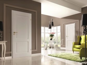
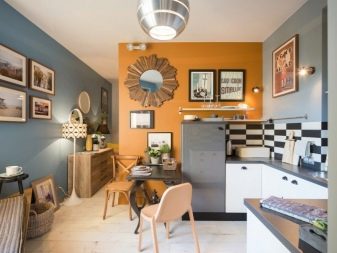
Living room
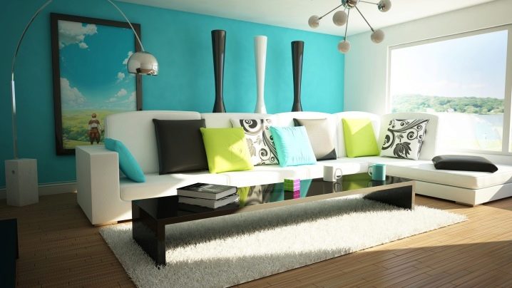
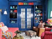
In the interior of the living room, you can safely use the game of contrasting catchy accents. They will bring showiness and cheerfulness to the style.
In large living rooms with windows to the north, warm shades of a natural scale are chosen as the basis of the interior, in small ones a cold palette is preferred - this visually "expands" the space.

Bedroom
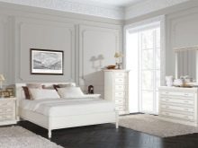
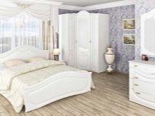
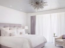
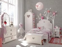
The interior of the bedroom will be matched with muted warm pastel colors to create a relaxing and soothing atmosphere for a complete and comfortable stay. Harsh contrasting colors are undesirable. For additional comfort, it is necessary to correctly place accents with the addition of white and accessories.
Children
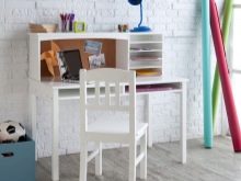
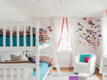
When decorating a nursery, it is important to take into account several aspects: beauty and convenience, cheerfulness of style, functionality, recommendations of psychologists and designers on the selection of color combinations. Not only are children in this room, adults also often have to look after them. Designers advise choosing light shades or even taking white as a basis, and correctly place bright colorful accents from decorative elements on a light background.
Such an interior will turn out to be light and airy, which will evoke positive emotions in children.
Kitchen
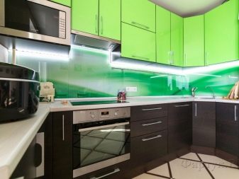
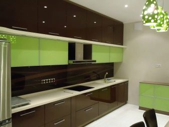
It is best to decorate the kitchen in warm colors, as they improve appetite and add positive emotions, and go well with neutral colors. If the kitchen is located on the south side, then instead of warm tones, you can choose a combination of colder tones, for example, brown and green, which will create additional notes of comfort and a feeling of being close to nature.
Basic knowledge of color theory and the use of the color wheel in making color decisions for interior decoration in preparation for renovation greatly simplifies this difficult task and avoids many risks and frustrations from the results obtained.
You can learn more about the combination of colors in the interior from the video below.


The comment was sent successfully.